Steampunk Industrial
Steampunk industrial interface. Ideal for landing pages, saas. AI-ready template.
Use case: Landing pages, SaaS
Historical Context
Steampunk didn't start as an aesthetic — it started as a literary argument. When Gibson and Sterling wrote The Difference Engine in 1990, they weren't designing a vibe. They were asking: what if the information age arrived a century early, powered by steam and brass instead of silicon? That question cracked open an entire genre. The maker movement grabbed it and ran. Suddenly you had people building actual functional computers inside mahogany cases, soldering copper pipe into keyboard frames, retrofitting analog gauges onto digital devices. It wasn't cosplay — it was a philosophical stance. A rejection of the disposable, the sealed-shut, the deliberately opaque. If you can't see the gears, how do you trust the machine? In UI, steampunk translates surprisingly well. Gauges become progress indicators. Dials become input controls. Riveted panels become card containers. The mechanical metaphor gives users something physical to grab onto — every interaction implies weight, resistance, consequence. Nothing happens without visible cause and effect. That's not decoration. That's information architecture wearing a top hat.
When to Use
Reach for steampunk when your project needs personality that conventional dark-mode-with-gradients can't deliver. Gaming interfaces, alternative history narratives, maker community platforms, themed entertainment experiences. It works when your audience already self-selects into worlds of craft and imagination. Don't use it for enterprise SaaS. Don't use it for medical apps. But for a tabletop RPG companion? A museum exhibit kiosk? A retro-futurist portfolio? The brass fits like a glove.
Design Principles
- Visible mechanics — every state change should feel like gears engaging, never abstract or invisible
- Material honesty — brass reads as brass, copper as copper; textures must reference real metallurgy, not plastic imitations
- Analog feedback — prefer gauges, dials, and mechanical indicators over flat progress bars and spinners
- Constructed weight — elements should feel riveted, bolted, assembled; nothing floats without visible support
- Functional ornament — decorative elements must serve navigational or informational purpose, never pure embellishment
DESIGN.md
---
version: "alpha"
name: "Steampunk Industrial"
description: "Steampunk industrial interface. Ideal for landing pages, saas. AI-ready template."
colors:
  primary: "#0D1B33"
  secondary: "#CD7F32"
  tertiary: "#8B7355"
  neutral: "#1A0F1F"
  surface: "#B87333"
  accent: "#4A3C28"
typography:
  h1:
    fontFamily: serif/industrial --navy-bg: #0D1B33
    fontSize: 2.25rem
    fontWeight: 700
  body-md:
    fontFamily: serif/industrial --navy-bg: #0D1B33
    fontSize: 1rem
    fontWeight: 400
  label-caps:
    fontFamily: serif/industrial --navy-bg: #0D1B33
    fontSize: 0.75rem
    fontWeight: 500
components:
  button-primary:
    backgroundColor: "{colors.primary}"
    textColor: "{colors.neutral}"
    padding: 12px
---

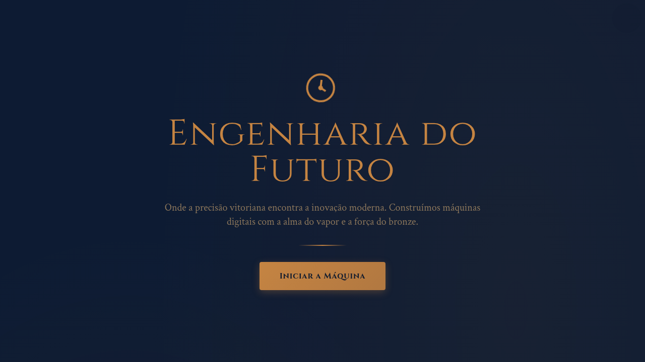
## Overview

Steampunk industrial interface. Ideal for landing pages, saas. AI-ready template. Steampunk didn't start as an aesthetic — it started as a literary argument. When Gibson and Sterling wrote The Difference Engine in 1990, they weren't designing a vibe. They were asking: what if the information age arrived a century early, powered by steam and brass instead of silicon? That question cracked open an entire genre.

The maker movement grabbed it and ran. Suddenly you had people building actual functional computers inside mahogany cases, soldering copper pipe into keyboard frames, retrofitting analog gauges onto digital devices. It wasn't cosplay — it was a philosophical stance. A rejection of the disposable, the sealed-shut, the deliberately opaque. If you can't see the gears, how do you trust the machine?

In UI, steampunk translates surprisingly well. Gauges become progress indicators. Dials become input controls. Riveted panels become card containers. The mechanical metaphor gives users something physical to grab onto — every interaction implies weight, resistance, consequence. Nothing happens without visible cause and effect. That's not decoration. That's information architecture wearing a top hat.

- Density: 5/10 — Balanced
- Variance: 4/10 — Moderate
- Motion: 8/10 — Cinematic

- **Style:** Mechanical, Victorian, Ornate, Industrial
- **Keywords:** Brass gears, copper piping, Victorian machinery, weathered metal, steam-powered, industrial, adventure, clockwork, mechanical
- **Era:** Victorian Steampunk
- **Light/Dark:** ✓ Full / ✓ Full

## Colors

- **Dark Navy** (#0D1B33) — Dark surface, primary background
- **Bronze** (#CD7F32) — Metallic accent, decorative detail
- **Warm Brown** (#8B7355) — Supporting palette color
- **Deep Purple** (#1A0F1F) — Accent color, emphasis elements
- **Copper** (#B87333) — Metallic accent, decorative detail
- **Aged Brass** (#4A3C28) — Extended palette, decorative use


## Typography

- **Display / Hero:** serif/industrial --navy-bg: #0D1B33 — Weight 700, tight tracking, used for headline impact
- **Body:** serif/industrial --navy-bg: #0D1B33 — Weight 400, 16px/1.6 line-height, max 72ch per line
- **UI Labels / Captions:** serif/industrial --navy-bg: #0D1B33 — 0.875rem, weight 500, slight letter-spacing
- **Monospace:** JetBrains Mono — Used for code, metadata, and technical values

Scale:
- Hero: clamp(2.5rem, 5vw, 4rem)
- H1: 2.25rem
- H2: 1.5rem
- Body: 1rem / 1.6
- Small: 0.875rem


## Layout

- **Grid:** CSS Grid primary. Max-width containment: 1280px centered with 1.5rem side padding.
- **Spacing rhythm:** Balanced. Base unit: 0.5rem (8px).
- **Section vertical gaps:** clamp(4rem, 8vw, 8rem).
- **Hero layout:** Split-screen (text left, visual right).
- **Feature sections:** Zig-zag alternating text+image rows. No 3-equal-columns.
- **Mobile collapse:** All multi-column layouts collapse below 768px. No horizontal overflow.
- **z-index contract:** base (0) / sticky-nav (100) / overlay (200) / modal (300) / toast (500).


## Elevation & Depth

Cinematic warm rim lighting, gear rotation animations, steam particle effects, clockwork tick animations, brass shimmer on hover

- **Physics:** Spring — stiffness 120, damping 20. Confident, weighted transitions.
- **Entry animations:** Fade + translate-Y (16px → 0) over 540ms ease-out. Staggered cascades for lists: 120ms between items.
- **Hover states:** Scale(1.03) + shadow lift over 200ms.
- **Page transitions:** Fade + slide (300ms).
- **Performance:** Only transform and opacity animated. No layout-triggering properties.


## Shapes

Base corner radius: 8px. See rounded tokens in front matter for the full scale.


## Components

- **Primary Button:** Subtly rounded (0.5rem) shape. Accent color fill. Hover: 8% darken + subtle lift shadow. Active: -1px translate tactile press. Font weight 600. No outer glows.
- **Secondary / Ghost Button:** Outline variant. 1.5px border in muted color. Text in primary color. Hover: subtle background fill.
- **Cards:** Subtly rounded (0.5rem) corners. Surface background. Subtle shadow (0 2px 12px rgba(0,0,0,0.06)). 1px border stroke.
- **Inputs:** Label above input. 1px border stroke. Focus ring: 2px accent color offset 2px. Error text below in semantic red. No floating labels.
- **Navigation:** Primary surface background. Active item: accent color indicator. Font weight 500 when active.
- **Skeletons:** Shimmer animation matching component dimensions. No circular spinners.
- **Empty States:** Icon-based composition with descriptive text and action button.


## Do's and Don'ts

- No emojis in UI — use icon system only (Lucide, Heroicons)
- No pure black (#000000) — use off-black or charcoal variants
- No oversaturated accent colors (saturation cap: 80%)
- No 3-column equal-width feature layouts — use zig-zag or asymmetric grid
- No `h-screen` — use `min-h-[100dvh]`
- No AI copywriting clichés: "Elevate", "Seamless", "Unleash", "Next-Gen"
- No broken external image links — use picsum.photos or inline SVG
- No generic lorem ipsum in demos

- Do Brass gears present
- Do Copper accents visible
- Do Weathered texture
- Do Dark navy background
- Do Clockwork animations
- Do Victorian machinery feel


## Use Case

Landing pages, SaaS
Technical Specs
CSS
background: #0D1B33 with metal texture, color: #CD7F32 accents, border: brass-colored, animation: rotate for gears, filter: sepia() for aged look, box-shadow: metallic depth, font-family: serif/industrial
Variables
--navy-bg: #0D1B33, --bronze: #CD7F32, --copper: #B87333, --aged-brass: #4A3C28, --gear-rotation: 20s linear infinite, --steam-opacity: 0.3
Checklist
☐ Brass gears present, ☐ Copper accents visible, ☐ Weathered texture, ☐ Dark navy background, ☐ Clockwork animations, ☐ Victorian machinery feel
Colors
Primary
Secondary
Effects
Cinematic warm rim lighting, gear rotation animations, steam particle effects, clockwork tick animations, brass shimmer on hover
Light/Dark
✓ Full / ✓ Full
AI Prompt
Act as a Senior Frontend Engineer and Expert UI Designer.
Your task is to code a complete Landing Page on the first attempt.
- Landing Page Theme: <INSERT THEME>
- Sections to add: <INSERT SECTIONS>

Generate the final code immediately following these definitions:

## Style

- **Name:** Steampunk Industrial
- **Type:** Mechanical, Victorian, Ornate, Industrial
- **Keywords:** Brass gears, copper piping, Victorian machinery, weathered metal, steam-powered, industrial, adventure, clockwork, mechanical
- **Era:** Victorian Steampunk
- **Light/Dark:** ✓ Full / ✓ Full

## Color Palette

- **Primary:** Dark Navy #0D1B33, Bronze #CD7F32, Warm Brown #8B7355, Deep Purple #1A0F1F
- **Secondary:** Copper #B87333, Aged Brass #4A3C28, Weathered Paper grain, starry cosmic void accents

## Visual Effects

Cinematic warm rim lighting, gear rotation animations, steam particle effects, clockwork tick animations, brass shimmer on hover

## AI Visual Direction

Design a steampunk industrial interface. Use: brass gear motifs, copper piping decorations, weathered metal textures, Victorian machinery aesthetic, dark navy background (#0D1B33), bronze/gold accents (#CD7F32), clockwork animations, steam effects.

## CSS Technical

```css
background: #0D1B33 with metal texture, color: #CD7F32 accents, border: brass-colored, animation: rotate for gears, filter: sepia() for aged look, box-shadow: metallic depth, font-family: serif/industrial
```

## Design System Variables

```css
--navy-bg: #0D1B33, --bronze: #CD7F32, --copper: #B87333, --aged-brass: #4A3C28, --gear-rotation: 20s linear infinite, --steam-opacity: 0.3
```

## Implementation Checklist

- ☐ Brass gears present
- ☐ Copper accents visible
- ☐ Weathered texture
- ☐ Dark navy background
- ☐ Clockwork animations
- ☐ Victorian machinery feel

## Execution Rules

1. Strictly follow the defined visual style.
2. Use high-quality inline SVG icons (Heroicons or Lucide style) — NEVER use emojis as icons.
3. Add `cursor-pointer` and smooth `hover` states (transition-all) on all interactive elements.
4. Required Page Structure:
   - Navbar (Logo + Links + CTA)
   - Hero Section (Impactful Headline + Subtitle + 2 buttons + 3D/Abstract visual element via CSS)
   - Features (3 cards with icons)
   - Testimonials (3 cards)
   - Pricing (3 tiers, highlight the middle one)
   - Final CTA
   - Full Footer with social links, privacy policy, terms of use, contact and SEO links.
5. All text content must be in English.
6. The visual must be CLEARLY distinct — do not create a "default Bootstrap" design. Force the use of the provided design system variables.
7. Use `<style>` tags in the head for custom classes (especially for complex backdrop-filter effects and animations) that Tailwind CDN doesn't cover.
8. Full Responsiveness: Layout must adapt perfectly to Mobile, Tablet and Desktop (vertical stack on mobile).
9. Include basic SEO, Viewport and Open Graph meta tags in `<head>`.
10. Footer must contain: Copyright 2026, Secondary navigation links and Social media icons.
11. Make the creative decisions needed to deliver the complete, functional result now.
Related
Last synced: 4/1/2026