Brutalism
Brutalist design with raw, unpolished, stark aesthetic. Ideal for creative portfolio, design agency, experimental blog, digital art. AI-ready template.
Use case: Creative portfolio, Design agency, Experimental blog, Digital art
Historical Context
The name comes from béton brut — raw concrete. Le Corbusier wasn't trying to be ugly. He was trying to be honest. The Brutalist architects of the 1950s stripped buildings down to structure and material because they believed ornamentation was a lie. Agree or not, the conviction was real. Web brutalism hit its stride around 2016. Bloomberg's site redesign shocked people. Craigslist suddenly looked intentional rather than outdated. Designers started asking: what if we just... didn't polish things? What if the grid showed through? What if Times New Roman was a choice? Now in 2026 we're deep into Anti-Design 2.0 — a second wave that's less about shock value and more about rejecting the sameness of design systems that all converged on the same rounded corners and soft shadows. Designers keep returning to brutalism because the web got too comfortable. Every SaaS looks identical. Brutalism is the antidote to that specific boredom. It's not rebellion for its own sake anymore. It's a legitimate design position.
When to Use
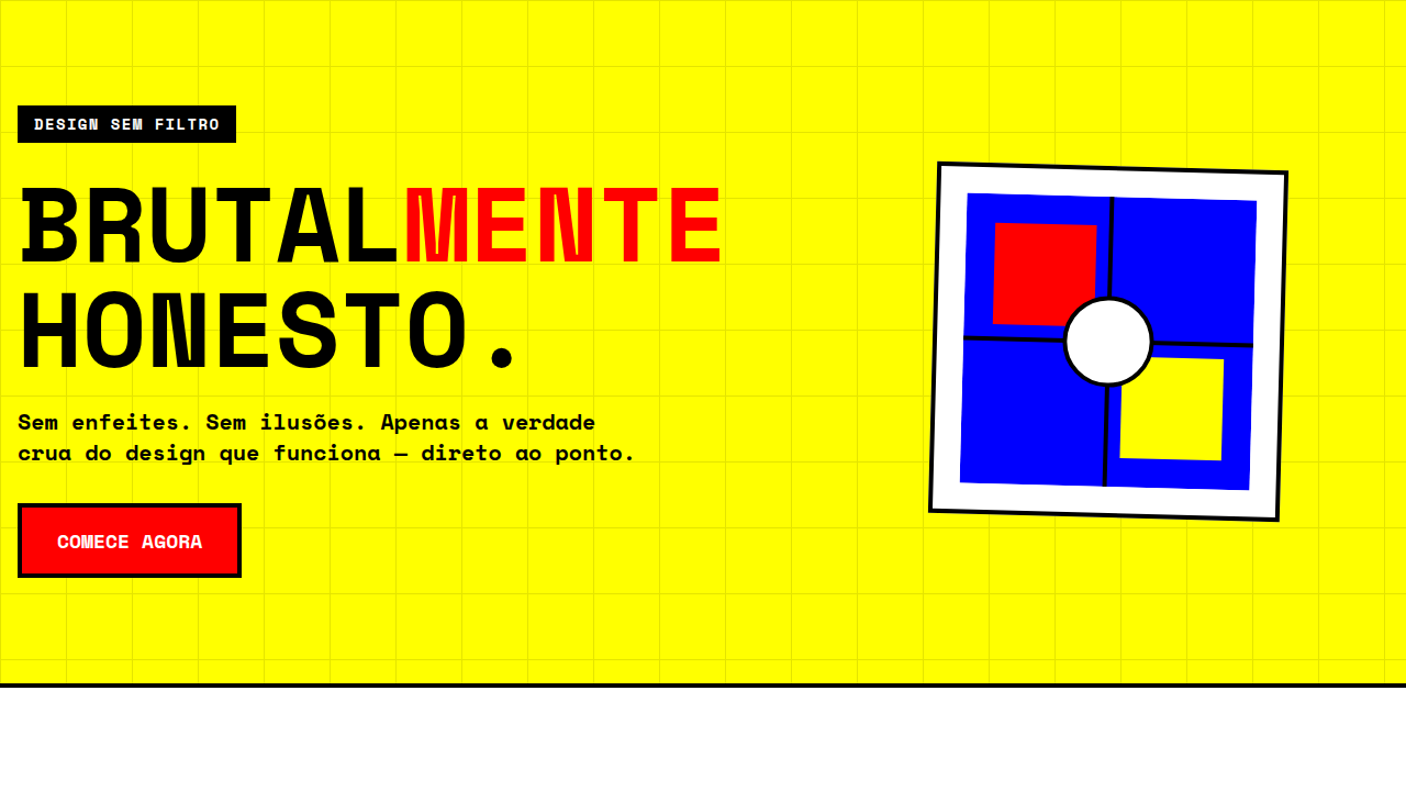
Brutalism works when your audience expects to be challenged — creative portfolios, design agencies, art publications, experimental projects. People in those spaces read rawness as confidence, not incompetence. But let's be honest: brutalism alienates most general audiences. Your mom's bakery website shouldn't look like a terminal dump. E-commerce with real conversion goals? Probably not. If your users need to feel safe handing over a credit card, brutalism is working against you. Use it when the aesthetic IS the message. Skip it when usability matters more than attitude.
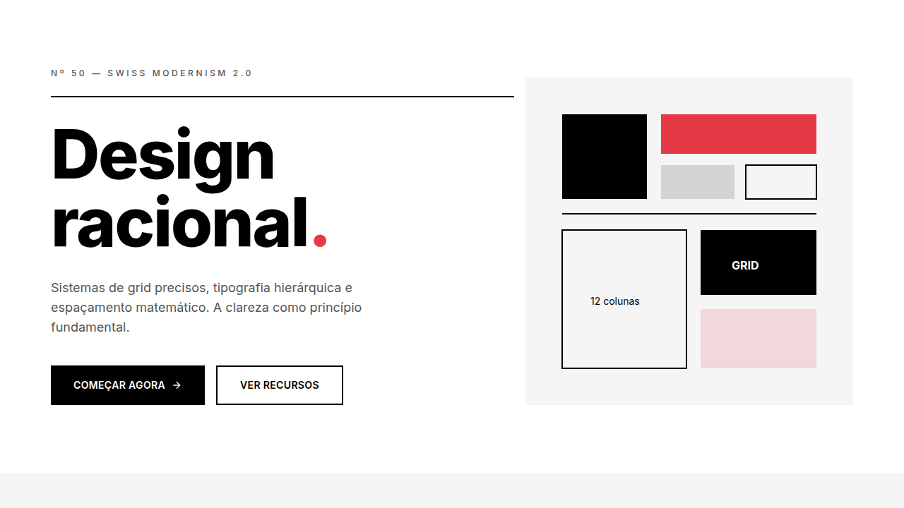
Design Principles
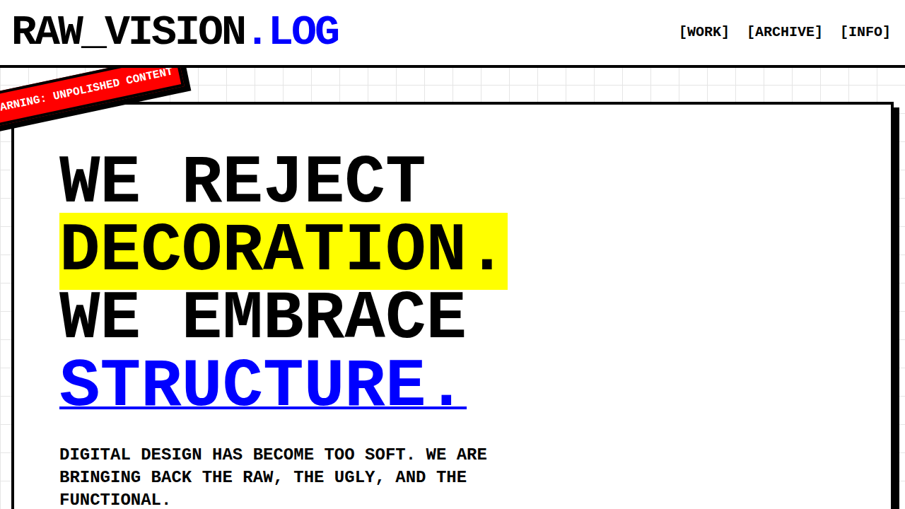
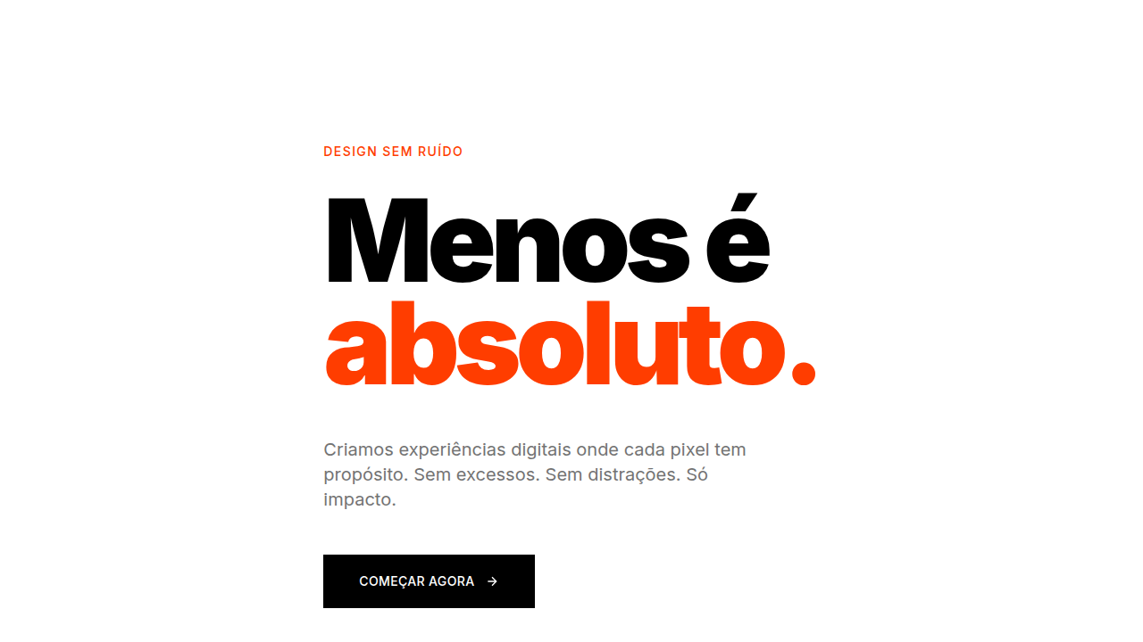
- Raw doesn't mean random — every exposed element should be a deliberate choice, not a missing stylesheet
- Typography carries the entire weight — when you strip decoration, type becomes architecture. Go bold or go home
- Contrast is your only tool for hierarchy — without shadows, gradients, or color ramps, you live and die by black against white
- Honor the medium — show the grid, show the markup logic, let the browser's native behavior be visible rather than overridden
- Restraint over chaos — the difference between intentional brutalism and a broken page is consistency. Pick your constraints and never break them
Technical Specs
Colors
Primary
Secondary
Effects
No smooth transitions (instant), sharp corners (0px), bold typography (700+), visible grid, large blocks
Light/Dark
✓ Full / ✓ Full
Related
Last synced: 4/1/2026