Neumorphism
Neumorphic UI with soft 3D effects. Ideal for modern apps, dashboards, health/fitness, productivity. AI-ready template.
Use case: Modern apps, Dashboards, Health/Fitness, Productivity
Historical Context
It started with a single Dribbble shot. In late 2019, Ukrainian designer Alexander Plyuto posted a soft, pillowy UI concept that looked like buttons extruded from clay. The internet lost its mind. By early 2020, "neumorphism" was everywhere — every design blog, every Twitter thread, every junior designer's portfolio. The name itself (new + skeuomorphism) promised a middle ground between the dead realism of iOS 6 and the sterile flatness that replaced it. The backlash came fast. Accessibility experts pointed out the obvious: when your entire UI relies on subtle shadow differences against a same-color background, contrast ratios tank. Buttons become invisible to low-vision users. Interactive states blur into decoration. WCAG compliance? Good luck. Six years later, neumorphism occupies a weird niche. Nobody ships a full neumorphic interface anymore — that experiment failed. But the technique survived as an accent. A toggle here, a card there, a dashboard widget that needs to feel tactile. It works best in controlled doses, on personal projects or internal tools where you control the audience. The hype died. The aesthetic didn't.
When to Use
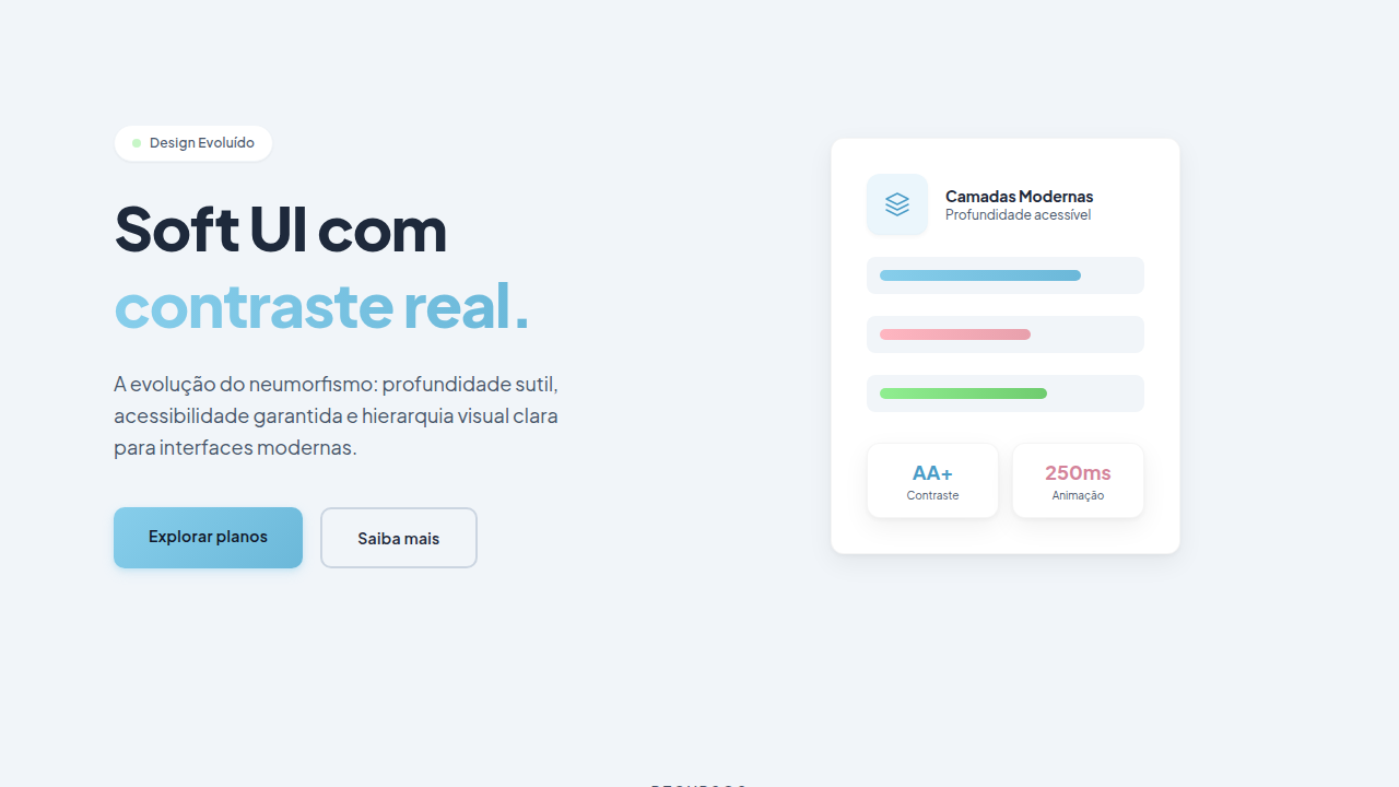
Neumorphism works for low-density interfaces where each element has breathing room — think fitness trackers, meditation apps, smart home controls, single-purpose dashboards. It's great when you want physicality without literal textures. Don't use it for text-heavy interfaces, complex forms, or anything requiring clear visual hierarchy at a glance. The contrast problem is real and unsolved — if your users include anyone with even mild visual impairment, neumorphism will fail them. Never use it for primary navigation or critical actions where discoverability matters more than aesthetics.
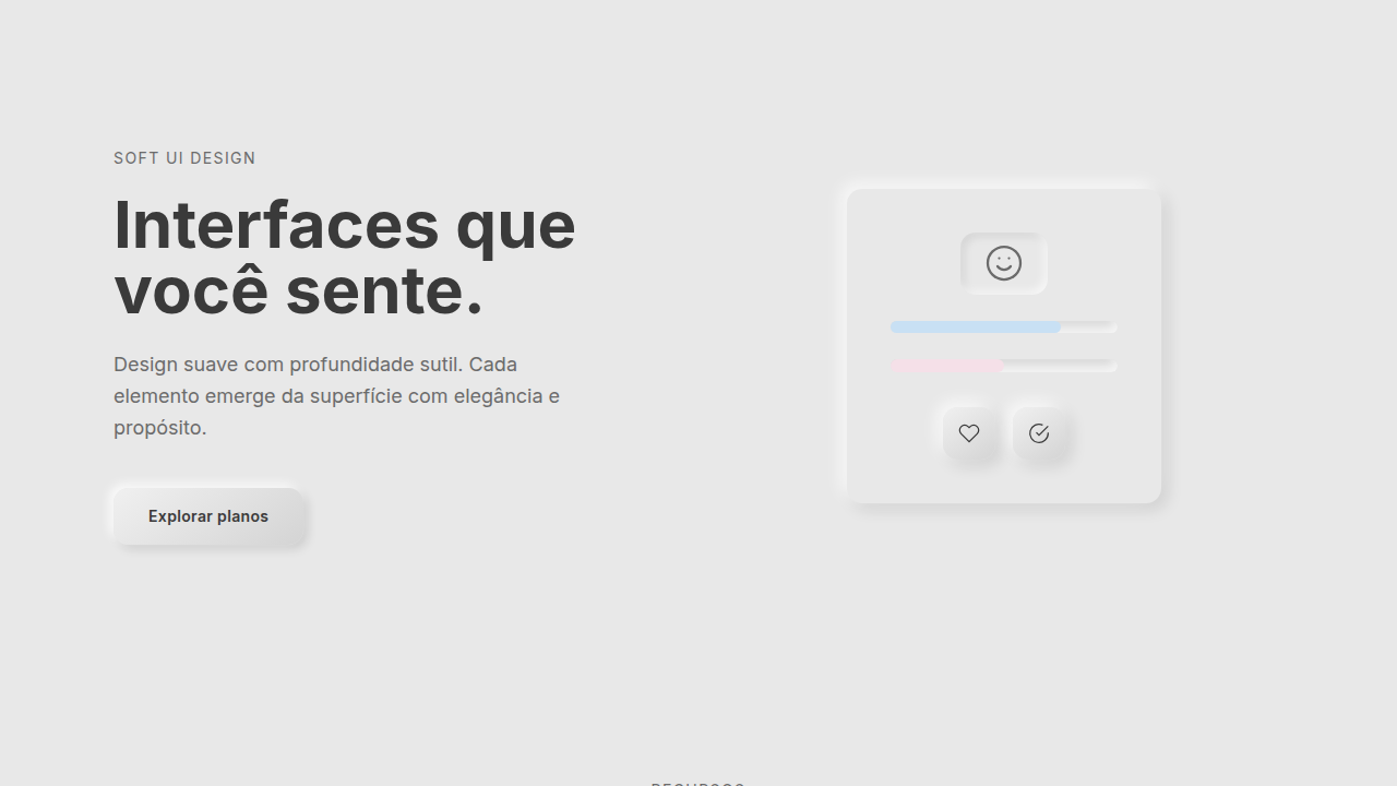
Design Principles
- Single light source, always. Pick top-left or top-right and commit. Mixed lighting kills the illusion instantly and makes the UI look broken rather than intentional.
- Background and element colors must share the same hue. Neumorphism only works when shadows create the depth — introduce color contrast between surface and element and you've just made a regular card with weird shadows.
- Pair every neumorphic element with a non-shadow affordance. A label, an icon, a color accent — something that communicates interactivity even if the shadows disappeared. This is your accessibility escape hatch.
- Keep shadow distances tight (4-8px) and blurs generous (12-20px). Harsh shadows break the soft illusion. You want the viewer to feel depth, not see edges.
- Reserve pressed/concave states for active selections only. If everything looks pushed in, nothing looks pushed in. The convex-to-concave transition is your most powerful feedback tool — don't waste it on hover.
Technical Specs
Colors
Primary
Effects
Soft box-shadow (multiple: -5px -5px 15px, 5px 5px 15px), smooth press (150ms), inner subtle shadow
Light/Dark
✓ Full / ◐ Partial
Related
Last synced: 4/1/2026