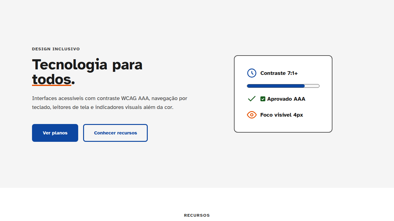
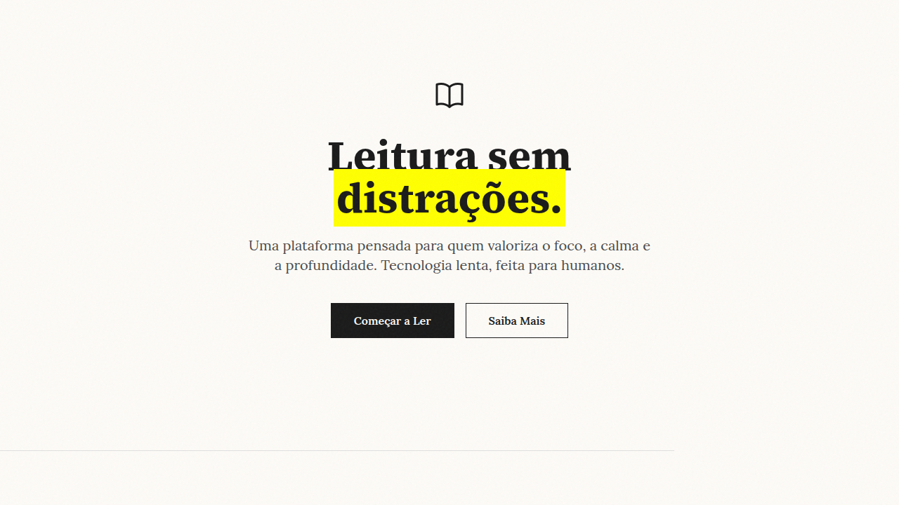
Minimalism & Swiss Style
Minimalist landing page. Ideal for b2b saas, enterprise apps, design saas, professional tools. AI-ready template.
Use case: B2B SaaS, Enterprise apps, Design SaaS, Professional tools
Historical Context
The Swiss Style didn't emerge from nowhere. It came out of the Basel and Zurich schools in the 1950s, where designers like Josef Müller-Brockmann were obsessed with one thing: removing the arbitrary from design. They built systems. Mathematical grids. Typographic hierarchies that worked because they followed rules, not gut feelings. Helvetica came out of this movement — a typeface so neutral it became invisible, which was exactly the point. What made it revolutionary wasn't minimalism for its own sake. It was the idea that design could be objective. That a grid system could solve layout problems the way engineering solves structural ones. Müller-Brockmann's concert posters proved you could be expressive within constraints — maybe more expressive because of them. It dominates digital interfaces today for a boring but true reason: it scales. When you're designing systems that need to work across hundreds of screens, languages, and contexts, the Swiss approach isn't a style choice — it's infrastructure. The grid is the API of visual design.
When to Use
This is your default for anything professional. B2B SaaS, enterprise dashboards, developer tools, design tools — anywhere users need to process information quickly without the interface getting in the way. It works brilliantly when content density is high and cognitive load matters. Where it falls flat: consumer apps that need emotional warmth, children's products, entertainment platforms, or anything where personality is the product. If your brand's differentiator is vibes, Swiss minimalism will make you look like every other SaaS landing page. It's a tool, not an identity.
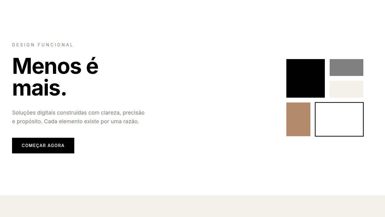
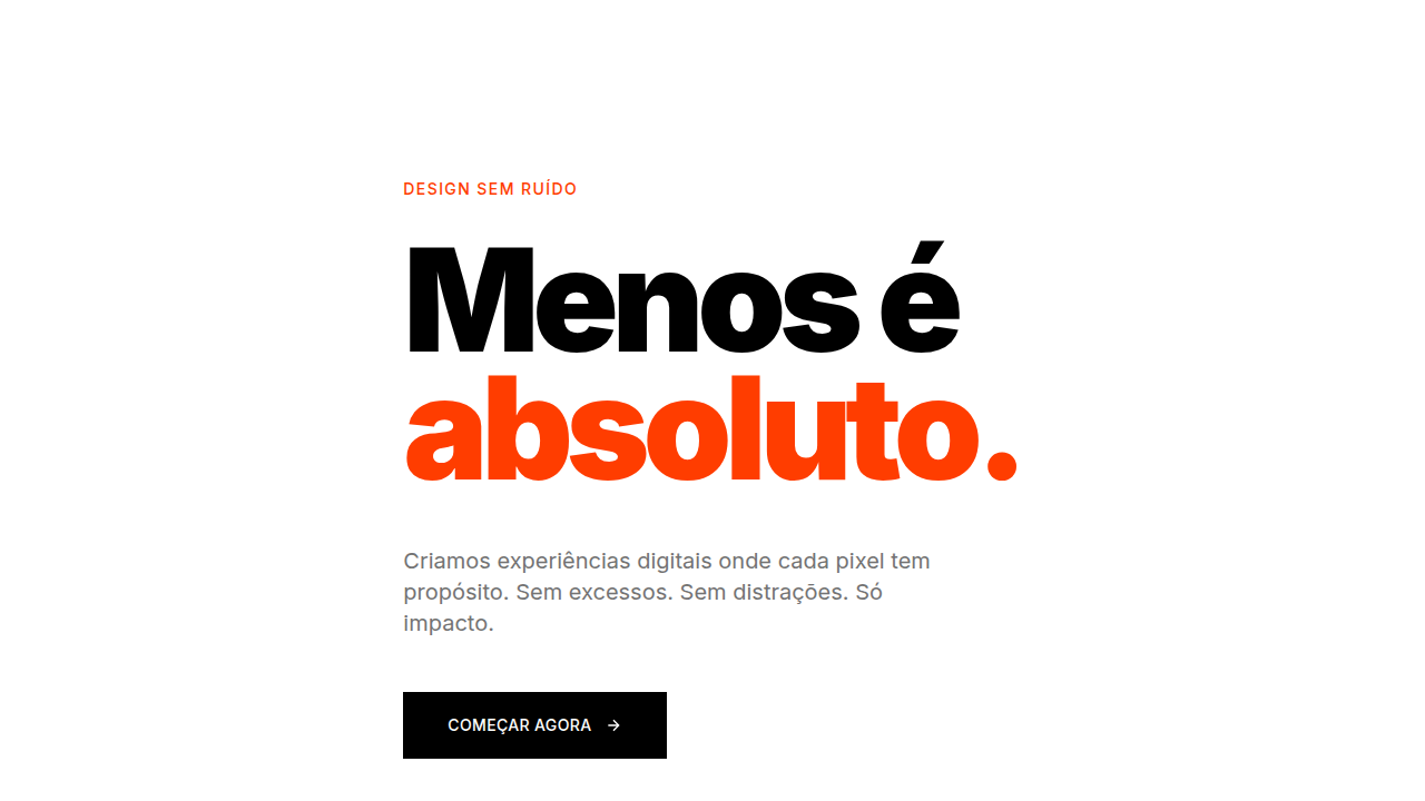
Design Principles
- Use a strict column grid (4, 8, or 12 columns) and actually align everything to it. If an element doesn't snap to the grid, you need a reason.
- Limit your type scale to 3-4 sizes maximum. The hierarchy comes from weight and spacing, not from having 9 different font sizes fighting each other.
- White space is structural, not decorative. Every margin and padding should be a multiple of your base unit — 4px or 8px. No magic numbers.
- One sans-serif typeface. Maybe two weights. If you're reaching for a third font, you've lost the plot.
- Interactions should be fast and invisible: 200ms transitions, no bouncing, no overshoot. The UI responds — it doesn't perform.
Technical Specs
Colors
Primary
Secondary
Effects
Subtle hover (200-250ms), smooth transitions, sharp shadows if any, clear type hierarchy, fast loading
Light/Dark
✓ Full / ✓ Full
Related
Last synced: 4/1/2026