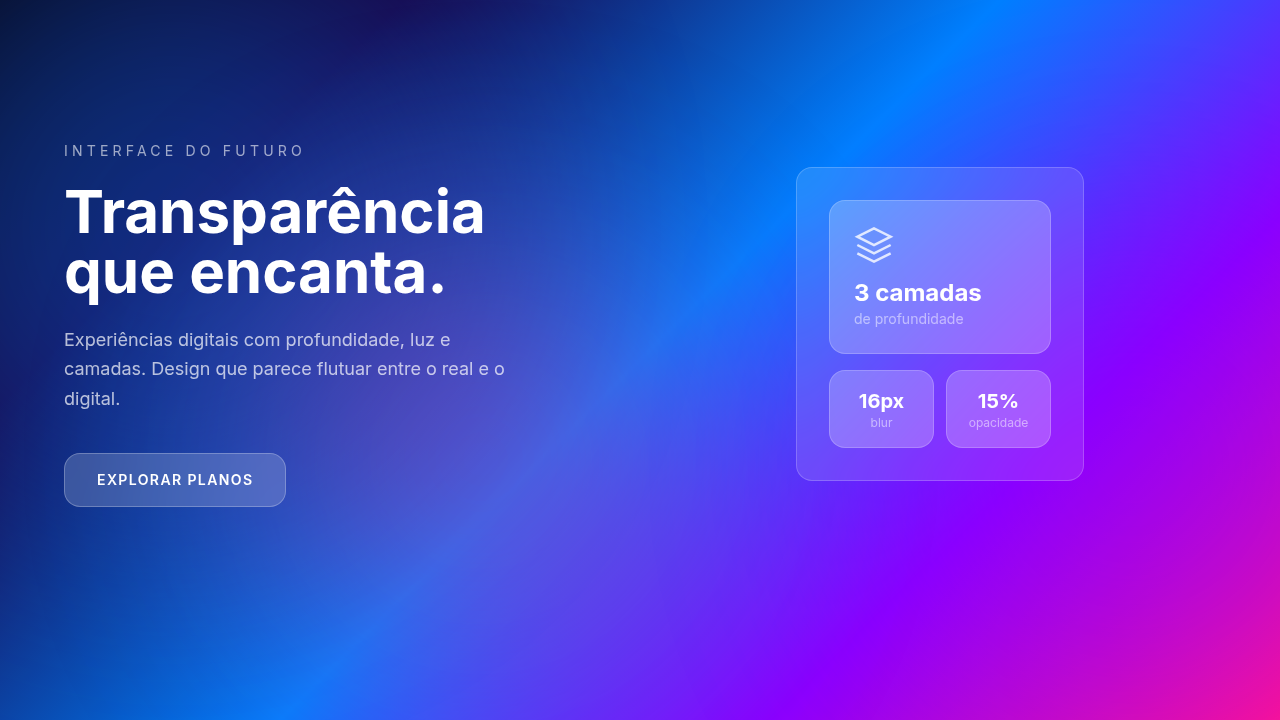
Glassmorphism
Glassmorphic interface with frosted glass effect. Ideal for overlays, modal dialogs, card components, premium interfaces. AI-ready template.
Use case: Overlays, Modal dialogs, Card components, Premium interfaces
Historical Context
Apple didn't invent frosted glass UI, but they made everyone care about it. iOS 7 dropped the skeuomorphism and introduced those translucent panels that let color bleed through from whatever sat behind them. It was polarizing. People hated it, then copied it. By Big Sur, the entire macOS chrome leaned into layered transparency as a spatial cue — and with visionOS, glass became the literal foundation of their spatial computing interface. It's not decoration there; it's architecture. Microsoft took a parallel path with Fluent Design's acrylic material around 2017. Windows 11 doubled down on it. Their approach was more systematic — defined noise textures, tint layers, luminosity blend modes. Less "pretty blur" and more "engineered material." What made glassmorphism actually viable for the web was backdrop-filter landing in all major browsers by 2020. Before that, you were faking it with duplicated backgrounds and clip paths — hacky, brittle, not worth the effort. Now it's a single CSS property. By 2026, it's a mature technique with solid browser support, though you still need to think about what happens when that blur can't render.
When to Use
Glass works when there's something worth seeing through it. A vibrant gradient, a photo, dynamic content shifting underneath — that's when the translucency earns its keep. Slapping backdrop-filter on a card over a white background? That's just a slightly transparent box. You've added GPU cost for nothing. And it does cost. Backdrop-filter triggers compositing layers and can tank scroll performance on lower-end devices, especially with large blur radii. Use it on focused, contained elements — modals, floating toolbars, notification panels. Not on every card in a grid of forty.
Design Principles
- Contrast is non-negotiable. Text over glass must hit WCAG AA minimums regardless of what's behind it. Add a semi-opaque tint layer or text shadow — don't rely on the background staying dark enough.
- Always provide a solid fallback. If backdrop-filter isn't supported or the OS has reduced transparency enabled, your UI should still look intentional, not broken.
- Keep blur radii between 10-20px. Below 10 looks like a rendering bug. Above 20 and you've lost the "seeing through" quality that makes glass feel like glass — it's just a colored overlay at that point.
- Use glass to communicate hierarchy, not to look fancy. A floating panel over content? Glass tells the user it's temporary, layered, dismissible. A primary content area? Use a solid surface.
- Mind the borders. A 1px border at rgba(255,255,255,0.15-0.25) sells the illusion of a physical edge catching light. Without it, glass elements bleed into their surroundings and lose definition.
Technical Specs
Colors
Secondary
Effects
Backdrop blur (10-20px), subtle border (1px solid rgba white 0.2), light reflection, Z-depth
Light/Dark
✓ Full / ✓ Full
Related
Last synced: 4/1/2026