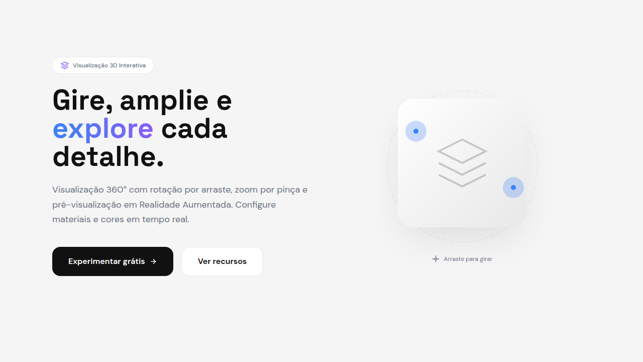
3D Product Preview
3D product preview interface. Ideal for landing pages, saas. AI-ready template.
Use case: Landing pages, SaaS
Historical Context
Static product photography had a good run. Decades of carefully lit hero shots, multiple angles, maybe a zoom-in on stitching. Then Apple dropped AR Quick Look in 2018 and everything shifted. Suddenly customers could place a MacBook on their desk before buying it. Shopify followed hard — integrating 3D models directly into product pages, reporting 94% higher conversion rates on listings with interactive previews. The writing was on the wall. Google's model-viewer web component democratized the whole thing. No WebGL expertise required. Drop a GLB file, add a tag, get a rotatable, zoomable 3D preview that works everywhere — phones included. By 2024, Shopify stores with 3D assets saw 40% fewer returns on furniture and apparel. The ROI argument was settled. Now we're past the novelty phase. 3D product viewers aren't experimental — they're infrastructure. The question isn't whether to use them, but how to implement them without tanking performance or confusing users who just want to see the damn shoe from the back.
When to Use
Deploy 3D previews when the product has spatial complexity that flat images can't communicate — furniture scale, sneaker texture, watch mechanics, car interiors. Essential for high-ticket items where returns are expensive and confidence drives conversion. Skip it for simple products (a plain t-shirt, a book) where photography still wins on load time and clarity. If your average order value is under $50 and the product is visually simple, the engineering cost won't pay back.
Design Principles
- Load progressive — show a high-quality poster image instantly, swap to the interactive model only after it's ready. Never show a loading spinner where a product should be.
- Respect the gesture — rotation should feel physical. Match finger velocity, add subtle inertia on release, never hijack page scroll. The model lives inside its container, period.
- Lighting sells — use neutral, studio-quality HDR environments by default. Dramatic lighting looks cool in demos but misrepresents materials. Customers need to trust what they're seeing.
- Annotate with restraint — hotspots and callouts should appear on intent (tap, hover), not clutter the resting state. The product is the hero, not your UI.
- Performance is non-negotiable — compress meshes aggressively, use Draco or Meshopt, keep initial payload under 5MB. A beautiful model that takes 8 seconds to load on mobile is a beautiful model nobody sees.
DESIGN.md
---
version: "alpha"
name: "3D Product Preview"
description: "3D product preview interface. Ideal for landing pages, saas. AI-ready template."
colors:
  primary: "#E8E8E8"
  secondary: "#FFFFFF"
typography:
  h1:
    fontFamily: System UI stack
    fontSize: 2.25rem
    fontWeight: 700
  body-md:
    fontFamily: System UI stack
    fontSize: 1rem
    fontWeight: 400
  label-caps:
    fontFamily: System UI stack
    fontSize: 0.75rem
    fontWeight: 500
components:
  button-primary:
    backgroundColor: "{colors.primary}"
    padding: 12px
---

## Overview

3D product preview interface. Ideal for landing pages, saas. AI-ready template. Static product photography had a good run. Decades of carefully lit hero shots, multiple angles, maybe a zoom-in on stitching. Then Apple dropped AR Quick Look in 2018 and everything shifted. Suddenly customers could place a MacBook on their desk before buying it. Shopify followed hard — integrating 3D models directly into product pages, reporting 94% higher conversion rates on listings with interactive previews. The writing was on the wall.

Google's model-viewer web component democratized the whole thing. No WebGL expertise required. Drop a GLB file, add a tag, get a rotatable, zoomable 3D preview that works everywhere — phones included. By 2024, Shopify stores with 3D assets saw 40% fewer returns on furniture and apparel. The ROI argument was settled.

Now we're past the novelty phase. 3D product viewers aren't experimental — they're infrastructure. The question isn't whether to use them, but how to implement them without tanking performance or confusing users who just want to see the damn shoe from the back.

- Density: 5/10 — Balanced
- Variance: 4/10 — Moderate
- Motion: 8/10 — Cinematic

- **Style:** 3D, Product-Focused, Interactive, E-commerce
- **Keywords:** 360 product view, rotatable, zoomable, touch-to-spin, AR preview, product configurator, interactive 3D model
- **Era:** 2025+ E-commerce 3D
- **Light/Dark:** ◐ Partial / ◐ Partial

## Colors

- **Soft Grey** (#E8E8E8) — Secondary text, borders, muted elements
- **Pure White** (#FFFFFF) — Light surface, card backgrounds


## Typography

- **Display / Hero:** System UI stack (-apple-system, sans-serif) — Weight 700, tight tracking, used for headline impact
- **Body:** System UI stack (-apple-system, sans-serif) — Weight 400, 16px/1.6 line-height, max 72ch per line
- **UI Labels / Captions:** System UI stack (-apple-system, sans-serif) — 0.875rem, weight 500, slight letter-spacing
- **Monospace:** JetBrains Mono — Used for code, metadata, and technical values

Scale:
- Hero: clamp(2.5rem, 5vw, 4rem)
- H1: 2.25rem
- H2: 1.5rem
- Body: 1rem / 1.6
- Small: 0.875rem


## Layout

- **Grid:** CSS Grid primary. Max-width containment: 1280px centered with 1.5rem side padding.
- **Spacing rhythm:** Balanced. Base unit: 0.5rem (8px).
- **Section vertical gaps:** clamp(4rem, 8vw, 8rem).
- **Hero layout:** Split-screen (text left, visual right).
- **Feature sections:** Zig-zag alternating text+image rows. No 3-equal-columns.
- **Mobile collapse:** All multi-column layouts collapse below 768px. No horizontal overflow.
- **z-index contract:** base (0) / sticky-nav (100) / overlay (200) / modal (300) / toast (500).


## Elevation & Depth

Drag-to-rotate, pinch-to-zoom, spin animation, AR placement, material switching, smooth orbit controls

- **Physics:** Spring — stiffness 120, damping 20. Confident, weighted transitions.
- **Entry animations:** Fade + translate-Y (16px → 0) over 540ms ease-out. Staggered cascades for lists: 120ms between items.
- **Hover states:** Scale(1.03) + shadow lift over 200ms.
- **Page transitions:** Fade + slide (300ms).
- **Performance:** Only transform and opacity animated. No layout-triggering properties.


## Shapes

Base corner radius: 8px. See rounded tokens in front matter for the full scale.


## Components

- **Primary Button:** Subtly rounded (0.5rem) shape. Accent color fill. Hover: 8% darken + subtle lift shadow. Active: -1px translate tactile press. Font weight 600. No outer glows.
- **Secondary / Ghost Button:** Outline variant. 1.5px border in muted color. Text in primary color. Hover: subtle background fill.
- **Cards:** Subtly rounded (0.5rem) corners. Surface background. Subtle shadow (0 2px 12px rgba(0,0,0,0.06)). 1px border stroke.
- **Inputs:** Label above input. 1px border stroke. Focus ring: 2px accent color offset 2px. Error text below in semantic red. No floating labels.
- **Navigation:** Primary surface background. Active item: accent color indicator. Font weight 500 when active.
- **Skeletons:** Shimmer animation matching component dimensions. No circular spinners.
- **Empty States:** Icon-based composition with descriptive text and action button.


## Do's and Don'ts

- No emojis in UI — use icon system only (Lucide, Heroicons)
- No pure black (#000000) — use off-black or charcoal variants
- No oversaturated accent colors (saturation cap: 80%)
- No 3-column equal-width feature layouts — use zig-zag or asymmetric grid
- No `h-screen` — use `min-h-[100dvh]`
- No AI copywriting clichés: "Elevate", "Seamless", "Unleash", "Next-Gen"
- No broken external image links — use picsum.photos or inline SVG
- No generic lorem ipsum in demos

- Do 3D model loads fast
- Do Rotation smooth
- Do Zoom works (pinch/scroll)
- Do AR button functional
- Do Colors switchable
- Do Mobile touch works


## Use Case

Landing pages, SaaS
Technical Specs
CSS
Three.js or model-viewer, OrbitControls, touch events for rotation, WebXR for AR, canvas with WebGL, loading placeholder, LOD for performance, environment lighting
Variables
--canvas-bg: #F5F5F5, --hotspot-color: #3B82F6, --loading-spinner: primary, --rotation-speed: 0.5, --zoom-min: 0.5, --zoom-max: 2
Checklist
☐ 3D model loads fast, ☐ Rotation smooth, ☐ Zoom works (pinch/scroll), ☐ AR button functional, ☐ Colors switchable, ☐ Mobile touch works
Colors
Primary
Effects
Drag-to-rotate, pinch-to-zoom, spin animation, AR placement, material switching, smooth orbit controls
Light/Dark
◐ Partial / ◐ Partial
AI Prompt
Act as a Senior Frontend Engineer and Expert UI Designer.
Your task is to code a complete Landing Page on the first attempt.
- Landing Page Theme: <INSERT THEME>
- Sections to add: <INSERT SECTIONS>

Generate the final code immediately following these definitions:

## Style

- **Name:** 3D Product Preview
- **Type:** 3D, Product-Focused, Interactive, E-commerce
- **Keywords:** 360 product view, rotatable, zoomable, touch-to-spin, AR preview, product configurator, interactive 3D model
- **Era:** 2025+ E-commerce 3D
- **Light/Dark:** ◐ Partial / ◐ Partial

## Color Palette

- **Primary:** Product-dependent, neutral backgrounds: Soft Grey #E8E8E8, Pure White #FFFFFF
- **Secondary:** Shadow gradients, reflection planes, environment lighting colors, accent highlights

## Visual Effects

Drag-to-rotate, pinch-to-zoom, spin animation, AR placement, material switching, smooth orbit controls

## AI Visual Direction

Design a 3D product preview interface. Use: 360° rotation, drag-to-spin, pinch-to-zoom, AR preview button, material/color switcher, hotspot annotations, orbit controls, product configurator, smooth rendering.

## CSS Technical

```css
Three.js or model-viewer, OrbitControls, touch events for rotation, WebXR for AR, canvas with WebGL, loading placeholder, LOD for performance, environment lighting
```

## Design System Variables

```css
--canvas-bg: #F5F5F5, --hotspot-color: #3B82F6, --loading-spinner: primary, --rotation-speed: 0.5, --zoom-min: 0.5, --zoom-max: 2
```

## Implementation Checklist

- ☐ 3D model loads fast
- ☐ Rotation smooth
- ☐ Zoom works (pinch/scroll)
- ☐ AR button functional
- ☐ Colors switchable
- ☐ Mobile touch works

## Execution Rules

1. Strictly follow the defined visual style.
2. Use high-quality inline SVG icons (Heroicons or Lucide style) — NEVER use emojis as icons.
3. Add `cursor-pointer` and smooth `hover` states (transition-all) on all interactive elements.
4. Required Page Structure:
   - Navbar (Logo + Links + CTA)
   - Hero Section (Impactful Headline + Subtitle + 2 buttons + 3D/Abstract visual element via CSS)
   - Features (3 cards with icons)
   - Testimonials (3 cards)
   - Pricing (3 tiers, highlight the middle one)
   - Final CTA
   - Full Footer with social links, privacy policy, terms of use, contact and SEO links.
5. All text content must be in English.
6. The visual must be CLEARLY distinct — do not create a "default Bootstrap" design. Force the use of the provided design system variables.
7. Use `<style>` tags in the head for custom classes (especially for complex backdrop-filter effects and animations) that Tailwind CDN doesn't cover.
8. Full Responsiveness: Layout must adapt perfectly to Mobile, Tablet and Desktop (vertical stack on mobile).
9. Include basic SEO, Viewport and Open Graph meta tags in `<head>`.
10. Footer must contain: Copyright 2026, Secondary navigation links and Social media icons.
11. Make the creative decisions needed to deliver the complete, functional result now.
Related

Last synced: 4/1/2026