Editorial Grid / Magazine
Design an editorial magazine layout. Ideal for landing pages, saas. AI-ready template.
Use case: Landing pages, SaaS
Historical Context
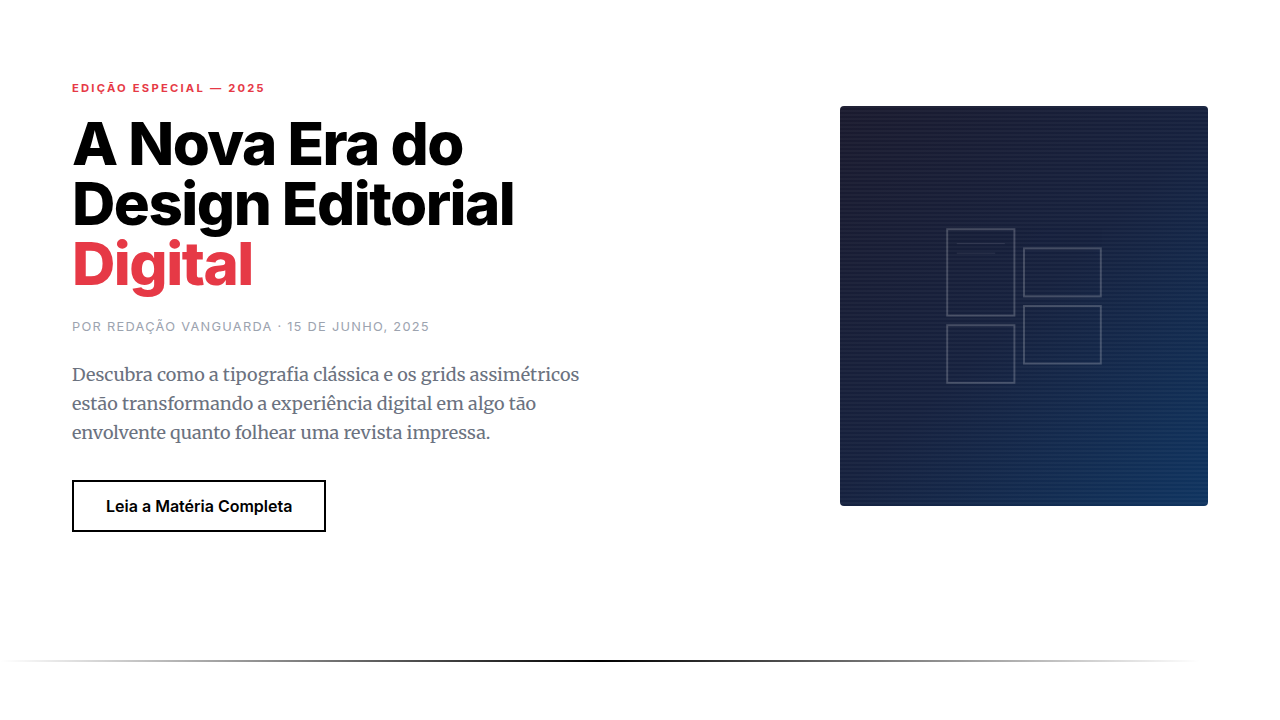
Print editorial design spent a century perfecting the art of guiding eyes across a page. Brodovitch at Harper's Bazaar, Neville Brody at The Face — they understood that white space is structure, not absence. Columns weren't containers; they were rhythm. Then the web happened and we lost all of it. Floats gave us two columns if we were lucky. The editorial tradition — asymmetric grids, pull quotes bleeding into margins, type that breathes differently at different scales — was simply impossible to build. We faked it with absolute positioning and prayed nothing broke. CSS Grid changed everything around 2017-2018, but it took publications like Bloomberg Businessweek's digital edition and the NYT's Snow Fall descendants to prove the model. They showed that a browser could hold the same tension between order and surprise that a printed spread delivers. Grid template areas, subgrid, container queries — suddenly the vocabulary matched the ambition. Magazine layout on the web stopped being a metaphor and became a real practice.
When to Use
When content deserves presence. Long-form journalism, cultural criticism, photo essays, annual reports — anything where the reading experience IS the product. Not dashboards. Not SaaS. Editorial grids demand content worth lingering over. If your users scan and leave, pick something simpler. But if you're building for readers who settle in, who scroll slowly, who notice when a pull quote lands perfectly against an image — this is your foundation.
Design Principles
- Asymmetry over symmetry — equal columns are for spreadsheets, not stories. Let one column dominate, let others support.
- Typography carries the hierarchy — size contrast does the work that color does elsewhere. A 64px headline next to 16px body copy creates its own grid.
- Whitespace is intentional, not leftover — margins and gaps are compositional choices. They control pace the way silence controls music.
- Content breaks the grid on purpose — pull quotes, full-bleed images, and inset elements should violate the column structure deliberately. Controlled tension.
- Vertical rhythm matters more than alignment — consistent baseline grids and spacing scales keep the page feeling composed even when layouts shift dramatically between sections.
DESIGN.md
---
version: "alpha"
name: "Editorial Grid / Magazine"
description: "Design an editorial magazine layout. Ideal for landing pages, saas. AI-ready template."
colors:
  primary: "#000000"
  secondary: "#FFFFFF"
typography:
  h1:
    fontFamily: System UI stack
    fontSize: 2.25rem
    fontWeight: 700
  body-md:
    fontFamily: System UI stack
    fontSize: 1rem
    fontWeight: 400
  label-caps:
    fontFamily: System UI stack
    fontSize: 0.75rem
    fontWeight: 500
spacing:
  sm: 2.0rem
  md: 4.0rem
  lg: 8.0rem
components:
  button-primary:
    backgroundColor: "{colors.primary}"
    padding: 12px
---

## Overview

Design an editorial magazine layout. Ideal for landing pages, saas. AI-ready template. Print editorial design spent a century perfecting the art of guiding eyes across a page. Brodovitch at Harper's Bazaar, Neville Brody at The Face — they understood that white space is structure, not absence. Columns weren't containers; they were rhythm.

Then the web happened and we lost all of it. Floats gave us two columns if we were lucky. The editorial tradition — asymmetric grids, pull quotes bleeding into margins, type that breathes differently at different scales — was simply impossible to build. We faked it with absolute positioning and prayed nothing broke.

CSS Grid changed everything around 2017-2018, but it took publications like Bloomberg Businessweek's digital edition and the NYT's Snow Fall descendants to prove the model. They showed that a browser could hold the same tension between order and surprise that a printed spread delivers. Grid template areas, subgrid, container queries — suddenly the vocabulary matched the ambition. Magazine layout on the web stopped being a metaphor and became a real practice.

- Density: 5/10 — Balanced
- Variance: 7/10 — Dynamic
- Motion: 8/10 — Cinematic

- **Style:** Editorial, Grid, Magazine, Typographic
- **Keywords:** Magazine layout, asymmetric grid, editorial typography, pull quotes, drop caps, column layout, print-inspired
- **Era:** 2020s Editorial Digital
- **Light/Dark:** ✓ Full / ✓ Full

## Colors

- **Black** (#000000) — Dark surface, primary background
- **White** (#FFFFFF) — Light surface, card backgrounds


## Typography

- **Display / Hero:** System UI stack (-apple-system, sans-serif) — Weight 700, tight tracking, used for headline impact
- **Body:** System UI stack (-apple-system, sans-serif) — Weight 400, 16px/1.6 line-height, max 72ch per line
- **UI Labels / Captions:** System UI stack (-apple-system, sans-serif) — 0.875rem, weight 500, slight letter-spacing
- **Monospace:** JetBrains Mono — Used for code, metadata, and technical values

Scale:
- Hero: clamp(2.5rem, 5vw, 4rem)
- H1: 2.25rem
- H2: 1.5rem
- Body: 1rem / 1.6
- Small: 0.875rem


## Layout

- **Grid:** CSS Grid primary. Max-width containment: 1280px centered with 1.5rem side padding.
- **Spacing rhythm:** Balanced. Base unit: 0.5rem (8px).
- **Section vertical gaps:** clamp(4rem, 8vw, 8rem).
- **Hero layout:** Asymmetric composition.
- **Feature sections:** Asymmetric grid with varied card sizes. No 3-equal-columns.
- **Mobile collapse:** All multi-column layouts collapse below 768px. No horizontal overflow.
- **z-index contract:** base (0) / sticky-nav (100) / overlay (200) / modal (300) / toast (500).


## Elevation & Depth

Smooth scroll, reveal on scroll, parallax images, text animations, page-flip transitions

- **Physics:** Spring — stiffness 120, damping 20. Confident, weighted transitions.
- **Entry animations:** Fade + translate-Y (16px → 0) over 540ms ease-out. Staggered cascades for lists: 120ms between items.
- **Hover states:** Scale(1.03) + shadow lift over 200ms.
- **Page transitions:** Fade + slide (300ms).
- **Performance:** Only transform and opacity animated. No layout-triggering properties.


## Shapes

Base corner radius: 8px. See rounded tokens in front matter for the full scale.


## Components

- **Primary Button:** Subtly rounded (0.5rem) shape. Accent color fill. Hover: 8% darken + subtle lift shadow. Active: -1px translate tactile press. Font weight 600. No outer glows.
- **Secondary / Ghost Button:** Outline variant. 1.5px border in muted color. Text in primary color. Hover: subtle background fill.
- **Cards:** Subtly rounded (0.5rem) corners. Surface background. Subtle shadow (0 2px 12px rgba(0,0,0,0.06)). 1px border stroke.
- **Inputs:** Label above input. 1px border stroke. Focus ring: 2px accent color offset 2px. Error text below in semantic red. No floating labels.
- **Navigation:** Primary surface background. Active item: accent color indicator. Font weight 500 when active.
- **Skeletons:** Shimmer animation matching component dimensions. No circular spinners.
- **Empty States:** Icon-based composition with descriptive text and action button.


## Do's and Don'ts

- No emojis in UI — use icon system only (Lucide, Heroicons)
- No pure black (#000000) — use off-black or charcoal variants
- No oversaturated accent colors (saturation cap: 80%)
- No 3-column equal-width feature layouts — use zig-zag or asymmetric grid
- No `h-screen` — use `min-h-[100dvh]`
- No AI copywriting clichés: "Elevate", "Seamless", "Unleash", "Next-Gen"
- No broken external image links — use picsum.photos or inline SVG
- No generic lorem ipsum in demos

- Do Grid asymmetric
- Do Typography editorial
- Do Pull quotes styled
- Do Drop caps present
- Do Images large/impactful
- Do Mobile reflows well


## Use Case

Landing pages, SaaS
Technical Specs
CSS
display: grid with named areas, column-count for text, ::first-letter for drop caps, blockquote styling, figure/figcaption, gap variations, font: serif for body, variable widths
Variables
--grid-cols: asymmetric, --body-font: Georgia/Merriweather, --heading-font: bold sans, --drop-cap-size: 4em, --pull-quote-size: 1.5em, --column-gap: 2rem
Checklist
☐ Grid asymmetric, ☐ Typography editorial, ☐ Pull quotes styled, ☐ Drop caps present, ☐ Images large/impactful, ☐ Mobile reflows well
Colors
Primary
Effects
Smooth scroll, reveal on scroll, parallax images, text animations, page-flip transitions
Light/Dark
✓ Full / ✓ Full
AI Prompt
Act as a Senior Frontend Engineer and Expert UI Designer.
Your task is to code a complete Landing Page on the first attempt.
- Landing Page Theme: <INSERT THEME>
- Sections to add: <INSERT SECTIONS>

Generate the final code immediately following these definitions:

## Style

- **Name:** Editorial Grid / Magazine
- **Type:** Editorial, Grid, Magazine, Typographic
- **Keywords:** Magazine layout, asymmetric grid, editorial typography, pull quotes, drop caps, column layout, print-inspired
- **Era:** 2020s Editorial Digital
- **Light/Dark:** ✓ Full / ✓ Full

## Color Palette

- **Primary:** High contrast: Black #000000, White #FFFFFF, accent brand color
- **Secondary:** Muted supporting, pull quote highlights, byline colors, section dividers

## Visual Effects

Smooth scroll, reveal on scroll, parallax images, text animations, page-flip transitions

## AI Visual Direction

Design an editorial magazine layout. Use: asymmetric grid, pull quotes, drop caps, multi-column text, large imagery, bylines, section dividers, print-inspired typography, article hierarchy, white space balance.

## CSS Technical

```css
display: grid with named areas, column-count for text, ::first-letter for drop caps, blockquote styling, figure/figcaption, gap variations, font: serif for body, variable widths
```

## Design System Variables

```css
--grid-cols: asymmetric, --body-font: Georgia/Merriweather, --heading-font: bold sans, --drop-cap-size: 4em, --pull-quote-size: 1.5em, --column-gap: 2rem
```

## Implementation Checklist

- ☐ Grid asymmetric
- ☐ Typography editorial
- ☐ Pull quotes styled
- ☐ Drop caps present
- ☐ Images large/impactful
- ☐ Mobile reflows well

## Execution Rules

1. Strictly follow the defined visual style.
2. Use high-quality inline SVG icons (Heroicons or Lucide style) — NEVER use emojis as icons.
3. Add `cursor-pointer` and smooth `hover` states (transition-all) on all interactive elements.
4. Required Page Structure:
   - Navbar (Logo + Links + CTA)
   - Hero Section (Impactful Headline + Subtitle + 2 buttons + 3D/Abstract visual element via CSS)
   - Features (3 cards with icons)
   - Testimonials (3 cards)
   - Pricing (3 tiers, highlight the middle one)
   - Final CTA
   - Full Footer with social links, privacy policy, terms of use, contact and SEO links.
5. All text content must be in English.
6. The visual must be CLEARLY distinct — do not create a "default Bootstrap" design. Force the use of the provided design system variables.
7. Use `<style>` tags in the head for custom classes (especially for complex backdrop-filter effects and animations) that Tailwind CDN doesn't cover.
8. Full Responsiveness: Layout must adapt perfectly to Mobile, Tablet and Desktop (vertical stack on mobile).
9. Include basic SEO, Viewport and Open Graph meta tags in `<head>`.
10. Footer must contain: Copyright 2026, Secondary navigation links and Social media icons.
11. Make the creative decisions needed to deliver the complete, functional result now.
Related
Last synced: 4/1/2026