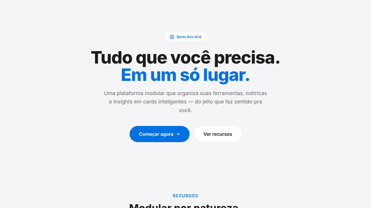
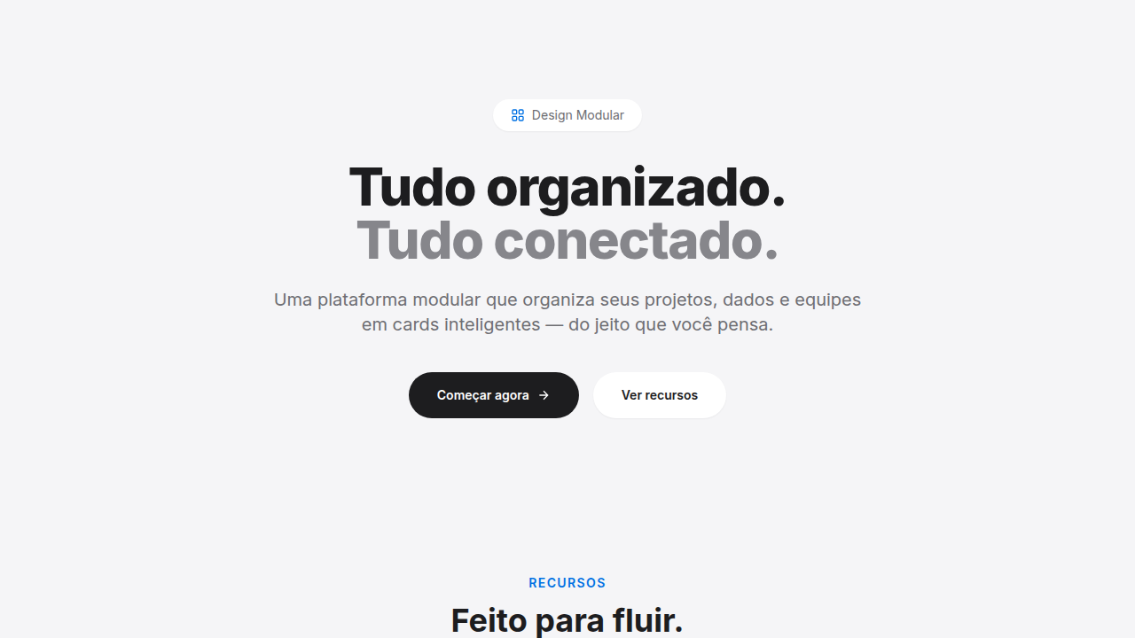
Bento Box Grid
Bento Box grid layout. Ideal for landing pages, saas. AI-ready template.
Use case: Landing pages, SaaS
Historical Context
Apple didn't invent the grid. But they made it sexy. WWDC 2020 rolls around and suddenly every slide deck is this gorgeous arrangement of rounded rectangles — different sizes, different weights, all breathing together. The Japanese bento box metaphor clicked instantly: compartments of varying proportion, each holding something distinct, the whole greater than its parts. It wasn't a new idea in layout theory, but Apple's execution — that specific combination of generous radius, flat color, and asymmetric sizing — turned it into a visual language overnight. Within months, every SaaS feature page looked like this. Linear did it. Raycast did it. Vercel did it. The bento grid became the default way to say "we have multiple features and they're all polished." It replaced the tired three-column icon grid that dominated the 2010s. Whether that's progress or just a new monoculture depends on your tolerance for trends — but the layout works because it creates visual hierarchy without requiring the viewer to read a single word.
When to Use
Reach for bento when you have 4-8 features that aren't equal in importance. The varied card sizes let you editorialize — make the hero feature a double-wide, tuck secondary stuff into smaller cells. It's perfect for product marketing pages, feature announcements, and anything where you need to communicate breadth without overwhelming. Skip it for content that's genuinely uniform (pricing tiers, team members) — forced asymmetry on equal items just looks arbitrary.
Design Principles
- Size encodes hierarchy — the biggest card carries the most weight, no exceptions. Don't make something large just to fill space.
- Consistent gap, inconsistent proportion. The gutter stays fixed; the cards breathe at different scales. This is what separates bento from chaos.
- Generous corner radius is load-bearing. Go too sharp and it reads as a data table. The softness signals editorial intent.
- Each cell is self-contained. A bento card should communicate its point without requiring context from neighbors — the grid is browsable in any order.
- Restrain the palette per card. One illustration, one stat, one short headline. The grid already creates complexity; individual cells need to stay dead simple.
Technical Specs
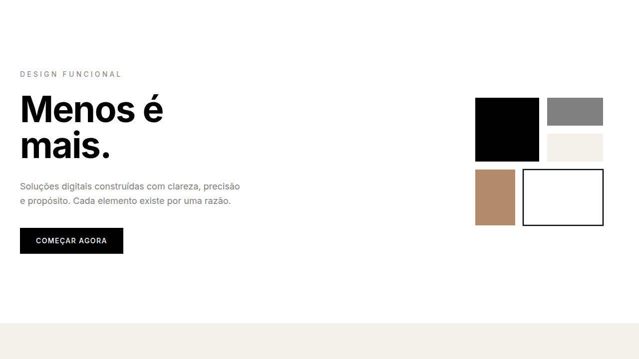
Colors
Primary
Effects
grid-template with varied spans, rounded-xl (16px), subtle shadows, hover scale (1.02), smooth transitions
Light/Dark
✓ Full / ✓ Full
Related

Last synced: 4/1/2026