Isometric Gaming / Voxel
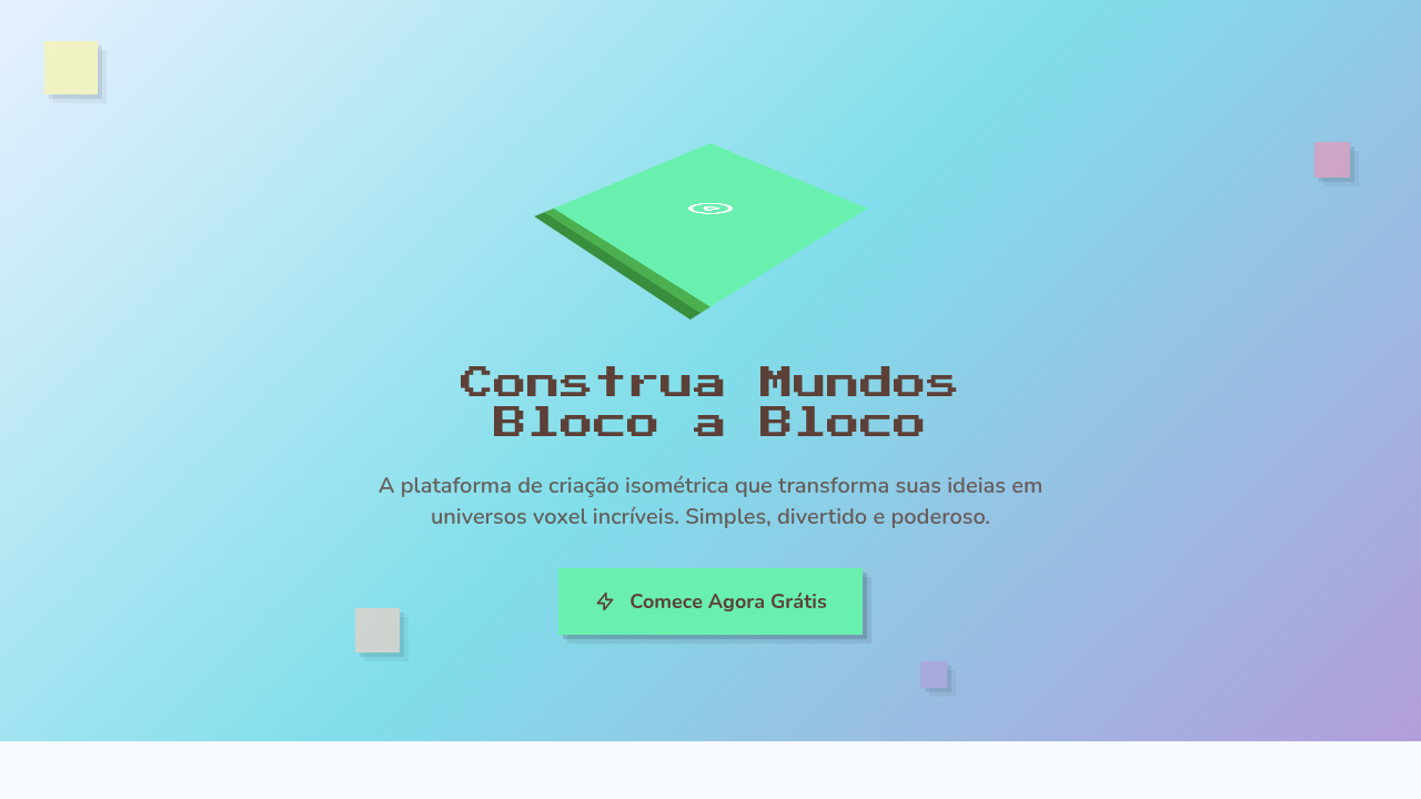
Design an isometric voxel gaming interface. Ideal for landing pages, saas. AI-ready template.
Use case: Landing pages, SaaS
Historical Context
Isometric projection didn't start on the web — it started in the trenches of 16-bit game design. SimCity (1989) proved you could build entire worlds on a 2:1 pixel ratio grid. Diablo took that same angular perspective and drenched it in atmosphere. The constraint was technical — true 3D was expensive — but the result was a visual language that felt deliberate, architectural, almost diagrammatic. Games like Habbo Hotel and early Flash worlds carried it into the internet era. Then Minecraft happened. Notch didn't invent voxels, but he made an entire generation see the world in cubes. Suddenly voxel art wasn't niche — it was cultural shorthand for creativity, building, ownership. The aesthetic bled into everything: album covers, brand illustrations, crypto projects. By the mid-2010s, isometric illustration had become a full-blown web design trend. Slack, Dropbox, dozens of SaaS landing pages — all using isometric scenes to explain abstract products. Some of it was lazy. The best of it retained that game-design DNA: precise grids, playful color, a sense that you could reach in and rearrange the pieces.
When to Use
Reach for isometric/voxel when your project needs to feel buildable and playful simultaneously. It's a natural fit for gaming platforms, metaverse interfaces, NFT collections that want retro credibility, and developer portfolios that need personality without corporate polish. The style signals craft — someone placed every cube deliberately. Works beautifully for onboarding flows, feature explanations, and hero sections where you want depth without the weight of photorealism. Avoid it for anything that needs to feel organic or emotionally vulnerable.
Design Principles
- Commit to the grid — isometric projection lives or dies by consistent 30° angles and pixel-perfect alignment. One misaligned cube breaks the illusion.
- Limit your palette aggressively. Voxel art gains charm from constraint — 8 to 12 colors maximum, with clear light/shadow faces on each cube.
- Design for modularity. The best isometric systems are built from repeatable blocks that snap together like LEGO, enabling scene composition without redrawing.
- Use depth as information hierarchy. Foreground elements carry primary content, mid-ground provides context, background sets mood — treat Z-axis like typographic scale.
- Animate sparingly but purposefully. A single rotating element or a looping particle effect gives life to a static scene without overwhelming the geometric precision.
DESIGN.md
---
version: "alpha"
name: "Isometric Gaming / Voxel"
description: "Design an isometric voxel gaming interface. Ideal for landing pages, saas. AI-ready template."
colors:
  primary: "#E8F0FE"
  secondary: "#5D4037"
  tertiary: "#69F0AE"
  neutral: "#FFCCBC"
  surface: "#FFF59D"
  accent: "#80DEEA"
typography:
  h1:
    fontFamily: System UI stack
    fontSize: 2.25rem
    fontWeight: 700
  body-md:
    fontFamily: System UI stack
    fontSize: 1rem
    fontWeight: 400
  label-caps:
    fontFamily: System UI stack
    fontSize: 0.75rem
    fontWeight: 500
components:
  button-primary:
    backgroundColor: "{colors.primary}"
    textColor: "{colors.neutral}"
    padding: 12px
---

## Overview

Design an isometric voxel gaming interface. Ideal for landing pages, saas. AI-ready template. Isometric projection didn't start on the web — it started in the trenches of 16-bit game design. SimCity (1989) proved you could build entire worlds on a 2:1 pixel ratio grid. Diablo took that same angular perspective and drenched it in atmosphere. The constraint was technical — true 3D was expensive — but the result was a visual language that felt deliberate, architectural, almost diagrammatic. Games like Habbo Hotel and early Flash worlds carried it into the internet era.

Then Minecraft happened. Notch didn't invent voxels, but he made an entire generation see the world in cubes. Suddenly voxel art wasn't niche — it was cultural shorthand for creativity, building, ownership. The aesthetic bled into everything: album covers, brand illustrations, crypto projects.

By the mid-2010s, isometric illustration had become a full-blown web design trend. Slack, Dropbox, dozens of SaaS landing pages — all using isometric scenes to explain abstract products. Some of it was lazy. The best of it retained that game-design DNA: precise grids, playful color, a sense that you could reach in and rearrange the pieces.

- Density: 5/10 — Balanced
- Variance: 7/10 — Dynamic
- Motion: 8/10 — Cinematic

- **Style:** Isometric, Pixelated, Gaming, Colorful
- **Keywords:** Isometric projection, voxel-style, Minecraft-esque, floating platforms, gamified, pixel-3D, step-down progression, playful 3D
- **Era:** 2020s Gaming Culture
- **Light/Dark:** ✓ Full / ✓ Full

## Colors

- **Sky Blue** (#E8F0FE) — Accent highlight, links and focus states
- **Warm Brown** (#5D4037) — Secondary surface or text color
- **Mint Green** (#69F0AE) — Supporting palette color
- **Peach** (#FFCCBC) — Supporting palette color
- **Pastel Yellow** (#FFF59D) — Warning states, attention indicators
- **Aqua** (#80DEEA) — Extended palette, decorative use
- **Pink** (#F48FB1) — Primary text color
- **Lavender** (#B39DDB) — Extended palette, decorative use


## Typography

- **Display / Hero:** System UI stack (-apple-system, sans-serif) — Weight 700, tight tracking, used for headline impact
- **Body:** System UI stack (-apple-system, sans-serif) — Weight 400, 16px/1.6 line-height, max 72ch per line
- **UI Labels / Captions:** System UI stack (-apple-system, sans-serif) — 0.875rem, weight 500, slight letter-spacing
- **Monospace:** JetBrains Mono — Used for code, metadata, and technical values

Scale:
- Hero: clamp(2.5rem, 5vw, 4rem)
- H1: 2.25rem
- H2: 1.5rem
- Body: 1rem / 1.6
- Small: 0.875rem


## Layout

- **Grid:** CSS Grid primary. Max-width containment: 1280px centered with 1.5rem side padding.
- **Spacing rhythm:** Balanced. Base unit: 0.5rem (8px).
- **Section vertical gaps:** clamp(4rem, 8vw, 8rem).
- **Hero layout:** Asymmetric composition.
- **Feature sections:** Asymmetric grid with varied card sizes. No 3-equal-columns.
- **Mobile collapse:** All multi-column layouts collapse below 768px. No horizontal overflow.
- **z-index contract:** base (0) / sticky-nav (100) / overlay (200) / modal (300) / toast (500).


## Elevation & Depth

Soft high-key ambient lighting, isometric transforms, floating animations, step-down reveal, gentle pastel shadows, bounce on interaction

- **Physics:** Spring — stiffness 120, damping 20. Confident, weighted transitions.
- **Entry animations:** Fade + translate-Y (16px → 0) over 540ms ease-out. Staggered cascades for lists: 120ms between items.
- **Hover states:** Scale(1.03) + shadow lift over 200ms.
- **Page transitions:** Fade + slide (300ms).
- **Performance:** Only transform and opacity animated. No layout-triggering properties.


## Shapes

Base corner radius: 0px. See rounded tokens in front matter for the full scale.


## Components

- **Primary Button:** Sharp edges (0px) shape. Accent color fill. Hover: 8% darken + subtle lift shadow. Active: -1px translate tactile press. Font weight 600. No outer glows.
- **Secondary / Ghost Button:** Outline variant. 1.5px border in muted color. Text in primary color. Hover: subtle background fill.
- **Cards:** Sharp edges (0px) corners. Surface background. Subtle shadow (0 2px 12px rgba(0,0,0,0.06)). 1px border stroke.
- **Inputs:** Label above input. 1px border stroke. Focus ring: 2px accent color offset 2px. Error text below in semantic red. No floating labels.
- **Navigation:** Primary surface background. Active item: accent color indicator. Font weight 500 when active.
- **Skeletons:** Shimmer animation matching component dimensions. No circular spinners.
- **Empty States:** Icon-based composition with descriptive text and action button.


## Do's and Don'ts

- No emojis in UI — use icon system only (Lucide, Heroicons)
- No pure black (#000000) — use off-black or charcoal variants
- No oversaturated accent colors (saturation cap: 80%)
- No 3-column equal-width feature layouts — use zig-zag or asymmetric grid
- No `h-screen` — use `min-h-[100dvh]`
- No AI copywriting clichés: "Elevate", "Seamless", "Unleash", "Next-Gen"
- No broken external image links — use picsum.photos or inline SVG
- No generic lorem ipsum in demos

- Do Isometric projection correct
- Do Voxel blocks styled
- Do Floating animation smooth
- Do Pastel palette applied
- Do Gamified feel achieved
- Do Mobile fallback provided


## Use Case

Landing pages, SaaS
Technical Specs
CSS
transform: rotateX(60deg) rotateZ(45deg) for isometric, box-shadow for voxel depth, background: pastel colors, animation: float (translateY), border-radius: 0 for blocky, pixel-perfect edges
Variables
--iso-rotate-x: 60deg, --iso-rotate-z: 45deg, --voxel-size: 40px, --float-distance: 10px, --float-duration: 3s, --pastel-bg: #E8F0FE
Checklist
☐ Isometric projection correct, ☐ Voxel blocks styled, ☐ Floating animation smooth, ☐ Pastel palette applied, ☐ Gamified feel achieved, ☐ Mobile fallback provided
Colors
Primary
Secondary
Effects
Soft high-key ambient lighting, isometric transforms, floating animations, step-down reveal, gentle pastel shadows, bounce on interaction
Light/Dark
✓ Full / ✓ Full
AI Prompt
Act as a Senior Frontend Engineer and Expert UI Designer.
Your task is to code a complete Landing Page on the first attempt.
- Landing Page Theme: <INSERT THEME>
- Sections to add: <INSERT SECTIONS>

Generate the final code immediately following these definitions:

## Style

- **Name:** Isometric Gaming / Voxel
- **Type:** Isometric, Pixelated, Gaming, Colorful
- **Keywords:** Isometric projection, voxel-style, Minecraft-esque, floating platforms, gamified, pixel-3D, step-down progression, playful 3D
- **Era:** 2020s Gaming Culture
- **Light/Dark:** ✓ Full / ✓ Full

## Color Palette

- **Primary:** Sky Blue #E8F0FE, Warm Brown #5D4037, Mint Green #69F0AE, Peach #FFCCBC
- **Secondary:** Pastel Yellow #FFF59D, Aqua #80DEEA, Pink #F48FB1, Lavender #B39DDB, soft gradients

## Visual Effects

Soft high-key ambient lighting, isometric transforms, floating animations, step-down reveal, gentle pastel shadows, bounce on interaction

## AI Visual Direction

Design an isometric voxel gaming interface. Use: isometric projection (transform: rotateX(60deg) rotateZ(45deg)), voxel-style characters, floating island platforms, step-down progression layout, pastel colors, gamified aesthetic, Minecraft-esque blocks.

## CSS Technical

```css
transform: rotateX(60deg) rotateZ(45deg) for isometric, box-shadow for voxel depth, background: pastel colors, animation: float (translateY), border-radius: 0 for blocky, pixel-perfect edges
```

## Design System Variables

```css
--iso-rotate-x: 60deg, --iso-rotate-z: 45deg, --voxel-size: 40px, --float-distance: 10px, --float-duration: 3s, --pastel-bg: #E8F0FE
```

## Implementation Checklist

- ☐ Isometric projection correct
- ☐ Voxel blocks styled
- ☐ Floating animation smooth
- ☐ Pastel palette applied
- ☐ Gamified feel achieved
- ☐ Mobile fallback provided

## Execution Rules

1. Strictly follow the defined visual style.
2. Use high-quality inline SVG icons (Heroicons or Lucide style) — NEVER use emojis as icons.
3. Add `cursor-pointer` and smooth `hover` states (transition-all) on all interactive elements.
4. Required Page Structure:
   - Navbar (Logo + Links + CTA)
   - Hero Section (Impactful Headline + Subtitle + 2 buttons + 3D/Abstract visual element via CSS)
   - Features (3 cards with icons)
   - Testimonials (3 cards)
   - Pricing (3 tiers, highlight the middle one)
   - Final CTA
   - Full Footer with social links, privacy policy, terms of use, contact and SEO links.
5. All text content must be in English.
6. The visual must be CLEARLY distinct — do not create a "default Bootstrap" design. Force the use of the provided design system variables.
7. Use `<style>` tags in the head for custom classes (especially for complex backdrop-filter effects and animations) that Tailwind CDN doesn't cover.
8. Full Responsiveness: Layout must adapt perfectly to Mobile, Tablet and Desktop (vertical stack on mobile).
9. Include basic SEO, Viewport and Open Graph meta tags in `<head>`.
10. Footer must contain: Copyright 2026, Secondary navigation links and Social media icons.
11. Make the creative decisions needed to deliver the complete, functional result now.
Related
Last synced: 4/1/2026