Estilo de Fluxo de Rede
Robust and connected landing page for network solutions. Ideal for landing pages, modern websites. AI-ready template.
Use case: Landing pages, Modern websites
Historical Context
The visual language of networks didn't emerge from design studios. It came from whiteboards in server rooms. Engineers at Cisco were drawing topology maps in the early 90s — boxes connected by lines, nothing fancy — and that crude vocabulary stuck. When AWS launched its architecture icons in 2017, they essentially formalized what every infrastructure team was already sketching: nodes, edges, regions drawn as rounded rectangles. Cloudflare took a different route, leaning into the flow metaphor — data as particles traveling through a global mesh. Their marketing made infrastructure feel alive, kinetic. What's interesting is how node-edge diagrams became the universal shorthand for distributed systems. Nobody decided this. It just happened because the mental model maps perfectly: services are nodes, connections are edges, and failure is a missing line. The style evolved from purely functional documentation into a full aesthetic category. Today you see it everywhere — landing pages for observability tools, pitch decks for cloud startups, even developer portfolios. The diagram became the brand. The futuristic layer came later. Dark backgrounds, glowing connections, pulsing animations. That's the data center romanticism — making racks and cables feel like science fiction. It works because infrastructure is invisible by nature, and this style makes it tangible.
When to Use
Reach for this style when your product lives in the infrastructure layer — when your users think in terms of uptime, latency, and packet loss. It's the right call for cloud dashboards, network monitoring tools, CDN status pages, and anything where topology matters. Also works beautifully for developer-facing landing pages where you need to communicate scale and reliability without resorting to stock photography. Skip it if your product is consumer-facing or if your audience doesn't already have a mental model of distributed systems. The style assumes technical literacy.
Design Principles
- Topology as narrative — let the arrangement of nodes tell the story of how data moves, not decorative illustrations
- Restrained glow — luminous edges and pulsing nodes signal activity, but overdoing it turns infrastructure into a nightclub; one accent color, used with intent
- Hierarchy through proximity and scale — critical nodes are larger or centered, peripheral services drift to edges, mirroring actual system architecture
- Motion implies health — subtle animation on connections communicates that the system is alive; static diagrams feel like something crashed
- Dark canvas, high contrast — dark backgrounds aren't aesthetic preference here, they're functional; they reduce visual noise and let the network topology read clearly at any density
DESIGN.md
---
version: "alpha"
name: "Estilo de Fluxo de Rede"
description: "Robust and connected landing page for network solutions. Ideal for landing pages, modern websites. AI-ready template."
colors:
primary: "#005691"
secondary: "#333333"
tertiary: "#FFFFFF"
neutral: "#CCCCCC"
surface: "#00FF00"
accent: "#FFA500"
typography:
h1:
fontFamily: Open Sans
fontSize: 2.5rem
fontWeight: 700
body-md:
fontFamily: Open Sans
fontSize: 1rem
fontWeight: 400
components:
button-primary:
backgroundColor: "{colors.primary}"
textColor: "{colors.neutral}"
padding: 12px
---
## Overview
Robust and connected landing page for network solutions. Ideal for landing pages, modern websites. AI-ready template. The visual language of networks didn't emerge from design studios. It came from whiteboards in server rooms. Engineers at Cisco were drawing topology maps in the early 90s — boxes connected by lines, nothing fancy — and that crude vocabulary stuck. When AWS launched its architecture icons in 2017, they essentially formalized what every infrastructure team was already sketching: nodes, edges, regions drawn as rounded rectangles. Cloudflare took a different route, leaning into the flow metaphor — data as particles traveling through a global mesh. Their marketing made infrastructure feel alive, kinetic.
What's interesting is how node-edge diagrams became the universal shorthand for distributed systems. Nobody decided this. It just happened because the mental model maps perfectly: services are nodes, connections are edges, and failure is a missing line. The style evolved from purely functional documentation into a full aesthetic category. Today you see it everywhere — landing pages for observability tools, pitch decks for cloud startups, even developer portfolios. The diagram became the brand.
The futuristic layer came later. Dark backgrounds, glowing connections, pulsing animations. That's the data center romanticism — making racks and cables feel like science fiction. It works because infrastructure is invisible by nature, and this style makes it tangible.
- Density: 5/10 — Balanced
- Variance: 4/10 — Moderate
- Motion: 4/10 — Subtle
- **Style:** Robust, Connected, Efficient
- **Keywords:** networking, infrastructure, data center, connectivity, security, cloud, robust, efficient, scalable, integrated
- **Era:** 2026+ Conectividade Ubíqua
- **Light/Dark:** ✓ Full / ✗ No
## Colors
- **Azul Conectividade** (#005691) — Accent highlight, links and focus states
- **Cinza Escuro** (#333333) — Dark surface, primary background
- **Branco** (#FFFFFF) — Light surface, card backgrounds
- **Cinza Claro** (#CCCCCC) — Secondary text, borders, muted elements
- **Verde Elétrico** (#00FF00) — Success states, positive indicators
- **Laranja** (#FFA500) — Warm accent, call-to-action secondary
- **Ciano** (#00FFFF) — Extended palette, decorative use
- **Preto** (#000000) — Deep contrast surface
## Typography
- **Display / Hero:** Open Sans — Weight 700, tight tracking, used for headline impact
- **Body:** Open Sans — Weight 400, 16px/1.6 line-height, max 72ch per line
- **UI Labels / Captions:** Open Sans — 0.875rem, weight 500, slight letter-spacing
- **Monospace:** JetBrains Mono — Used for code, metadata, and technical values
Scale:
- Hero: clamp(2.5rem, 5vw, 4rem)
- H1: 2.25rem
- H2: 1.5rem
- Body: 1rem / 1.6
- Small: 0.875rem
## Layout
- **Grid:** CSS Grid primary. Max-width containment: 1280px centered with 1.5rem side padding.
- **Spacing rhythm:** Balanced. Base unit: 0.5rem (8px).
- **Section vertical gaps:** clamp(4rem, 8vw, 8rem).
- **Hero layout:** Split-screen (text left, visual right).
- **Feature sections:** Zig-zag alternating text+image rows. No 3-equal-columns.
- **Mobile collapse:** All multi-column layouts collapse below 768px. No horizontal overflow.
- **z-index contract:** base (0) / sticky-nav (100) / overlay (200) / modal (300) / toast (500).
## Elevation & Depth
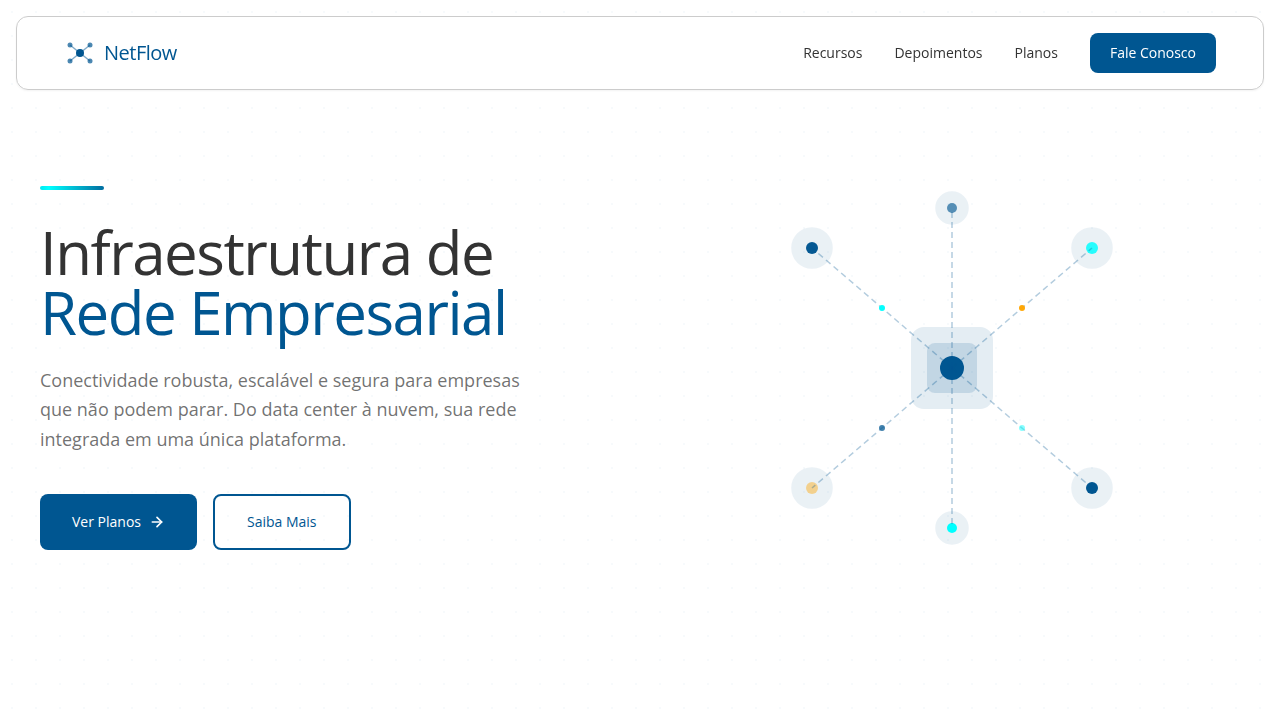
Visualização de fluxo de dados, diagramas de rede interativos, brilhos sutis em conexões, tipografia robusta, micro-interações de status, elementos modulares, animações de tráfego de rede.
- **Physics:** Ease-out curves, 200-300ms duration. Smooth and predictable.
- **Entry animations:** Fade + translate-Y (16px → 0) over 420ms ease-out. Staggered cascades for lists: 80ms between items.
- **Hover states:** Subtle color shift + shadow adjustment over 200ms.
- **Page transitions:** Fade only (200ms).
- **Performance:** Only transform and opacity animated. No layout-triggering properties.
## Shapes
Base corner radius: 8px. See rounded tokens in front matter for the full scale.
## Components
- **Primary Button:** Subtly rounded (0.5rem) shape. Accent color fill. Hover: 8% darken + subtle lift shadow. Active: -1px translate tactile press. Font weight 600. No outer glows.
- **Secondary / Ghost Button:** Outline variant. 1.5px border in muted color. Text in primary color. Hover: subtle background fill.
- **Cards:** Subtly rounded (0.5rem) corners. Surface background. Subtle shadow (0 2px 12px rgba(0,0,0,0.06)). 1px border stroke.
- **Inputs:** Label above input. 1px border stroke. Focus ring: 2px accent color offset 2px. Error text below in semantic red. No floating labels.
- **Navigation:** Primary surface background. Active item: accent color indicator. Font weight 500 when active.
- **Skeletons:** Shimmer animation matching component dimensions. No circular spinners.
- **Empty States:** Icon-based composition with descriptive text and action button.
## Do's and Don'ts
- No emojis in UI — use icon system only (Lucide, Heroicons)
- No pure black (#000000) — use off-black or charcoal variants
- No oversaturated accent colors (saturation cap: 80%)
- No 3-column equal-width feature layouts — use zig-zag or asymmetric grid
- No `h-screen` — use `min-h-[100dvh]`
- No AI copywriting clichés: "Elevate", "Seamless", "Unleash", "Next-Gen"
- No broken external image links — use picsum.photos or inline SVG
- No generic lorem ipsum in demos
- Do Visualização de fluxo de dados
- Do Diagramas de rede interativos
- Do Brilhos em conexões
- Do Tipografia robusta
- Do Elementos modulares
- Do Animações de tráfego.
## Use Case
Landing pages, Modern websites
Technical Specs
CSS
background: #FFFFFF, color: #333333, border-bottom: 1px solid #CCCCCC, box-shadow: 0 2px 5px rgba(0,0,0,0.08), font-family: "Open Sans, sans-serif", transition: all 0.3s ease-in-out, background-image: linear-gradient(to bottom, #F8F8F8, #FFFFFF), .network-diagram-animation, .data-flow-effect.
Variables
--connectivity-blue: #005691, --dark-grey: #333333, --white: #FFFFFF, --light-grey: #CCCCCC, --network-glow: rgba(0,255,0,0.3), --font-network: "Open Sans, sans-serif", --shadow-network: 0 2px 5px rgba(0,0,0,0.08).
Checklist
☐ Visualização de fluxo de dados, ☐ Diagramas de rede interativos, ☐ Brilhos em conexões, ☐ Tipografia robusta, ☐ Elementos modulares, ☐ Animações de tráfego.
Colors
Primary
Secondary
Effects
Visualização de fluxo de dados, diagramas de rede interativos, brilhos sutis em conexões, tipografia robusta, micro-interações de status, elementos modulares, animações de tráfego de rede.
Light/Dark
✓ Full / ✗ No
AI Prompt
Act as a Senior Frontend Engineer and Expert UI Designer.
Your task is to code a complete Landing Page on the first attempt.
- Landing Page Theme: <INSERT THEME>
- Sections to add: <INSERT SECTIONS>

Generate the final code immediately following these definitions:

## Style

- **Name:** Estilo de Fluxo de Rede
- **Type:** Robust, Connected, Efficient
- **Keywords:** networking, infrastructure, data center, connectivity, security, cloud, robust, efficient, scalable, integrated
- **Era:** 2026+ Conectividade Ubíqua
- **Light/Dark:** ✓ Full / ✗ No

## Color Palette

- **Primary:** Azul Conectividade #005691, Cinza Escuro #333333, Branco #FFFFFF, Cinza Claro #CCCCCC
- **Secondary:** Verde Elétrico #00FF00, Laranja #FFA500, Ciano #00FFFF, Preto #000000

## Visual Effects

Visualização de fluxo de dados, diagramas de rede interativos, brilhos sutis em conexões, tipografia robusta, micro-interações de status, elementos modulares, animações de tráfego de rede.

## AI Visual Direction

Design a robust and connected landing page for network solutions. Use: connectivity blue accents, dark grey background, data flow visualizations, interactive network diagrams, subtle connection glows, robust typography, modular elements, network traffic animations, efficient and integrated feel.

## CSS Technical

```css
background: #FFFFFF, color: #333333, border-bottom: 1px solid #CCCCCC, box-shadow: 0 2px 5px rgba(0,0,0,0.08), font-family: "Open Sans, sans-serif", transition: all 0.3s ease-in-out, background-image: linear-gradient(to bottom, #F8F8F8, #FFFFFF), .network-diagram-animation, .data-flow-effect.
```

## Design System Variables

```css
--connectivity-blue: #005691, --dark-grey: #333333, --white: #FFFFFF, --light-grey: #CCCCCC, --network-glow: rgba(0,255,0,0.3), --font-network: "Open Sans, sans-serif", --shadow-network: 0 2px 5px rgba(0,0,0,0.08).
```

## Implementation Checklist

- ☐ Visualização de fluxo de dados
- ☐ Diagramas de rede interativos
- ☐ Brilhos em conexões
- ☐ Tipografia robusta
- ☐ Elementos modulares
- ☐ Animações de tráfego.

## Execution Rules

1. Strictly follow the defined visual style.
2. Use high-quality inline SVG icons (Heroicons or Lucide style) — NEVER use emojis as icons.
3. Add `cursor-pointer` and smooth `hover` states (transition-all) on all interactive elements.
4. Required Page Structure:
   - Navbar (Logo + Links + CTA)
   - Hero Section (Impactful Headline + Subtitle + 2 buttons + 3D/Abstract visual element via CSS)
   - Features (3 cards with icons)
   - Testimonials (3 cards)
   - Pricing (3 tiers, highlight the middle one)
   - Final CTA
   - Full Footer with social links, privacy policy, terms of use, contact and SEO links.
5. All text content must be in English.
6. The visual must be CLEARLY distinct — do not create a "default Bootstrap" design. Force the use of the provided design system variables.
7. Use `<style>` tags in the head for custom classes (especially for complex backdrop-filter effects and animations) that Tailwind CDN doesn't cover.
8. Full Responsiveness: Layout must adapt perfectly to Mobile, Tablet and Desktop (vertical stack on mobile).
9. Include basic SEO, Viewport and Open Graph meta tags in `<head>`.
10. Footer must contain: Copyright 2026, Secondary navigation links and Social media icons.
11. Make the creative decisions needed to deliver the complete, functional result now.
Related
Last synced: 4/1/2026