Estilo de Experiência de Compra Contínua
Functional and trustworthy landing page for a premium subscription service. Ideal for landing pages, modern websites. AI-ready template.
Use case: Landing pages, Modern websites
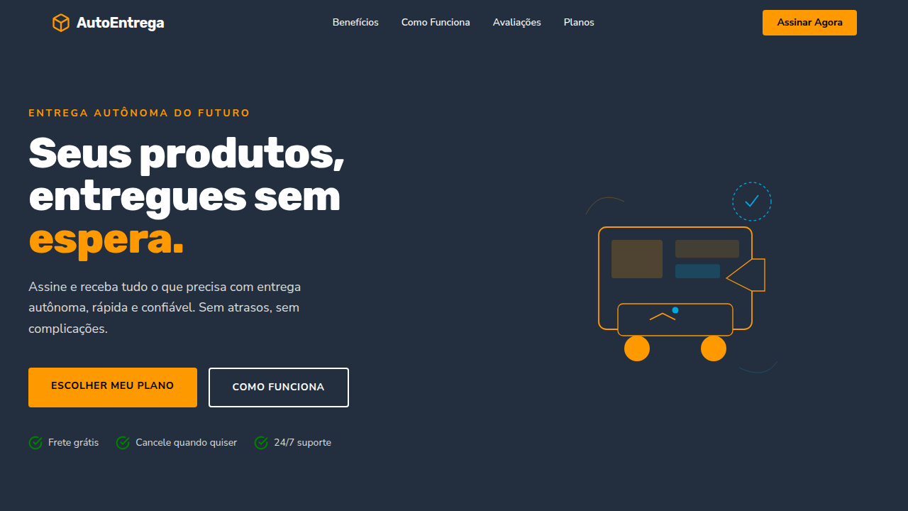
Historical Context
Before Amazon patented one-click in 1999, buying online felt like filling out a mortgage application. That single patent rewired how an entire industry thinks about friction. Suddenly, every unnecessary form field was a leak in the funnel. Checkout UX became its own discipline — not a subfield of information architecture, but a craft obsessed with milliseconds and micro-decisions. The visual language followed. Trust badges, progress indicators, persistent cart totals — these weren't decorative choices. They were answers to anxiety. Early e-commerce looked like a catalog stapled to a database. The shift toward seamless commerce demanded a new aesthetic: one where logistics infrastructure becomes invisible and the interface feels less like software, more like intention made tangible. Omnichannel pushed it further. When a cart persists from phone to laptop to physical store, the design system isn't styling pages anymore — it's maintaining continuity across realities. The futuristic layer isn't about looking sci-fi. It's about making distributed cloud systems feel like a single, breathing surface.
When to Use
Reach for this when commerce needs to feel effortless rather than transactional. Marketplace apps where browsing and buying blur together. Checkout flows that need to collapse twelve steps into perceived zero. Retail tech platforms bridging physical inventory with digital storefronts. Any omnichannel experience where the user shouldn't notice they've crossed a system boundary. Particularly strong for high-frequency purchase environments — grocery, fashion, subscriptions — where repeat friction compounds into churn.
Design Principles
- Invisible infrastructure — cloud complexity stays behind the curtain; users see only momentum
- Progressive commitment — reveal cost and consequence gradually, never front-load cognitive debt
- Persistent state as trust — a cart that remembers across devices signals reliability louder than any badge
- Velocity over decoration — every animation must accelerate perceived speed, never stall it
- Contextual confidence — surface the right reassurance (shipping, returns, security) exactly when doubt arises, not before
DESIGN.md
---
version: "alpha"
name: "Estilo de Experiência de Compra Contínua"
description: "Functional and trustworthy landing page for a premium subscription service. Ideal for landing pages, modern websites. AI-ready template."
colors:
  primary: "#FF9900"
  secondary: "#000000"
  tertiary: "#FFFFFF"
  neutral: "#232F3E"
  surface: "#DDDDDD"
  accent: "#00A8E1"
typography:
  h1:
    fontFamily: Verdana
    fontSize: 2.5rem
    fontWeight: 700
  body-md:
    fontFamily: Verdana
    fontSize: 1rem
    fontWeight: 400
rounded:
  sm: 3px
  md: 6px
  lg: 9px
components:
  button-primary:
    backgroundColor: "{colors.primary}"
    textColor: "{colors.neutral}"
    rounded: "{rounded.sm}"
    padding: 12px
---

## Overview

Functional and trustworthy landing page for a premium subscription service. Ideal for landing pages, modern websites. AI-ready template. Before Amazon patented one-click in 1999, buying online felt like filling out a mortgage application. That single patent rewired how an entire industry thinks about friction. Suddenly, every unnecessary form field was a leak in the funnel. Checkout UX became its own discipline — not a subfield of information architecture, but a craft obsessed with milliseconds and micro-decisions.

The visual language followed. Trust badges, progress indicators, persistent cart totals — these weren't decorative choices. They were answers to anxiety. Early e-commerce looked like a catalog stapled to a database. The shift toward seamless commerce demanded a new aesthetic: one where logistics infrastructure becomes invisible and the interface feels less like software, more like intention made tangible.

Omnichannel pushed it further. When a cart persists from phone to laptop to physical store, the design system isn't styling pages anymore — it's maintaining continuity across realities. The futuristic layer isn't about looking sci-fi. It's about making distributed cloud systems feel like a single, breathing surface.

- Density: 5/10 — Balanced
- Variance: 4/10 — Moderate
- Motion: 4/10 — Subtle

- **Style:** Functional, Trustworthy, Scalable
- **Keywords:** e-commerce, cloud, logistics, autonomous delivery, customer-centric, reliable, efficient, vast, seamless, modern
- **Era:** 2026+ E-commerce Evolution
- **Light/Dark:** ✓ Full / ✗ No

## Colors

- **Laranja Varejo** (#FF9900) — Warm accent, call-to-action secondary
- **Preto** (#000000) — Dark surface, primary background
- **Branco** (#FFFFFF) — Light surface, card backgrounds
- **Cinza Escuro** (#232F3E) — Dark surface, primary background
- **Cinza Claro** (#DDDDDD) — Secondary text, borders, muted elements
- **Verde-azulado** (#00A8E1) — Success states, positive indicators
- **Verde** (#008000) — Success states, positive indicators
- **Dourado** (#FFD700) — Premium accent, decorative highlights


## Typography

- **Display / Hero:** Verdana — Weight 700, tight tracking, used for headline impact
- **Body:** Verdana — Weight 400, 16px/1.6 line-height, max 72ch per line
- **UI Labels / Captions:** Verdana — 0.875rem, weight 500, slight letter-spacing
- **Monospace:** JetBrains Mono — Used for code, metadata, and technical values

Scale:
- Hero: clamp(2.5rem, 5vw, 4rem)
- H1: 2.25rem
- H2: 1.5rem
- Body: 1rem / 1.6
- Small: 0.875rem


## Layout

- **Grid:** CSS Grid primary. Max-width containment: 1280px centered with 1.5rem side padding.
- **Spacing rhythm:** Balanced. Base unit: 0.5rem (8px).
- **Section vertical gaps:** clamp(4rem, 8vw, 8rem).
- **Hero layout:** Split-screen (text left, visual right).
- **Feature sections:** Zig-zag alternating text+image rows. No 3-equal-columns.
- **Mobile collapse:** All multi-column layouts collapse below 768px. No horizontal overflow.
- **z-index contract:** base (0) / sticky-nav (100) / overlay (200) / modal (300) / toast (500).


## Elevation & Depth

Layouts limpos e focados no produto, micro-interações de compra, animações de carregamento eficientes, tipografia clara (sans-serif), elementos de confiança (selos, avaliações), visualizações de rota de entrega, transições suaves.

- **Physics:** Ease-out curves, 200-300ms duration. Smooth and predictable.
- **Entry animations:** Fade + translate-Y (16px → 0) over 420ms ease-out. Staggered cascades for lists: 80ms between items.
- **Hover states:** Subtle color shift + shadow adjustment over 200ms.
- **Page transitions:** Fade only (200ms).
- **Performance:** Only transform and opacity animated. No layout-triggering properties.


## Shapes

Base corner radius: 3px. See rounded tokens in front matter for the full scale.


## Components

- **Primary Button:** Rounded (3px) shape. Accent color fill. Hover: 8% darken + subtle lift shadow. Active: -1px translate tactile press. Font weight 600. No outer glows.
- **Secondary / Ghost Button:** Outline variant. 1.5px border in muted color. Text in primary color. Hover: subtle background fill.
- **Cards:** Rounded (3px) corners. Surface background. Subtle shadow (0 2px 12px rgba(0,0,0,0.06)). 1px border stroke.
- **Inputs:** Label above input. 1px border stroke. Focus ring: 2px accent color offset 2px. Error text below in semantic red. No floating labels.
- **Navigation:** Primary surface background. Active item: accent color indicator. Font weight 500 when active.
- **Skeletons:** Shimmer animation matching component dimensions. No circular spinners.
- **Empty States:** Icon-based composition with descriptive text and action button.


## Do's and Don'ts

- No emojis in UI — use icon system only (Lucide, Heroicons)
- No pure black (#000000) — use off-black or charcoal variants
- No oversaturated accent colors (saturation cap: 80%)
- No 3-column equal-width feature layouts — use zig-zag or asymmetric grid
- No `h-screen` — use `min-h-[100dvh]`
- No AI copywriting clichés: "Elevate", "Seamless", "Unleash", "Next-Gen"
- No broken external image links — use picsum.photos or inline SVG
- No generic lorem ipsum in demos

- Do Layouts focados no produto
- Do Micro-interações de compra
- Do Animações eficientes
- Do Tipografia clara
- Do Elementos de confiança
- Do Visualizações de entrega.


## Use Case

Landing pages, Modern websites
Technical Specs
CSS
background: #FFFFFF, color: #000000, box-shadow: 0 1px 3px rgba(0,0,0,0.12), border-radius: 3px, font-family: "Verdana, Arial, sans-serif", transition: all 0.2s ease-in-out, background-image: linear-gradient(to bottom, #F7FAFA, #FFFFFF), .product-card-hover, .delivery-animation.
Variables
--retail-orange: #FF9900, --black: #000000, --white: #FFFFFF, --dark-grey: #232F3E, --border-radius-sm: 3px, --font-body: "Verdana, Arial, sans-serif", --shadow-product: 0 1px 3px rgba(0,0,0,0.12).
Checklist
☐ Layouts focados no produto, ☐ Micro-interações de compra, ☐ Animações eficientes, ☐ Tipografia clara, ☐ Elementos de confiança, ☐ Visualizações de entrega.
Colors
Primary
Secondary
Effects
Layouts limpos e focados no produto, micro-interações de compra, animações de carregamento eficientes, tipografia clara (sans-serif), elementos de confiança (selos, avaliações), visualizações de rota de entrega, transições suaves.
Light/Dark
✓ Full / ✗ No
AI Prompt
Act as a Senior Frontend Engineer and Expert UI Designer.
Your task is to code a complete Landing Page on the first attempt.
- Landing Page Theme: <INSERT THEME>
- Sections to add: <INSERT SECTIONS>

Generate the final code immediately following these definitions:

## Style

- **Name:** Estilo de Experiência de Compra Contínua
- **Type:** Functional, Trustworthy, Scalable
- **Keywords:** e-commerce, cloud, logistics, autonomous delivery, customer-centric, reliable, efficient, vast, seamless, modern
- **Era:** 2026+ E-commerce Evolution
- **Light/Dark:** ✓ Full / ✗ No

## Color Palette

- **Primary:** Laranja Varejo #FF9900, Preto #000000, Branco #FFFFFF, Cinza Escuro #232F3E
- **Secondary:** Cinza Claro #DDDDDD, Verde-azulado #00A8E1, Verde #008000, Dourado #FFD700

## Visual Effects

Layouts limpos e focados no produto, micro-interações de compra, animações de carregamento eficientes, tipografia clara (sans-serif), elementos de confiança (selos, avaliações), visualizações de rota de entrega, transições suaves.

## AI Visual Direction

Design a functional and trustworthy landing page for a premium subscription service. Use: retail orange accents, clean product-focused layouts, efficient loading animations, clear typography, trust elements, autonomous delivery route visualizations, seamless and modern feel.

## CSS Technical

```css
background: #FFFFFF, color: #000000, box-shadow: 0 1px 3px rgba(0,0,0,0.12), border-radius: 3px, font-family: "Verdana, Arial, sans-serif", transition: all 0.2s ease-in-out, background-image: linear-gradient(to bottom, #F7FAFA, #FFFFFF), .product-card-hover, .delivery-animation.
```

## Design System Variables

```css
--retail-orange: #FF9900, --black: #000000, --white: #FFFFFF, --dark-grey: #232F3E, --border-radius-sm: 3px, --font-body: "Verdana, Arial, sans-serif", --shadow-product: 0 1px 3px rgba(0,0,0,0.12).
```

## Implementation Checklist

- ☐ Layouts focados no produto
- ☐ Micro-interações de compra
- ☐ Animações eficientes
- ☐ Tipografia clara
- ☐ Elementos de confiança
- ☐ Visualizações de entrega.

## Execution Rules

1. Strictly follow the defined visual style.
2. Use high-quality inline SVG icons (Heroicons or Lucide style) — NEVER use emojis as icons.
3. Add `cursor-pointer` and smooth `hover` states (transition-all) on all interactive elements.
4. Required Page Structure:
   - Navbar (Logo + Links + CTA)
   - Hero Section (Impactful Headline + Subtitle + 2 buttons + 3D/Abstract visual element via CSS)
   - Features (3 cards with icons)
   - Testimonials (3 cards)
   - Pricing (3 tiers, highlight the middle one)
   - Final CTA
   - Full Footer with social links, privacy policy, terms of use, contact and SEO links.
5. All text content must be in English.
6. The visual must be CLEARLY distinct — do not create a "default Bootstrap" design. Force the use of the provided design system variables.
7. Use `<style>` tags in the head for custom classes (especially for complex backdrop-filter effects and animations) that Tailwind CDN doesn't cover.
8. Full Responsiveness: Layout must adapt perfectly to Mobile, Tablet and Desktop (vertical stack on mobile).
9. Include basic SEO, Viewport and Open Graph meta tags in `<head>`.
10. Footer must contain: Copyright 2026, Secondary navigation links and Social media icons.
11. Make the creative decisions needed to deliver the complete, functional result now.
Related
Last synced: 4/1/2026