Estilo de Elegância Fintech
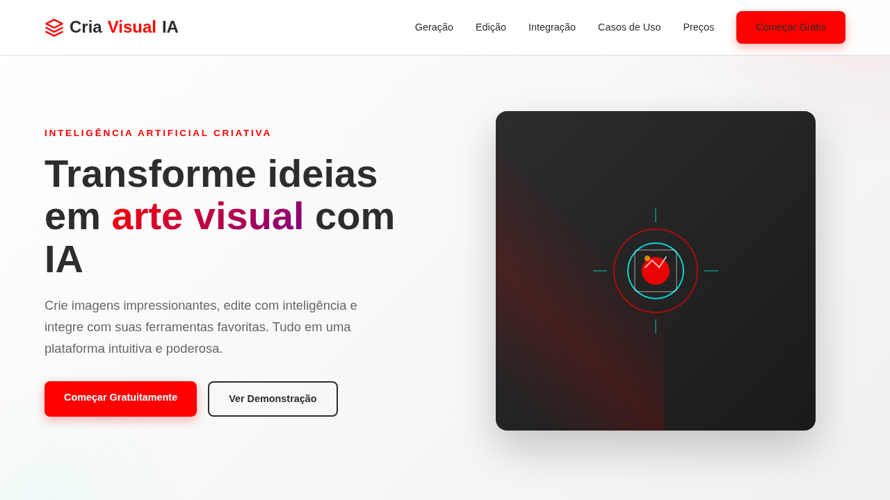
Clean and professional landing page for a payment platform. Ideal for landing pages, modern websites. AI-ready template.
Use case: Landing pages, Modern websites
Historical Context
Stripe rewrote the rules. Before 2012, financial interfaces looked like they were designed by compliance departments — gray tables, tiny type, zero personality. Then Stripe showed up with gradient meshes, generous whitespace, and the radical idea that a payments API could feel like a luxury product. Square followed with hardware-meets-software minimalism. Revolut pushed the envelope into dark mode territory, neon accents, card designs that made people actually want to screenshot their banking app. The shift wasn't cosmetic. It was strategic. These companies understood that in fintech, design IS trust. A polished interface signals competence. A beautiful dashboard whispers "your money is safe here" louder than any security badge ever could. The old guard — your Chase, your HSBC — scrambled to catch up, hiring design teams that would've seemed absurd a decade earlier. What emerged is a distinct visual language: deep blacks and rich gradients, monospaced numbers that feel precise, animations that communicate state without demanding attention. Financial products stopped apologizing for being financial products. They became aspirational.
When to Use
Reach for this when you're building something that handles money and needs to feel like it deserves to. Payment platforms, neobank dashboards, investment portfolios, financial SaaS — anywhere users need to trust you with their capital. It works when your product serves a global audience expecting premium polish. Skip it if you're building internal admin tools or consumer apps targeting price-sensitive markets. This style demands execution quality; done halfway, it reads as pretentious rather than premium.
Design Principles
- Trust through precision — Monospaced figures, aligned decimals, pixel-perfect spacing. Every misaligned element erodes confidence in your ability to handle money correctly.
- Restrained motion — Animations exist to confirm actions and communicate state, never to entertain. A successful transaction needs a subtle pulse, not confetti.
- Depth without decoration — Use layered surfaces, subtle gradients, and controlled shadows to create hierarchy. Ornament is noise; structure is signal.
- Global neutrality — Color choices, iconography, and metaphors must translate across cultures. Green doesn't mean 'good' everywhere. Design for Tokyo and São Paulo simultaneously.
- Contrast as confidence — Bold typographic scale, decisive color blocking, generous negative space. Timid design suggests a timid product. Own the screen.
DESIGN.md
---
version: "alpha"
name: "Estilo de Elegância Fintech"
description: "Clean and professional landing page for a payment platform. Ideal for landing pages, modern websites. AI-ready template."
colors:
  primary: "#635BFF"
  secondary: "#FFFFFF"
  tertiary: "#242424"
  neutral: "#E6E6E6"
  surface: "#00C48C"
  accent: "#FFC700"
typography:
  h1:
    fontFamily: Inter
    fontSize: 2.5rem
    fontWeight: 700
  body-md:
    fontFamily: Inter
    fontSize: 1rem
    fontWeight: 400
rounded:
  sm: 6px
  md: 12px
  lg: 18px
components:
  button-primary:
    backgroundColor: "{colors.primary}"
    textColor: "{colors.neutral}"
    rounded: "{rounded.sm}"
    padding: 12px
---

## Overview

Clean and professional landing page for a payment platform. Ideal for landing pages, modern websites. AI-ready template. Stripe rewrote the rules. Before 2012, financial interfaces looked like they were designed by compliance departments — gray tables, tiny type, zero personality. Then Stripe showed up with gradient meshes, generous whitespace, and the radical idea that a payments API could feel like a luxury product. Square followed with hardware-meets-software minimalism. Revolut pushed the envelope into dark mode territory, neon accents, card designs that made people actually want to screenshot their banking app.

The shift wasn't cosmetic. It was strategic. These companies understood that in fintech, design IS trust. A polished interface signals competence. A beautiful dashboard whispers "your money is safe here" louder than any security badge ever could. The old guard — your Chase, your HSBC — scrambled to catch up, hiring design teams that would've seemed absurd a decade earlier.

What emerged is a distinct visual language: deep blacks and rich gradients, monospaced numbers that feel precise, animations that communicate state without demanding attention. Financial products stopped apologizing for being financial products. They became aspirational.

- Density: 3/10 — Airy
- Variance: 3/10 — Restrained
- Motion: 4/10 — Subtle

- **Style:** Clean, Professional, Developer-Friendly
- **Keywords:** fintech, payments, global, developer, API, secure, scalable, professional, minimalist, efficient
- **Era:** 2026+ Global Payments
- **Light/Dark:** ✓ Full / ✗ No

## Colors

- **Azul Fintech** (#635BFF) — Accent highlight, links and focus states
- **Branco** (#FFFFFF) — Light surface, card backgrounds
- **Cinza Escuro** (#242424) — Dark surface, primary background
- **Cinza Claro** (#E6E6E6) — Secondary text, borders, muted elements
- **Verde** (#00C48C) — Success states, positive indicators
- **Amarelo** (#FFC700) — Warning states, attention indicators
- **Vermelho** (#FF4B4B) — Error states, destructive actions
- **Preto** (#000000) — Deep contrast surface


## Typography

- **Display / Hero:** Inter — Weight 700, tight tracking, used for headline impact
- **Body:** Inter — Weight 400, 16px/1.6 line-height, max 72ch per line
- **UI Labels / Captions:** Inter — 0.875rem, weight 500, slight letter-spacing
- **Monospace:** JetBrains Mono — Used for code, metadata, and technical values

Scale:
- Hero: clamp(2.5rem, 5vw, 4rem)
- H1: 2.25rem
- H2: 1.5rem
- Body: 1rem / 1.6
- Small: 0.875rem


## Layout

- **Grid:** CSS Grid primary. Max-width containment: 1280px centered with 1.5rem side padding.
- **Spacing rhythm:** Balanced. Base unit: 0.5rem (8px).
- **Section vertical gaps:** clamp(4rem, 8vw, 8rem).
- **Hero layout:** Split-screen (text left, visual right).
- **Feature sections:** Zig-zag alternating text+image rows. No 3-equal-columns.
- **Mobile collapse:** All multi-column layouts collapse below 768px. No horizontal overflow.
- **z-index contract:** base (0) / sticky-nav (100) / overlay (200) / modal (300) / toast (500).


## Elevation & Depth

Layouts limpos e focados em dados, diagramas de fluxo de API, brilhos sutis em elementos de segurança, tipografia técnica e moderna (sans-serif), micro-interações de status de transação, elementos modulares, animações de fluxo de dinheiro.

- **Physics:** Ease-out curves, 200-300ms duration. Smooth and predictable.
- **Entry animations:** Fade + translate-Y (16px → 0) over 420ms ease-out. Staggered cascades for lists: 80ms between items.
- **Hover states:** Subtle color shift + shadow adjustment over 200ms.
- **Page transitions:** Fade only (200ms).
- **Performance:** Only transform and opacity animated. No layout-triggering properties.


## Shapes

Base corner radius: 6px. See rounded tokens in front matter for the full scale.


## Components

- **Primary Button:** Rounded (6px) shape. Accent color fill. Hover: 8% darken + subtle lift shadow. Active: -1px translate tactile press. Font weight 600. No outer glows.
- **Secondary / Ghost Button:** Outline variant. 1.5px border in muted color. Text in primary color. Hover: subtle background fill.
- **Cards:** Rounded (6px) corners. Surface background. Subtle shadow (0 2px 12px rgba(0,0,0,0.06)). 1px border stroke.
- **Inputs:** Label above input. 1px border stroke. Focus ring: 2px accent color offset 2px. Error text below in semantic red. No floating labels.
- **Navigation:** Primary surface background. Active item: accent color indicator. Font weight 500 when active.
- **Skeletons:** Shimmer animation matching component dimensions. No circular spinners.
- **Empty States:** Icon-based composition with descriptive text and action button.


## Do's and Don'ts

- No emojis in UI — use icon system only (Lucide, Heroicons)
- No decorative gradients — flat color only
- No shadows heavier than 0 2px 8px rgba(0,0,0,0.08)
- No pure black (#000000) — use off-black or charcoal variants
- No oversaturated accent colors (saturation cap: 80%)
- No 3-column equal-width feature layouts — use zig-zag or asymmetric grid
- No `h-screen` — use `min-h-[100dvh]`
- No AI copywriting clichés: "Elevate", "Seamless", "Unleash", "Next-Gen"
- No broken external image links — use picsum.photos or inline SVG
- No generic lorem ipsum in demos

- Do Layouts focados em dados
- Do Diagramas de fluxo de API
- Do Brilhos de segurança
- Do Tipografia técnica
- Do Micro-interações de status
- Do Animações de fluxo de dinheiro.


## Use Case

Landing pages, Modern websites
Technical Specs
CSS
background: #FFFFFF, color: #242424, box-shadow: 0 2px 8px rgba(0,0,0,0.1), border-radius: 6px, font-family: "Inter, sans-serif", transition: all 0.3s ease-in-out, background-image: linear-gradient(to bottom, #F9F9F9, #FFFFFF), .api-flow-animation, .transaction-status-indicator.
Variables
--fintech-blue: #635BFF, --white: #FFFFFF, --dark-grey: #242424, --light-grey: #E6E6E6, --security-glow: rgba(99,91,255,0.3), --font-tech: "Inter, sans-serif", --shadow-light: 0 2px 8px rgba(0,0,0,0.1).
Checklist
☐ Layouts focados em dados, ☐ Diagramas de fluxo de API, ☐ Brilhos de segurança, ☐ Tipografia técnica, ☐ Micro-interações de status, ☐ Animações de fluxo de dinheiro.
Colors
Primary
Secondary
Effects
Layouts limpos e focados em dados, diagramas de fluxo de API, brilhos sutis em elementos de segurança, tipografia técnica e moderna (sans-serif), micro-interações de status de transação, elementos modulares, animações de fluxo de dinheiro.
Light/Dark
✓ Full / ✗ No
AI Prompt
Act as a Senior Frontend Engineer and Expert UI Designer.
Your task is to code a complete Landing Page on the first attempt.
- Landing Page Theme: <INSERT THEME>
- Sections to add: <INSERT SECTIONS>

Generate the final code immediately following these definitions:

## Style

- **Name:** Estilo de Elegância Fintech
- **Type:** Clean, Professional, Developer-Friendly
- **Keywords:** fintech, payments, global, developer, API, secure, scalable, professional, minimalist, efficient
- **Era:** 2026+ Global Payments
- **Light/Dark:** ✓ Full / ✗ No

## Color Palette

- **Primary:** Azul Fintech #635BFF, Branco #FFFFFF, Cinza Escuro #242424, Cinza Claro #E6E6E6
- **Secondary:** Verde #00C48C, Amarelo #FFC700, Vermelho #FF4B4B, Preto #000000

## Visual Effects

Layouts limpos e focados em dados, diagramas de fluxo de API, brilhos sutis em elementos de segurança, tipografia técnica e moderna (sans-serif), micro-interações de status de transação, elementos modulares, animações de fluxo de dinheiro.

## AI Visual Direction

Design a clean and professional landing page for a payment platform. Use: fintech blue accents, clean data-focused layouts, API flow diagrams, subtle security glows, modern technical typography, transaction status micro-interactions, modular elements, money flow animations, developer-friendly and efficient feel.

## CSS Technical

```css
background: #FFFFFF, color: #242424, box-shadow: 0 2px 8px rgba(0,0,0,0.1), border-radius: 6px, font-family: "Inter, sans-serif", transition: all 0.3s ease-in-out, background-image: linear-gradient(to bottom, #F9F9F9, #FFFFFF), .api-flow-animation, .transaction-status-indicator.
```

## Design System Variables

```css
--fintech-blue: #635BFF, --white: #FFFFFF, --dark-grey: #242424, --light-grey: #E6E6E6, --security-glow: rgba(99,91,255,0.3), --font-tech: "Inter, sans-serif", --shadow-light: 0 2px 8px rgba(0,0,0,0.1).
```

## Implementation Checklist

- ☐ Layouts focados em dados
- ☐ Diagramas de fluxo de API
- ☐ Brilhos de segurança
- ☐ Tipografia técnica
- ☐ Micro-interações de status
- ☐ Animações de fluxo de dinheiro.

## Execution Rules

1. Strictly follow the defined visual style.
2. Use high-quality inline SVG icons (Heroicons or Lucide style) — NEVER use emojis as icons.
3. Add `cursor-pointer` and smooth `hover` states (transition-all) on all interactive elements.
4. Required Page Structure:
   - Navbar (Logo + Links + CTA)
   - Hero Section (Impactful Headline + Subtitle + 2 buttons + 3D/Abstract visual element via CSS)
   - Features (3 cards with icons)
   - Testimonials (3 cards)
   - Pricing (3 tiers, highlight the middle one)
   - Final CTA
   - Full Footer with social links, privacy policy, terms of use, contact and SEO links.
5. All text content must be in English.
6. The visual must be CLEARLY distinct — do not create a "default Bootstrap" design. Force the use of the provided design system variables.
7. Use `<style>` tags in the head for custom classes (especially for complex backdrop-filter effects and animations) that Tailwind CDN doesn't cover.
8. Full Responsiveness: Layout must adapt perfectly to Mobile, Tablet and Desktop (vertical stack on mobile).
9. Include basic SEO, Viewport and Open Graph meta tags in `<head>`.
10. Footer must contain: Copyright 2026, Secondary navigation links and Social media icons.
11. Make the creative decisions needed to deliver the complete, functional result now.
Related
Last synced: 4/1/2026