Voice-First Multimodal
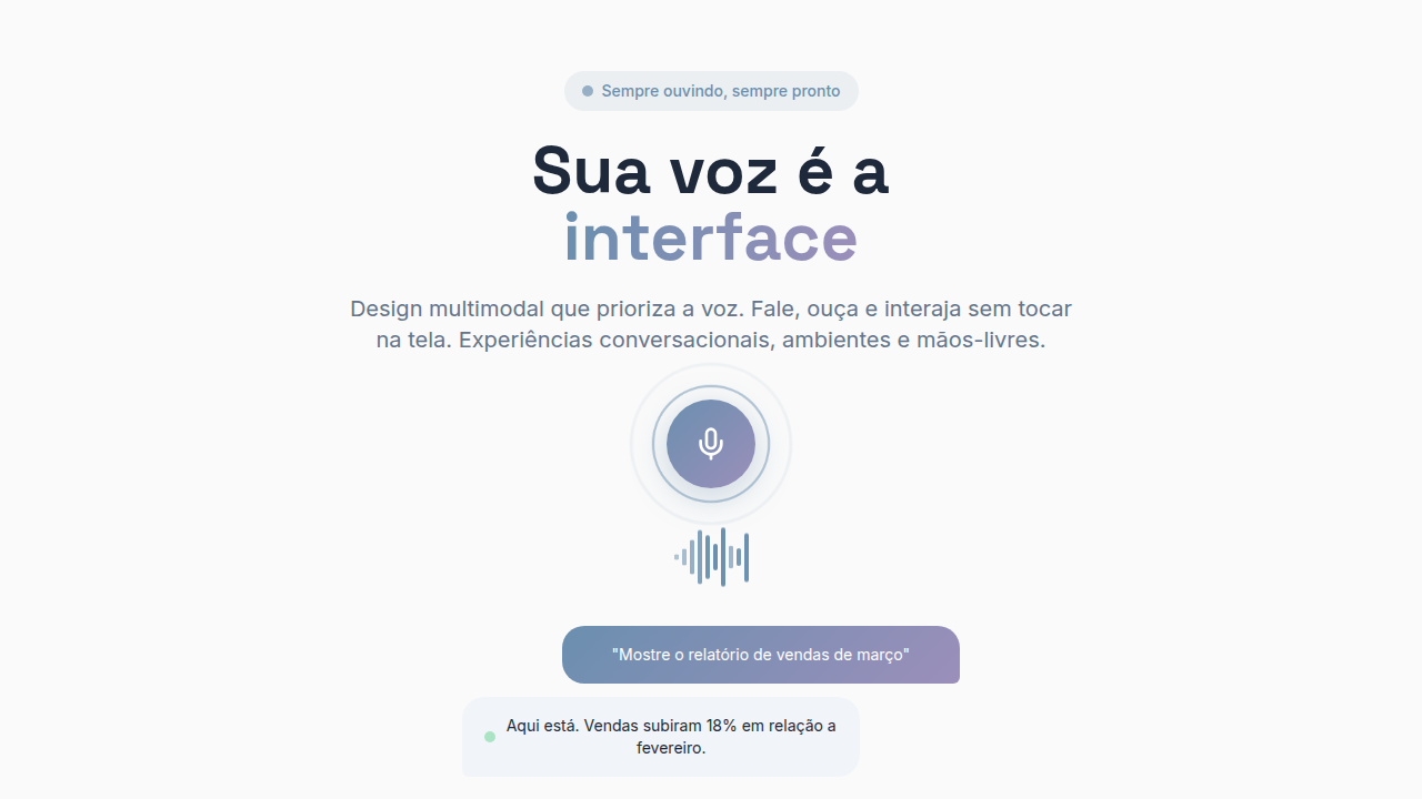
Voice-first multimodal interface. Ideal for landing pages, saas. AI-ready template.
Use case: Landing pages, SaaS
Historical Context
Voice interfaces spent a decade being disappointing. Siri launched in 2011 as a party trick. Alexa turned voice into a shopping cart with a speaker attached. Google Assistant got smarter but stayed trapped in a cylinder. The problem was never recognition accuracy — it was that we kept designing voice as a replacement for screens instead of a companion to them. The real shift happened when designers stopped asking "how do we remove the screen?" and started asking "what does each modality do best?" Voice excels at intent, at speed, at hands-free moments. Screens excel at comparison, at browsing, at confirmation. The multimodal era — where voice and visual work as a unified experience — finally arrived when automotive and smart display interfaces proved the pattern at scale. By 2026, voice-first multimodal is the default for automotive dashboards, kitchen displays, accessibility layers, and AI assistant interfaces. The design challenge isn't technical anymore. It's choreographic: orchestrating what the user hears, sees, and says into a single coherent flow without either channel fighting the other.
When to Use
Reach for voice-first multimodal when the user's hands or eyes are occupied — driving, cooking, navigating physical space. It's the right call for accessibility tools where screen readers fall short of true interaction. Use it when the task is sequential and confirmatory: ordering, controlling, querying. Skip it for dense comparison tasks, creative work, or anything requiring spatial memory. If your user needs to see twelve options simultaneously, voice isn't helping — it's slowing them down.
Design Principles
- Modality should follow context, not preference — let the environment dictate whether voice or screen leads at any given moment
- Audio feedback must be instant and unmistakable — silence after a voice command is the equivalent of a frozen screen
- Design for the repair turn — people misspeak, systems mishear, and recovery must feel effortless, never punishing
- Visual confirmation anchors spoken intent — show what was understood so the user never wonders if they were heard correctly
- Conversations have memory — every interaction that forces the user to repeat context is a design failure, not a technical limitation
DESIGN.md
---
version: "alpha"
name: "Voice-First Multimodal"
description: "Voice-first multimodal interface. Ideal for landing pages, saas. AI-ready template."
colors:
  primary: "#FAFAFA"
  secondary: "#6B8FAF"
  tertiary: "#9B8FBB"
typography:
  h1:
    fontFamily: System UI stack
    fontSize: 2.25rem
    fontWeight: 700
  body-md:
    fontFamily: System UI stack
    fontSize: 1rem
    fontWeight: 400
  label-caps:
    fontFamily: System UI stack
    fontSize: 0.75rem
    fontWeight: 500
components:
  button-primary:
    backgroundColor: "{colors.primary}"
    padding: 12px
---

## Overview

Voice-first multimodal interface. Ideal for landing pages, saas. AI-ready template. Voice interfaces spent a decade being disappointing. Siri launched in 2011 as a party trick. Alexa turned voice into a shopping cart with a speaker attached. Google Assistant got smarter but stayed trapped in a cylinder. The problem was never recognition accuracy — it was that we kept designing voice as a replacement for screens instead of a companion to them.

The real shift happened when designers stopped asking "how do we remove the screen?" and started asking "what does each modality do best?" Voice excels at intent, at speed, at hands-free moments. Screens excel at comparison, at browsing, at confirmation. The multimodal era — where voice and visual work as a unified experience — finally arrived when automotive and smart display interfaces proved the pattern at scale.

By 2026, voice-first multimodal is the default for automotive dashboards, kitchen displays, accessibility layers, and AI assistant interfaces. The design challenge isn't technical anymore. It's choreographic: orchestrating what the user hears, sees, and says into a single coherent flow without either channel fighting the other.

- Density: 5/10 — Balanced
- Variance: 4/10 — Moderate
- Motion: 6/10 — Expressive

- **Style:** Voice-First, Multimodal, Ambient, Accessible
- **Keywords:** Voice UI, multimodal, audio feedback, conversational, hands-free, ambient, contextual, speech recognition
- **Era:** 2025+ Voice Era
- **Light/Dark:** ✓ Full / ✓ Full

## Colors

- **Soft White** (#FAFAFA) — Light surface, card backgrounds
- **Muted Blue** (#6B8FAF) — Secondary text, borders, muted elements
- **Gentle Purple** (#9B8FBB) — Accent color, emphasis elements


## Typography

- **Display / Hero:** System UI stack (-apple-system, sans-serif) — Weight 700, tight tracking, used for headline impact
- **Body:** System UI stack (-apple-system, sans-serif) — Weight 400, 16px/1.6 line-height, max 72ch per line
- **UI Labels / Captions:** System UI stack (-apple-system, sans-serif) — 0.875rem, weight 500, slight letter-spacing
- **Monospace:** JetBrains Mono — Used for code, metadata, and technical values

Scale:
- Hero: clamp(2.5rem, 5vw, 4rem)
- H1: 2.25rem
- H2: 1.5rem
- Body: 1rem / 1.6
- Small: 0.875rem


## Layout

- **Grid:** CSS Grid primary. Max-width containment: 1280px centered with 1.5rem side padding.
- **Spacing rhythm:** Balanced. Base unit: 0.5rem (8px).
- **Section vertical gaps:** clamp(4rem, 8vw, 8rem).
- **Hero layout:** Split-screen (text left, visual right).
- **Feature sections:** Zig-zag alternating text+image rows. No 3-equal-columns.
- **Mobile collapse:** All multi-column layouts collapse below 768px. No horizontal overflow.
- **z-index contract:** base (0) / sticky-nav (100) / overlay (200) / modal (300) / toast (500).


## Elevation & Depth

Voice waveform visualization, listening pulse, processing spinner, speak animation, smooth transitions

- **Physics:** Spring — stiffness 120, damping 20. Confident, weighted transitions.
- **Entry animations:** Fade + translate-Y (16px → 0) over 480ms ease-out. Staggered cascades for lists: 100ms between items.
- **Hover states:** Scale(1.03) + shadow lift over 200ms.
- **Page transitions:** Fade + slide (300ms).
- **Performance:** Only transform and opacity animated. No layout-triggering properties.


## Shapes

Base corner radius: 24px. See rounded tokens in front matter for the full scale.


## Components

- **Primary Button:** Generously rounded (1.5rem) shape. Accent color fill. Hover: 8% darken + subtle lift shadow. Active: -1px translate tactile press. Font weight 600. No outer glows.
- **Secondary / Ghost Button:** Outline variant. 1.5px border in muted color. Text in primary color. Hover: subtle background fill.
- **Cards:** Generously rounded (1.5rem) corners. Surface background. Subtle shadow (0 2px 12px rgba(0,0,0,0.06)). 1px border stroke.
- **Inputs:** Label above input. 1px border stroke. Focus ring: 2px accent color offset 2px. Error text below in semantic red. No floating labels.
- **Navigation:** Primary surface background. Active item: accent color indicator. Font weight 500 when active.
- **Skeletons:** Shimmer animation matching component dimensions. No circular spinners.
- **Empty States:** Icon-based composition with descriptive text and action button.


## Do's and Don'ts

- No emojis in UI — use icon system only (Lucide, Heroicons)
- No pure black (#000000) — use off-black or charcoal variants
- No oversaturated accent colors (saturation cap: 80%)
- No 3-column equal-width feature layouts — use zig-zag or asymmetric grid
- No `h-screen` — use `min-h-[100dvh]`
- No AI copywriting clichés: "Elevate", "Seamless", "Unleash", "Next-Gen"
- No broken external image links — use picsum.photos or inline SVG
- No generic lorem ipsum in demos

- Do Voice recognition works
- Do Visual feedback clear
- Do Listening state obvious
- Do Speaking animation smooth
- Do Fallback UI provided
- Do Accessibility excellent


## Use Case

Landing pages, SaaS
Technical Specs
CSS
Web Speech API integration, canvas for waveform, animation: pulse for listening, status indicators (color change), audio visualization (Web Audio API), minimal chrome, large touch targets
Variables
--listening-color: #6B8FAF, --speaking-color: #22C55E, --waveform-height: 60px, --pulse-duration: 1.5s, --indicator-size: 24px, --voice-accent: #9B8FBB
Checklist
☐ Voice recognition works, ☐ Visual feedback clear, ☐ Listening state obvious, ☐ Speaking animation smooth, ☐ Fallback UI provided, ☐ Accessibility excellent
Colors
Primary
Effects
Voice waveform visualization, listening pulse, processing spinner, speak animation, smooth transitions
Light/Dark
✓ Full / ✓ Full
AI Prompt
Act as a Senior Frontend Engineer and Expert UI Designer.
Your task is to code a complete Landing Page on the first attempt.
- Landing Page Theme: <INSERT THEME>
- Sections to add: <INSERT SECTIONS>

Generate the final code immediately following these definitions:

## Style

- **Name:** Voice-First Multimodal
- **Type:** Voice-First, Multimodal, Ambient, Accessible
- **Keywords:** Voice UI, multimodal, audio feedback, conversational, hands-free, ambient, contextual, speech recognition
- **Era:** 2025+ Voice Era
- **Light/Dark:** ✓ Full / ✓ Full

## Color Palette

- **Primary:** Calm neutrals: Soft White #FAFAFA, Muted Blue #6B8FAF, Gentle Purple #9B8FBB
- **Secondary:** Audio waveform colors, status indicators (listening/processing/speaking), success/error tones

## Visual Effects

Voice waveform visualization, listening pulse, processing spinner, speak animation, smooth transitions

## AI Visual Direction

Design a voice-first multimodal interface. Use: voice waveform visualization, listening state indicator, speaking animation, minimal visible UI, audio feedback cues, hands-free optimized, conversational flow, ambient design.

## CSS Technical

```css
Web Speech API integration, canvas for waveform, animation: pulse for listening, status indicators (color change), audio visualization (Web Audio API), minimal chrome, large touch targets
```

## Design System Variables

```css
--listening-color: #6B8FAF, --speaking-color: #22C55E, --waveform-height: 60px, --pulse-duration: 1.5s, --indicator-size: 24px, --voice-accent: #9B8FBB
```

## Implementation Checklist

- ☐ Voice recognition works
- ☐ Visual feedback clear
- ☐ Listening state obvious
- ☐ Speaking animation smooth
- ☐ Fallback UI provided
- ☐ Accessibility excellent

## Execution Rules

1. Strictly follow the defined visual style.
2. Use high-quality inline SVG icons (Heroicons or Lucide style) — NEVER use emojis as icons.
3. Add `cursor-pointer` and smooth `hover` states (transition-all) on all interactive elements.
4. Required Page Structure:
   - Navbar (Logo + Links + CTA)
   - Hero Section (Impactful Headline + Subtitle + 2 buttons + 3D/Abstract visual element via CSS)
   - Features (3 cards with icons)
   - Testimonials (3 cards)
   - Pricing (3 tiers, highlight the middle one)
   - Final CTA
   - Full Footer with social links, privacy policy, terms of use, contact and SEO links.
5. All text content must be in English.
6. The visual must be CLEARLY distinct — do not create a "default Bootstrap" design. Force the use of the provided design system variables.
7. Use `<style>` tags in the head for custom classes (especially for complex backdrop-filter effects and animations) that Tailwind CDN doesn't cover.
8. Full Responsiveness: Layout must adapt perfectly to Mobile, Tablet and Desktop (vertical stack on mobile).
9. Include basic SEO, Viewport and Open Graph meta tags in `<head>`.
10. Footer must contain: Copyright 2026, Secondary navigation links and Social media icons.
11. Make the creative decisions needed to deliver the complete, functional result now.
Related
Last synced: 4/1/2026