AI-Native UI
Design an AI-native interface. Ideal for landing pages, saas. AI-ready template.
Use case: Landing pages, SaaS

Historical Context
November 2022. OpenAI drops ChatGPT and suddenly every product team on earth is staring at a blinking cursor in a chat bubble, wondering if their entire interface just became obsolete. The chat-as-interface pattern didn't evolve gradually — it detonated. Within months, the most sophisticated AI on the planet was being accessed through what is essentially a text field and a send button. That's wild if you think about it. Here's the distinction that matters: AI-augmented means you bolt intelligence onto existing UI patterns — autocomplete, smart suggestions, inline corrections. AI-native means the conversation IS the interface. There's no dashboard behind the curtain. The prompt is the navigation, the output is the content, and the boundary between input and output dissolves entirely. This creates what designers call the blank canvas problem. A empty text field carries zero affordance. Users don't know what's possible, what's off-limits, or how to get from vague intent to useful output. Solving that tension — infinite capability versus zero discoverability — is the core design challenge of this generation.
When to Use
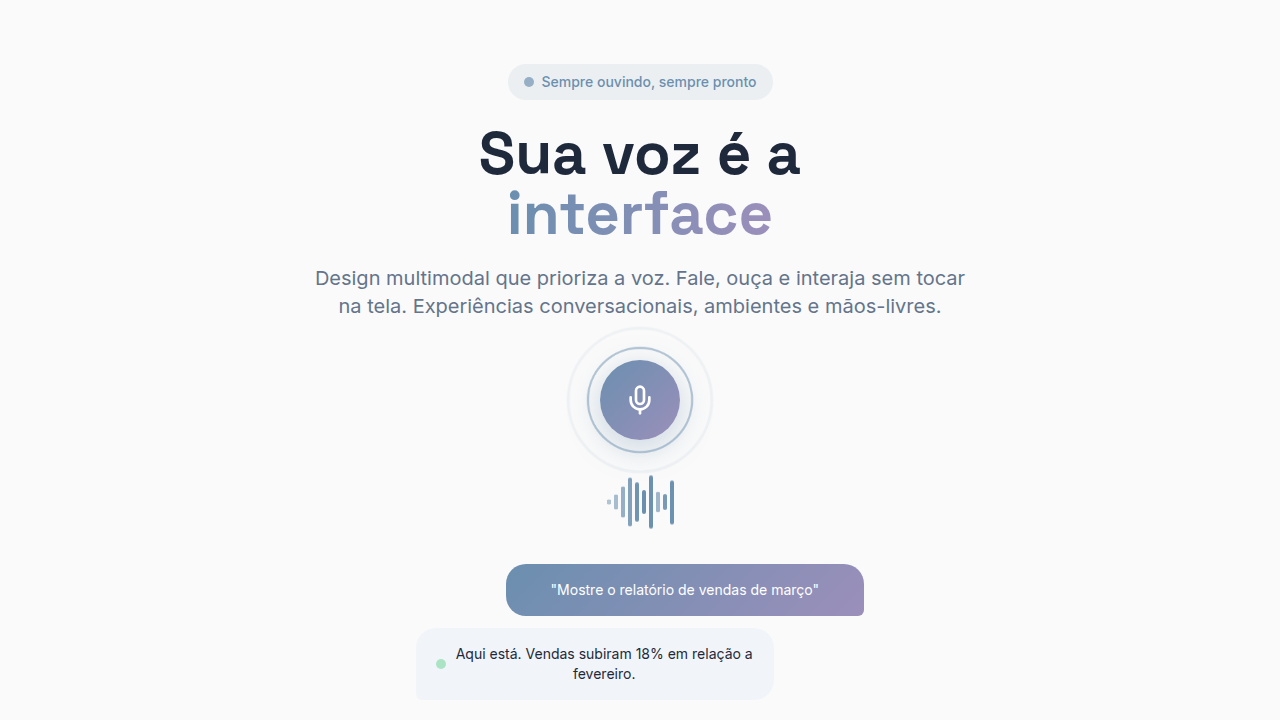
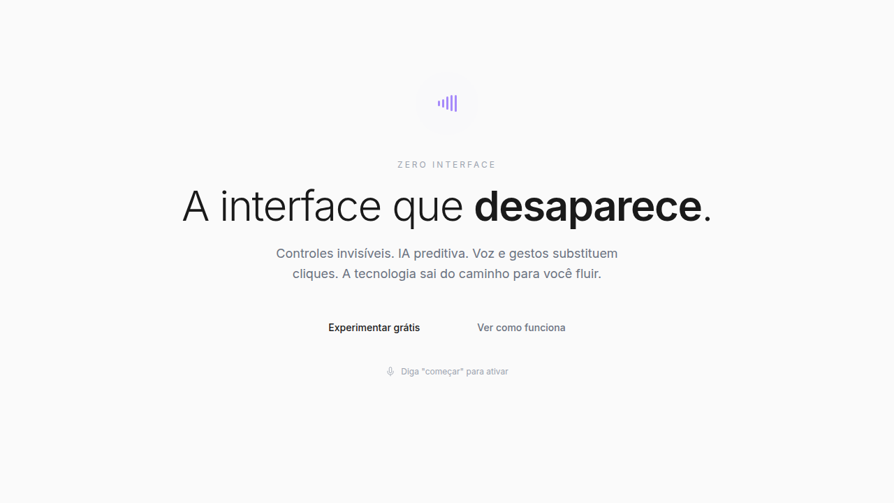
When the primary interaction model is conversational or generative. Think AI assistants, copilot sidebars, prompt-based creative tools, voice interfaces with visual feedback. Use this when your product generates rather than retrieves — when outputs are non-deterministic and the user's intent needs to be interpreted, not just routed. Not appropriate for transactional flows where users need predictability and direct manipulation. If your AI is a feature, use AI-augmented patterns instead.
Design Principles
- Progressive disclosure of capability — never present a blank void; use starter prompts, contextual suggestions, and ghost text to signal what's possible without overwhelming
- Transparent provenance — always communicate confidence levels, source attribution, and the boundary between generated content and verified fact
- Graceful latency — streaming responses, skeleton states, and typing indicators transform wait time into engagement; never leave users staring at a spinner
- Editable outputs over final answers — treat every AI response as a draft; provide inline editing, regeneration, and refinement controls that keep humans in the loop
- Conversation memory with escape hatches — maintain context across turns but always offer clear paths to reset, branch, or break out of conversational dead ends
Technical Specs
Colors
Primary
Effects
Typing indicators (3-dot pulse), streaming text animations, pulse animations, context cards, smooth reveals
Light/Dark
✓ Full / ✓ Full
Related


Last synced: 4/1/2026