Swiss Modernism 2.0
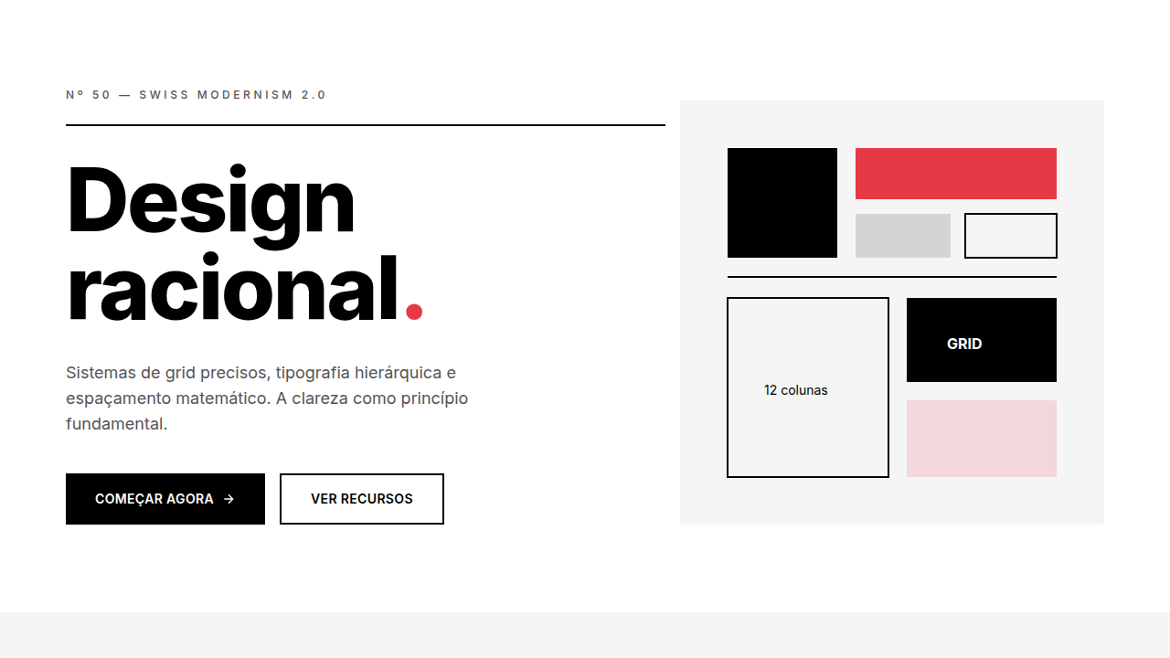
Design with Swiss Modernism 2.0. Ideal for landing pages, saas. AI-ready template.
Use case: Landing pages, SaaS
Historical Context
Swiss Modernism never died. It just went through a quiet decade where everyone mistook minimalism for laziness. The original movement—Müller-Brockmann, Ruder, the whole Zurich school—was obsessed with systems. Grids weren't decoration. They were ideology. Every element earned its place through mathematical relationships, not gut feeling. Fast forward to now. Open Figma. Open Linear. Look at how they handle information density. The 4px baseline grid. The relentless typographic hierarchy. The way negative space does actual work instead of just existing. These tools didn't copy Swiss design—they internalized its logic and rebuilt it for screens that refresh sixty times per second. Here's the tension though: the originals worked with lead type and offset printing. Constraints bred clarity. We have infinite canvas, variable fonts, fluid viewports. The challenge isn't applying Swiss principles—it's knowing which constraints to impose on yourself when the medium imposes almost none. That discipline is what separates updated Swiss from generic minimalism.
When to Use
Reach for this when information density is high and clarity is non-negotiable. Design tools, creative platforms, typography apps—anywhere users need to parse complex interfaces without cognitive overhead. Agencies love it because it signals competence without shouting. Works beautifully for data-heavy dashboards, developer tools, and editorial layouts. Skip it if your product needs warmth or playfulness—Swiss is precise, not friendly. It rewards users who value function. It alienates users who want personality.
Design Principles
- The grid is structural, not decorative—every element aligns to a mathematical system that justifies its position
- Typography carries the hierarchy alone; if you need color or icons to clarify importance, your type system failed
- Negative space is active, not leftover—it directs attention with the same intentionality as filled space
- Modularity over bespoke: components repeat, scale, and recombine without losing coherence across contexts
- Restraint as a feature—limit your palette, limit your type scale, and let the constraints produce clarity
DESIGN.md
---
version: "alpha"
name: "Swiss Modernism 2.0"
description: "Design with Swiss Modernism 2.0. Ideal for landing pages, saas. AI-ready template."
colors:
  primary: "#000000"
  secondary: "#FFFFFF"
  tertiary: "#F5F5F5"
typography:
  h1:
    fontFamily: Inter/Helvetica
    fontSize: 2.25rem
    fontWeight: 700
  body-md:
    fontFamily: Inter/Helvetica
    fontSize: 1rem
    fontWeight: 400
  label-caps:
    fontFamily: Inter/Helvetica
    fontSize: 0.75rem
    fontWeight: 500
spacing:
  sm: 1.0rem
  md: 2.0rem
  lg: 4.0rem
components:
  button-primary:
    backgroundColor: "{colors.primary}"
    padding: 12px
---

## Overview

Design with Swiss Modernism 2.0. Ideal for landing pages, saas. AI-ready template. Swiss Modernism never died. It just went through a quiet decade where everyone mistook minimalism for laziness. The original movement—Müller-Brockmann, Ruder, the whole Zurich school—was obsessed with systems. Grids weren't decoration. They were ideology. Every element earned its place through mathematical relationships, not gut feeling.

Fast forward to now. Open Figma. Open Linear. Look at how they handle information density. The 4px baseline grid. The relentless typographic hierarchy. The way negative space does actual work instead of just existing. These tools didn't copy Swiss design—they internalized its logic and rebuilt it for screens that refresh sixty times per second.

Here's the tension though: the originals worked with lead type and offset printing. Constraints bred clarity. We have infinite canvas, variable fonts, fluid viewports. The challenge isn't applying Swiss principles—it's knowing which constraints to impose on yourself when the medium imposes almost none. That discipline is what separates updated Swiss from generic minimalism.

- Density: 3/10 — Airy
- Variance: 7/10 — Dynamic
- Motion: 4/10 — Subtle

- **Style:** Grid-Based, Typographic, Functional, Modern
- **Keywords:** Grid system, Helvetica, modular, asymmetric, international style, rational, clean, mathematical spacing
- **Era:** 1950s Swiss + 2020s
- **Light/Dark:** ✓ Full / ✓ Full

## Colors

- **#000000** (#000000) — Primary surface or dominant color
- **#FFFFFF** (#FFFFFF) — Secondary surface or text color
- **#F5F5F5** (#F5F5F5) — Supporting palette color


## Typography

- **Display / Hero:** Inter/Helvetica — Weight 700, tight tracking, used for headline impact
- **Body:** Inter/Helvetica — Weight 400, 16px/1.6 line-height, max 72ch per line
- **UI Labels / Captions:** Inter/Helvetica — 0.875rem, weight 500, slight letter-spacing
- **Monospace:** JetBrains Mono — Used for code, metadata, and technical values

Scale:
- Hero: clamp(2.5rem, 5vw, 4rem)
- H1: 2.25rem
- H2: 1.5rem
- Body: 1rem / 1.6
- Small: 0.875rem


## Layout

- **Grid:** CSS Grid primary. Max-width containment: 1280px centered with 1.5rem side padding.
- **Spacing rhythm:** Balanced. Base unit: 0.5rem (8px).
- **Section vertical gaps:** clamp(4rem, 8vw, 8rem).
- **Hero layout:** Asymmetric composition.
- **Feature sections:** Asymmetric grid with varied card sizes. No 3-equal-columns.
- **Mobile collapse:** All multi-column layouts collapse below 768px. No horizontal overflow.
- **z-index contract:** base (0) / sticky-nav (100) / overlay (200) / modal (300) / toast (500).


## Elevation & Depth

display: grid, grid-template-columns: repeat(12 1fr), gap: 1rem, mathematical ratios, clear hierarchy

- **Physics:** Ease-out curves, 200-300ms duration. Smooth and predictable.
- **Entry animations:** Fade + translate-Y (16px → 0) over 420ms ease-out. Staggered cascades for lists: 80ms between items.
- **Hover states:** Subtle color shift + shadow adjustment over 200ms.
- **Page transitions:** Fade only (200ms).
- **Performance:** Only transform and opacity animated. No layout-triggering properties.


## Shapes

Base corner radius: 8px. See rounded tokens in front matter for the full scale.


## Components

- **Primary Button:** Subtly rounded (0.5rem) shape. Accent color fill. Hover: 8% darken + subtle lift shadow. Active: -1px translate tactile press. Font weight 600. No outer glows.
- **Secondary / Ghost Button:** Outline variant. 1.5px border in muted color. Text in primary color. Hover: subtle background fill.
- **Cards:** Subtly rounded (0.5rem) corners. Surface background. Subtle shadow (0 2px 12px rgba(0,0,0,0.06)). 1px border stroke.
- **Inputs:** Label above input. 1px border stroke. Focus ring: 2px accent color offset 2px. Error text below in semantic red. No floating labels.
- **Navigation:** Primary surface background. Active item: accent color indicator. Font weight 500 when active.
- **Skeletons:** Shimmer animation matching component dimensions. No circular spinners.
- **Empty States:** Icon-based composition with descriptive text and action button.


## Do's and Don'ts

- No emojis in UI — use icon system only (Lucide, Heroicons)
- No pure black (#000000) — use off-black or charcoal variants
- No oversaturated accent colors (saturation cap: 80%)
- No 3-column equal-width feature layouts — use zig-zag or asymmetric grid
- No `h-screen` — use `min-h-[100dvh]`
- No AI copywriting clichés: "Elevate", "Seamless", "Unleash", "Next-Gen"
- No broken external image links — use picsum.photos or inline SVG
- No generic lorem ipsum in demos

- Do 12-column grid strict
- Do Spacing mathematical
- Do Typography hierarchy clear
- Do Single accent only
- Do No decorations
- Do High contrast verified


## Use Case

Landing pages, SaaS
Technical Specs
CSS
display: grid, grid-template-columns: repeat(12, 1fr), gap: 1rem (8px base unit), font-family: Inter/Helvetica, font-weight: 400-700, color: #000/#FFF, single accent
Variables
--grid-columns: 12, --grid-gap: 1rem, --base-unit: 8px, --font-primary: Inter, --color-text: #000000, --color-bg: #FFFFFF, --accent: single vibrant
Checklist
☐ 12-column grid strict, ☐ Spacing mathematical, ☐ Typography hierarchy clear, ☐ Single accent only, ☐ No decorations, ☐ High contrast verified
Colors
Primary
Effects
display: grid, grid-template-columns: repeat(12 1fr), gap: 1rem, mathematical ratios, clear hierarchy
Light/Dark
✓ Full / ✓ Full
AI Prompt
Act as a Senior Frontend Engineer and Expert UI Designer.
Your task is to code a complete Landing Page on the first attempt.
- Landing Page Theme: <INSERT THEME>
- Sections to add: <INSERT SECTIONS>

Generate the final code immediately following these definitions:

## Style

- **Name:** Swiss Modernism 2.0
- **Type:** Grid-Based, Typographic, Functional, Modern
- **Keywords:** Grid system, Helvetica, modular, asymmetric, international style, rational, clean, mathematical spacing
- **Era:** 1950s Swiss + 2020s
- **Light/Dark:** ✓ Full / ✓ Full

## Color Palette

- **Primary:** #000000, #FFFFFF, #F5F5F5, single vibrant accent only
- **Secondary:** Minimal secondary, accent for emphasis only, no gradients

## Visual Effects

display: grid, grid-template-columns: repeat(12 1fr), gap: 1rem, mathematical ratios, clear hierarchy

## AI Visual Direction

Design with Swiss Modernism 2.0. Use: strict grid system (12 columns), Helvetica/Inter fonts, mathematical spacing, asymmetric balance, high contrast, minimal decoration, clean hierarchy, single accent color.

## CSS Technical

```css
display: grid, grid-template-columns: repeat(12, 1fr), gap: 1rem (8px base unit), font-family: Inter/Helvetica, font-weight: 400-700, color: #000/#FFF, single accent
```

## Design System Variables

```css
--grid-columns: 12, --grid-gap: 1rem, --base-unit: 8px, --font-primary: Inter, --color-text: #000000, --color-bg: #FFFFFF, --accent: single vibrant
```

## Implementation Checklist

- ☐ 12-column grid strict
- ☐ Spacing mathematical
- ☐ Typography hierarchy clear
- ☐ Single accent only
- ☐ No decorations
- ☐ High contrast verified

## Execution Rules

1. Strictly follow the defined visual style.
2. Use high-quality inline SVG icons (Heroicons or Lucide style) — NEVER use emojis as icons.
3. Add `cursor-pointer` and smooth `hover` states (transition-all) on all interactive elements.
4. Required Page Structure:
   - Navbar (Logo + Links + CTA)
   - Hero Section (Impactful Headline + Subtitle + 2 buttons + 3D/Abstract visual element via CSS)
   - Features (3 cards with icons)
   - Testimonials (3 cards)
   - Pricing (3 tiers, highlight the middle one)
   - Final CTA
   - Full Footer with social links, privacy policy, terms of use, contact and SEO links.
5. All text content must be in English.
6. The visual must be CLEARLY distinct — do not create a "default Bootstrap" design. Force the use of the provided design system variables.
7. Use `<style>` tags in the head for custom classes (especially for complex backdrop-filter effects and animations) that Tailwind CDN doesn't cover.
8. Full Responsiveness: Layout must adapt perfectly to Mobile, Tablet and Desktop (vertical stack on mobile).
9. Include basic SEO, Viewport and Open Graph meta tags in `<head>`.
10. Footer must contain: Copyright 2026, Secondary navigation links and Social media icons.
11. Make the creative decisions needed to deliver the complete, functional result now.
Related
Last synced: 4/1/2026