Azulejaria Digital Moderna
Geometric and modular landing page for a collaborative digital art platform, inspired by Brazilian modernist azulejaria. Ideal for landing pages, saas. AI-ready template.
Use case: Landing pages, SaaS
Historical Context
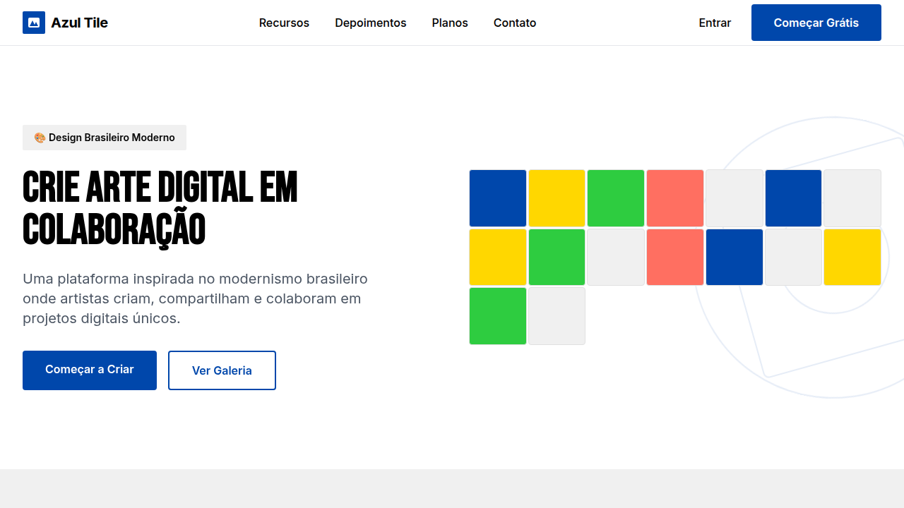
The azulejo never belonged to museums. It belonged to streets, to kitchens, to the curved walls of colonial churches where light hit glazed surfaces and scattered. Portuguese colonizers brought the tradition to Brazil in the 1600s, and Brazilian artisans immediately broke the rules — bolder colors, looser geometry, narrative panels that told local stories instead of repeating Moorish abstractions. Athos Bulcão shattered the grid entirely in Brasília, proving tiles could be modern, could be architecture itself. Digital azulejaria picks up exactly there. Artists like Gustavo Magalhães and collectives such as Azulejo Coletivo treat the pixel as a tessera, building modular pattern systems that snap together like ceramic but propagate through screens. The key shift: collaboration. Where a single artisan once painted a panel, now dozens of contributors submit individual tile designs to shared repositories. The pattern emerges from the collective, not the individual. This isn't nostalgia rendered in vectors. It's a living practice — generative algorithms producing variations no hand could sustain, open-source tile libraries anyone can fork, public projections turning building facades into participatory mosaics. The modularity that made azulejos scalable across colonial architecture makes them native to digital systems.
When to Use
When your project needs visual identity rooted in Brazilian material culture without falling into folklore pastiche. Strong fit for collaborative platforms where multiple contributors need a unifying visual grammar — each person designs a tile, the system composes the wall. Cultural institutions digitizing collections. Educational platforms teaching geometry through play. Any interface where repetition creates rhythm rather than monotony. Avoid if you need photographic realism or minimal aesthetics — this system is unapologetically decorative.
Design Principles
- Modularity is meaning — every element must function alone as a complete composition and multiply into larger patterns without losing coherence at either scale
- Constraint breeds variation — work within a fixed grid (square, hexagonal, or triangular) but exhaust its combinatorial possibilities before ever expanding the canvas
- Color carries climate — pull palettes from Brazilian built environments: the oxide terracotta of Olinda, the cobalt-and-white of São Luís, the tropical maximalism of Pelourinho facades
- Collaboration over authorship — design systems where individual contributions dissolve into collective pattern, where no single tile dominates but every tile matters
- Imperfection is signal — introduce controlled irregularity (slight rotation, color drift, hand-drawn edges) to resist the sterility of pure digital repetition
Technical Specs
Colors
Primary
Secondary
Effects
Layouts de grid modular inspirados em azulejos, com elementos geométricos que rotacionam e se combinam, tipografia sans-serif limpa e moderna, ícones vetoriais que remetem a formas abstratas, micro-interações de hover com mudança de padrão ou cor do azulejo, transições de seção com efeito de "montagem" de módulos.
Light/Dark
✓ Full / ✗ No
Related
Last synced: 4/1/2026