Swiss Design Gráfico
Swiss graphic design landing page. Ideal for landing pages, saas. AI-ready template.
Use case: Landing pages, SaaS
Historical Context
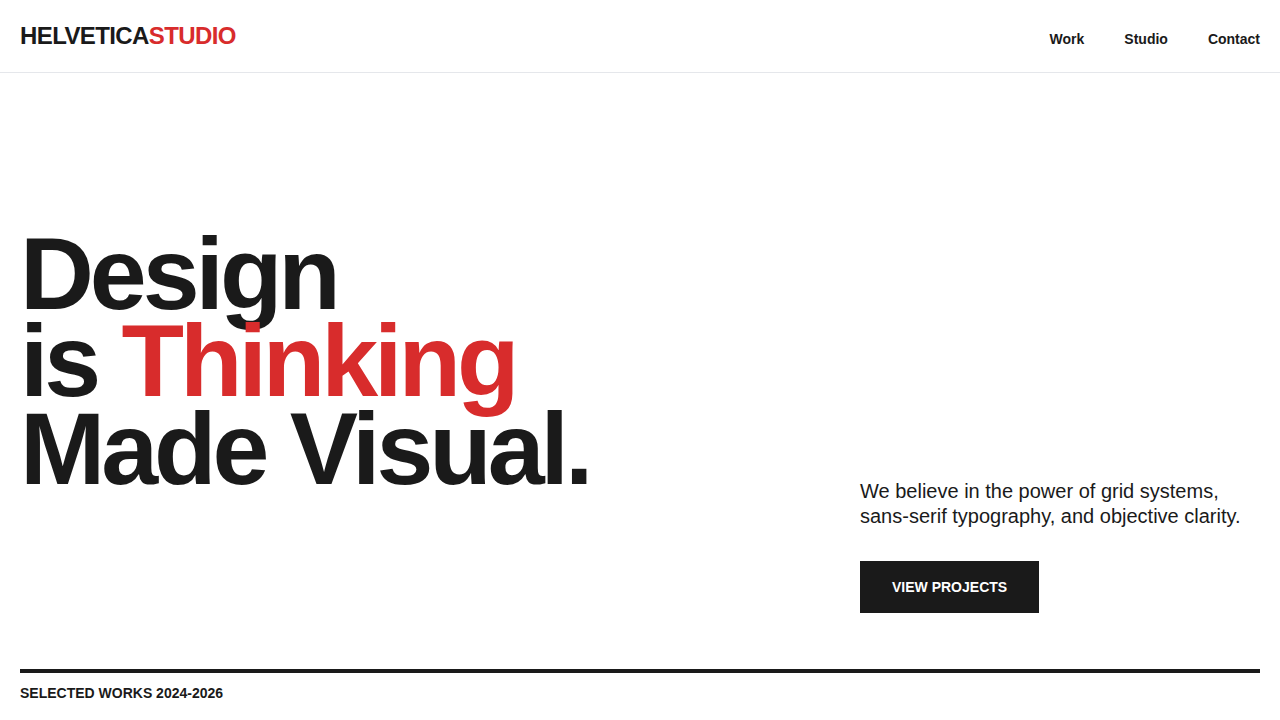
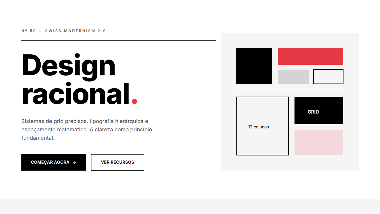
Swiss Graphic Design didn't emerge from tech startups or UI kits. It came from Basel and Zürich in the 1950s — from letterpress workshops, lithographic posters, and a near-obsessive belief that typography could carry meaning without decoration. Armin Hofmann taught his students to strip away. Emil Ruder wrote the book — literally — on typographic rhythm, proving that whitespace wasn't emptiness but structure. Their posters weren't minimal for aesthetic reasons. They were minimal because every element had to earn its place. This is fundamentally different from what people now call 'Swiss Modernism 2.0' — that Dribbble-friendly aesthetic of geometric sans-serifs on pastel backgrounds. The original movement was rougher, more intellectual. Hofmann's work had tension. Ruder's grids weren't decorative scaffolding; they were argumentative frameworks. Translating this to screens means understanding what survived and what didn't. The grid translated beautifully. The typographic hierarchy — large, confident, unapologetic — works even better at screen scale. But the texture of ink on uncoated stock, the slight registration misalignment of overprinted colors? That's gone. What remains is the discipline: let the grid do the talking, let type breathe, and never add what you can't justify.
When to Use
Reach for this when the content itself is the product. Design agencies presenting portfolios. Cultural institutions that need authority without shouting. Typography tools where the interface must disappear behind the letterforms. Print studios whose digital presence should feel like an extension of their craft. It works poorly for playful consumer apps or anything requiring emotional warmth — this system is confident, cool, and deliberately restrained. If your brand needs a hug, look elsewhere.
Design Principles
- The grid is non-negotiable — every element aligns to a mathematical structure, not to 'what feels right'
- Typography is the primary visual material — if your layout doesn't work in black and white with only type, it doesn't work
- Whitespace is active, not leftover — margins and gutters carry as much intent as the content they frame
- Objectivity over expression — the designer's hand recedes; the information speaks
- Reduction until it breaks — remove elements until the communication fails, then add back exactly one thing
Technical Specs
Colors
Primary
Secondary
Effects
Strong grid system, sans-serif typography (Helvetica), asymmetrical layout, clean lines, focus on negative space, objective photography, no ornamentation, flush left rag right text
Light/Dark
✓ Full / ✗ No
Related
Last synced: 4/1/2026