Grunge Rock dos Anos 90
90s grunge rock landing page. Ideal for landing pages, saas. AI-ready template.
Use case: Landing pages, SaaS
Historical Context
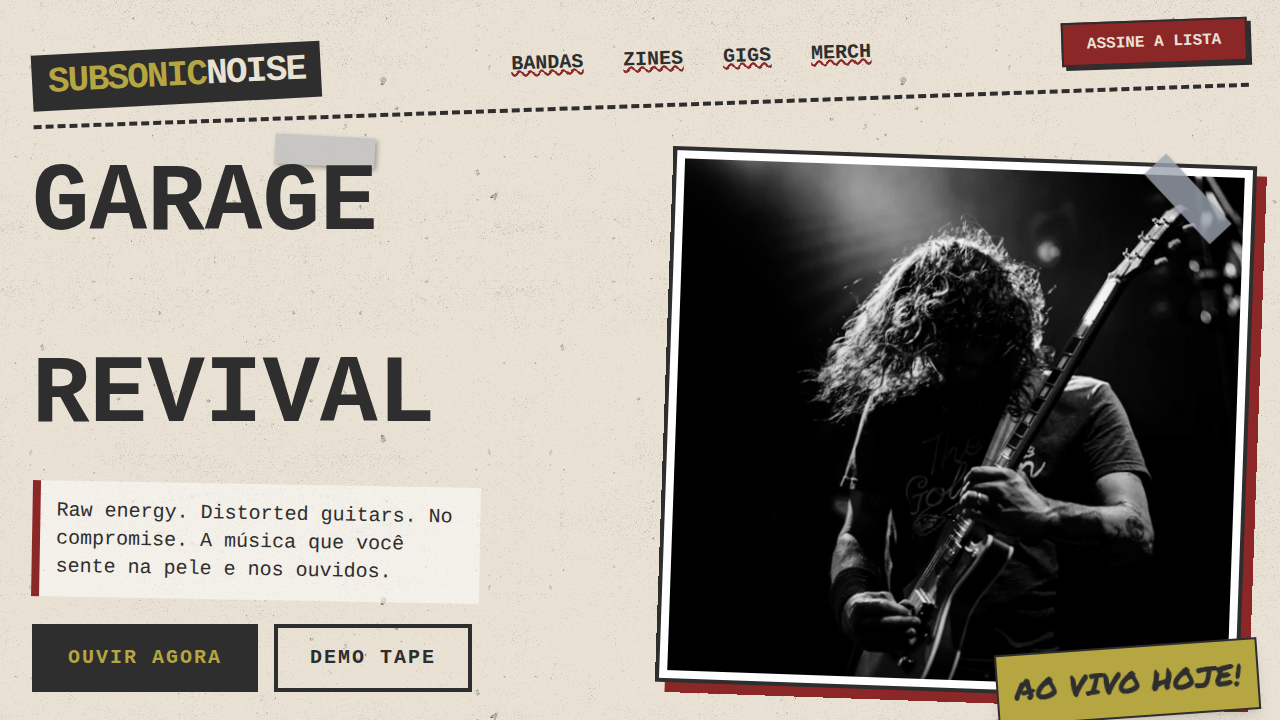
Before grunge had a name, it had a look — photocopied flyers stapled to telephone poles outside Seattle venues, hand-scrawled setlists, album art that looked like it survived a basement flood. Nirvana's Nevermind was polished on purpose (the irony wasn't lost on anyone), but Pearl Jam's Vs. and its stark livestock photography, Alice in Chains' tripod artwork, Mudhoney's xeroxed chaos — that was the real visual DNA. It wasn't designed. It was assembled. Then David Carson blew typography apart. Ray Gun magazine (1992–2000) treated readability as optional. He set entire interviews in Zapf Dingbats. Columns bled off pages. Photos were scratched, layered, degraded. Carson wasn't illustrating grunge — he was proving that destruction was a valid compositional tool. The establishment hated it. Kids pinned those pages to their walls. Distressed textures, torn paper edges, misregistered ink — these weren't aesthetic choices born from software filters. They came from actual physical processes: bad photocopiers, wheat-paste residue, rained-on gig posters. The roughness was evidence of lived experience. Anti-design became the only honest design for a generation that rejected the slick corporate visual language of the 80s.
When to Use
When the brief demands authenticity over polish. Music labels launching vinyl reissues or new underground acts. Streetwear drops that need to feel found, not manufactured. Skate brands whose audience can smell corporate design from three blocks away. Zine culture, alternative festivals, any project where looking too clean would be a credibility problem. Not for healthcare. Not for fintech. This aesthetic earns trust through visible imperfection — use it where that currency matters.
Design Principles
- Destruction as composition — tear, layer, and degrade with intention. Every rip should create a new visual relationship, not just noise.
- Texture carries meaning — distressed surfaces communicate history, use, and realness. Flat digital perfection is the enemy.
- Typography as rebellion — break grids, overlap text, let letterforms collide. Legibility is a spectrum, not a binary.
- Analog process over digital simulation — reference real physical artifacts (photocopies, screen prints, wheat-paste) rather than applying Photoshop filters to clean layouts.
- Restraint within chaos — the best grunge design has underlying structure. Total randomness reads as lazy. Controlled destruction reads as confident.
DESIGN.md
---
version: "alpha"
name: "Grunge Rock dos Anos 90"
description: "90s grunge rock landing page. Ideal for landing pages, saas. AI-ready template."
colors:
  primary: "#2E2E2E"
  secondary: "#B5A642"
  tertiary: "#8C2727"
  neutral: "#E9E1D4"
  surface: "#6B8E23"
  accent: "#3B5998"
typography:
  h1:
    fontFamily: Courier New
    fontSize: 2.5rem
    fontWeight: 700
  body-md:
    fontFamily: Courier New
    fontSize: 1rem
    fontWeight: 400
components:
  button-primary:
    backgroundColor: "{colors.primary}"
    textColor: "{colors.neutral}"
    padding: 12px
---

## Overview

90s grunge rock landing page. Ideal for landing pages, saas. AI-ready template. Before grunge had a name, it had a look — photocopied flyers stapled to telephone poles outside Seattle venues, hand-scrawled setlists, album art that looked like it survived a basement flood. Nirvana's Nevermind was polished on purpose (the irony wasn't lost on anyone), but Pearl Jam's Vs. and its stark livestock photography, Alice in Chains' tripod artwork, Mudhoney's xeroxed chaos — that was the real visual DNA. It wasn't designed. It was assembled.

Then David Carson blew typography apart. Ray Gun magazine (1992–2000) treated readability as optional. He set entire interviews in Zapf Dingbats. Columns bled off pages. Photos were scratched, layered, degraded. Carson wasn't illustrating grunge — he was proving that destruction was a valid compositional tool. The establishment hated it. Kids pinned those pages to their walls.

Distressed textures, torn paper edges, misregistered ink — these weren't aesthetic choices born from software filters. They came from actual physical processes: bad photocopiers, wheat-paste residue, rained-on gig posters. The roughness was evidence of lived experience. Anti-design became the only honest design for a generation that rejected the slick corporate visual language of the 80s.

- Density: 5/10 — Balanced
- Variance: 8/10 — Expressive
- Motion: 4/10 — Subtle

- **Style:** Raw, Gritty, Anti-Design
- **Keywords:** grunge, 90s rock, raw, gritty, anti-design, distressed, xerox, zine, chaotic, authentic
- **Era:** Early 1990s Alternative Scene
- **Light/Dark:** ✓ Full / ✗ No

## Colors

- **Faded Black** (#2E2E2E) — Dark surface, primary background
- **Dirty Yellow** (#B5A642) — Warning states, attention indicators
- **Muted Red** (#8C2727) — Secondary text, borders, muted elements
- **Off-White** (#E9E1D4) — Light surface, card backgrounds
- **Olive Drab** (#6B8E23) — Extended palette, decorative use
- **Denim Blue** (#3B5998) — Secondary accent
- **Concrete Grey** (#7A7A7A) — Secondary text, borders, muted elements
- **Burnt Orange** (#A84700) — Warm accent, call-to-action secondary


## Typography

- **Display / Hero:** Courier New — Weight 700, tight tracking, used for headline impact
- **Body:** Courier New — Weight 400, 16px/1.6 line-height, max 72ch per line
- **UI Labels / Captions:** Courier New — 0.875rem, weight 500, slight letter-spacing
- **Monospace:** Courier New — Used for code, metadata, and technical values

Scale:
- Hero: clamp(2.5rem, 5vw, 4rem)
- H1: 2.25rem
- H2: 1.5rem
- Body: 1rem / 1.6
- Small: 0.875rem


## Layout

- **Grid:** CSS Grid primary. Max-width containment: 1280px centered with 1.5rem side padding.
- **Spacing rhythm:** Balanced. Base unit: 0.5rem (8px).
- **Section vertical gaps:** clamp(4rem, 8vw, 8rem).
- **Hero layout:** Asymmetric composition.
- **Feature sections:** Asymmetric grid with varied card sizes. No 3-equal-columns.
- **Mobile collapse:** All multi-column layouts collapse below 768px. No horizontal overflow.
- **z-index contract:** base (0) / sticky-nav (100) / overlay (200) / modal (300) / toast (500).


## Elevation & Depth

Distressed textures, torn paper, xerox copy artifacts, chaotic typography, handwritten notes, duct tape elements, grainy photos, misaligned grids

- **Physics:** Ease-out curves, 200-300ms duration. Smooth and predictable.
- **Entry animations:** Fade + translate-Y (16px → 0) over 420ms ease-out. Staggered cascades for lists: 80ms between items.
- **Hover states:** Subtle color shift + shadow adjustment over 200ms.
- **Page transitions:** Fade only (200ms).
- **Performance:** Only transform and opacity animated. No layout-triggering properties.


## Shapes

Base corner radius: 8px. See rounded tokens in front matter for the full scale.


## Components

- **Primary Button:** Subtly rounded (0.5rem) shape. Accent color fill. Hover: 8% darken + subtle lift shadow. Active: -1px translate tactile press. Font weight 600. No outer glows.
- **Secondary / Ghost Button:** Outline variant. 1.5px border in muted color. Text in primary color. Hover: subtle background fill.
- **Cards:** Subtly rounded (0.5rem) corners. Surface background. Subtle shadow (0 2px 12px rgba(0,0,0,0.06)). 1px border stroke.
- **Inputs:** Label above input. 1px border stroke. Focus ring: 2px accent color offset 2px. Error text below in semantic red. No floating labels.
- **Navigation:** Primary surface background. Active item: accent color indicator. Font weight 500 when active.
- **Skeletons:** Shimmer animation matching component dimensions. No circular spinners.
- **Empty States:** Icon-based composition with descriptive text and action button.


## Do's and Don'ts

- No emojis in UI — use icon system only (Lucide, Heroicons)
- No pure black (#000000) — use off-black or charcoal variants
- No oversaturated accent colors (saturation cap: 80%)
- No 3-column equal-width feature layouts — use zig-zag or asymmetric grid
- No `h-screen` — use `min-h-[100dvh]`
- No AI copywriting clichés: "Elevate", "Seamless", "Unleash", "Next-Gen"
- No broken external image links — use picsum.photos or inline SVG
- No generic lorem ipsum in demos

- Do Distressed textures
- Do Xerox copy effects
- Do Chaotic typography
- Do Torn paper edges
- Do Duct tape elements
- Do Zine-style layout


## Use Case

Landing pages, SaaS
Technical Specs
CSS
background: #E9E1D4, color: #2E2E2E, font-family: 'Courier New', monospace, text-decoration: underline, filter: saturate(0.8) contrast(1.3), transform: rotate(-2deg), border: 2px dashed #2E2E2E, box-shadow: none, animation: text-flicker 0.2s infinite, background-image: url('distressed-texture.png')Variables
--faded-black: #2E2E2E, --dirty-yellow: #B5A642, --muted-red: #8C2727, --off-white: #E9E1D4, --distress-opacity: 0.4, --font-grunge: 'Courier New', monospace
Checklist
☐ Distressed textures, ☐ Xerox copy effects, ☐ Chaotic typography, ☐ Torn paper edges, ☐ Duct tape elements, ☐ Zine-style layout
Colors
Primary
Secondary
Effects
Distressed textures, torn paper, xerox copy artifacts, chaotic typography, handwritten notes, duct tape elements, grainy photos, misaligned grids
Light/Dark
✓ Full / ✗ No
AI Prompt
Act as a Senior Frontend Engineer and Expert UI Designer.
Your task is to code a complete Landing Page on the first attempt.
- Landing Page Theme: <INSERT THEME>
- Sections to add: <INSERT SECTIONS>

Generate the final code immediately following these definitions:

## Style

- **Name:** Grunge Rock dos Anos 90
- **Type:** Raw, Gritty, Anti-Design
- **Keywords:** grunge, 90s rock, raw, gritty, anti-design, distressed, xerox, zine, chaotic, authentic
- **Era:** Early 1990s Alternative Scene
- **Light/Dark:** ✓ Full / ✗ No

## Color Palette

- **Primary:** Faded Black #2E2E2E, Dirty Yellow #B5A642, Muted Red #8C2727, Off-White #E9E1D4
- **Secondary:** Olive Drab #6B8E23, Denim Blue #3B5998, Concrete Grey #7A7A7A, Burnt Orange #A84700

## Visual Effects

Distressed textures, torn paper, xerox copy artifacts, chaotic typography, handwritten notes, duct tape elements, grainy photos, misaligned grids

## AI Visual Direction

Design a 90s grunge rock landing page. Use: faded black and dirty yellow, distressed textures, xerox copy effects, chaotic typography, torn paper edges, duct tape elements, grainy photos, zine-style layout.

## CSS Technical

```css
background: #E9E1D4, color: #2E2E2E, font-family: 'Courier New', monospace, text-decoration: underline, filter: saturate(0.8) contrast(1.3), transform: rotate(-2deg), border: 2px dashed #2E2E2E, box-shadow: none, animation: text-flicker 0.2s infinite, background-image: url('distressed-texture.png')
```

## Design System Variables

```css
--faded-black: #2E2E2E, --dirty-yellow: #B5A642, --muted-red: #8C2727, --off-white: #E9E1D4, --distress-opacity: 0.4, --font-grunge: 'Courier New', monospace
```

## Implementation Checklist

- ☐ Distressed textures
- ☐ Xerox copy effects
- ☐ Chaotic typography
- ☐ Torn paper edges
- ☐ Duct tape elements
- ☐ Zine-style layout

## Execution Rules

1. Strictly follow the defined visual style.
2. Use high-quality inline SVG icons (Heroicons or Lucide style) — NEVER use emojis as icons.
3. Add `cursor-pointer` and smooth `hover` states (transition-all) on all interactive elements.
4. Required Page Structure:
   - Navbar (Logo + Links + CTA)
   - Hero Section (Impactful Headline + Subtitle + 2 buttons + 3D/Abstract visual element via CSS)
   - Features (3 cards with icons)
   - Testimonials (3 cards)
   - Pricing (3 tiers, highlight the middle one)
   - Final CTA
   - Full Footer with social links, privacy policy, terms of use, contact and SEO links.
5. All text content must be in English.
6. The visual must be CLEARLY distinct — do not create a "default Bootstrap" design. Force the use of the provided design system variables.
7. Use `<style>` tags in the head for custom classes (especially for complex backdrop-filter effects and animations) that Tailwind CDN doesn't cover.
8. Full Responsiveness: Layout must adapt perfectly to Mobile, Tablet and Desktop (vertical stack on mobile).
9. Include basic SEO, Viewport and Open Graph meta tags in `<head>`.
10. Footer must contain: Copyright 2026, Secondary navigation links and Social media icons.
11. Make the creative decisions needed to deliver the complete, functional result now.Related
Last synced: 4/1/2026