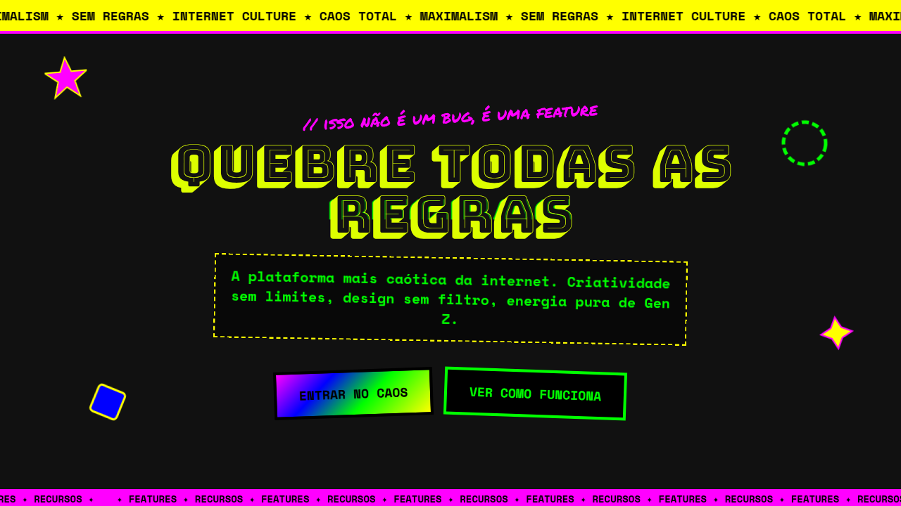
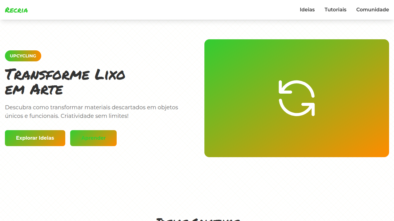
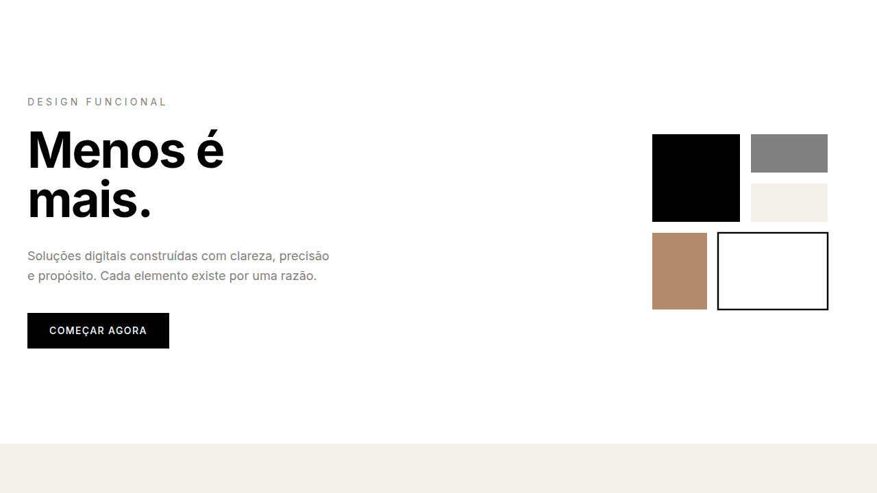
Gen Z Chaos / Maximalism
Gen Z chaos maximalist interface. Ideal for landing pages, saas. AI-ready template.
Use case: Landing pages, SaaS
Historical Context
Millennials gave us the white space gospel. Clean grids, sans-serif everything, that particular shade of startup blue. Gen Z looked at all of it and said: absolutely not. The backlash started on TikTok and BeReal — raw, unfiltered, deliberately messy. Screenshots layered on screenshots. Stickers slapped over stickers. The aesthetic wasn't accidental; it was a middle finger to the polished, venture-backed sameness that dominated the 2010s. 'Ugly' became a design choice, not a failure. Cluttercore wasn't just for bedrooms — it hit the screen. This is anti-corporate design as identity politics. When every brand looks like every other brand (thanks, Figma templates), visual chaos becomes rebellion. The references pull from early-2000s web, MySpace customization, zine culture, and meme formats. It's maximalism with a purpose: if your design looks too clean, you're probably lying about something. Gen Z trusts the mess because the mess feels human.
When to Use
When your audience is under 25 and allergic to anything that smells like a boardroom. Youth brands, social-first apps, streetwear drops, meme pages, creator tools — anywhere authenticity matters more than polish. Works brilliantly for limited drops, event marketing, and anything competing for attention in a feed. Skip this if you need enterprise trust signals or if your users are over 40. The chaos has to feel native, not cosplayed.
Design Principles
- More is more — layer stickers, textures, type, and imagery until it feels alive, then add one more thing
- Kill the grid on purpose — asymmetry, overlapping elements, and intentional 'broken' layouts signal authenticity
- Steal from the feed — meme formats, screenshot aesthetics, chat bubbles, and notification UI as decorative elements
- Anti-polish everything — pixel fonts, compression artifacts, hand-drawn marks, and visible tool traces over rendered perfection
- Velocity over refinement — design should feel fast, reactive, and disposable, like a story that expires in 24 hours
Technical Specs
Colors
Primary
Effects
Marquee scrolls, jitter, sticker layering, GIF overload, random placement, drag-and-drop
Light/Dark
✓ Full / ✓ Full
Related
Last synced: 4/1/2026