Tropicalismo Gastronômico Vibrante
Vibrant and flavorful landing page for a Brazilian gastronomy festival, inspired by tropicalism. Ideal for landing pages, saas. AI-ready template.
Use case: Landing pages, SaaS
Historical Context
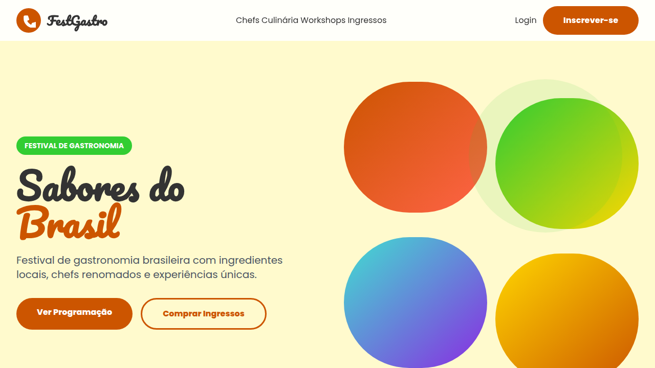
Brazilian food design didn't emerge from Michelin-starred kitchens or corporate branding agencies. It came from the street. From the hand-painted signs above juice bars in Belém, the neon-on-black menus of São Paulo's lanchonetes, the improvised typography of feira livre vendors stacking towers of tropical fruit. This is a visual language born from abundance and urgency — where communication needs to be loud, immediate, and unmistakably alive. The country's culinary identity — açaí bowls in their deep violet geometry, the burnt-orange layers of feijoada served in black iron, the chaotic color of a churrasco spread — generates a palette that no European food tradition can replicate. It's saturated without apology. Warm without restraint. The visual codes carry the heat of the equator and the density of a culture that treats eating as collective ritual, never solitary consumption. What makes this tradition remarkable for design is its refusal to be minimal. Brazilian gastronomic branding at its best embraces visual maximalism as honesty — the plate is full, the flavor is complex, so the design should match. When farm-to-table movements and food festivals lean into this heritage rather than sanitizing it, they tap into something genuinely powerful: a visual system where excess is authenticity.
When to Use
Deploy when the brief demands warmth, generosity, and sensory overload done right. Food festivals that need to feel like a celebration, not a corporate activation. Brazilian restaurants building identity beyond clichés of flags and soccer. Culinary brands connecting ingredient provenance to cultural pride. Farm-to-table concepts where the land's richness should hit visually before the first bite. Works best when you want audiences to feel hunger through color alone.
Design Principles
- Saturated palettes pulled from actual ingredients — deep açaí purples, dendê oil ambers, lime greens, charred blacks. Never desaturate tropical color into 'tasteful' pastels.
- Textural layering that mirrors the plate: overlapping elements, visible grain, hand-drawn marks coexisting with bold type. Clean grids feel dishonest here.
- Typography with physical weight — condensed sans-serifs for impact, hand-lettered scripts for warmth. The type should feel like it could be painted on a market wall.
- Composition that embraces abundance over negative space. Fill the frame. Let elements crowd and overlap like dishes on a shared table.
- Material honesty in print and digital — kraft textures, uncoated stocks, visible ink density. The design should feel like it could absorb oil and still look intentional.
Technical Specs
Colors
Primary
Secondary
Effects
Imagens de alimentos coloridos e frescos em grande destaque, tipografia orgânica e expressiva, elementos de UI com formas de frutas e vegetais, micro-interações de hover com efeito de "sabor" visual, transições de seção com efeito de "camadas" de ingredientes.
Light/Dark
✓ Full / ✗ No
Related
Last synced: 4/1/2026