Brutalist Web Design
Brutalist web landing page. Ideal for landing pages, saas. AI-ready template.
Use case: Landing pages, SaaS
Historical Context
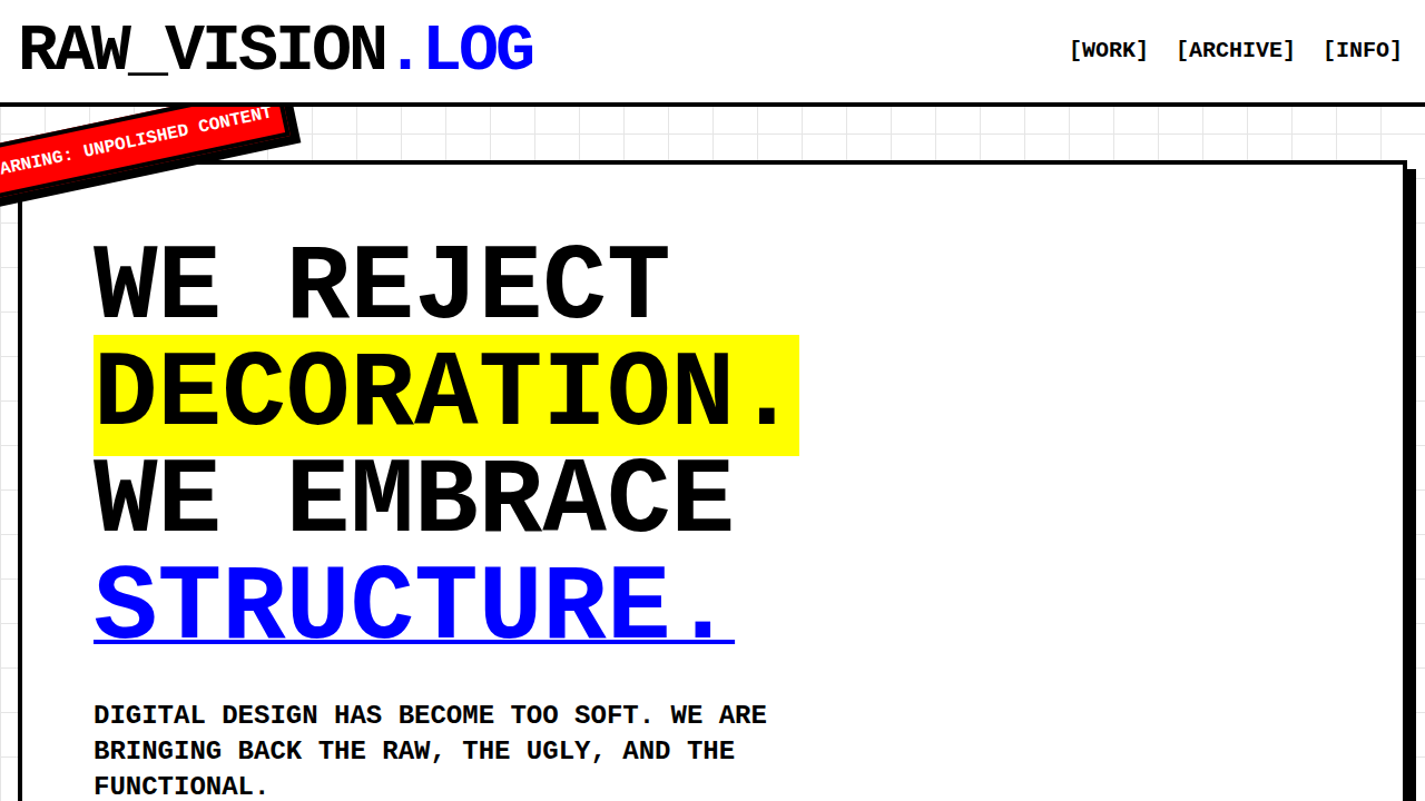
Web brutalism borrowed the name but not the playbook. Architectural brutalism was about honest materials — raw concrete, exposed utilities, structural legibility. Web brutalism took that last part and ran with it. The movement crystallized around 2014–2016, when Pascal Deville's brutalistwebsites.com began archiving sites that rejected the polished sameness of Bootstrap-era design. Suddenly there was a canon: Craigslist, the Drudge Report, early Bloomberg, academic homepages that hadn't been touched since 1997. But here's the distinction that matters: web brutalism isn't just "ugly on purpose." It's a specific set of conventions. System fonts — Georgia, Times, Arial, or whatever the OS hands you. Default blue underlined links. Visible document structure where the HTML hierarchy *is* the design. No hero images. No smooth transitions. The page loads and it's done. You see the grid because there's nothing hiding it. The web-specific version also carries an implicit argument: that the browser's defaults were already a design system. A good one. Every layer of CSS you add is a choice to obscure that, and maybe you should justify each one.
When to Use
When the content should feel unmediated. Art galleries where the work needs zero visual competition. Developer blogs where the writing is the interface. Independent publishers who want to signal "we spent the budget on journalism, not gradients." Experimental sites that treat the browser as material rather than canvas. Also works when you genuinely need speed — brutalist sites are fast by default because there's nothing to load. Not appropriate when users expect conventional wayfinding or when accessibility requires more visual hierarchy than raw HTML provides.
Design Principles
- Use system fonts exclusively — the user's OS already made a typography decision, respect it
- Let HTML structure be visible — headings, lists, and links should look like what they are without cosmetic overrides
- Reject decorative layers that don't serve comprehension — every border, shadow, and gradient needs a functional justification
- Embrace the default stylesheet as a starting point, not a problem to solve
- Prioritize content density and immediacy over visual comfort — the page is a document, not a stage set
Technical Specs
Colors
Primary
Secondary
Effects
Visible grid structure, oversized typography, raw HTML aesthetic, thick harsh borders, no rounded corners, system fonts, deliberate misalignment, underlined links, monospace blocks, stark color blocks
Light/Dark
✓ Full / ✗ No
Related
Last synced: 4/1/2026