Bauhaus / Risograph Modern
Bauhaus risograph modern interface. Ideal for landing pages, saas. AI-ready template.
Use case: Landing pages, SaaS
Historical Context
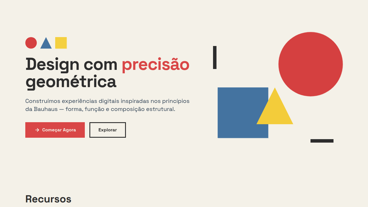
The Bauhaus didn't just teach design — it rewired how we think about visual communication. Founded by Walter Gropius in Weimar in 1919, the school collapsed the boundary between fine art and functional craft. Kandinsky brought spiritual geometry. Klee brought playful systems. Together they built a vocabulary of circles, grids, and primary color that still echoes in every design token we ship today. Form-follows-function wasn't a slogan — it was a survival mechanism. Strip the ornament, reveal the structure. That ethos translated almost perfectly into digital interfaces decades later: clear hierarchy, intentional whitespace, type as architecture. The Bauhaus masters would have loved component libraries. Then risograph entered the conversation. That beautiful, imperfect printing process — with its misregistration, grain, and limited ink palette — gave Bauhaus geometry something it desperately needed: warmth. Suddenly those rigid circles and rectangles breathed. The revival isn't nostalgia. It's correction. Clean structure plus analog texture equals something that feels both rigorous and human. That tension is the whole point.
When to Use
Reach for this when the project demands intellectual credibility without coldness. Art galleries that want to feel contemporary but grounded. Design schools communicating their own values. Creative agencies tired of the same sans-serif minimalism. Cultural institutions bridging historical weight with modern accessibility. It works when your audience appreciates intentionality — when they'll notice the grid, respect the restraint, and feel the texture. Not for brands that need to shout. Perfect for those confident enough to whisper with precision.
Design Principles
- Geometric primitives as primary compositional elements — circles, triangles, rectangles doing the heavy lifting instead of decoration
- Strict limited palette (3-4 colors max) with deliberate overlap zones where risograph-style ink mixing creates accidental beauty
- Asymmetric balance over centered symmetry — tension holds attention longer than comfort
- Visible texture and grain as a counterweight to geometric precision — perfection is sterile, controlled imperfection is alive
- Typography as structural element, not afterthought — letterforms participate in the composition with the same weight as shape
DESIGN.md
---
version: "alpha"
name: "Bauhaus / Risograph Modern"
description: "Bauhaus risograph modern interface. Ideal for landing pages, saas. AI-ready template."
colors:
  primary: "#F4F1E8"
  secondary: "#2D2D2D"
  tertiary: "#D94646"
  neutral: "#4A7BA7"
  surface: "#F4D03F"
  accent: "#2E4053"
typography:
  h1:
    fontFamily: geometric sans-serif --paper-bg: #F4F1E8
    fontSize: 2.25rem
    fontWeight: 700
  body-md:
    fontFamily: geometric sans-serif --paper-bg: #F4F1E8
    fontSize: 1rem
    fontWeight: 400
  label-caps:
    fontFamily: geometric sans-serif --paper-bg: #F4F1E8
    fontSize: 0.75rem
    fontWeight: 500
components:
  button-primary:
    backgroundColor: "{colors.primary}"
    textColor: "{colors.neutral}"
    padding: 12px
---

## Overview

Bauhaus risograph modern interface. Ideal for landing pages, saas. AI-ready template. The Bauhaus didn't just teach design — it rewired how we think about visual communication. Founded by Walter Gropius in Weimar in 1919, the school collapsed the boundary between fine art and functional craft. Kandinsky brought spiritual geometry. Klee brought playful systems. Together they built a vocabulary of circles, grids, and primary color that still echoes in every design token we ship today.

Form-follows-function wasn't a slogan — it was a survival mechanism. Strip the ornament, reveal the structure. That ethos translated almost perfectly into digital interfaces decades later: clear hierarchy, intentional whitespace, type as architecture. The Bauhaus masters would have loved component libraries.

Then risograph entered the conversation. That beautiful, imperfect printing process — with its misregistration, grain, and limited ink palette — gave Bauhaus geometry something it desperately needed: warmth. Suddenly those rigid circles and rectangles breathed. The revival isn't nostalgia. It's correction. Clean structure plus analog texture equals something that feels both rigorous and human. That tension is the whole point.

- Density: 5/10 — Balanced
- Variance: 2/10 — Structured
- Motion: 6/10 — Expressive

- **Style:** Geometric, Primary-Colors, Functional, Modern
- **Keywords:** Geometric shapes, limited color palette, Bauhaus composition, grid-based, modern retro, structural, analytical, constructivist
- **Era:** 1920s Bauhaus + Modern
- **Light/Dark:** ✓ Full / ✓ Full

## Colors

- **Warm Paper** (#F4F1E8) — Primary surface or dominant color
- **Charcoal** (#2D2D2D) — Dark surface, primary background
- **Bauhaus Red** (#D94646) — Error states, destructive actions
- **Steel Blue** (#4A7BA7) — Accent highlight, links and focus states
- **Bauhaus Yellow** (#F4D03F) — Warning states, attention indicators
- **Dark Slate** (#2E4053) — Deep contrast surface
- **Cool Grey** (#95A5A6) — Secondary text, borders, muted elements


## Typography

- **Display / Hero:** geometric sans-serif --paper-bg: #F4F1E8 — Weight 700, tight tracking, used for headline impact
- **Body:** geometric sans-serif --paper-bg: #F4F1E8 — Weight 400, 16px/1.6 line-height, max 72ch per line
- **UI Labels / Captions:** geometric sans-serif --paper-bg: #F4F1E8 — 0.875rem, weight 500, slight letter-spacing
- **Monospace:** JetBrains Mono — Used for code, metadata, and technical values

Scale:
- Hero: clamp(2.5rem, 5vw, 4rem)
- H1: 2.25rem
- H2: 1.5rem
- Body: 1rem / 1.6
- Small: 0.875rem


## Layout

- **Grid:** CSS Grid primary. Max-width containment: 1280px centered with 1.5rem side padding.
- **Spacing rhythm:** Balanced. Base unit: 0.5rem (8px).
- **Section vertical gaps:** clamp(4rem, 8vw, 8rem).
- **Hero layout:** Split-screen (text left, visual right).
- **Feature sections:** Zig-zag alternating text+image rows. No 3-equal-columns.
- **Mobile collapse:** All multi-column layouts collapse below 768px. No horizontal overflow.
- **z-index contract:** base (0) / sticky-nav (100) / overlay (200) / modal (300) / toast (500).


## Elevation & Depth

Flat graphic lighting, slight misregistration effect, geometric shape animations, grid-based reveals, bold shape transitions

- **Physics:** Spring — stiffness 120, damping 20. Confident, weighted transitions.
- **Entry animations:** Fade + translate-Y (16px → 0) over 480ms ease-out. Staggered cascades for lists: 100ms between items.
- **Hover states:** Scale(1.03) + shadow lift over 200ms.
- **Page transitions:** Fade + slide (300ms).
- **Performance:** Only transform and opacity animated. No layout-triggering properties.


## Shapes

Base corner radius: 8px. See rounded tokens in front matter for the full scale.


## Components

- **Primary Button:** Subtly rounded (0.5rem) shape. Accent color fill. Hover: 8% darken + subtle lift shadow. Active: -1px translate tactile press. Font weight 600. No outer glows.
- **Secondary / Ghost Button:** Outline variant. 1.5px border in muted color. Text in primary color. Hover: subtle background fill.
- **Cards:** Subtly rounded (0.5rem) corners. Surface background. Subtle shadow (0 2px 12px rgba(0,0,0,0.06)). 1px border stroke.
- **Inputs:** Label above input. 1px border stroke. Focus ring: 2px accent color offset 2px. Error text below in semantic red. No floating labels.
- **Navigation:** Primary surface background. Active item: accent color indicator. Font weight 500 when active.
- **Skeletons:** Shimmer animation matching component dimensions. No circular spinners.
- **Empty States:** Icon-based composition with descriptive text and action button.


## Do's and Don'ts

- No emojis in UI — use icon system only (Lucide, Heroicons)
- No pure black (#000000) — use off-black or charcoal variants
- No oversaturated accent colors (saturation cap: 80%)
- No 3-column equal-width feature layouts — use zig-zag or asymmetric grid
- No `h-screen` — use `min-h-[100dvh]`
- No AI copywriting clichés: "Elevate", "Seamless", "Unleash", "Next-Gen"
- No broken external image links — use picsum.photos or inline SVG
- No generic lorem ipsum in demos

- Do Geometric shapes dominant
- Do Limited palette (3-4 colors)
- Do Grid-based layout
- Do Bauhaus principles
- Do Misregistration subtle
- Do Constructivist feel


## Use Case

Landing pages, SaaS
Technical Specs
CSS
display: grid strict, clip-path: circle()/polygon(), background: #F4F1E8, color: limited palette, mix-blend-mode: multiply for overlaps, transform: slight misalignment, font-family: geometric sans-serif
Variables
--paper-bg: #F4F1E8, --bauhaus-red: #D94646, --bauhaus-blue: #4A7BA7, --bauhaus-yellow: #F4D03F, --grid-strict: 12-column, --misalign: 1px
Checklist
☐ Geometric shapes dominant, ☐ Limited palette (3-4 colors), ☐ Grid-based layout, ☐ Bauhaus principles, ☐ Misregistration subtle, ☐ Constructivist feel
Colors
Primary
Secondary
Effects
Flat graphic lighting, slight misregistration effect, geometric shape animations, grid-based reveals, bold shape transitions
Light/Dark
✓ Full / ✓ Full
AI Prompt
Act as a Senior Frontend Engineer and Expert UI Designer.
Your task is to code a complete Landing Page on the first attempt.
- Landing Page Theme: <INSERT THEME>
- Sections to add: <INSERT SECTIONS>

Generate the final code immediately following these definitions:

## Style

- **Name:** Bauhaus / Risograph Modern
- **Type:** Geometric, Primary-Colors, Functional, Modern
- **Keywords:** Geometric shapes, limited color palette, Bauhaus composition, grid-based, modern retro, structural, analytical, constructivist
- **Era:** 1920s Bauhaus + Modern
- **Light/Dark:** ✓ Full / ✓ Full

## Color Palette

- **Primary:** Warm Paper #F4F1E8, Charcoal #2D2D2D, Bauhaus Red #D94646, Steel Blue #4A7BA7
- **Secondary:** Bauhaus Yellow #F4D03F, Dark Slate #2E4053, Cool Grey #95A5A6, risograph misregistration

## Visual Effects

Flat graphic lighting, slight misregistration effect, geometric shape animations, grid-based reveals, bold shape transitions

## AI Visual Direction

Design a Bauhaus risograph modern interface. Use: geometric shapes (circles, triangles, rectangles), limited color palette (red, blue, yellow + neutrals), grid-based composition, Bauhaus principles, slight risograph misregistration, constructivist aesthetic.

## CSS Technical

```css
display: grid strict, clip-path: circle()/polygon(), background: #F4F1E8, color: limited palette, mix-blend-mode: multiply for overlaps, transform: slight misalignment, font-family: geometric sans-serif
```

## Design System Variables

```css
--paper-bg: #F4F1E8, --bauhaus-red: #D94646, --bauhaus-blue: #4A7BA7, --bauhaus-yellow: #F4D03F, --grid-strict: 12-column, --misalign: 1px
```

## Implementation Checklist

- ☐ Geometric shapes dominant
- ☐ Limited palette (3-4 colors)
- ☐ Grid-based layout
- ☐ Bauhaus principles
- ☐ Misregistration subtle
- ☐ Constructivist feel

## Execution Rules

1. Strictly follow the defined visual style.
2. Use high-quality inline SVG icons (Heroicons or Lucide style) — NEVER use emojis as icons.
3. Add `cursor-pointer` and smooth `hover` states (transition-all) on all interactive elements.
4. Required Page Structure:
   - Navbar (Logo + Links + CTA)
   - Hero Section (Impactful Headline + Subtitle + 2 buttons + 3D/Abstract visual element via CSS)
   - Features (3 cards with icons)
   - Testimonials (3 cards)
   - Pricing (3 tiers, highlight the middle one)
   - Final CTA
   - Full Footer with social links, privacy policy, terms of use, contact and SEO links.
5. All text content must be in English.
6. The visual must be CLEARLY distinct — do not create a "default Bootstrap" design. Force the use of the provided design system variables.
7. Use `<style>` tags in the head for custom classes (especially for complex backdrop-filter effects and animations) that Tailwind CDN doesn't cover.
8. Full Responsiveness: Layout must adapt perfectly to Mobile, Tablet and Desktop (vertical stack on mobile).
9. Include basic SEO, Viewport and Open Graph meta tags in `<head>`.
10. Footer must contain: Copyright 2026, Secondary navigation links and Social media icons.
11. Make the creative decisions needed to deliver the complete, functional result now.
Related
Last synced: 4/1/2026