Accessible & Ethical
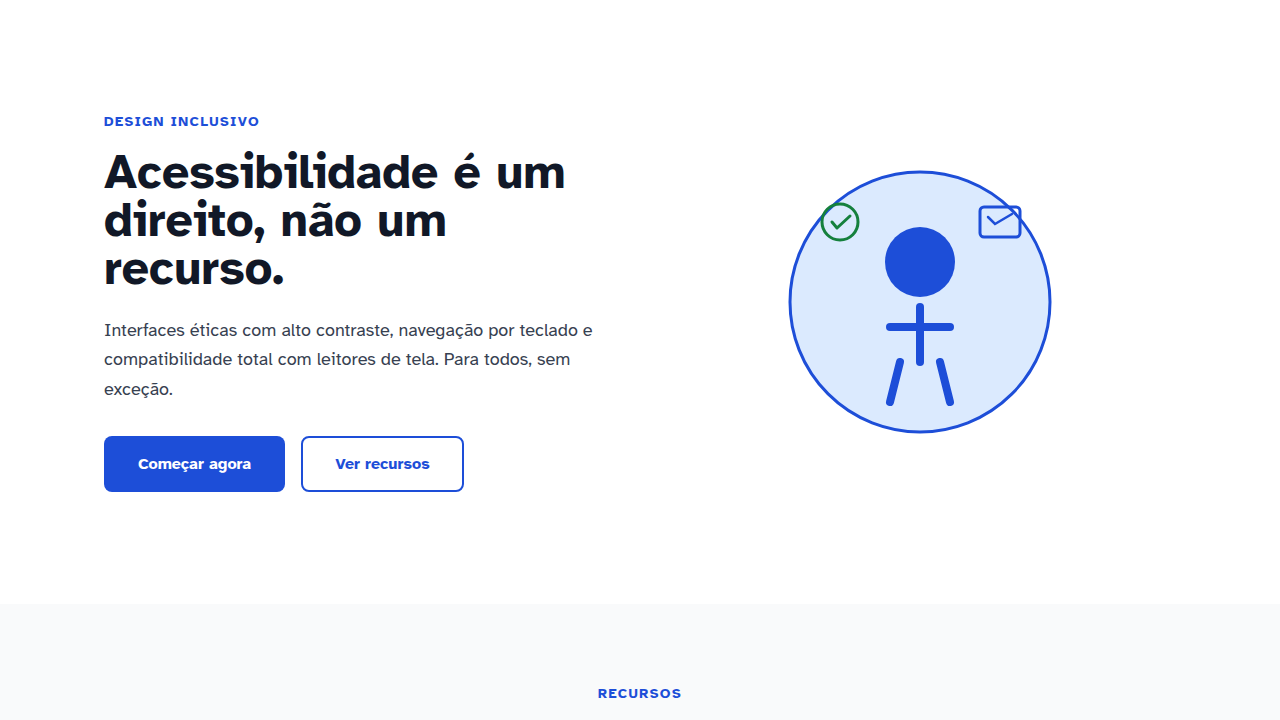
Design with WCAG AAA compliance. Ideal for government, healthcare, education, qualquer site inclusivo. AI-ready template.
Use case: Government, Healthcare, Education, Qualquer site inclusivo
Historical Context
Accessibility on the web started as a whisper. Section 508 in 1998 forced US federal agencies to make their digital stuff usable by people with disabilities, but the private sector mostly shrugged. Then WCAG 1.0 dropped in 1999 — a noble attempt, honestly kind of unreadable, and largely ignored by anyone shipping product. For years, accessibility lived in a sad little checkbox at the bottom of a QA spreadsheet. Nobody designed for it. They retrofitted for it, badly, at the last minute. Everything changed when the lawsuits started. Domino's Pizza. Beyoncé's website. Target. Suddenly 'we'll fix it later' became 'our legal team says fix it now.' The ADA, written decades before the web existed, got interpreted to cover digital experiences. Companies started paying six-figure settlements over missing alt text and inaccessible forms. That woke people up fast. Now we're somewhere more interesting. The best teams don't treat accessibility as compliance — they treat it as a design constraint that makes everything better. Like responsive design before it, accessibility is shifting from 'extra work' to 'this is just how we build things.' WCAG 2.2 and the push toward AAA aren't aspirational anymore. They're the baseline smart teams aim for.
When to Use
Here's the honest answer: AA is the legal floor and it's enough for most products. Hit AA, sleep at night. But if you're building for government, healthcare, or education — go AAA. Those users aren't edge cases, they're your primary audience. The cost difference between AA and AAA is real but overstated. Most of it is color contrast and text sizing decisions you should be making anyway. Where it gets expensive is retroactively fixing a codebase that never considered accessibility. Build it in from day one and the marginal cost of AAA over AA is maybe 10-15% more design time. Worth it.
Design Principles
- Focus states are UI, not decoration — Design your focus rings intentionally. A 3px solid outline with 2px offset in your brand color tells keyboard users exactly where they are. If your focus states look like an afterthought, they are.
- Content hierarchy must survive without color — Remove all color from your interface. Can you still understand the hierarchy? If not, you're relying on a channel that 8% of men literally cannot perceive. Use size, weight, spacing, and position first. Color reinforces, it never carries meaning alone.
- Interactive targets need generous geometry — 44×44px minimum touch targets aren't just a mobile concern. People with motor impairments use mice too. Padding is cheap. Frustration is expensive. Make buttons and links physically easy to hit.
- Reading flow must be logical when linearized — Your screen reader users experience your layout as a single stream. If your visual design uses CSS Grid to reorder content, the DOM order still needs to make narrative sense. Design the reading order first, then arrange it visually.
- Provide multiple paths to every action — Some users can't hover. Some can't click precisely. Some can't see your icon-only buttons. Every critical action needs at least two ways in: keyboard shortcut and click, visible label and ARIA label, gesture and button. Redundancy is a feature.
DESIGN.md
---
version: "alpha"
name: "Accessible & Ethical"
description: "Design with WCAG AAA compliance. Ideal for government, healthcare, education, qualquer site inclusivo. AI-ready template."
colors:
  primary: "#000000"
  secondary: "#333333"
  tertiary: "#0000FF"
  neutral: "#FFFFFF"

typography:
  h1:
    fontFamily: -apple-system, sans-serif
    fontSize: 2.25rem
    fontWeight: 700
  body-md:
    fontFamily: -apple-system, sans-serif
    fontSize: 1rem
    fontWeight: 400
  label-caps:
    fontFamily: -apple-system, sans-serif
    fontSize: 0.75rem
    fontWeight: 500
---

## Overview

Design with WCAG AAA compliance. Ideal for government, healthcare, education, qualquer site inclusivo. AI-ready template. Accessibility on the web started as a whisper. Section 508 in 1998 forced US federal agencies to make their digital stuff usable by people with disabilities, but the private sector mostly shrugged. Then WCAG 1.0 dropped in 1999 — a noble attempt, honestly kind of unreadable, and largely ignored by anyone shipping product. For years, accessibility lived in a sad little checkbox at the bottom of a QA spreadsheet. Nobody designed for it. They retrofitted for it, badly, at the last minute.

Everything changed when the lawsuits started. Domino's Pizza. Beyoncé's website. Target. Suddenly 'we'll fix it later' became 'our legal team says fix it now.' The ADA, written decades before the web existed, got interpreted to cover digital experiences. Companies started paying six-figure settlements over missing alt text and inaccessible forms. That woke people up fast.

Now we're somewhere more interesting. The best teams don't treat accessibility as compliance — they treat it as a design constraint that makes everything better. Like responsive design before it, accessibility is shifting from 'extra work' to 'this is just how we build things.' WCAG 2.2 and the push toward AAA aren't aspirational anymore. They're the baseline smart teams aim for.

- Density: 5/10 — Balanced
- Variance: 4/10 — Moderate
- Motion: 6/10 — Expressive

- **Style:** Inclusive, High-Contrast, Semantic, Keyboard-Friendly
- **Keywords:** High contrast, large text (16px+), keyboard navigation, screen reader friendly, WCAG compliant, focus state, semantic
- **Era:** Universal
- **Light/Dark:** ✓ Full / ✓ Full

## Colors

- Palette derived from style keywords and era context


## Typography

- **Display / Hero:** System UI stack (-apple-system, sans-serif) — Weight 700, tight tracking, used for headline impact
- **Body:** System UI stack (-apple-system, sans-serif) — Weight 400, 16px/1.6 line-height, max 72ch per line
- **UI Labels / Captions:** System UI stack (-apple-system, sans-serif) — 0.875rem, weight 500, slight letter-spacing
- **Monospace:** JetBrains Mono — Used for code, metadata, and technical values

Scale:
- Hero: clamp(2.5rem, 5vw, 4rem)
- H1: 2.25rem
- H2: 1.5rem
- Body: 1rem / 1.6
- Small: 0.875rem


## Layout

- **Grid:** CSS Grid primary. Max-width containment: 1280px centered with 1.5rem side padding.
- **Spacing rhythm:** Balanced. Base unit: 0.5rem (8px).
- **Section vertical gaps:** clamp(4rem, 8vw, 8rem).
- **Hero layout:** Split-screen (text left, visual right).
- **Feature sections:** Zig-zag alternating text+image rows. No 3-equal-columns.
- **Mobile collapse:** All multi-column layouts collapse below 768px. No horizontal overflow.
- **z-index contract:** base (0) / sticky-nav (100) / overlay (200) / modal (300) / toast (500).


## Elevation & Depth

Clear focus rings (3-4px), ARIA labels, skip links, responsive design, reduced motion, 44x44px touch targets

- **Physics:** Spring — stiffness 120, damping 20. Confident, weighted transitions.
- **Entry animations:** Fade + translate-Y (16px → 0) over 480ms ease-out. Staggered cascades for lists: 100ms between items.
- **Hover states:** Scale(1.03) + shadow lift over 200ms.
- **Page transitions:** Fade + slide (300ms).
- **Performance:** Only transform and opacity animated. No layout-triggering properties.


## Shapes

Base corner radius: 4px. See rounded tokens in front matter for the full scale.

## Components

- **Primary Button:** Subtly rounded (0.5rem) shape. Accent color fill. Hover: 8% darken + subtle lift shadow. Active: -1px translate tactile press. Font weight 600. No outer glows.
- **Secondary / Ghost Button:** Outline variant. 1.5px border in muted color. Text in primary color. Hover: subtle background fill.
- **Cards:** Subtly rounded (0.5rem) corners. Surface background. Subtle shadow (0 2px 12px rgba(0,0,0,0.06)). 1px border stroke.
- **Inputs:** Label above input. 1px border stroke. Focus ring: 2px accent color offset 2px. Error text below in semantic red. No floating labels.
- **Navigation:** Primary surface background. Active item: accent color indicator. Font weight 500 when active.
- **Skeletons:** Shimmer animation matching component dimensions. No circular spinners.
- **Empty States:** Icon-based composition with descriptive text and action button.


## Do's and Don'ts

- No emojis in UI — use icon system only (Lucide, Heroicons)
- No pure black (#000000) — use off-black or charcoal variants
- No oversaturated accent colors (saturation cap: 80%)
- No 3-column equal-width feature layouts — use zig-zag or asymmetric grid
- No `h-screen` — use `min-h-[100dvh]`
- No AI copywriting clichés: "Elevate", "Seamless", "Unleash", "Next-Gen"
- No broken external image links — use picsum.photos or inline SVG
- No generic lorem ipsum in demos

- Do WCAG AAA verified
- Do 7:1+ contrast checked
- Do Keyboard navigation tested
- Do Screen reader tested
- Do Focus visible 3-4px
- Do Semantic HTML used
- Do Touch targets 44x44px


## Use Case

Government, Healthcare, Education, Qualquer site inclusivo
Technical Specs
CSS
color-contrast: 7:1+, font-size: 16px+, outline: 3-4px on :focus-visible, aria-label, role attributes, @media (prefers-reduced-motion), touch-target: 44x44px, cursor: pointer
Variables
--contrast-ratio: 7:1, --font-size-min: 16px, --focus-ring: 3-4px, --touch-target: 44x44px, --wcag-level: AAA, --keyboard-accessible: true, --sr-tested: true
Checklist
☐ WCAG AAA verified, ☐ 7:1+ contrast checked, ☐ Keyboard navigation tested, ☐ Screen reader tested, ☐ Focus visible 3-4px, ☐ Semantic HTML used, ☐ Touch targets 44x44px
Colors
Effects
Clear focus rings (3-4px), ARIA labels, skip links, responsive design, reduced motion, 44x44px touch targets
Light/Dark
✓ Full / ✓ Full
AI Prompt
Act as a Senior Frontend Engineer and Expert UI Designer.
Your task is to code a complete Landing Page on the first attempt.
- Landing Page Theme: <INSERT THEME>
- Sections to add: <INSERT SECTIONS>

Generate the final code immediately following these definitions:

## Style

- **Name:** Accessible & Ethical
- **Type:** Inclusive, High-Contrast, Semantic, Keyboard-Friendly
- **Keywords:** High contrast, large text (16px+), keyboard navigation, screen reader friendly, WCAG compliant, focus state, semantic
- **Era:** Universal
- **Light/Dark:** ✓ Full / ✓ Full

## Color Palette

- **Primary:** WCAG AA/AAA (4.5:1 min), simple primary, clear secondary, high luminosity (7:1+)
- **Secondary:** Symbol-based colors (not color-only), supporting patterns, inclusive combinations

## Visual Effects

Clear focus rings (3-4px), ARIA labels, skip links, responsive design, reduced motion, 44x44px touch targets

## AI Visual Direction

Design with WCAG AAA compliance. Include: high contrast (7:1+), large text (16px+), keyboard navigation, screen reader compatibility, focus states visible (3-4px ring), semantic HTML, ARIA labels, skip links, reduced motion support (prefers-reduced-motion), 44x44px touch targets.

## CSS Technical

```css
color-contrast: 7:1+, font-size: 16px+, outline: 3-4px on :focus-visible, aria-label, role attributes, @media (prefers-reduced-motion), touch-target: 44x44px, cursor: pointer
```

## Design System Variables

```css
--contrast-ratio: 7:1, --font-size-min: 16px, --focus-ring: 3-4px, --touch-target: 44x44px, --wcag-level: AAA, --keyboard-accessible: true, --sr-tested: true
```

## Implementation Checklist

- ☐ WCAG AAA verified
- ☐ 7:1+ contrast checked
- ☐ Keyboard navigation tested
- ☐ Screen reader tested
- ☐ Focus visible 3-4px
- ☐ Semantic HTML used
- ☐ Touch targets 44x44px

## Execution Rules

1. Strictly follow the defined visual style.
2. Use high-quality inline SVG icons (Heroicons or Lucide style) — NEVER use emojis as icons.
3. Add `cursor-pointer` and smooth `hover` states (transition-all) on all interactive elements.
4. Required Page Structure:
   - Navbar (Logo + Links + CTA)
   - Hero Section (Impactful Headline + Subtitle + 2 buttons + 3D/Abstract visual element via CSS)
   - Features (3 cards with icons)
   - Testimonials (3 cards)
   - Pricing (3 tiers, highlight the middle one)
   - Final CTA
   - Full Footer with social links, privacy policy, terms of use, contact and SEO links.
5. All text content must be in English.
6. The visual must be CLEARLY distinct — do not create a "default Bootstrap" design. Force the use of the provided design system variables.
7. Use `<style>` tags in the head for custom classes (especially for complex backdrop-filter effects and animations) that Tailwind CDN doesn't cover.
8. Full Responsiveness: Layout must adapt perfectly to Mobile, Tablet and Desktop (vertical stack on mobile).
9. Include basic SEO, Viewport and Open Graph meta tags in `<head>`.
10. Footer must contain: Copyright 2026, Secondary navigation links and Social media icons.
11. Make the creative decisions needed to deliver the complete, functional result now.
Related
Last synced: 4/1/2026