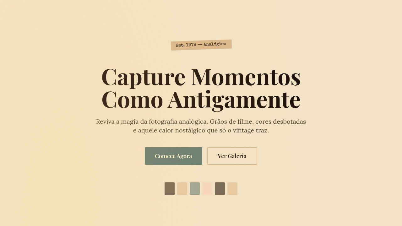
Vintage Analog / Retro Film
Design with vintage analog film aesthetic. Ideal for landing pages, saas. AI-ready template.
Use case: Landing pages, SaaS
Historical Context
There's a reason the lo-fi hip hop girl never stopped studying. She became shorthand for a feeling — warmth in a cold digital landscape. The analog revival in design didn't start with nostalgia; it started with distrust. When everything on screen became too clean, too vector-perfect, designers reached backward. Film grain. VHS tracking lines. The soft blur of a cassette dub copied three times over. These artifacts weren't flaws anymore — they were proof of human touch. The 2010s YouTube lo-fi explosion made it mainstream, but the roots go deeper. Graphic designers in the early 2000s were already scanning old Polaroids, layering halftone dots over digital layouts, trying to make pixels feel less sterile. Then AI-generated imagery arrived and the need intensified. When any machine can produce a flawless render, imperfection becomes the new authenticity. A slightly blown-out highlight, a color shift toward amber — these say "a person was here." Today the aesthetic lives everywhere: album covers, indie brand packaging, editorial photography sites. It's not about faking the past. It's about borrowing its texture to make the present feel less disposable.
When to Use
Reach for analog warmth when your project needs to feel handmade, intimate, or countercultural. Music labels, vinyl reissues, independent film — obvious fits. But it works just as well for photography portfolios that want to distance themselves from stock-photo sterility, or indie DTC brands selling candles, zines, or vintage clothing. Use it when your audience values authenticity over polish. Skip it for corporate SaaS, healthcare, or anything requiring clinical trust — grain reads as carelessness in those contexts.
Design Principles
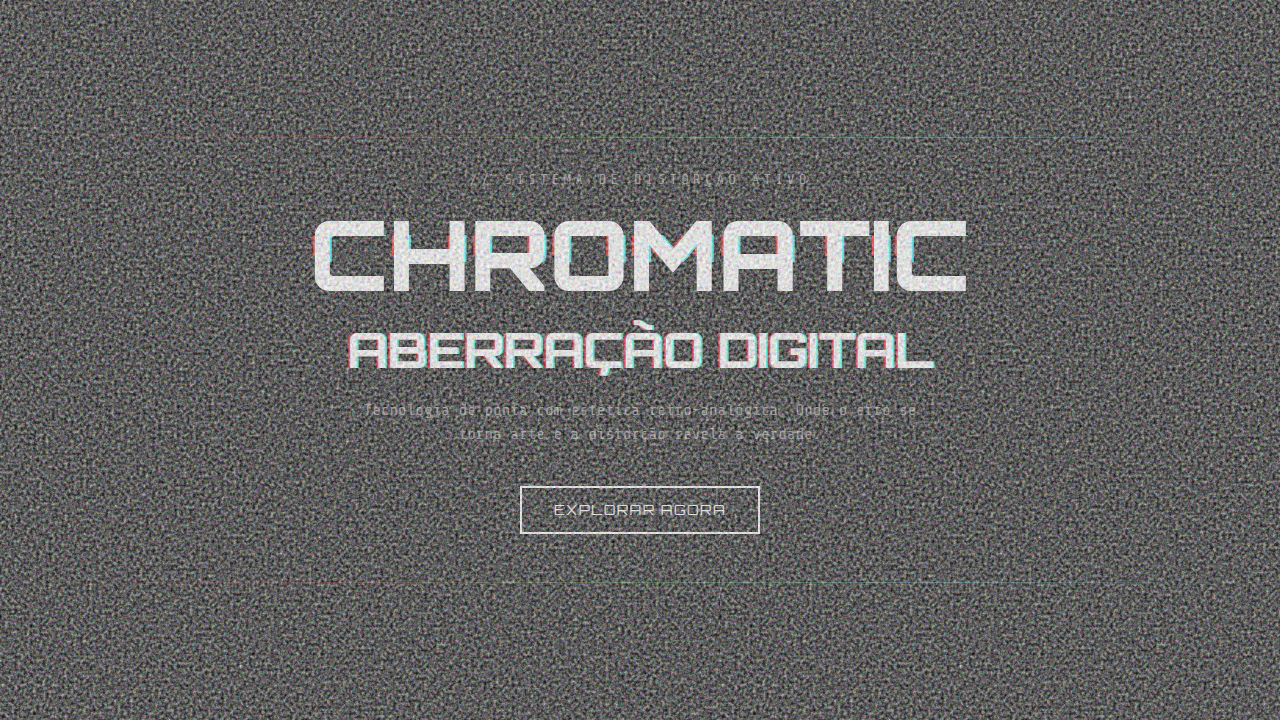
- Imperfection is intentional — every grain particle, color bleed, and soft focus should feel placed, not random. Controlled chaos.
- Warm color science over cool — shift toward amber, ochre, and desaturated reds. Kill the blue cast. Analog never looked like a monitor.
- Texture is structure — grain and noise aren't decoration layered on top. They're load-bearing. Remove them and the design collapses into generic flatness.
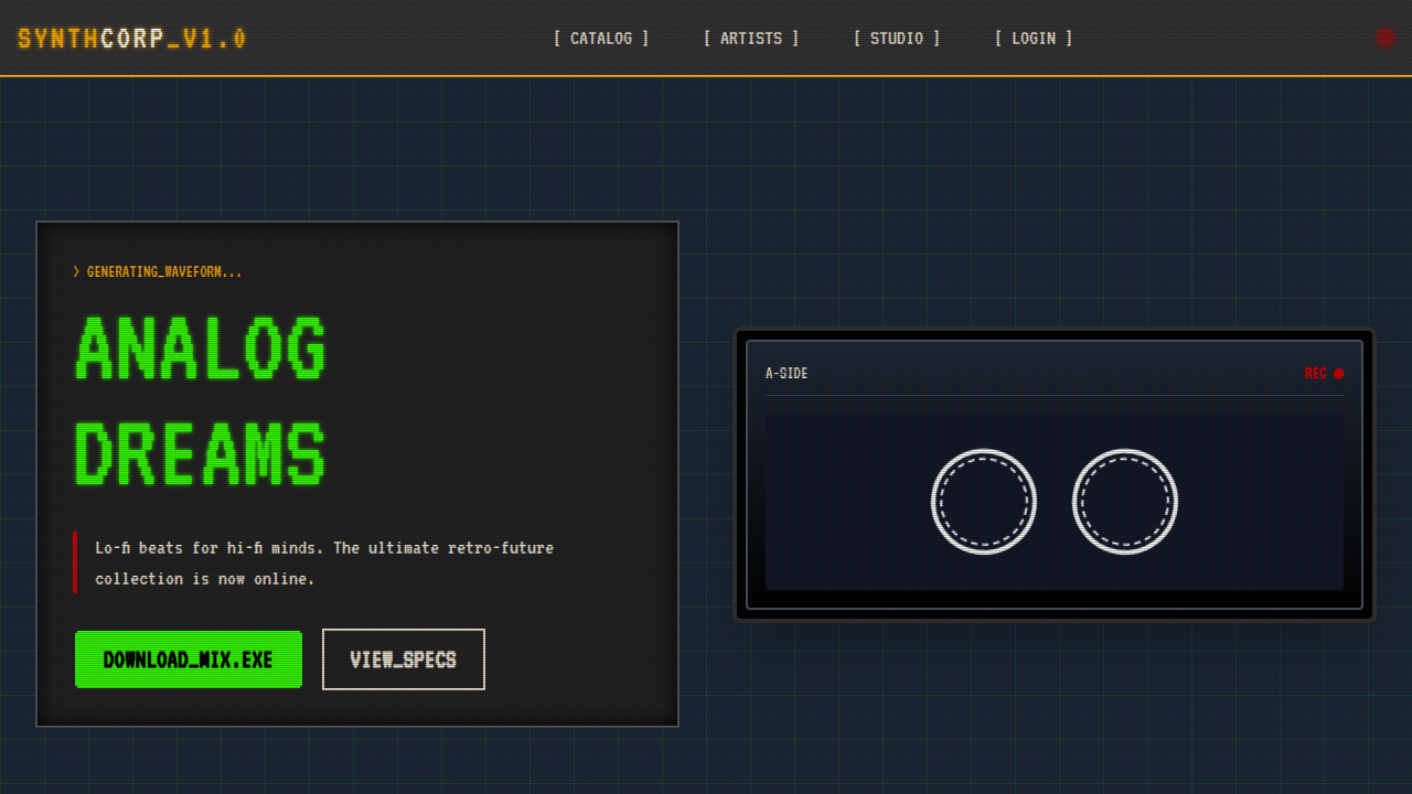
- Respect the source era — don't mix VHS artifacts with daguerreotype tones. Pick a decade. A 1970s Kodachrome palette and a 1990s camcorder glitch are different languages.
- Restraint over maximalism — one or two analog effects per composition. Stack too many and you get a Instagram filter from 2012, not a design system.
Technical Specs
Colors
Primary
Effects
Film grain overlay, VHS tracking effect, polaroid shake, fade-in transitions, light leak animations
Light/Dark
✓ Full / ◐ Partial
Related
Last synced: 4/1/2026