Utilitarian
Utilitarian landing page stripped to absolute essentials. Ideal for sinalética, interfaces industriais, etiquetas de roupa, design de embalagens informativas. AI-ready template.
Use case: Sinalética, Interfaces industriais, Etiquetas de roupa, Design de embalagens informativas
Historical Context
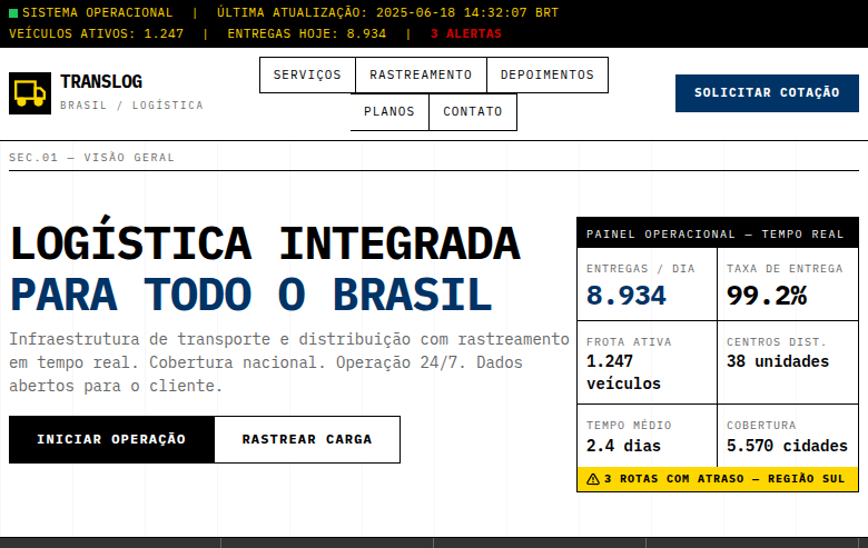
Utilitarian design didn't emerge from art schools or manifestos — it came from necessity. Military equipment manuals, factory floor signage, government forms. Places where misunderstanding a label could get someone killed. The aesthetic wasn't chosen; it was what remained after everything unnecessary was stripped away. The lineage traces through Soviet constructivism, Dieter Rams at Braun, and the anonymous designers who created NATO symbology and industrial safety standards. These weren't people concerned with beauty. They were solving communication problems under constraint — limited ink, bad lighting, stressed operators, zero tolerance for ambiguity. What makes utilitarian design distinct from mere minimalism is its indifference to taste. Minimalism still cares about looking good. Utilitarian design cares about working. The grid exists because alignment reduces cognitive load. The type is monospaced because columns need to scan vertically. The color is functional — red means stop, not 'accent.' Every decision answers to the task, never to the portfolio.
When to Use
When your users are there to accomplish something and any visual flourish is a speed bump. Developer tools, CLI interfaces, dashboards monitoring critical systems, military and government applications where clarity is non-negotiable. Products where the audience actively distrusts polish — where looking 'designed' signals that you spent time on the wrong things. No-nonsense B2B tools, industrial control panels, infrastructure software. If your users would describe the ideal interface as 'it just gets out of my way,' this is your system.
Design Principles
- Function dictates form — every element must justify its existence through utility, not aesthetics
- Information density over white space — respect the operator's time by showing what matters without forcing clicks
- Systematic color with zero decoration — color is a data channel, never ornament. Reserve it for status, severity, and state
- Monospace and tabular alignment — text is data. Columns align, numbers right-justify, and scanning is vertical
- Visible hierarchy through weight and scale alone — no borders, cards, or shadows when typographic contrast solves the problem
Technical Specs
Colors
Primary
Secondary
Effects
No decorative elements whatsoever, strict rigid grid (12-column), monospace typography only, visible grid lines as design element, high information density, minimal padding, functional color coding (red=alert, yellow=warning, blue=info), no animations except functional state changes
Light/Dark
✓ Full / ✓ Full
Related
Last synced: 4/1/2026