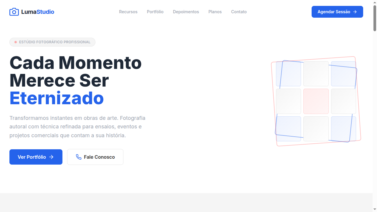
3x3 Grid Design
3x3 grid-based landing page where content is organized in nine uniform boxes. Ideal for feeds de instagram, moodboards, portfólios, design de vestuário/boutiques. AI-ready template.
Use case: Feeds de Instagram, Moodboards, Portfólios, Design de vestuário/boutiques
Historical Context
The 3x3 grid is one of those layouts that feels inevitable — like someone discovered it rather than invented it. Its roots trace back to the Rule of Thirds in classical painting and photography, where dividing a canvas into nine equal zones created natural focal points. But in graphic design, the nine-box grid became a workhorse of Swiss modernism. Müller-Brockmann and his contemporaries used modular grids obsessively, and the 3x3 was the simplest expression of that philosophy: enough cells to create rhythm, few enough to maintain clarity. What makes it endure in digital design isn't nostalgia — it's math. Nine is the sweet spot where content density meets scannability. Two columns feel sparse, four feel like a spreadsheet. Three columns, three rows: the eye knows exactly where to go. The grid imposes democracy on content — every box gets equal weight, equal breathing room. No hierarchy games, no visual shouting. Just nine honest containers doing their job. The web didn't invent this layout, but CSS Grid finally made it trivial to implement properly. Before that, we were faking it with floats and clearfixes — a crime against semantics that lasted a decade too long.
When to Use
Deploy the 3x3 when you have exactly nine items of equal importance — or when you can edit ruthlessly to get there. Feature showcases where no single feature outranks another. Comparison matrices where parity matters. Portfolio grids where the work speaks uniformly. Product catalogs at category level. Kill it immediately if your content count is seven or eleven — a grid with orphan cells looks broken, not intentional. The 3x3 demands content discipline. If you can't commit to nine, pick a different layout.
Design Principles
- Uniform spacing is non-negotiable — the gap between cells must be identical horizontally and vertically, or the entire modular logic collapses into visual noise
- Each cell must carry equal visual weight through consistent padding, type size, and media dimensions — one oversized thumbnail destroys the democratic contract of the grid
- Responsive collapse should follow a 3→2→1 column sequence, never 3→1 directly — the intermediate step preserves rhythm on tablets where most grids fall apart
- Content within cells needs a strict internal hierarchy: one media element, one heading, one descriptor maximum — the grid provides structure, not permission to overload
- Outer margins must equal or exceed the inter-cell gap — cramming a 3x3 edge-to-edge against viewport boundaries makes the grid feel trapped rather than composed
Technical Specs
Colors
Primary
Secondary
Effects
Strict 3x3 CSS grid layout, uniform gap spacing (16px), subtle hover scale (1.02) on grid items, clean thin borders between cells, smooth fade-in on scroll for each cell, minimal shadow on hover
Light/Dark
✓ Full / ✓ Full
Related


Last synced: 4/1/2026