Trust & Authority
Trust-focused landing page. Ideal for marketing, conversão, lead gen. AI-ready template.
Use case: Marketing, Conversion, Lead gen
Historical Context
Trust on the web used to be simple — a padlock icon, maybe a VeriSign seal slapped in the footer. Nobody questioned it. Then regulated industries showed up with real stakes: HIPAA compliance, SOC 2 audits, bar association memberships. Suddenly trust wasn't decorative. It was contractual. The visual language evolved fast. Badges moved from pixelated GIFs to refined SVG marks with specific color palettes tied to certifying bodies. Healthcare sites started displaying board certifications inline with provider bios. Financial platforms embedded FDIC and SIPC logos not as afterthoughts but as architectural elements — positioned with the same intentionality as a primary CTA. What's interesting about the 2020s approach is the shift from passive display to active proof. Static badges gave way to case studies with hard metrics, named credentials with verifiable links, and third-party review scores pulled live. The best implementations treat authority signals as content, not chrome. They earn space in the layout because they do real work — reducing friction at decision points where stakes are highest.
When to Use
Deploy trust patterns when your user faces a high-consequence decision — submitting medical records, transferring funds, signing agreements, or committing to enterprise contracts. If the cost of being wrong is significant, credibility signals aren't optional. Also reach for these when entering a new market where brand recognition is zero, when competitors have established trust and you're the challenger, or when your conversion data shows drop-off at commitment points. Skip them on low-stakes flows — overusing badges dilutes their power.
Design Principles
- Place credentials at decision points, not in graveyards — a badge next to a form submit button works harder than one buried in the footer.
- Use verifiable signals over decorative ones — link certifications to their source, display real metrics from real engagements, name actual humans with actual titles.
- Match visual weight to actual authority — a Fortune 500 client logo grid earns prominent placement; a self-awarded 'best in class' badge deserves nothing.
- Respect the typography hierarchy — credentials and case study metrics should feel like editorial content, set in your type system, not like foreign objects pasted from a partner's brand kit.
- Restrain the impulse to over-prove — three strong trust signals outperform twelve weak ones every time. Curate ruthlessly.
DESIGN.md
---
version: "alpha"
name: "Trust & Authority"
description: "Trust-focused landing page. Ideal for marketing, conversão, lead gen. AI-ready template."
colors:
  primary: "#1A1A1A"
  secondary: "#4A4A4A"
  tertiary: "#0066FF"
  neutral: "#FFFFFF"
typography:
  h1:
    fontFamily: System UI stack
    fontSize: 2.25rem
    fontWeight: 700
  body-md:
    fontFamily: System UI stack
    fontSize: 1rem
    fontWeight: 400
  label-caps:
    fontFamily: System UI stack
    fontSize: 0.75rem
    fontWeight: 500
---

## Overview

Trust-focused landing page. Ideal for marketing, conversão, lead gen. AI-ready template. Trust on the web used to be simple — a padlock icon, maybe a VeriSign seal slapped in the footer. Nobody questioned it. Then regulated industries showed up with real stakes: HIPAA compliance, SOC 2 audits, bar association memberships. Suddenly trust wasn't decorative. It was contractual.

The visual language evolved fast. Badges moved from pixelated GIFs to refined SVG marks with specific color palettes tied to certifying bodies. Healthcare sites started displaying board certifications inline with provider bios. Financial platforms embedded FDIC and SIPC logos not as afterthoughts but as architectural elements — positioned with the same intentionality as a primary CTA.

What's interesting about the 2020s approach is the shift from passive display to active proof. Static badges gave way to case studies with hard metrics, named credentials with verifiable links, and third-party review scores pulled live. The best implementations treat authority signals as content, not chrome. They earn space in the layout because they do real work — reducing friction at decision points where stakes are highest.

- Density: 5/10 — Balanced
- Variance: 4/10 — Moderate
- Motion: 6/10 — Expressive

- **Style:** Landing Page
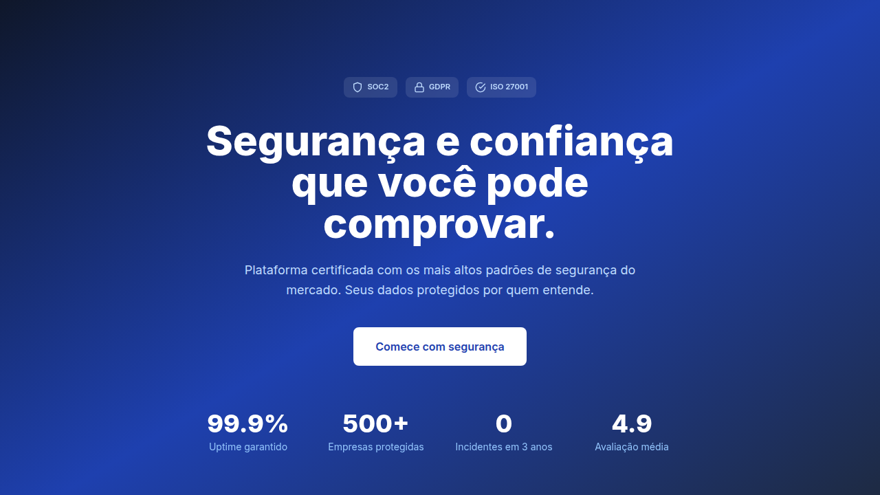
- **Keywords:** Certificates/badges displayed, expert credentials, case studies with metrics, before/after comparisons, industry recognition, security badges
- **Era:** 2020s Modern
- **Light/Dark:** ✓ Full / ✓ Full

## Colors

- Palette derived from style keywords and era context


## Typography

- **Display / Hero:** System UI stack (-apple-system, sans-serif) — Weight 700, tight tracking, used for headline impact
- **Body:** System UI stack (-apple-system, sans-serif) — Weight 400, 16px/1.6 line-height, max 72ch per line
- **UI Labels / Captions:** System UI stack (-apple-system, sans-serif) — 0.875rem, weight 500, slight letter-spacing
- **Monospace:** JetBrains Mono — Used for code, metadata, and technical values

Scale:
- Hero: clamp(2.5rem, 5vw, 4rem)
- H1: 2.25rem
- H2: 1.5rem
- Body: 1rem / 1.6
- Small: 0.875rem


## Layout

- **Grid:** CSS Grid primary. Max-width containment: 1280px centered with 1.5rem side padding.
- **Spacing rhythm:** Balanced. Base unit: 0.5rem (8px).
- **Section vertical gaps:** clamp(4rem, 8vw, 8rem).
- **Hero layout:** Split-screen (text left, visual right).
- **Feature sections:** Zig-zag alternating text+image rows. No 3-equal-columns.
- **Mobile collapse:** All multi-column layouts collapse below 768px. No horizontal overflow.
- **z-index contract:** base (0) / sticky-nav (100) / overlay (200) / modal (300) / toast (500).


## Elevation & Depth

Badge hover effects, metric pulse animations, certificate carousel, smooth stat reveal

- **Physics:** Spring — stiffness 120, damping 20. Confident, weighted transitions.
- **Entry animations:** Fade + translate-Y (16px → 0) over 480ms ease-out. Staggered cascades for lists: 100ms between items.
- **Hover states:** Scale(1.03) + shadow lift over 200ms.
- **Page transitions:** Fade + slide (300ms).
- **Performance:** Only transform and opacity animated. No layout-triggering properties.


## Shapes

Base corner radius: 8px. See rounded tokens in front matter for the full scale.


## Components

- **Primary Button:** Subtly rounded (0.5rem) shape. Accent color fill. Hover: 8% darken + subtle lift shadow. Active: -1px translate tactile press. Font weight 600. No outer glows.
- **Secondary / Ghost Button:** Outline variant. 1.5px border in muted color. Text in primary color. Hover: subtle background fill.
- **Cards:** Subtly rounded (0.5rem) corners. Surface background. Subtle shadow (0 2px 12px rgba(0,0,0,0.06)). 1px border stroke.
- **Inputs:** Label above input. 1px border stroke. Focus ring: 2px accent color offset 2px. Error text below in semantic red. No floating labels.
- **Navigation:** Primary surface background. Active item: accent color indicator. Font weight 500 when active.
- **Skeletons:** Shimmer animation matching component dimensions. No circular spinners.
- **Empty States:** Icon-based composition with descriptive text and action button.


## Do's and Don'ts

- No emojis in UI — use icon system only (Lucide, Heroicons)
- No pure black (#000000) — use off-black or charcoal variants
- No oversaturated accent colors (saturation cap: 80%)
- No 3-column equal-width feature layouts — use zig-zag or asymmetric grid
- No `h-screen` — use `min-h-[100dvh]`
- No AI copywriting clichés: "Elevate", "Seamless", "Unleash", "Next-Gen"
- No broken external image links — use picsum.photos or inline SVG
- No generic lorem ipsum in demos

- Do Security badges visible
- Do Certifications verified
- Do Metrics with sources
- Do Professional imagery
- Do Guarantee clearly stated
- Do Contact info accessible


## Use Case

Marketing, Conversion, Lead gen
Technical Specs
CSS
badge grid layout, shield icons, lock icons for security, certificate styling, metric cards with icons, professional color scheme (blue/grey), subtle shadows for depth
Variables
--badge-height: 48px, --trust-color: #1E40AF, --security-green: #059669, --card-shadow: 0 4px 6px rgba(0,0,0,0.1), --metric-highlight: #F59E0B
Checklist
☐ Security badges visible, ☐ Certifications verified, ☐ Metrics with sources, ☐ Professional imagery, ☐ Guarantee clearly stated, ☐ Contact info accessible
Colors
Effects
Badge hover effects, metric pulse animations, certificate carousel, smooth stat reveal
Light/Dark
✓ Full / ✓ Full
AI Prompt
Act as a Senior Frontend Engineer and Expert UI Designer.
Your task is to code a complete Landing Page on the first attempt.
- Landing Page Theme: <INSERT THEME>
- Sections to add: <INSERT SECTIONS>

Generate the final code immediately following these definitions:

## Style

- **Name:** Trust & Authority
- **Type:** Landing Page
- **Keywords:** Certificates/badges displayed, expert credentials, case studies with metrics, before/after comparisons, industry recognition, security badges
- **Era:** 2020s Modern
- **Light/Dark:** ✓ Full / ✓ Full

## Color Palette

- **Primary:** Professional colors (blue/grey), trust colors, certification badge colors (gold/silver accents)
- **Secondary:** Certificate highlight colors, metric showcase colors, comparison highlight (success green)

## Visual Effects

Badge hover effects, metric pulse animations, certificate carousel, smooth stat reveal

## AI Visual Direction

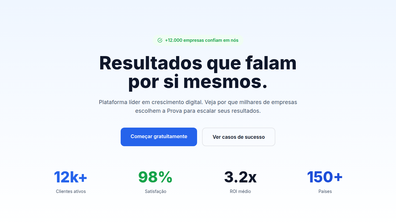
Design a trust-focused landing page. Use: certification badges, security indicators, expert credentials, industry awards, case study metrics, compliance logos (GDPR, SOC2), guarantee badges, professional photography.

## CSS Technical

```css
badge grid layout, shield icons, lock icons for security, certificate styling, metric cards with icons, professional color scheme (blue/grey), subtle shadows for depth
```

## Design System Variables

```css
--badge-height: 48px, --trust-color: #1E40AF, --security-green: #059669, --card-shadow: 0 4px 6px rgba(0,0,0,0.1), --metric-highlight: #F59E0B
```

## Implementation Checklist

- ☐ Security badges visible
- ☐ Certifications verified
- ☐ Metrics with sources
- ☐ Professional imagery
- ☐ Guarantee clearly stated
- ☐ Contact info accessible

## Execution Rules

1. Strictly follow the defined visual style.
2. Use high-quality inline SVG icons (Heroicons or Lucide style) — NEVER use emojis as icons.
3. Add `cursor-pointer` and smooth `hover` states (transition-all) on all interactive elements.
4. Required Page Structure:
   - Navbar (Logo + Links + CTA)
   - Hero Section (Impactful Headline + Subtitle + 2 buttons + 3D/Abstract visual element via CSS)
   - Features (3 cards with icons)
   - Testimonials (3 cards)
   - Pricing (3 tiers, highlight the middle one)
   - Final CTA
   - Full Footer with social links, privacy policy, terms of use, contact and SEO links.
5. All text content must be in English.
6. The visual must be CLEARLY distinct — do not create a "default Bootstrap" design. Force the use of the provided design system variables.
7. Use `<style>` tags in the head for custom classes (especially for complex backdrop-filter effects and animations) that Tailwind CDN doesn't cover.
8. Full Responsiveness: Layout must adapt perfectly to Mobile, Tablet and Desktop (vertical stack on mobile).
9. Include basic SEO, Viewport and Open Graph meta tags in `<head>`.
10. Footer must contain: Copyright 2026, Secondary navigation links and Social media icons.
11. Make the creative decisions needed to deliver the complete, functional result now.
Related
Last synced: 4/1/2026