Conversion-Optimized
Conversion-optimized landing page. Ideal for marketing, conversão, lead gen. AI-ready template.
Use case: Marketing, Conversão, Lead gen
Historical Context
The conversion-optimized page didn't emerge from design theory. It came from A/B tests. Thousands of them. By the mid-2010s, tools like Unbounce, Leadpages, and Instapage had democratized landing page creation, and with that came an obsessive culture of testing every pixel. Designers watched heatmaps like hawks. The result was a ruthless distillation: one page, one goal, one button. Everything else got stripped away. What's interesting is how this functional pressure produced a genuine aesthetic. The single-CTA philosophy forced designers to master hierarchy through typography alone — no navigation bars to lean on, no sidebar distractions. You had a headline, a subhead, maybe a form, and a button. That's it. The constraint bred clarity, and clarity bred a look: generous whitespace, editorial type scales, high-contrast CTAs floating in negative space. By the 2020s, this wasn't just landing page doctrine anymore. SaaS companies adopted it wholesale for signup flows, trial pages, even homepages. The landing page builders didn't just shape a workflow — they shaped an entire design language built on the premise that attention is finite and every element must earn its place.
When to Use
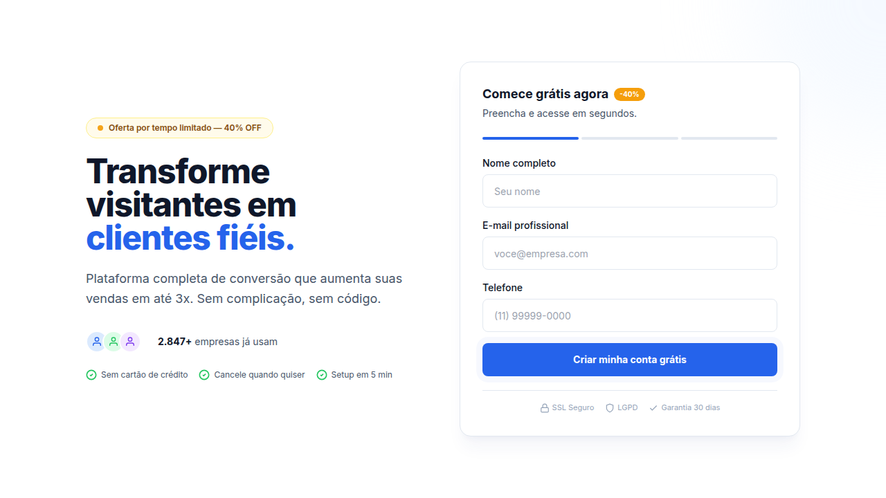
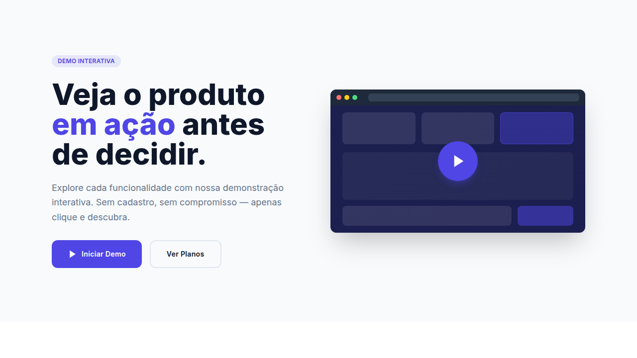
Use this when you have one clear action you need someone to take. Newsletter signups, free trial starts, demo requests — moments where the user's decision is binary. It works because it respects attention. But be honest with yourself: if you're hiding pricing, burying cancellation flows, or using dark patterns to manufacture urgency, you've crossed from persuasion into manipulation. The line is intent. Are you removing friction from a decision they'd make anyway, or engineering consent? Conversion design serves the user when the offer is genuinely good. When it's not, all the whitespace in the world won't save you.
Design Principles
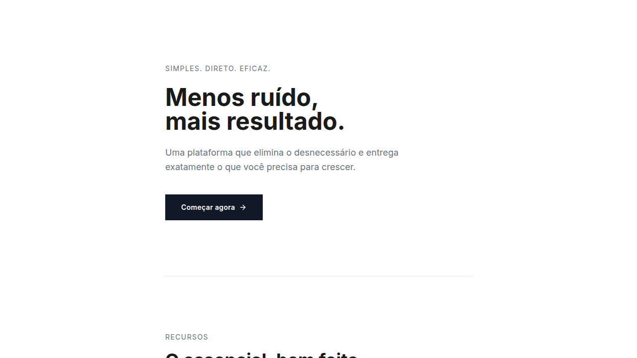
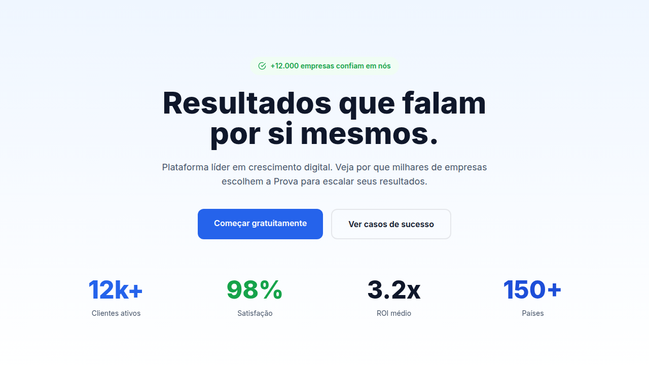
- One page, one job. Kill every element that doesn't directly support the primary action. Navigation, footer links, secondary CTAs — if it offers an escape route, it's working against you.
- Typography does the heavy lifting. With so few elements on the page, your type scale IS your hierarchy. Use dramatic size contrast between headline and body. Let the headline breathe.
- The form is the design. Don't treat it as an afterthought shoved below the fold. Style it with the same care as your hero. Reduce fields to the absolute minimum — every field you add costs you conversions.
- Whitespace is not empty space, it's pressure. Generous margins around your CTA create visual gravity. The button should feel like the only logical place for the eye to land.
- Contrast is commitment. Your CTA button needs to be the highest-contrast element on the page. Not just slightly different — unmissably different. If someone squints, it should be the only thing they see.
Technical Specs
Colors
Effects
Hover states on CTA (color shift, slight scale), form field focus animations, loading spinner, success feedback
Light/Dark
✓ Full / ✓ Full
Related
Last synced: 4/1/2026