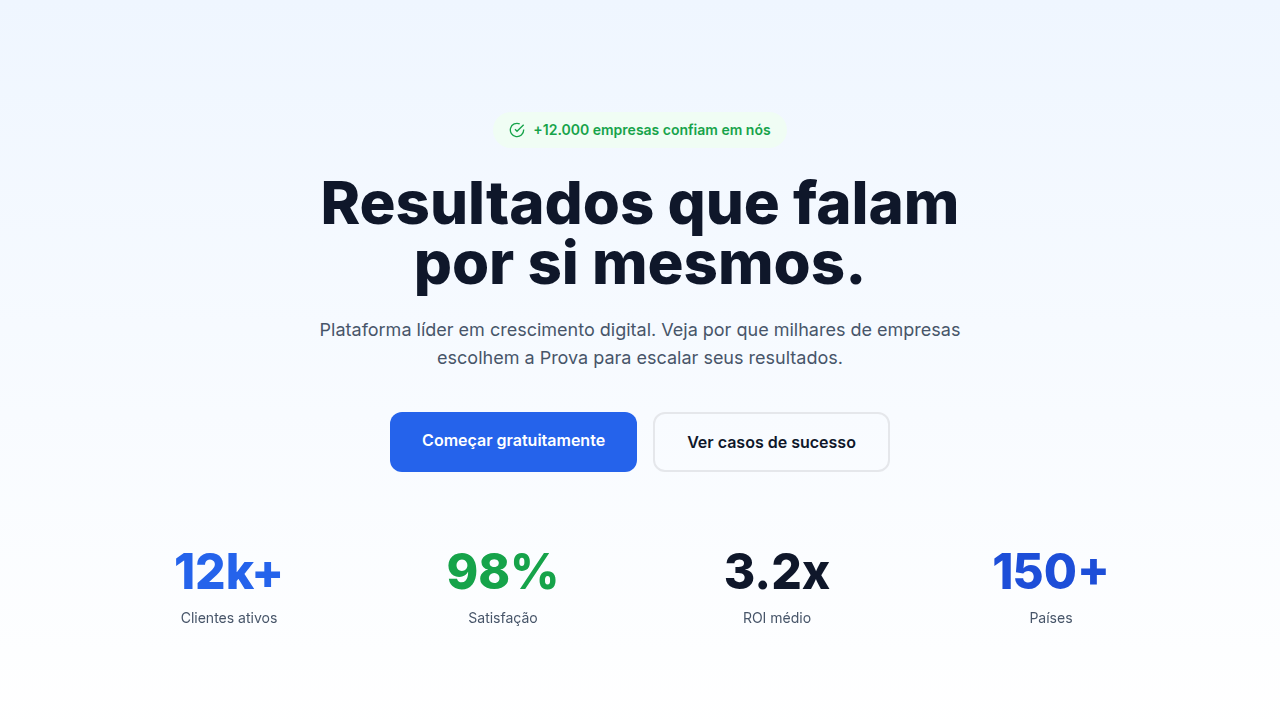
Hero-Centric Design
Hero-centric landing page. Ideal for marketing, conversão, lead gen. AI-ready template.
Use case: Marketing, Conversão, Lead gen
Historical Context
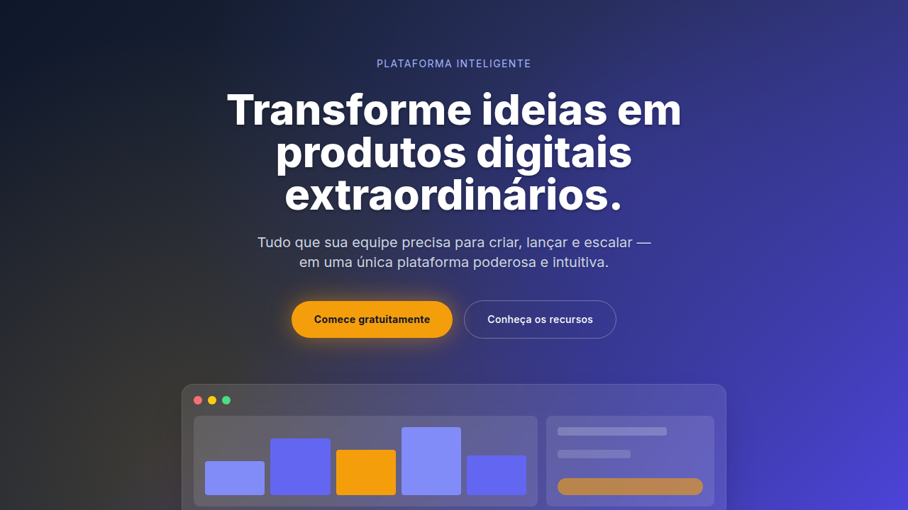
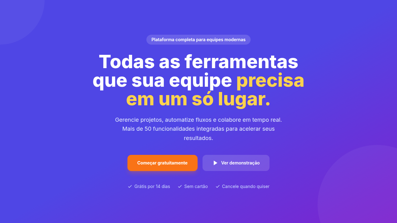
Remember image sliders? Those rotating carousels that every client demanded in 2010 because they couldn't pick one message? That era died slowly, painfully, replaced by the full-screen hero that said one thing and said it loud. The shift wasn't subtle. Somewhere around 2015, Apple started treating product pages like cinema — single frame, massive type, product floating in space. Everyone followed. By the 2020s, the hero section became the entire pitch compressed into a viewport. The 'above the fold' obsession never really left us — it just got dressed up in better typography. What changed is confidence. Instead of cramming five value props into 600 pixels, designers learned to trust a single statement backed by a clear action. One headline. One CTA. Maybe a product shot. That's it. But here's the tension nobody talks about enough: a 4MB hero video tanks your Core Web Vitals. The most impactful heroes are often the lightest — sharp type on a solid background loads instantly and hits harder than any stock footage ever could.
When to Use
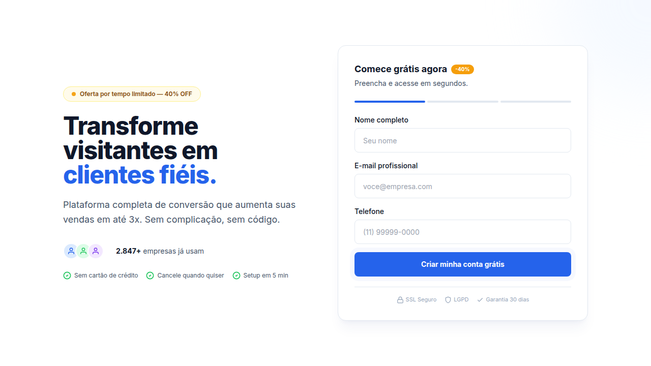
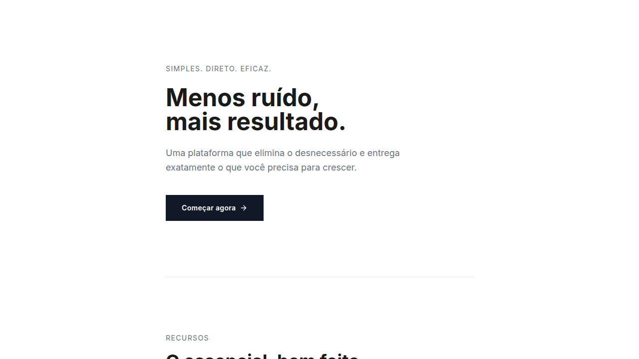
Hero-centric works when you have one clear thing to say and the confidence to say it without hedging. Product launches, SaaS pages where the value prop is tight, agency sites selling taste. It converts when the headline does real work — not 'Welcome to our platform' but an actual reason to stay. Skip it when your product needs explanation before it needs drama. If users land confused and have to scroll past a viewport of vibes to find substance, you've traded conversion for aesthetics. Dashboard apps, documentation sites, marketplaces with browsing intent — these need content density up top, not theater.
Design Principles
- One headline, one job — if your hero needs a subtitle to make sense, the headline failed
- CTA contrast is non-negotiable — the button should be the highest-contrast element on screen, not competing with decorative elements
- Viewport height is a budget, not a target — 100vh heroes on mobile push all content into scroll oblivion; size to content, not to device
- Typography IS the design — when your hero is text-driven, the font choice, weight, and spacing carry the entire visual weight; treat type as imagery
- Speed over spectacle — a hero that loads in 200ms with system fonts beats a 3-second hero with a custom typeface every single time for conversion
Technical Specs
Colors
Effects
Smooth scroll reveal, fade-in animations on hero, subtle background parallax, CTA glow/pulse effect
Light/Dark
✓ Full / ✓ Full
Related
Last synced: 4/1/2026