Split Pastel
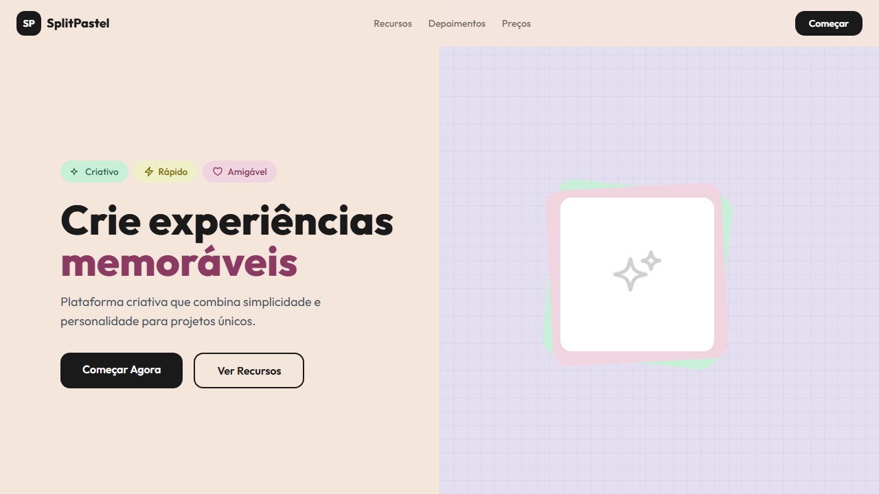
Playful, modern, friendly landing page with split pastel background. Ideal for apps criativos, plataformas de design, startups friendly, ecommerce lifestyle. AI-ready template.
Use case: Creative apps, Design platforms, Friendly startups, Lifestyle e-commerce
Historical Context
The split background isn't some trendy invention — it's a direct descendant of color field painting. Rothko and Barnett Newman were obsessing over how two adjacent color planes create tension and emotional weight decades before any of us touched a screen. The technique migrated into editorial print design in the 1960s, where art directors at Vogue and Harper's Bazaar used bisected color planes to create visual hierarchy without relying on imagery alone. The pastel variant — specifically the peach-lavender pairing — gained serious traction in the mid-2010s when Pantone crowned Rose Quartz and Serenity as dual Colors of the Year in 2016. That wasn't arbitrary. It reflected a cultural shift toward gender fluidity and softness in branding that fashion and beauty houses were already exploring. Glossier's visual identity, Mansur Gavriel's campaigns, and countless indie beauty brands adopted these split pastels not as decoration, but as positioning. The two-tone split says: we're refined, we're intentional, we reject the maximalist noise. Today the pattern persists because it solves a real layout problem — it divides content zones with color alone, eliminating the need for heavy borders or containers while maintaining an unmistakably editorial feel.
When to Use
Reach for split pastel when your brand lives in the feminine-forward space and needs to feel elevated without being cold. It works beautifully for fashion lookbooks, beauty product launches, lifestyle editorial, and any context where you want the layout itself to communicate softness and intentionality. Avoid it for anything that needs to feel urgent, technical, or masculine-coded. This pattern demands breathing room — cramped layouts kill it instantly. Best deployed on hero sections, feature highlights, and editorial spreads where content naturally divides into two conceptual halves.
Design Principles
- Commit to asymmetry in the split ratio — 50/50 is boring. Try 40/60 or even 30/70 to create natural visual tension and guide the eye toward your primary content zone.
- Keep the palette analogous or complementary within the pastel range. Peach and lavender work because they share warmth without competing. High-contrast pastel pairings (mint and coral) risk looking juvenile rather than sophisticated.
- Typography must be decisive against soft backgrounds. Use medium-to-bold weights in a refined serif or geometric sans. Light type on pastels disappears — you lose hierarchy entirely.
- Let the split line itself become a compositional tool. Overlap imagery or type across the boundary to unify the two zones. A hard stop with no bridging element feels like two separate designs stitched together.
- Resist the urge to add texture, grain, or gradients to the color planes. The power of this pattern is in flat, confident color. Noise undermines the editorial authority you're trying to establish.
DESIGN.md
---
version: "alpha"
name: "Split Pastel"
description: "Playful, modern, friendly landing page with split pastel background. Ideal for apps criativos, plataformas de design, startups friendly, ecommerce lifestyle. AI-ready template."
colors:
  primary: "#f5e6dc"
  secondary: "#e4dff0"
  tertiary: "#1a1a1a"
  neutral: "#c8f0d8"
  surface: "#f0f0c8"
  accent: "#f0d4e0"
typography:
  h1:
    fontFamily: Outfit
    fontSize: 2.5rem
    fontWeight: 700
  body-md:
    fontFamily: Outfit
    fontSize: 1rem
    fontWeight: 400
rounded:
  sm: 20px
  md: 40px
  lg: 60px
spacing:
  sm: 6.0px
  md: 12.0px
  lg: 24.0px
components:
  button-primary:
    backgroundColor: "{colors.primary}"
    textColor: "{colors.neutral}"
    rounded: "{rounded.sm}"
    padding: 12px
---

## Overview

Playful, modern, friendly landing page with split pastel background. Ideal for apps criativos, plataformas de design, startups friendly, ecommerce lifestyle. AI-ready template. The split background isn't some trendy invention — it's a direct descendant of color field painting. Rothko and Barnett Newman were obsessing over how two adjacent color planes create tension and emotional weight decades before any of us touched a screen. The technique migrated into editorial print design in the 1960s, where art directors at Vogue and Harper's Bazaar used bisected color planes to create visual hierarchy without relying on imagery alone.

The pastel variant — specifically the peach-lavender pairing — gained serious traction in the mid-2010s when Pantone crowned Rose Quartz and Serenity as dual Colors of the Year in 2016. That wasn't arbitrary. It reflected a cultural shift toward gender fluidity and softness in branding that fashion and beauty houses were already exploring. Glossier's visual identity, Mansur Gavriel's campaigns, and countless indie beauty brands adopted these split pastels not as decoration, but as positioning. The two-tone split says: we're refined, we're intentional, we reject the maximalist noise.

Today the pattern persists because it solves a real layout problem — it divides content zones with color alone, eliminating the need for heavy borders or containers while maintaining an unmistakably editorial feel.

- Density: 5/10 — Balanced
- Variance: 7/10 — Dynamic
- Motion: 4/10 — Subtle

- **Style:** Playful, Modern, Friendly, Creative
- **Keywords:** split background, peach, lavender, playful, modern, friendly, Outfit, badge pills, grid pattern, rounded CTA
- **Era:** 2024-2026 Playful Modern
- **Light/Dark:** ✓ Full / ✗ No

## Colors

- **Peach** (#f5e6dc) — Primary surface or dominant color
- **Lavender** (#e4dff0) — Secondary surface or text color
- **Text Dark** (#1a1a1a) — Dark surface, primary background
- **Badge Mint** (#c8f0d8) — Extended palette, decorative use
- **Badge Yellow** (#f0f0c8) — Warning states, attention indicators
- **Badge Pink** (#f0d4e0) — Primary text color
- **White** (#ffffff) — Secondary surface


## Typography

- **Display / Hero:** Outfit — Weight 700, tight tracking, used for headline impact
- **Body:** Outfit — Weight 400, 16px/1.6 line-height, max 72ch per line
- **UI Labels / Captions:** Outfit — 0.875rem, weight 500, slight letter-spacing
- **Monospace:** JetBrains Mono — Used for code, metadata, and technical values

Scale:
- Hero: clamp(2.5rem, 5vw, 4rem)
- H1: 2.25rem
- H2: 1.5rem
- Body: 1rem / 1.6
- Small: 0.875rem


## Layout

- **Grid:** CSS Grid primary. Max-width containment: 1280px centered with 1.5rem side padding.
- **Spacing rhythm:** Balanced. Base unit: 0.5rem (8px).
- **Section vertical gaps:** clamp(4rem, 8vw, 8rem).
- **Hero layout:** Asymmetric composition.
- **Feature sections:** Asymmetric grid with varied card sizes. No 3-equal-columns.
- **Mobile collapse:** All multi-column layouts collapse below 768px. No horizontal overflow.
- **z-index contract:** base (0) / sticky-nav (100) / overlay (200) / modal (300) / toast (500).


## Elevation & Depth

Split background colors (peach left, lavender right), playful badge pills with icons, grid pattern overlay on right panel, rounded CTA buttons, smooth transitions 250ms

- **Physics:** Ease-out curves, 200-300ms duration. Smooth and predictable.
- **Entry animations:** Fade + translate-Y (16px → 0) over 420ms ease-out. Staggered cascades for lists: 80ms between items.
- **Hover states:** Subtle color shift + shadow adjustment over 200ms.
- **Page transitions:** Fade only (200ms).
- **Performance:** Only transform and opacity animated. No layout-triggering properties.


## Shapes

Base corner radius: 20px. See rounded tokens in front matter for the full scale.


## Components

- **Primary Button:** Pill-shaped (9999px) shape. Accent color fill. Hover: 8% darken + subtle lift shadow. Active: -1px translate tactile press. Font weight 600. No outer glows.
- **Secondary / Ghost Button:** Outline variant. 1.5px border in muted color. Text in primary color. Hover: subtle background fill.
- **Cards:** Pill-shaped (9999px) corners. Surface background. Subtle shadow (0 2px 12px rgba(0,0,0,0.06)). 1px border stroke.
- **Inputs:** Label above input. 1px border stroke. Focus ring: 2px accent color offset 2px. Error text below in semantic red. No floating labels.
- **Navigation:** Primary surface background. Active item: accent color indicator. Font weight 500 when active.
- **Skeletons:** Shimmer animation matching component dimensions. No circular spinners.
- **Empty States:** Icon-based composition with descriptive text and action button.


## Do's and Don'ts

- No emojis in UI — use icon system only (Lucide, Heroicons)
- No pure black (#000000) — use off-black or charcoal variants
- No oversaturated accent colors (saturation cap: 80%)
- No 3-column equal-width feature layouts — use zig-zag or asymmetric grid
- No `h-screen` — use `min-h-[100dvh]`
- No AI copywriting clichés: "Elevate", "Seamless", "Unleash", "Next-Gen"
- No broken external image links — use picsum.photos or inline SVG
- No generic lorem ipsum in demos

- Do Outfit font carregada
- Do Split background peach/lavender
- Do Badge pills com ícones
- Do Grid pattern overlay
- Do Rounded CTA buttons
- Do Cores pastel consistentes
- Do Responsivo mobile/tablet/desktop


## Use Case

Creative apps, Design platforms, Friendly startups, Lifestyle e-commerce
Technical Specs
CSS
font-family: 'Outfit', .split-left { background: #f5e6dc }, .split-right { background: #e4dff0 }, .badge { display: inline-flex; align-items: center; gap: 6px; padding: 6px 14px; border-radius: 20px; font-size: 0.85rem }, .badge-mint { background: #c8f0d8 }, .grid-overlay { background-image: linear-gradient(rgba(0,0,0,0.03) 1px, transparent 1px), linear-gradient(90deg, rgba(0,0,0,0.03) 1px, transparent 1px); background-size: 20px 20px }Variables
--bg-peach: #f5e6dc, --bg-lavender: #e4dff0, --text-dark: #1a1a1a, --badge-mint: #c8f0d8, --badge-yellow: #f0f0c8, --badge-pink: #f0d4e0, --font-primary: 'Outfit', --badge-radius: 20px, --grid-size: 20px
Checklist
☐ Outfit font carregada, ☐ Split background peach/lavender, ☐ Badge pills com ícones, ☐ Grid pattern overlay, ☐ Rounded CTA buttons, ☐ Cores pastel consistentes, ☐ Responsivo mobile/tablet/desktop
Colors
Primary
Secondary
Effects
Split background colors (peach left, lavender right), playful badge pills with icons, grid pattern overlay on right panel, rounded CTA buttons, smooth transitions 250ms
Light/Dark
✓ Full / ✗ No
AI Prompt
Act as a Senior Frontend Engineer and Expert UI Designer.
Your task is to code a complete Landing Page on the first attempt.
- Landing Page Theme: <INSERT THEME>
- Sections to add: <INSERT SECTIONS>

Generate the final code immediately following these definitions:

## Style

- **Name:** Split Pastel
- **Type:** Playful, Modern, Friendly, Creative
- **Keywords:** split background, peach, lavender, playful, modern, friendly, Outfit, badge pills, grid pattern, rounded CTA
- **Era:** 2024-2026 Playful Modern
- **Light/Dark:** ✓ Full / ✗ No

## Color Palette

- **Primary:** Peach #f5e6dc, Lavender #e4dff0, Text Dark #1a1a1a
- **Secondary:** Badge Mint #c8f0d8, Badge Yellow #f0f0c8, Badge Pink #f0d4e0, White #ffffff

## Visual Effects

Split background colors (peach left, lavender right), playful badge pills with icons, grid pattern overlay on right panel, rounded CTA buttons, smooth transitions 250ms

## AI Visual Direction

Design a playful, modern, friendly landing page with split pastel background. Peach (#f5e6dc) on left, lavender (#e4dff0) on right. Add playful badge pills with icons in mint, yellow, pink. Include grid pattern overlay on right panel. Use Outfit font (700/800 for display, 400/500 for body). Rounded CTA buttons. Creative and approachable feel.

## CSS Technical

```css
font-family: 'Outfit', .split-left { background: #f5e6dc }, .split-right { background: #e4dff0 }, .badge { display: inline-flex; align-items: center; gap: 6px; padding: 6px 14px; border-radius: 20px; font-size: 0.85rem }, .badge-mint { background: #c8f0d8 }, .grid-overlay { background-image: linear-gradient(rgba(0,0,0,0.03) 1px, transparent 1px), linear-gradient(90deg, rgba(0,0,0,0.03) 1px, transparent 1px); background-size: 20px 20px }
```

## Design System Variables

```css
--bg-peach: #f5e6dc, --bg-lavender: #e4dff0, --text-dark: #1a1a1a, --badge-mint: #c8f0d8, --badge-yellow: #f0f0c8, --badge-pink: #f0d4e0, --font-primary: 'Outfit', --badge-radius: 20px, --grid-size: 20px
```

## Implementation Checklist

- ☐ Outfit font carregada
- ☐ Split background peach/lavender
- ☐ Badge pills com ícones
- ☐ Grid pattern overlay
- ☐ Rounded CTA buttons
- ☐ Cores pastel consistentes
- ☐ Responsivo mobile/tablet/desktop

## Execution Rules

1. Strictly follow the defined visual style.
2. Use high-quality inline SVG icons (Heroicons or Lucide style) — NEVER use emojis as icons.
3. Add `cursor-pointer` and smooth `hover` states (transition-all) on all interactive elements.
4. Required Page Structure:
   - Navbar (Logo + Links + CTA)
   - Hero Section (Impactful Headline + Subtitle + 2 buttons + 3D/Abstract visual element via CSS)
   - Features (3 cards with icons)
   - Testimonials (3 cards)
   - Pricing (3 tiers, highlight the middle one)
   - Final CTA
   - Full Footer with social links, privacy policy, terms of use, contact and SEO links.
5. All text content must be in English.
6. The visual must be CLEARLY distinct — do not create a "default Bootstrap" design. Force the use of the provided design system variables.
7. Use `<style>` tags in the head for custom classes (especially for complex backdrop-filter effects and animations) that Tailwind CDN doesn't cover.
8. Full Responsiveness: Layout must adapt perfectly to Mobile, Tablet and Desktop (vertical stack on mobile).
9. Include basic SEO, Viewport and Open Graph meta tags in `<head>`.
10. Footer must contain: Copyright 2026, Secondary navigation links and Social media icons.
11. Make the creative decisions needed to deliver the complete, functional result now.Related
Last synced: 4/1/2026