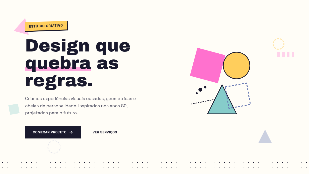
Memphis Design
Memphis style interface. Ideal for landing pages, saas. AI-ready template.
Use case: Landing pages, SaaS
Historical Context
In 1981, Ettore Sottsass gathered a group of young architects and designers in his Milan apartment and basically told modernism to go to hell. The Memphis Group — named after a Bob Dylan song, not the city — exploded onto the design world with furniture and objects that were loud, clashing, and deliberately "ugly" by establishment standards. Laminate surfaces in garish colors. Geometric shapes stacked without logic. Squiggles treated as serious ornament. It was a middle finger to the beige rationalism that had dominated design for decades. The movement burned bright and fast — officially disbanding by 1987. But its DNA never really left. When web designers in the early 2020s started reaching for terrazzo patterns, scattered geometric confetti, and clashing pastels, they were channeling Memphis whether they knew it or not. The aesthetic hit perfectly: social media had primed audiences for visual maximalism, and the nostalgia cycle had rotated back to the 80s. Suddenly every creative agency landing page had floating shapes and zigzag dividers. What makes Memphis endure isn't the specific shapes — it's the permission it grants. Permission to be excessive, to reject good taste as a constraint, to treat the surface as playground rather than problem to solve.
When to Use
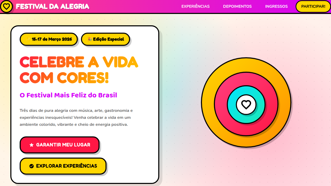
Memphis works when your brand has nothing to whisper about. Creative agencies, music festivals, streetwear drops, Gen-Z product launches — contexts where restraint reads as boring. It's ideal for short-lived campaigns and event sites where you want immediate visual impact over long-term sophistication. Fashion editorials, youth marketing, portfolio sites for illustrators who actually have personality. Avoid it for anything requiring trust signals — fintech, healthcare, enterprise SaaS. Memphis says "fun" not "reliable."
Design Principles
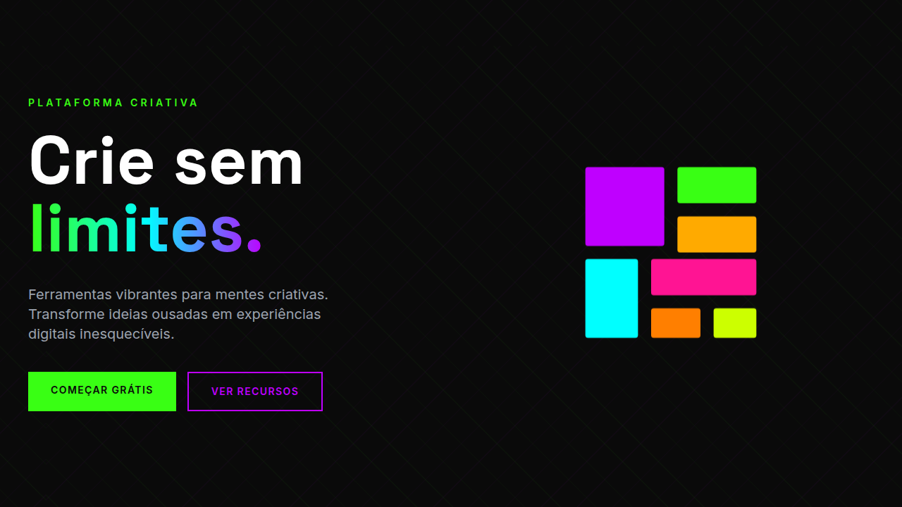
- Clash on purpose — combine colors that modernism would never allow in the same room. Pink against teal, yellow against violet. If it feels comfortable, push further.
- Geometry as decoration, not structure — circles, triangles, and squiggles exist for visual energy, not to organize content. Let them float, overlap, interrupt.
- Surface over depth — reject minimalist transparency. Embrace pattern, texture, and terrazzo fills. Every surface is an opportunity for visual noise.
- Asymmetry as default — nothing centers, nothing aligns perfectly. Layouts should feel composed but never grid-locked. Tension is the point.
- Scale without logic — a tiny triangle next to a massive circle. Oversized typography crashing into micro-elements. Hierarchy through contrast, not proportion.
Technical Specs
Colors
Primary
Effects
transform: rotate(), clip-path: polygon(), mix-blend-mode, repeating patterns, bold shapes
Light/Dark
✓ Full / ✓ Full
Related
Last synced: 4/1/2026