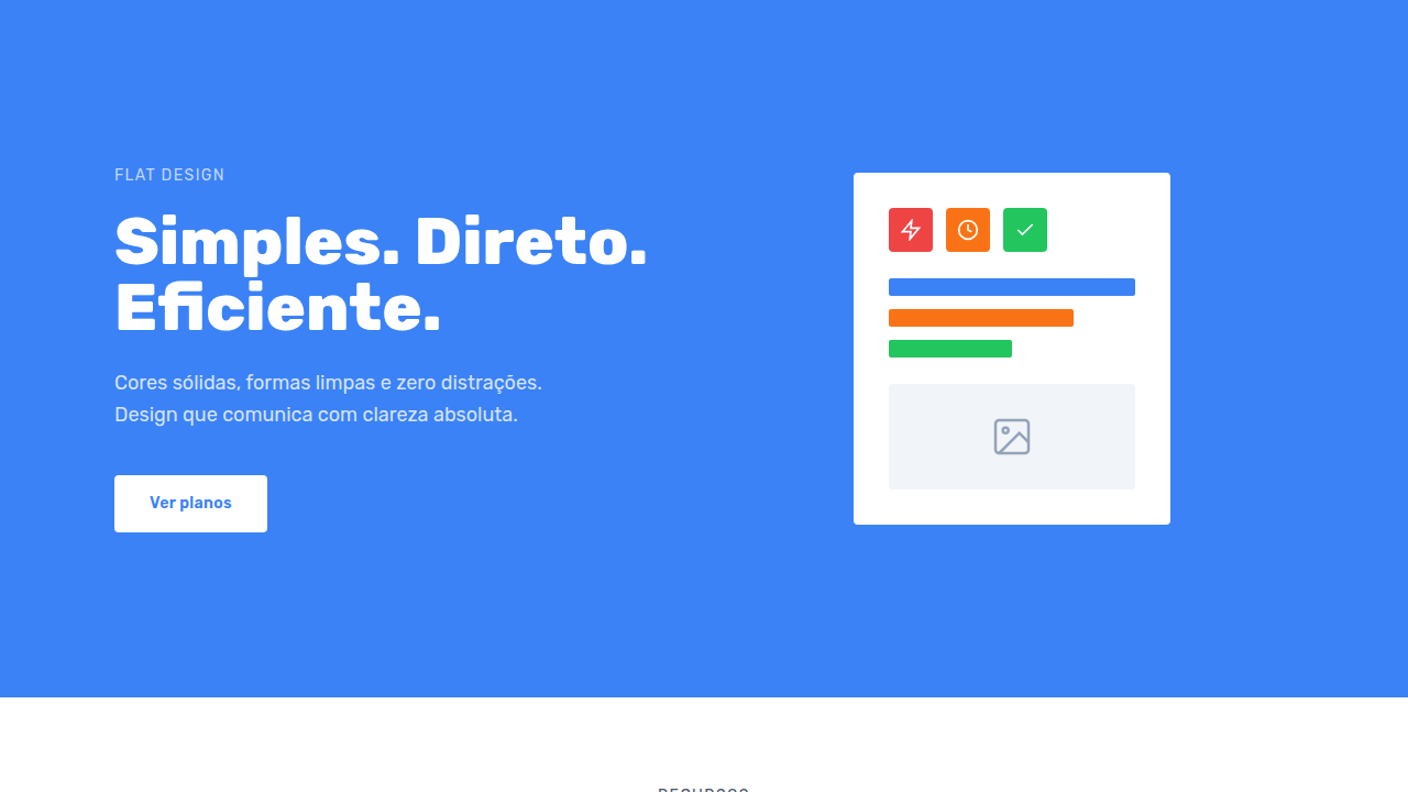
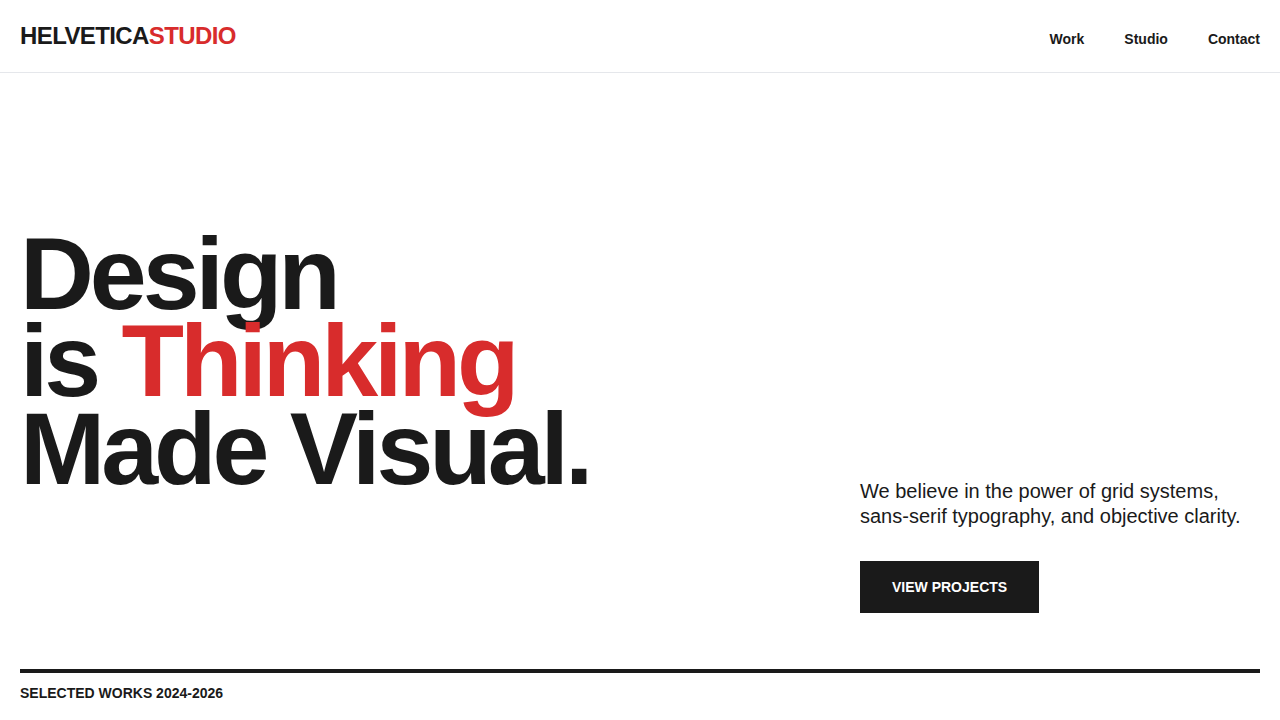
Flat Design
Flat, 2D interface with bold colors, no shadows/gradients, clean lines, simple geometric shapes, icon-heavy, typography-focused, minimal ornamentation. Ideal for landing pages, saas. AI-ready template.
Use case: Landing pages, SaaS
Historical Context
Microsoft fired the first shot. Windows Phone's Metro UI in 2010 stripped everything back to typography and color blocks — no chrome, no bevels, no apologies. Most designers shrugged it off as corporate minimalism. Then Apple nuked skeuomorphism overnight with iOS 7 in 2013, and suddenly every leather texture and drop shadow on the internet looked embarrassing. The industry pivoted in months. Google complicated things with Material Design in 2014, reintroducing elevation and shadow as meaningful hierarchy tools. Purists called it a betrayal. Pragmatists called it usable. Either way, it proved that pure flat had accessibility problems — when everything sits on the same plane, users lose depth cues. By 2026, flat won the war but absorbed the lessons. Neumorphism came and went like a fever dream. Glassmorphism had its moment on Dribbble and mostly stayed there. What survived is flat's core conviction — that interfaces should communicate through color, type, and space, not simulate physical materials. The shadows that remain are functional, not decorative. That's the settlement.
When to Use
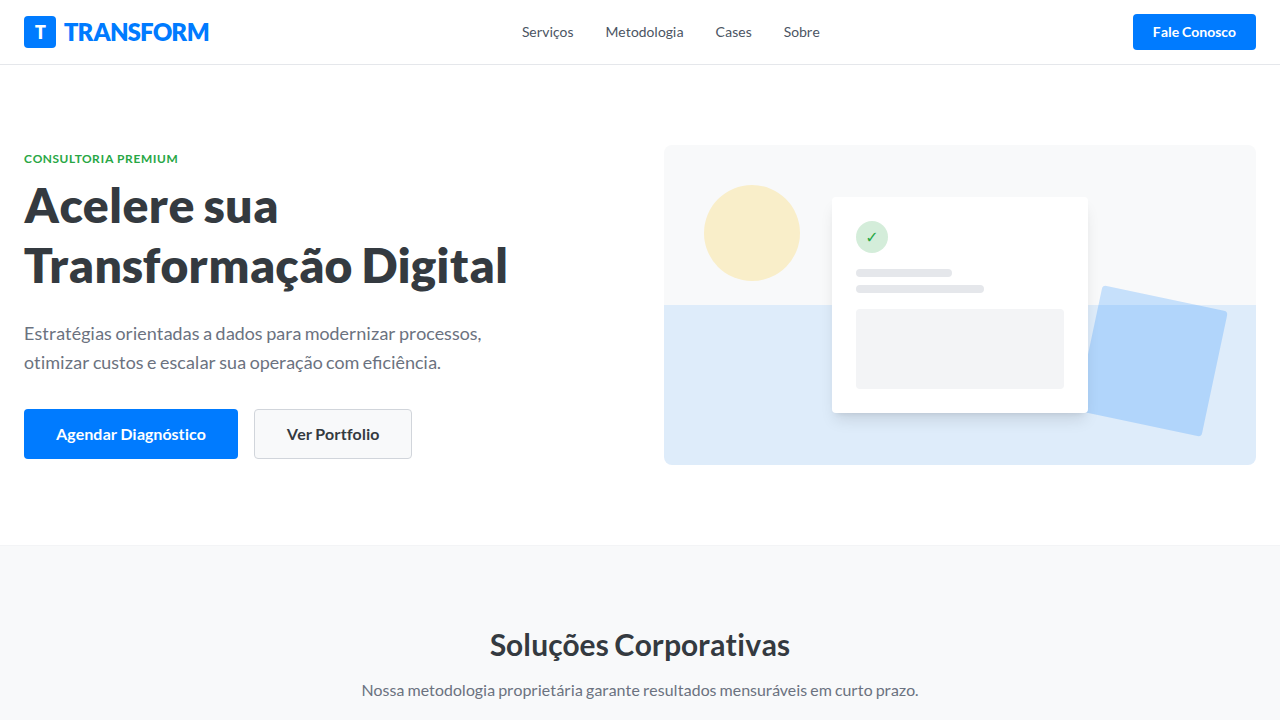
Flat is your best default when content density is high and distraction tolerance is low. SaaS dashboards, mobile apps with tight real estate, corporate sites that need to load fast and feel professional without trying too hard. It works when your color system is strong enough to carry hierarchy alone. But flat becomes lazy when you use it to avoid making decisions about depth and emphasis. If users can't tell what's clickable, if cards blend into backgrounds, if your page feels like a parking lot of rectangles — that's not flat design, that's no design. Flat earns its minimalism through precision, not absence.
Design Principles
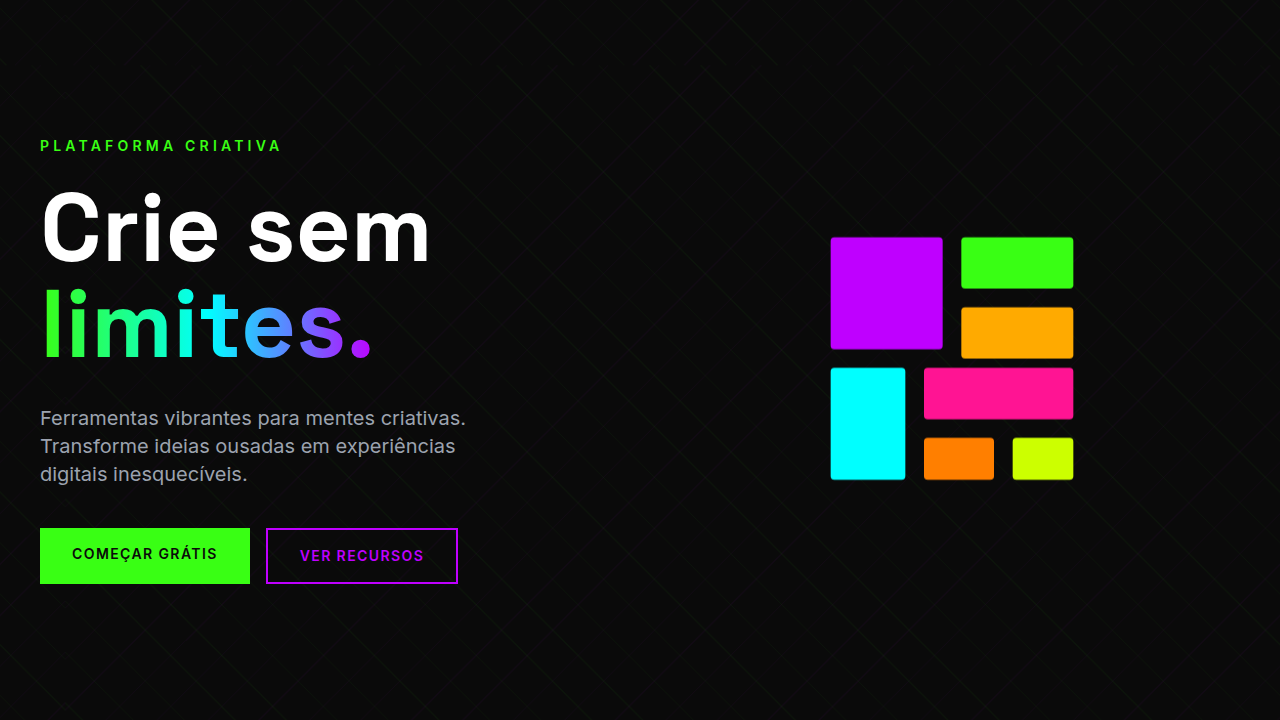
- Color carries hierarchy — use saturation and contrast to establish importance, not shadows or borders
- Every element earns its pixel — if it doesn't communicate function or structure, remove it
- Typography does the heavy lifting — size, weight, and spacing replace decorative containers
- Whitespace is structural, not leftover — it defines relationships as deliberately as any visible element
- Consistency over cleverness — flat systems break the moment one component tries to be special
Technical Specs
Colors
Effects
No gradients/shadows, simple hover (color/opacity shift), fast loading, clean transitions (150-200ms ease), minimal icons
Light/Dark
✓ Full / ✓ Full
Related
Last synced: 4/1/2026