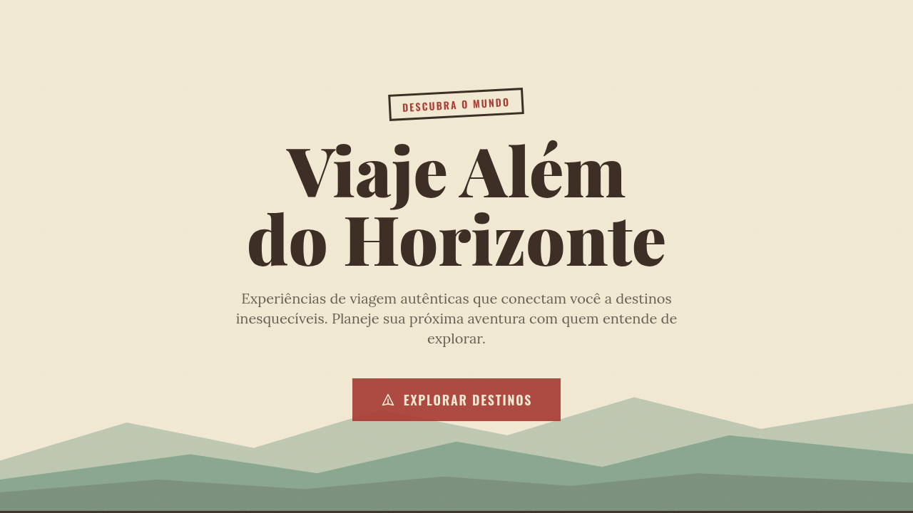
Retro Travel Poster
Retro travel poster interface. Ideal for landing pages, saas. AI-ready template.
Use case: Landing pages, SaaS
Historical Context
The retro travel poster owes everything to the WPA Federal Art Project of the 1930s. Government artists — many of them fresh out of art school, working for pennies — distilled entire national parks into three colors and a slab-serif headline. No photography. No realism. Just flat planes of saturated color stacked to suggest depth, and typography muscular enough to read from across a train station. That constraint became the aesthetic. Art Deco gave it the geometry. Streamlined curves, sunburst motifs, the obsession with speed and modernity — all of it filtered through lithographic printing limitations into something iconic. Then in 2016, the NASA JPL studio revived the whole language for their Visions of the Future series. Same playbook: simplified illustration, impossible color palettes, bold sans-serifs promising adventure. It worked because the formula never stopped working. Reduce a place to its emotional essence, frame it in confident type, and people want to go there. The poster doesn't describe a destination — it sells a feeling.
When to Use
Reach for this when the brief is aspirational. Tourism campaigns, airline branding, hospitality collateral, adventure brands — anywhere you need to romanticize a place or experience without photographic literalism. It's particularly effective for destinations that benefit from mystique over accuracy. Works beautifully at large scale (billboards, lobby art, hero sections) where the simplified shapes read instantly. Less suited to anything requiring nuance or detailed information hierarchy — this style is a single bold statement, not a conversation.
Design Principles
- Flatten aggressively — reduce landscapes to 3-5 planes of color with no gradients, no texture, no apology
- Let typography do the heavy lifting — one headline set in a period-appropriate face (geometric sans or condensed slab) carries the entire narrative
- Limit your palette to 4-6 colors maximum, biased warm, and commit to saturation levels that feel slightly unreal
- Use geometric simplification over organic detail — circles for suns, triangles for mountains, clean arcs for waves
- Compose with a clear foreground/midground/background stack that creates depth through overlap and value shift alone
Technical Specs
Colors
Primary
Secondary
Effects
Screen-printed flat lighting, no gradients, subtle texture overlay, bold shape reveals, vintage fade-in transitions
Light/Dark
✓ Full / ◐ Partial
Related
Last synced: 4/1/2026