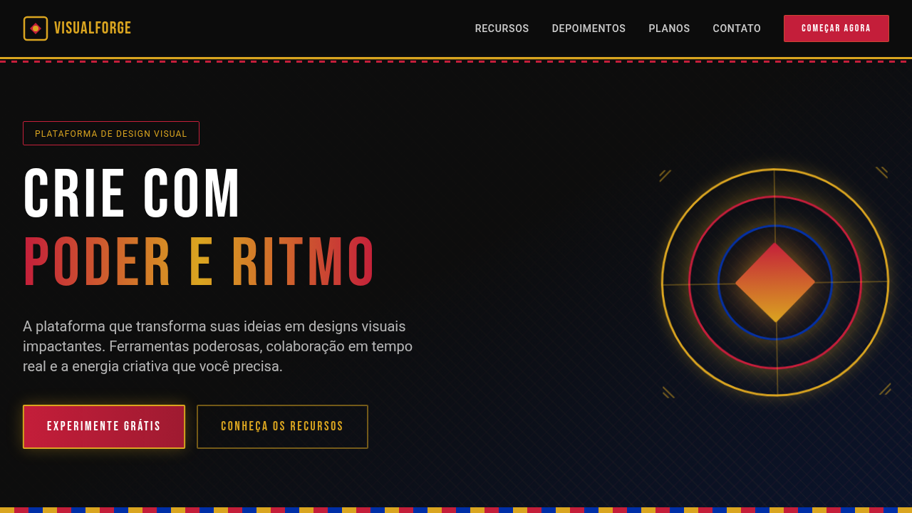
Tropicalismo Aventureiro Natural
Design an adventurous and natural landing page for an ecotourism travel agency in Brazil, inspired by tropicalism. Ideal for landing pages, saas. AI-ready template.
Use case: Landing pages, SaaS
Historical Context
Brazilian ecotourism design didn't emerge from boardrooms. It crawled out of the Pantanal wetlands, salt-crusted from Fernando de Noronha tides, carrying red clay under its fingernails. The country's absurd biodiversity — 60,000 plant species, the Amazon basin alone holding 10% of Earth's creatures — forced designers to abandon the sanitized resort aesthetic that dominated travel marketing for decades. You can't reduce the Cerrado to a stock photo gradient. What emerged instead was a visual language rooted in texture and imperfection. Cracked earth palettes. The specific green of bromeliad leaves catching filtered canopy light. Typography that breathes like humid air — loose tracking, organic weight distribution. Fernando de Noronha's volcanic geology introduced sharp angular contrasts against soft oceanic blues. The Pantanal brought golden-hour warmth and the patience of slow water. This isn't decoration. It's a design philosophy that says: the wilderness is the product. Every layout choice serves immersion over polish, presence over performance.
When to Use
Deploy this system when the brand promise is transformation through nature — not relaxation, not luxury escapism, but genuine encounter with wild ecosystems. Works for ecotourism operators, conservation-focused travel agencies, sustainable adventure outfitters, and environmental education platforms. Particularly effective when your audience has already rejected the all-inclusive resort model and seeks authenticity. Not appropriate for urban tourism, nightlife-forward travel, or budget backpacker brands where grit reads differently.
Design Principles
- Texture over cleanliness — use organic noise, grain, and natural material photography that preserves imperfection rather than airbrushing it away
- Chromatic restraint from ecosystems — pull palettes directly from specific biomes (Pantanal gold-green, Atlantic Forest deep emerald, Caatinga terracotta) rather than generic tropical saturation
- Typographic humidity — favor generous spacing, soft weights, and letterforms that suggest organic growth over mechanical precision
- Immersive hierarchy — let landscape photography dominate; UI elements recede into the environment rather than floating above it
- Sustainable pacing — design for slow scrolling and contemplation, rejecting the urgency patterns of commercial travel sites in favor of rhythms that mirror nature's tempo
Technical Specs
Colors
Primary
Secondary
Effects
Imagens de paisagens naturais brasileiras em tela cheia, tipografia sans-serif que transmite aventura, elementos de UI com formas de folhas e montanhas, micro-interações de hover com efeito de "descoberta" de detalhes da paisagem, transições de seção com efeito de "exploração" ou "zoom" em mapas.
Light/Dark
✓ Full / ✗ No
Related
Last synced: 4/1/2026