Logoisum Video Agency Hero
Premium video agency hero with full-screen video no color overlay. Ideal for agências de vídeo, produtoras de reels e shorts, estúdios de edição, freelancers de vídeo. AI-ready template.
Use case: Agencies de vídeo, Produtoras de reels e shorts, Studios de edição, Freelancers de vídeo
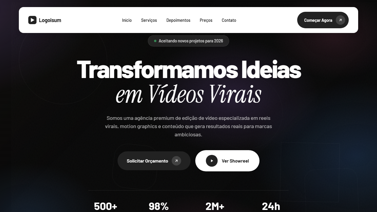
Historical Context
The video agency hero pattern emerged from the collision of two worlds: editorial print design and motion graphics showreels. In the early 2010s, production houses realized their websites needed to feel like their work — kinetic, bold, unapologetically visual. The floating white navbar became the signature move, borrowed from fashion editorial sites where navigation needed to exist without competing with full-bleed imagery beneath it. What makes this pattern distinctly "agency" rather than generic corporate is the tension between restraint and spectacle. The navbar floats clean and minimal — almost Swiss in its discipline — while the hero below it screams creativity through illustration, oversized type, or looping video. That contrast is the whole point. It signals: we understand craft AND we understand business. The illustrated variant (Arte & Ilustração) pushes further into personality territory. Where photo-based heroes commoditize quickly, custom illustration declares a point of view. Studios like Buck, Oddfellows, and Gunner pioneered this approach — proving that hand-crafted visual identity in the hero converts better than stock footage ever could.
When to Use
Deploy this when your client's entire value proposition is visual craft. Video production agencies, post-production houses, content studios, and creative agencies where the work speaks louder than copy. The floating white navbar works specifically when hero content is dark or richly colored — it creates immediate figure-ground separation without a hard border. Skip this if you have more than 5 nav items or need complex dropdowns; the floating treatment falls apart with dense navigation.
Design Principles
- Navbar floats with no visible boundary — transparency and subtle backdrop-blur only. The moment you add a solid background or drop shadow on load, you've killed the editorial quality.
- Hero illustration or video must bleed full-width with zero container padding. The content IS the layout; don't cage it in a max-width wrapper.
- Typography in the hero should be display-weight and oversized — minimum 4rem on desktop. Agency heroes that whisper get scrolled past.
- Color palette follows the artwork, not the other way around. Extract your UI accent colors from the hero illustration; never impose brand colors onto custom art.
- Maintain at minimum 90vh hero height. Cutting it short to show content below is a conversion optimization instinct that destroys the cinematic first impression these agencies need.
DESIGN.md
---
version: "alpha"
name: "Logoisum Video Agency Hero"
description: "Premium video agency hero with full-screen video no color overlay. Ideal for agências de vídeo, produtoras de reels e shorts, estúdios de edição, freelancers de vídeo. AI-ready template."
colors:
  primary: "#FFFFFF"
  secondary: "#222222"
  tertiary: "#000000"
  neutral: "#F5F5F5"
  surface: "#666666"
  accent: "#FFFFFF"
typography:
  h1:
    fontFamily: Barlow
    fontSize: 2.5rem
    fontWeight: 700
  body-md:
    fontFamily: Barlow
    fontSize: 1rem
    fontWeight: 400
components:
  button-primary:
    backgroundColor: "{colors.primary}"
    textColor: "{colors.neutral}"
    padding: 12px
---

## Overview

Premium video agency hero with full-screen video no color overlay. Ideal for agências de vídeo, produtoras de reels e shorts, estúdios de edição, freelancers de vídeo. AI-ready template. The video agency hero pattern emerged from the collision of two worlds: editorial print design and motion graphics showreels. In the early 2010s, production houses realized their websites needed to feel like their work — kinetic, bold, unapologetically visual. The floating white navbar became the signature move, borrowed from fashion editorial sites where navigation needed to exist without competing with full-bleed imagery beneath it.

What makes this pattern distinctly "agency" rather than generic corporate is the tension between restraint and spectacle. The navbar floats clean and minimal — almost Swiss in its discipline — while the hero below it screams creativity through illustration, oversized type, or looping video. That contrast is the whole point. It signals: we understand craft AND we understand business.

The illustrated variant (Arte & Ilustração) pushes further into personality territory. Where photo-based heroes commoditize quickly, custom illustration declares a point of view. Studios like Buck, Oddfellows, and Gunner pioneered this approach — proving that hand-crafted visual identity in the hero converts better than stock footage ever could.

- Density: 3/10 — Airy
- Variance: 3/10 — Restrained
- Motion: 6/10 — Expressive

- **Style:** Agency, Floating White Navbar, Video No Overlay, Instrument Serif Italic, Minimal Premium
- **Keywords:** agency, vídeo editing, floating navbar branca, sem overlay, Instrument Serif italic, Barlow font, seta 45 graus, play icon, minimal premium, reels virais
- **Era:** 2024-2026 Video Agency Premium
- **Light/Dark:** ✓ Full / ◐ Partial

## Colors

- **Branco** (#FFFFFF) — Light surface, card backgrounds
- **Preto Escuro** (#222222) — Dark surface, primary background
- **Preto** (#000000) — Dark surface, primary background
- **Cinza Claro** (#F5F5F5) — Secondary text, borders, muted elements
- **Cinza Texto** (#666666) — Primary text color
- **Branco Puro** (#FFFFFF) — Secondary surface
- **Preto Suave** (#333333) — Deep contrast surface
- **Sombra Sutil** (rgba(0,0,0,0.08)) — Extended palette, decorative use


## Typography

- **Display / Hero:** Barlow — Weight 700, tight tracking, used for headline impact
- **Accent:** Instrument Serif — Used for decorative or emphasis text
- **Body:** Barlow — Weight 400, 16px/1.6 line-height, max 72ch per line
- **UI Labels / Captions:** Barlow — 0.875rem, weight 500, slight letter-spacing
- **Monospace:** JetBrains Mono — Used for code, metadata, and technical values

Scale:
- Hero: clamp(2.5rem, 5vw, 4rem)
- H1: 2.25rem
- H2: 1.5rem
- Body: 1rem / 1.6
- Small: 0.875rem


## Layout

- **Grid:** CSS Grid primary. Max-width containment: 1280px centered with 1.5rem side padding.
- **Spacing rhythm:** Balanced. Base unit: 0.5rem (8px).
- **Section vertical gaps:** clamp(4rem, 8vw, 8rem).
- **Hero layout:** Split-screen (text left, visual right).
- **Feature sections:** Zig-zag alternating text+image rows. No 3-equal-columns.
- **Mobile collapse:** All multi-column layouts collapse below 768px. No horizontal overflow.
- **z-index contract:** base (0) / sticky-nav (100) / overlay (200) / modal (300) / toast (500).


## Elevation & Depth

VÍDEO: Showreel de edição de vídeo profissional com cortes rápidos de projetos de vídeo, reels e conteúdo para redes sociais. Cenas dinâmicas com transições fluidas mostrando trabalhos de edição, color grading e motion graphics. Exibido em tela cheia sem overlay de cor, permitindo que a qualidade do trabalho fale por si. A navbar flutuante branca contrasta elegantemente sobre o vídeo. | EFEITOS CSS: Vídeo de fundo tela cheia sem overlay de cor, navbar flutuante branca rounded-[16px] com sombra sutil, botão CTA escuro (#222) com ícone seta 45 graus em housing circular, headline em duas linhas: Barlow bold tracking-[-4px] e Instrument Serif italic 84px, botão pill branco grande com ícone play, layout min-h-[90vh] centralizado, tipografia 14px Barlow Medium para links

- **Physics:** Spring — stiffness 120, damping 20. Confident, weighted transitions.
- **Entry animations:** Fade + translate-Y (16px → 0) over 480ms ease-out. Staggered cascades for lists: 100ms between items.
- **Hover states:** Scale(1.03) + shadow lift over 200ms.
- **Page transitions:** Fade + slide (300ms).
- **Performance:** Only transform and opacity animated. No layout-triggering properties.


## Shapes

Base corner radius: 12px. See rounded tokens in front matter for the full scale.


## Components

- **Primary Button:** Moderately rounded (0.75rem) shape. Accent color fill. Hover: 8% darken + subtle lift shadow. Active: -1px translate tactile press. Font weight 600. No outer glows.
- **Secondary / Ghost Button:** Outline variant. 1.5px border in muted color. Text in primary color. Hover: subtle background fill.
- **Cards:** Moderately rounded (0.75rem) corners. Surface background. Subtle shadow (0 2px 12px rgba(0,0,0,0.06)). 1px border stroke.
- **Inputs:** Label above input. 1px border stroke. Focus ring: 2px accent color offset 2px. Error text below in semantic red. No floating labels.
- **Navigation:** Primary surface background. Active item: accent color indicator. Font weight 500 when active.
- **Skeletons:** Shimmer animation matching component dimensions. No circular spinners.
- **Empty States:** Icon-based composition with descriptive text and action button.


## Do's and Don'ts

- No emojis in UI — use icon system only (Lucide, Heroicons)
- No decorative gradients — flat color only
- No shadows heavier than 0 2px 8px rgba(0,0,0,0.08)
- No pure black (#000000) — use off-black or charcoal variants
- No oversaturated accent colors (saturation cap: 80%)
- No 3-column equal-width feature layouts — use zig-zag or asymmetric grid
- No `h-screen` — use `min-h-[100dvh]`
- No AI copywriting clichés: "Elevate", "Seamless", "Unleash", "Next-Gen"
- No broken external image links — use picsum.photos or inline SVG
- No generic lorem ipsum in demos

- Do Vídeo tela cheia sem overlay
- Do Navbar flutuante branca rounded-16px
- Do Botão CTA escuro seta 45° circular
- Do Headline Barlow + Instrument Serif 84px
- Do Botão pill branco play icon
- Do Layout min-h-90vh
- Do Barlow Medium 14px nav
- Do Subtexto 18px centralizado
- Do Responsivo


## Use Case

Agencies de vídeo, Produtoras de reels e shorts, Studios de edição, Freelancers de vídeo
Technical Specs
CSS
font-family: 'Barlow' / 'Instrument Serif' italic, video: autoplay loop muted object-cover no overlay, navbar: bg-white rounded-[16px] shadow-sm, button: bg-[#222] rounded-full, font-size: 84px italic / tracking-[-4px] bold, min-height: 90vh, text-align: center
Variables
--bg-navbar: #FFFFFF, --bg-button: #222222, --text-primary: #000000, --font-body: 'Barlow', --font-display: 'Instrument Serif', --navbar-radius: 16px, --display-size: 84px, --tracking-tight: -4px, --min-height: 90vh
Checklist
☐ Vídeo tela cheia sem overlay, ☐ Navbar flutuante branca rounded-16px, ☐ Botão CTA escuro seta 45° circular, ☐ Headline Barlow + Instrument Serif 84px, ☐ Botão pill branco play icon, ☐ Layout min-h-90vh, ☐ Barlow Medium 14px nav, ☐ Subtexto 18px centralizado, ☐ Responsivo
Colors
Primary
Secondary
Effects
VÍDEO: Showreel de edição de vídeo profissional com cortes rápidos de projetos de vídeo, reels e conteúdo para redes sociais. Cenas dinâmicas com transições fluidas mostrando trabalhos de edição, color grading e motion graphics. Exibido em tela cheia sem overlay de cor, permitindo que a qualidade do trabalho fale por si. A navbar flutuante branca contrasta elegantemente sobre o vídeo. | EFEITOS CSS: Vídeo de fundo tela cheia sem overlay de cor, navbar flutuante branca rounded-[16px] com sombra sutil, botão CTA escuro (#222) com ícone seta 45 graus em housing circular, headline em duas linhas: Barlow bold tracking-[-4px] e Instrument Serif italic 84px, botão pill branco grande com ícone play, layout min-h-[90vh] centralizado, tipografia 14px Barlow Medium para links
Light/Dark
✓ Full / ◐ Partial
AI Prompt
Act as a Senior Frontend Engineer and Expert UI Designer.
Your task is to code a complete Landing Page on the first attempt.
- Landing Page Theme: <INSERT THEME>
- Sections to add: <INSERT SECTIONS>

Generate the final code immediately following these definitions:

## Style

- **Name:** Logoisum Video Agency Hero
- **Type:** Agency, Floating White Navbar, Video No Overlay, Instrument Serif Italic, Minimal Premium
- **Keywords:** agency, vídeo editing, floating navbar branca, sem overlay, Instrument Serif italic, Barlow font, seta 45 graus, play icon, minimal premium, reels virais
- **Era:** 2024-2026 Video Agency Premium
- **Light/Dark:** ✓ Full / ◐ Partial

## Color Palette

- **Primary:** Branco #FFFFFF, Preto Escuro #222222, Preto #000000, Cinza Claro #F5F5F5
- **Secondary:** Sombra Sutil rgba(0,0,0,0.08), Cinza Texto #666666, Branco Puro #FFFFFF, Preto Suave #333333

## Visual Effects

VÍDEO: Showreel de edição de vídeo profissional com cortes rápidos de projetos de vídeo, reels e conteúdo para redes sociais. Cenas dinâmicas com transições fluidas mostrando trabalhos de edição, color grading e motion graphics. Exibido em tela cheia sem overlay de cor, permitindo que a qualidade do trabalho fale por si. A navbar flutuante branca contrasta elegantemente sobre o vídeo. | EFEITOS CSS: Vídeo de fundo tela cheia sem overlay de cor, navbar flutuante branca rounded-[16px] com sombra sutil, botão CTA escuro (#222) com ícone seta 45 graus em housing circular, headline em duas linhas: Barlow bold tracking-[-4px] e Instrument Serif italic 84px, botão pill branco grande com ícone play, layout min-h-[90vh] centralizado, tipografia 14px Barlow Medium para links

## AI Visual Direction

Design a premium video agency hero with full-screen video no color overlay. Floating white navbar rounded-[16px] subtle shadow. Dark CTA button #222 with 45-degree arrow in circular housing. Two-line headline: Barlow bold tracking-[-4px] first line, Instrument Serif italic 84px second line. Large white pill button with play icon. Min-height 90vh centered. Barlow Medium 14px nav links.

## CSS Technical

```css
font-family: 'Barlow' / 'Instrument Serif' italic, video: autoplay loop muted object-cover no overlay, navbar: bg-white rounded-[16px] shadow-sm, button: bg-[#222] rounded-full, font-size: 84px italic / tracking-[-4px] bold, min-height: 90vh, text-align: center
```

## Design System Variables

```css
--bg-navbar: #FFFFFF, --bg-button: #222222, --text-primary: #000000, --font-body: 'Barlow', --font-display: 'Instrument Serif', --navbar-radius: 16px, --display-size: 84px, --tracking-tight: -4px, --min-height: 90vh
```

## Implementation Checklist

- ☐ Vídeo tela cheia sem overlay
- ☐ Navbar flutuante branca rounded-16px
- ☐ Botão CTA escuro seta 45° circular
- ☐ Headline Barlow + Instrument Serif 84px
- ☐ Botão pill branco play icon
- ☐ Layout min-h-90vh
- ☐ Barlow Medium 14px nav
- ☐ Subtexto 18px centralizado
- ☐ Responsivo

## Execution Rules

1. Strictly follow the defined visual style.
2. Use high-quality inline SVG icons (Heroicons or Lucide style) — NEVER use emojis as icons.
3. Add `cursor-pointer` and smooth `hover` states (transition-all) on all interactive elements.
4. Required Page Structure:
   - Navbar (Logo + Links + CTA)
   - Hero Section (Impactful Headline + Subtitle + 2 buttons + 3D/Abstract visual element via CSS)
   - Features (3 cards with icons)
   - Testimonials (3 cards)
   - Pricing (3 tiers, highlight the middle one)
   - Final CTA
   - Full Footer with social links, privacy policy, terms of use, contact and SEO links.
5. All text content must be in English.
6. The visual must be CLEARLY distinct — do not create a "default Bootstrap" design. Force the use of the provided design system variables.
7. Use `<style>` tags in the head for custom classes (especially for complex backdrop-filter effects and animations) that Tailwind CDN doesn't cover.
8. Full Responsiveness: Layout must adapt perfectly to Mobile, Tablet and Desktop (vertical stack on mobile).
9. Include basic SEO, Viewport and Open Graph meta tags in `<head>`.
10. Footer must contain: Copyright 2026, Secondary navigation links and Social media icons.
11. Make the creative decisions needed to deliver the complete, functional result now.
Related
Last synced: 4/1/2026