Glassmorphism Agency Hero
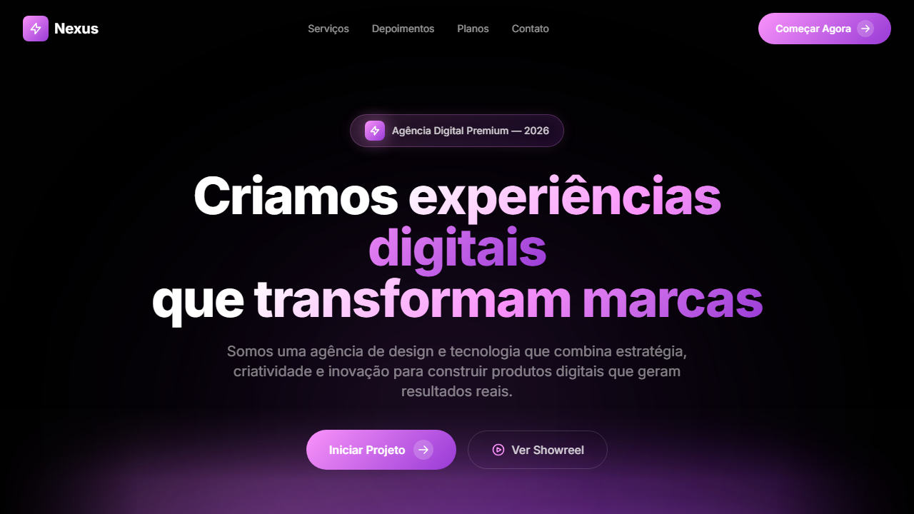
Dark agency hero with HLS video using mix-blend-screen. Ideal for digital agencies, estúdios criativos, consultorias de design, portfólios de agência. AI-ready template.
Use case: Digital agencies, Creative studios, Design consultancies, Agency portfolios
Historical Context
Glassmorphism didn't appear out of nowhere — it's the logical conclusion of decades of UI experimentation with depth and translucency. Apple flirted with frosted glass in iOS 7 (2013), but the aesthetic truly crystallized around 2020 when designers got tired of flat design's sterility and started layering blur effects over vibrant gradients. The purple-pink spectrum became the default palette for tech-forward agencies because it signals both creativity and sophistication without the corporate coldness of blues. What makes this hero pattern specifically interesting for agencies is the tension it creates. You're simultaneously saying 'we understand craft' (the precise blur values, the subtle border luminosity) and 'we push boundaries' (the gradient saturation, the floating card depth). It's a flex disguised as restraint. The best implementations treat the glass layer as architecture, not decoration — each translucent panel exists because it creates hierarchy, not because it looks cool on Dribbble. The pattern matured significantly since its hype peak. Early glassmorphism was often illegible — contrast ratios sacrificed for aesthetics. The current generation respects readability while maintaining that ethereal depth that makes visitors pause and actually look at your headline.
When to Use
Deploy this when your agency needs to communicate technical sophistication without alienating creative clients. It works best when you have a strong gradient background that can breathe through the frosted layers — if your brand palette is muted earth tones, this isn't your pattern. Ideal for studios positioning at the intersection of design and technology, particularly those selling digital products, immersive experiences, or brand systems. Skip it if your portfolio is editorial or print-heavy — the futuristic coding clashes with traditional craft positioning.
Design Principles
- Contrast is non-negotiable: maintain WCAG AA on every glass panel regardless of what bleeds through from behind — if your text disappears when the gradient shifts, your blur radius or background opacity is wrong
- Limit glass layers to two depths maximum — hero background and one floating card level — three layers turns sophisticated into cluttered instantly
- The gradient does the emotional heavy lifting; the glass does the structural work — never let frosted panels compete with the color story underneath
- Border luminosity (that subtle 1px white-opacity edge) is what separates polished glassmorphism from 'I just added backdrop-filter' — treat it as essential, not optional
- Motion should be environmental, not decorative: subtle gradient animation or parallax on the glass layers creates life without the cringe of bouncing elements
DESIGN.md
---
version: "alpha"
name: "Glassmorphism Agency Hero"
description: "Dark agency hero with HLS video using mix-blend-screen. Ideal for digital agencies, estúdios criativos, consultorias de design, portfólios de agência. AI-ready template."
colors:
  primary: "#010101"
  secondary: "#FA93FA"
  tertiary: "#C967E8"
  neutral: "#983AD6"
  surface: "#010101"
typography:
  h1:
    fontFamily: System UI stack
    fontSize: 2.25rem
    fontWeight: 700
  body-md:
    fontFamily: System UI stack
    fontSize: 1rem
    fontWeight: 400
  label-caps:
    fontFamily: System UI stack
    fontSize: 0.75rem
    fontWeight: 500
components:
  button-primary:
    backgroundColor: "{colors.primary}"
    textColor: "{colors.neutral}"
    padding: 12px
---

## Overview

Dark agency hero with HLS video using mix-blend-screen. Ideal for digital agencies, estúdios criativos, consultorias de design, portfólios de agência. AI-ready template. Glassmorphism didn't appear out of nowhere — it's the logical conclusion of decades of UI experimentation with depth and translucency. Apple flirted with frosted glass in iOS 7 (2013), but the aesthetic truly crystallized around 2020 when designers got tired of flat design's sterility and started layering blur effects over vibrant gradients. The purple-pink spectrum became the default palette for tech-forward agencies because it signals both creativity and sophistication without the corporate coldness of blues.

What makes this hero pattern specifically interesting for agencies is the tension it creates. You're simultaneously saying 'we understand craft' (the precise blur values, the subtle border luminosity) and 'we push boundaries' (the gradient saturation, the floating card depth). It's a flex disguised as restraint. The best implementations treat the glass layer as architecture, not decoration — each translucent panel exists because it creates hierarchy, not because it looks cool on Dribbble.

The pattern matured significantly since its hype peak. Early glassmorphism was often illegible — contrast ratios sacrificed for aesthetics. The current generation respects readability while maintaining that ethereal depth that makes visitors pause and actually look at your headline.

- Density: 5/10 — Balanced
- Variance: 4/10 — Moderate
- Motion: 4/10 — Subtle

- **Style:** Agency, Glassmorphism, Purple-Pink Gradient, Video Mix-Blend, Infinite Slider
- **Keywords:** agency, glassmorphism, gradiente roxo-rosa, mix-blend-screen, vídeo HLS, infinite slider, logo cloud, Zap icon, glow effect, dark premium
- **Era:** 2024-2026 Agency Premium Dark
- **Light/Dark:** ✗ Not Recommended / ✓ Full

## Colors

- **Preto Base** (#010101) — Primary background surface
- **Rosa** (#FA93FA) — Decorative accent, highlight elements
- **Roxo Médio** (#C967E8) — Accent color, emphasis elements
- **Roxo Escuro** (#983AD6) — Dark surface, primary background
- **Preto Overlay** (#010101) — Deep contrast surface
- **Vidro Escuro** (rgba(28,27,36,0.15)) — Deep contrast surface
- **** (rgba(255,255,255,0.8)) — Extended palette, decorative use
- **Borda Sutil** (rgba(255,255,255,0.05)) — Extended palette, decorative use


## Typography

- **Display / Hero:** System UI stack (-apple-system, sans-serif) — Weight 700, tight tracking, used for headline impact
- **Body:** System UI stack (-apple-system, sans-serif) — Weight 400, 16px/1.6 line-height, max 72ch per line
- **UI Labels / Captions:** System UI stack (-apple-system, sans-serif) — 0.875rem, weight 500, slight letter-spacing
- **Monospace:** JetBrains Mono — Used for code, metadata, and technical values

Scale:
- Hero: clamp(2.5rem, 5vw, 4rem)
- H1: 2.25rem
- H2: 1.5rem
- Body: 1rem / 1.6
- Small: 0.875rem


## Layout

- **Grid:** CSS Grid primary. Max-width containment: 1280px centered with 1.5rem side padding.
- **Spacing rhythm:** Balanced. Base unit: 0.5rem (8px).
- **Section vertical gaps:** clamp(4rem, 8vw, 8rem).
- **Hero layout:** Split-screen (text left, visual right).
- **Feature sections:** Zig-zag alternating text+image rows. No 3-equal-columns.
- **Mobile collapse:** All multi-column layouts collapse below 768px. No horizontal overflow.
- **z-index contract:** base (0) / sticky-nav (100) / overlay (200) / modal (300) / toast (500).


## Elevation & Depth

VÍDEO: Stream HLS via Cloudflare com visual abstrato de luz e movimento em tons escuros. Efeitos de luz, partículas ou formas fluidas que se fundem com o fundo preto da página via mix-blend-screen (o preto do vídeo se torna transparente). Posicionado na parte inferior do hero com margin-top negativo (-150px), criando sobreposição atrás do texto. Gradient overlay (from #010101 via transparent to #010101) nas bordas. | EFEITOS CSS: Vídeo HLS com mix-blend-screen (fundo preto do vídeo se funde com a página), vídeo na parte inferior do hero com margin-top negativo (-150px) sobrepondo atrás do texto, gradient overlay, pill badge com ícone Zap em caixa gradiente com glow, headline com gradient fill (branco para roxo/rosa), botão CTA com círculo gradiente e seta, logo cloud animado com InfiniteSlider horizontal infinito, logos em brightness-0 invert

- **Physics:** Ease-out curves, 200-300ms duration. Smooth and predictable.
- **Entry animations:** Fade + translate-Y (16px → 0) over 420ms ease-out. Staggered cascades for lists: 80ms between items.
- **Hover states:** Subtle color shift + shadow adjustment over 200ms.
- **Page transitions:** Fade only (200ms).
- **Performance:** Only transform and opacity animated. No layout-triggering properties.


## Shapes

Base corner radius: 8px. See rounded tokens in front matter for the full scale.


## Components

- **Primary Button:** Subtly rounded (0.5rem) shape. Accent color fill. Hover: 8% darken + subtle lift shadow. Active: -1px translate tactile press. Font weight 600. No outer glows.
- **Secondary / Ghost Button:** Outline variant. 1.5px border in muted color. Text in primary color. Hover: subtle background fill.
- **Cards:** Subtly rounded (0.5rem) corners. Surface background. Subtle shadow (0 2px 12px rgba(0,0,0,0.06)). 1px border stroke.
- **Inputs:** Label above input. 1px border stroke. Focus ring: 2px accent color offset 2px. Error text below in semantic red. No floating labels.
- **Navigation:** Primary surface background. Active item: accent color indicator. Font weight 500 when active.
- **Skeletons:** Shimmer animation matching component dimensions. No circular spinners.
- **Empty States:** Icon-based composition with descriptive text and action button.


## Do's and Don'ts

- No emojis in UI — use icon system only (Lucide, Heroicons)
- No pure white (#FFFFFF) backgrounds — use off-white or dark surfaces
- No oversaturated accent colors (saturation cap: 80%)
- No 3-column equal-width feature layouts — use zig-zag or asymmetric grid
- No `h-screen` — use `min-h-[100dvh]`
- No AI copywriting clichés: "Elevate", "Seamless", "Unleash", "Next-Gen"
- No broken external image links — use picsum.photos or inline SVG
- No generic lorem ipsum in demos

- Do Vídeo HLS com mix-blend-screen
- Do Vídeo inferior com margin negativo
- Do Gradient overlay
- Do Badge com Zap icon e glow
- Do Headline gradient text fill
- Do CTA com círculo gradiente
- Do Logo cloud infinite slider
- Do Logos brancos invertidos
- Do Responsivo


## Use Case

Digital agencies, Creative studios, Design consultancies, Agency portfolios
Technical Specs
CSS
background: #010101, video: mix-blend-screen w-full h-auto -mt-[150px], gradient: linear-gradient(#FA93FA, #C967E8, #983AD6), -webkit-background-clip: text, animation: infinite translateX for slider, filter: brightness(0) invert(1)
Variables
--bg-primary: #010101, --gradient-primary: linear-gradient(#FA93FA, #C967E8, #983AD6), --text-primary: #FFFFFF, --glass-bg: rgba(28,27,36,0.15), --border-subtle: rgba(255,255,255,0.05), --video-margin: -150px, --blend-mode: screen
Checklist
☐ Vídeo HLS com mix-blend-screen, ☐ Vídeo inferior com margin negativo, ☐ Gradient overlay, ☐ Badge com Zap icon e glow, ☐ Headline gradient text fill, ☐ CTA com círculo gradiente, ☐ Logo cloud infinite slider, ☐ Logos brancos invertidos, ☐ Responsivo
Colors
Primary
Secondary
Effects
VÍDEO: Stream HLS via Cloudflare com visual abstrato de luz e movimento em tons escuros. Efeitos de luz, partículas ou formas fluidas que se fundem com o fundo preto da página via mix-blend-screen (o preto do vídeo se torna transparente). Posicionado na parte inferior do hero com margin-top negativo (-150px), criando sobreposição atrás do texto. Gradient overlay (from #010101 via transparent to #010101) nas bordas. | EFEITOS CSS: Vídeo HLS com mix-blend-screen (fundo preto do vídeo se funde com a página), vídeo na parte inferior do hero com margin-top negativo (-150px) sobrepondo atrás do texto, gradient overlay, pill badge com ícone Zap em caixa gradiente com glow, headline com gradient fill (branco para roxo/rosa), botão CTA com círculo gradiente e seta, logo cloud animado com InfiniteSlider horizontal infinito, logos em brightness-0 invert
Light/Dark
✗ Not Recommended / ✓ Full
AI Prompt
Act as a Senior Frontend Engineer and Expert UI Designer.
Your task is to code a complete Landing Page on the first attempt.
- Landing Page Theme: <INSERT THEME>
- Sections to add: <INSERT SECTIONS>

Generate the final code immediately following these definitions:

## Style

- **Name:** Glassmorphism Agency Hero
- **Type:** Agency, Glassmorphism, Purple-Pink Gradient, Video Mix-Blend, Infinite Slider
- **Keywords:** agency, glassmorphism, gradiente roxo-rosa, mix-blend-screen, vídeo HLS, infinite slider, logo cloud, Zap icon, glow effect, dark premium
- **Era:** 2024-2026 Agency Premium Dark
- **Light/Dark:** ✗ Not Recommended / ✓ Full

## Color Palette

- **Primary:** Preto Base #010101, Rosa #FA93FA, Roxo Médio #C967E8, Roxo Escuro #983AD6
- **Secondary:** Vidro Escuro rgba(28,27,36,0.15), Branco 80% rgba(255,255,255,0.8), Borda Sutil rgba(255,255,255,0.05), Preto Overlay #010101

## Visual Effects

VÍDEO: Stream HLS via Cloudflare com visual abstrato de luz e movimento em tons escuros. Efeitos de luz, partículas ou formas fluidas que se fundem com o fundo preto da página via mix-blend-screen (o preto do vídeo se torna transparente). Posicionado na parte inferior do hero com margin-top negativo (-150px), criando sobreposição atrás do texto. Gradient overlay (from #010101 via transparent to #010101) nas bordas. | EFEITOS CSS: Vídeo HLS com mix-blend-screen (fundo preto do vídeo se funde com a página), vídeo na parte inferior do hero com margin-top negativo (-150px) sobrepondo atrás do texto, gradient overlay, pill badge com ícone Zap em caixa gradiente com glow, headline com gradient fill (branco para roxo/rosa), botão CTA com círculo gradiente e seta, logo cloud animado com InfiniteSlider horizontal infinito, logos em brightness-0 invert

## AI Visual Direction

Design a dark agency hero with HLS video using mix-blend-screen. Video at bottom with negative top margin overlapping behind text. Gradient overlay. Pill badge with Zap icon in gradient box with glow. Large headline with text gradient fill white to purple/pink. CTA with gradient circle arrow. Animated infinite logo slider with white inverted logos. Primary gradient: #FA93FA via #C967E8 to #983AD6.

## CSS Technical

```css
background: #010101, video: mix-blend-screen w-full h-auto -mt-[150px], gradient: linear-gradient(#FA93FA, #C967E8, #983AD6), -webkit-background-clip: text, animation: infinite translateX for slider, filter: brightness(0) invert(1)
```

## Design System Variables

```css
--bg-primary: #010101, --gradient-primary: linear-gradient(#FA93FA, #C967E8, #983AD6), --text-primary: #FFFFFF, --glass-bg: rgba(28,27,36,0.15), --border-subtle: rgba(255,255,255,0.05), --video-margin: -150px, --blend-mode: screen
```

## Implementation Checklist

- ☐ Vídeo HLS com mix-blend-screen
- ☐ Vídeo inferior com margin negativo
- ☐ Gradient overlay
- ☐ Badge com Zap icon e glow
- ☐ Headline gradient text fill
- ☐ CTA com círculo gradiente
- ☐ Logo cloud infinite slider
- ☐ Logos brancos invertidos
- ☐ Responsivo

## Execution Rules

1. Strictly follow the defined visual style.
2. Use high-quality inline SVG icons (Heroicons or Lucide style) — NEVER use emojis as icons.
3. Add `cursor-pointer` and smooth `hover` states (transition-all) on all interactive elements.
4. Required Page Structure:
   - Navbar (Logo + Links + CTA)
   - Hero Section (Impactful Headline + Subtitle + 2 buttons + 3D/Abstract visual element via CSS)
   - Features (3 cards with icons)
   - Testimonials (3 cards)
   - Pricing (3 tiers, highlight the middle one)
   - Final CTA
   - Full Footer with social links, privacy policy, terms of use, contact and SEO links.
5. All text content must be in English.
6. The visual must be CLEARLY distinct — do not create a "default Bootstrap" design. Force the use of the provided design system variables.
7. Use `<style>` tags in the head for custom classes (especially for complex backdrop-filter effects and animations) that Tailwind CDN doesn't cover.
8. Full Responsiveness: Layout must adapt perfectly to Mobile, Tablet and Desktop (vertical stack on mobile).
9. Include basic SEO, Viewport and Open Graph meta tags in `<head>`.
10. Footer must contain: Copyright 2026, Secondary navigation links and Social media icons.
11. Make the creative decisions needed to deliver the complete, functional result now.
Related
Last synced: 4/1/2026