Bold Portfolio Hero
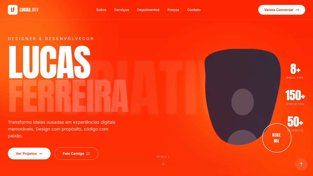
Estilo Bold Portfolio com gradiente vibrante, tipografia oversized Anton e imagem com CSS mask. Ideal para portfólios criativos, designers freelancer e agências de branding.
Uso: Portfólios criativos, Designers freelancer, Agências de branding, Sites pessoais de artistas
Contexto Histórico
Reflete a tendência de portfólios criativos com tipografia oversized e efeitos visuais ousados como CSS masks e blobs luminosos, priorizando impacto visual e personalidade.
Especificações Técnicas
Cores
Primárias
Secundárias
Efeitos
VÍDEO: Este estilo não utiliza vídeo de fundo. O impacto visual vem do gradiente vibrante vermelho-laranja (#fd2601 para #f37e1c), tipografia massiva Anton, imagem com CSS mask brush stroke, e blobs luminosos com mix-blend-screen. O fundo é puramente CSS com gradiente e efeitos de luz. | EFEITOS CSS: Gradiente vertical de vermelho-laranja para laranja como fundo, tipografia massiva (12vw, max 180px) com font Anton uppercase, imagem central com CSS mask (brush stroke shape) sobrepondo o texto criando profundidade, blobs luminosos (300-600px, blur 80px, mix-blend-screen, opacity-60), texto SVG gigante no fundo (opacity 0.08, blur 4px), botão HIRE ME circular com borda branca e hover fill branco, brand strip de logos na parte inferior
Light/Dark
✗ Not Recommended / ✓ Full
CSS
background: linear-gradient(to bottom, #fd2601, #f37e1c), font-family: 'Anton' / 'Inter', font-size: clamp(4rem, 12vw, 180px), text-transform: uppercase, -webkit-mask-image for brush stroke, mix-blend-mode: screen on blobs, filter: blur(80px), ::selection { background: white; color: #fd2601 }
Variáveis
--gradient-bg: linear-gradient(to bottom, #fd2601, #f37e1c), --text-primary: #FFFFFF, --color-orange: #fd2601, --color-blob: #F4791B, --font-display: 'Anton', --font-body: 'Inter', --display-size: clamp(4rem, 12vw, 180px), --blob-blur: 80px
Checklist
☐ Gradiente vertical vermelho-laranja, ☐ Tipografia massiva Anton uppercase, ☐ Imagem com CSS mask brush stroke, ☐ Blobs luminosos mix-blend-screen, ☐ Texto SVG fundo opacity 0.08, ☐ Botão circular HIRE ME, ☐ Brand strip logos, ☐ Responsivo stack mobile
DESIGN.md
Design System: Bold Portfolio Hero
1. Visual Theme & Atmosphere
Estilo Bold Portfolio com gradiente vibrante, tipografia oversized Anton e imagem com CSS mask. Ideal para portfólios criativos, designers freelancer e agências de branding. Reflete a tendência de portfólios criativos com tipografia oversized e efeitos visuais ousados como CSS masks e blobs luminosos, priorizando impacto visual e personalidade.
- Density: 5/10 — Balanced
- Variance: 4/10 — Moderate
- Motion: 4/10 — Subtle
2. Color Palette & Roles
- Vermelho-Laranja (#fd2601) — Error states, destructive actions
- Laranja (#f37e1c) — Warm accent, call-to-action secondary
- Branco (#FFFFFF) — Light surface, card backgrounds
- Laranja Blob (#F4791B) — Warm accent, call-to-action secondary
- Branco Seleção (#FFFFFF) — Secondary surface
- Laranja Seleção (#fd2601) — Warm accent, call-to-action secondary
- Branco Opaco (rgba(255,255,255,0.08)) — Secondary surface
- Branco Borda (rgba(255,255,255,0.9)) — Secondary surface
3. Typography Rules
- Display / Hero: Anton — Weight 700, tight tracking, used for headline impact
- Accent: Inter — Used for decorative or emphasis text
- Body: Anton — Weight 400, 16px/1.6 line-height, max 72ch per line
- UI Labels / Captions: Anton — 0.875rem, weight 500, slight letter-spacing
- Monospace: JetBrains Mono — Used for code, metadata, and technical values
Scale:
- Hero: clamp(2.5rem, 5vw, 4rem)
- H1: 2.25rem
- H2: 1.5rem
- Body: 1rem / 1.6
- Small: 0.875rem
4. Component Stylings
- Primary Button: Subtly rounded (0.5rem) shape. Accent color fill. Hover: 8% darken + subtle lift shadow. Active: -1px translate tactile press. Font weight 600. No outer glows.
- Secondary / Ghost Button: Outline variant. 1.5px border in muted color. Text in primary color. Hover: subtle background fill.
- Cards: Subtly rounded (0.5rem) corners. Surface background. Subtle shadow (0 2px 12px rgba(0,0,0,0.06)). 1px border stroke.
- Inputs: Label above input. 1px border stroke. Focus ring: 2px accent color offset 2px. Error text below in semantic red. No floating labels.
- Navigation: Primary surface background. Active item: accent color indicator. Font weight 500 when active.
- Skeletons: Shimmer animation matching component dimensions. No circular spinners.
- Empty States: Icon-based composition with descriptive text and action button.
5. Layout Principles
- Grid: CSS Grid primary. Max-width containment: 1280px centered with 1.5rem side padding.
- Spacing rhythm: Balanced. Base unit: 0.5rem (8px).
- Section vertical gaps: clamp(4rem, 8vw, 8rem).
- Hero layout: Split-screen (text left, visual right).
- Feature sections: Zig-zag alternating text+image rows. No 3-equal-columns.
- Mobile collapse: All multi-column layouts collapse below 768px. No horizontal overflow.
- z-index contract: base (0) / sticky-nav (100) / overlay (200) / modal (300) / toast (500).
6. Motion & Interaction
- Physics: Ease-out curves, 200-300ms duration. Smooth and predictable.
- Entry animations: Fade + translate-Y (16px → 0) over 420ms ease-out. Staggered cascades for lists: 80ms between items.
- Hover states: Subtle color shift + shadow adjustment over 200ms.
- Page transitions: Fade only (200ms).
- Performance: Only transform and opacity animated. No layout-triggering properties.
7. Anti-Patterns (Banned)
- No emojis in UI — use icon system only (Lucide, Heroicons)
- No pure black (#000000) — use off-black or charcoal variants
- No oversaturated accent colors (saturation cap: 80%)
- No 3-column equal-width feature layouts — use zig-zag or asymmetric grid
- No
h-screen— usemin-h-[100dvh] - No AI copywriting clichés: "Elevate", "Seamless", "Unleash", "Next-Gen"
- No broken external image links — use picsum.photos or inline SVG
- No generic lorem ipsum in demos
Prompt para AI
Design a bold portfolio hero with vertical gradient from red-orange #fd2601 to orange #f37e1c. Massive uppercase headline (12vw, max 180px) Anton font. Central portrait with CSS mask brush stroke overlapping text. Glowing blobs (300-600px, blur 80px, mix-blend-screen). Faint SVG text background (opacity 0.08). Circular HIRE ME button with white border hover fill. Brand logo strip at bottom.
Relacionados
Última sincronização: 01/04/2026