Kitsch
Kitsch landing page with intentionally bright, exaggerated, over-the-top aesthetics. Ideal for branding satírico, produtos de novidade, autocolantes, campanhas de marketing exageradas. AI-ready template.
Use case: Branding satírico, Produtos de novidade, Autocolantes, Campanhas de marketing exageradas
Historical Context
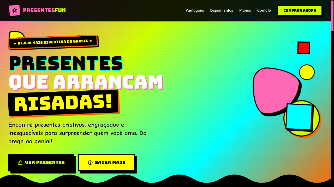
Kitsch never asked for permission. It crawled out of post-war consumer culture — cheap souvenirs, velvet paintings, plastic flamingos — everything the art establishment despised. The term itself carried German disdain for sentimental trash, but that's exactly what gave it power. By the time Susan Sontag wrote 'Notes on Camp' in 1964, the conversation shifted: what if bad taste, deployed with full awareness, becomes its own aesthetic statement? Suddenly the line between sincere and ironic collapsed entirely. The 1980s and 90s turned kitsch into a design weapon. Jeff Koons put balloon dogs in galleries. John Waters built an entire filmography on it. Memphis Group furniture made modernists physically uncomfortable. These weren't accidents — they were deliberate provocations against good taste as a gatekeeping mechanism. Kitsch said: your hierarchies are boring, and we're going to make something louder, cheaper-looking, and more memorable than anything in your approved canon. Today kitsch lives in brand identities that refuse subtlety, in maximalist web design that treats whitespace as cowardice, in the entire aesthetic vocabulary of internet irony. It's not retro nostalgia — it's an active rejection of the idea that restraint equals sophistication.
When to Use
Deploy kitsch when your project needs to signal self-awareness and cultural fluency simultaneously. It works for entertainment brands that thrive on excess, ironic product lines that wink at the audience, pop culture commentary that needs visual volume, and any context where sincerity and absurdity coexist without apology. Kitsch fails completely when used timidly — half-committed kitsch just looks like a mistake. You either crank every dial past ten or you pick a different direction entirely.
Design Principles
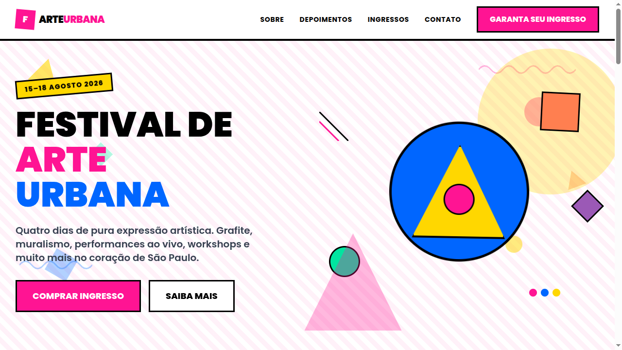
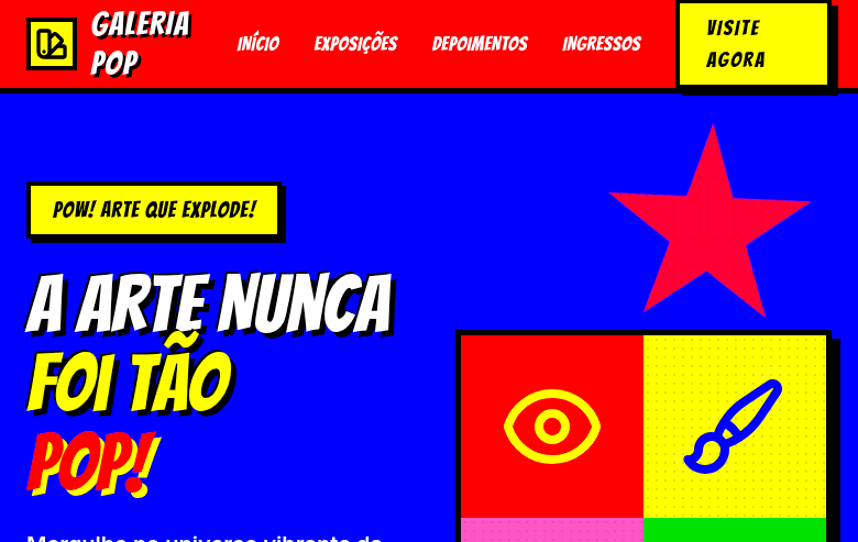
- Commit fully or don't bother — kitsch at 60% just looks like bad design with no alibi
- Clash colors with intention: hot pink against lime green isn't random, it's confrontational palette work that rejects harmony as a default
- Exaggerate proportions, borders, and ornamentation until the viewer understands this is a choice, not incompetence
- Layer cultural references shamelessly — mix decades, mix high and low, treat the mood board like a thrift store bin
- Maintain ironic distance through typography and copywriting: the visuals scream sincerity while the voice stays knowing
Technical Specs
Colors
Primary
Secondary
Effects
Clashing color combinations, exaggerated drop shadows (8px), bold thick borders (4px+), retro halftone dot patterns, pop-up/bounce animations, rotating decorative elements, intentionally 'tacky' gradient backgrounds
Light/Dark
✓ Full / ◐ Partial
Related
Last synced: 4/1/2026