Pop Art
Pop Art landing page with extremely saturated bold colors and comic-strip aesthetics. Ideal for branding lúdico, design de vestuário, embalagens icônicas, capas editoriais. AI-ready template.
Use case: Branding lúdico, Design de vestuário, Embalagens icônicas, Capas editoriais
Historical Context
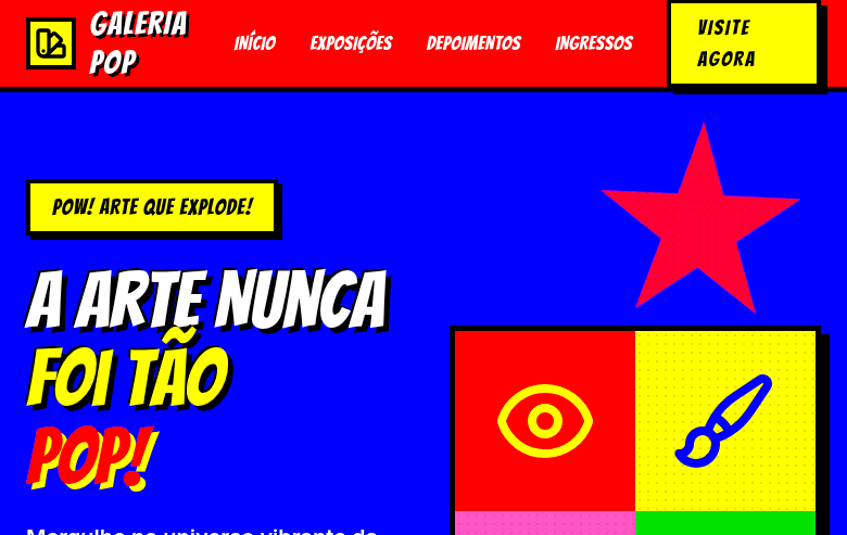
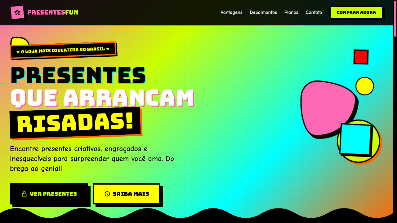
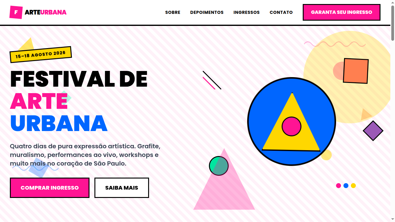
Pop Art didn't ask permission. It kicked down the gallery door in the late 1950s and dragged commercial culture — soup cans, comic strips, celebrity headshots — into spaces that had been reserved for oil-on-canvas reverence. Warhol understood repetition as critique; Lichtenstein turned Ben-Day dots into a weapon against artistic pretension. The movement was a direct rejection of Abstract Expressionism's navel-gazing — suddenly art could be loud, accessible, and mass-produced without apology. What makes Pop Art endure in design isn't nostalgia — it's the underlying philosophy. These artists treated visual culture as raw material. They flattened hierarchy between high and low, proving that a Brillo box could carry the same weight as a Rothko. That democratization of imagery is essentially what every brand designer does today when they pull from memes, street culture, or TikTok aesthetics. The palette was never subtle. Saturated magentas, electric yellows, cyan pushed to the edge — colors chosen for maximum retinal impact, borrowed directly from commercial printing limitations that became deliberate stylistic choices.
When to Use
Pop Art works when you need to be impossible to ignore. Entertainment brands, youth-facing products, fashion campaigns that refuse to whisper — this is your territory. It's the right call when your audience scrolls fast and you need to stop thumbs dead. Bold outlines and saturated color create instant recognition at any scale, from billboard to app icon. But commit fully. Half-hearted Pop Art reads as clip art. You either embrace the maximalism or you pick a different direction entirely.
Design Principles
- Saturate without fear — push color to full intensity, let hues clash deliberately rather than harmonize politely
- Outline everything with confident, uniform weight — the bold black stroke is non-negotiable and creates the graphic punch that separates Pop from generic illustration
- Flatten depth aggressively — eliminate gradients and subtle shadows in favor of hard-edged color blocks that read instantly
- Repeat and multiply — single images gain power through serialization, grids, and pattern; repetition is meaning, not laziness
- Scale disproportionately — blow up mundane objects to monumental size or shrink important ones; the tension between scale and subject creates visual interest
Technical Specs
Colors
Primary
Secondary
Effects
Halftone dot pattern overlays (CSS radial-gradient), bold black outlines (3-4px), comic speech bubble shapes, Ben-Day dots background, repetitive grid layouts (Warhol-style), high saturation filters, pop-in scale animations
Light/Dark
✓ Full / ◐ Partial
Related
Last synced: 4/1/2026