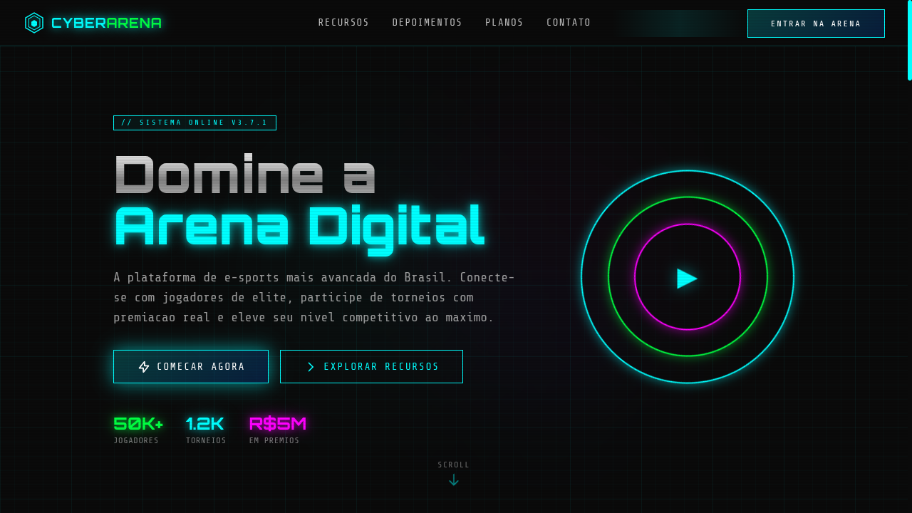
Futurista & Tech 2010s-2020s Digital Subculture

Cyber Core

Estilo Cyber Core com visuais neon, motivos de circuito e acabamentos metálicos de alta velocidade digital. Ideal para marcas de gaming, pôsteres e branding digital edgy.

Cyber core neon circuit board metallic heavy shadows pop-up windows OS-style digital gaming edgy high-speed

Uso: Marcas de gaming, Design de pôsteres, Branding digital edgy, Portfólios tech

Cyber Core

Contexto Histórico

O Cyber Core emerge da subcultura digital dos anos 2010-20, inspirado por cyberpunk, interfaces de sistemas operacionais e estética de gaming. Celebra a velocidade digital e o neon.

Especificações Técnicas

Cores

Primárias

#00FFFF
#00FF41
#0A0A0A
#C0C0C0

Secundárias

#FF00FF
#0066FF
#FF3333
#1A1A2E

Efeitos

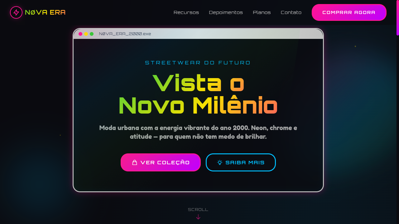
Neon glow borders (box-shadow: 0 0 15px), circuit board pattern backgrounds via CSS, metallic gradient text, OS-style window frame sections with title bars, scanline overlay, glitch animation on hover, heavy drop shadows

Light/Dark

◐ Partial / ✓ Full

CSS

font-family: 'Share Tech Mono', monospace, background: #0A0A0A, color: #00FFFF, border: 1px solid #00FFFF, box-shadow: 0 0 15px rgba(0,255,255,0.5), text-shadow: 0 0 10px rgba(0,255,255,0.5), background-clip: text for metallic gradients, animation: glitch 0.3s on hover

Variáveis

--color-cyan: #00FFFF, --color-green: #00FF41, --color-black: #0A0A0A, --color-chrome: #C0C0C0, --font-mono: 'Share Tech Mono', --glow-cyan: rgba(0,255,255,0.5), --border: 1px solid #00FFFF, --spacing: 1.5rem, --border-radius: 2px

Checklist

☐ Neon glow borders and text, ☐ Circuit board pattern backgrounds, ☐ OS-style window frame sections, ☐ Metallic gradient text effects, ☐ Scanline overlay, ☐ Glitch hover animations, ☐ Monospace tech typography, ☐ Dark base with neon accents, ☐ Responsive with maintained digital edge

DESIGN.md

Design System: Cyber Core

1. Visual Theme & Atmosphere

Estilo Cyber Core com visuais neon, motivos de circuito e acabamentos metálicos de alta velocidade digital. Ideal para marcas de gaming, pôsteres e branding digital edgy. O Cyber Core emerge da subcultura digital dos anos 2010-20, inspirado por cyberpunk, interfaces de sistemas operacionais e estética de gaming. Celebra a velocidade digital e o neon.

  • Density: 5/10 — Balanced
  • Variance: 7/10 — Dynamic
  • Motion: 6/10 — Expressive

2. Color Palette & Roles

  • Neon Cyan (#00FFFF) — Accent highlight, links and focus states
  • Matrix Green (#00FF41) — Secondary surface or text color
  • Deep Black (#0A0A0A) — Dark surface, primary background
  • Chrome Silver (#C0C0C0) — Supporting palette color
  • Neon Pink (#FF00FF) — Primary text color
  • Electric Blue (#0066FF) — Secondary accent
  • Warning Red (#FF3333) — Error states, destructive actions
  • Dark Grey (#1A1A2E) — Deep contrast surface

3. Typography Rules

  • Display / Hero: Share Tech Mono — Weight 700, tight tracking, used for headline impact
  • Body: Share Tech Mono — Weight 400, 16px/1.6 line-height, max 72ch per line
  • UI Labels / Captions: Share Tech Mono — 0.875rem, weight 500, slight letter-spacing
  • Monospace: Share Tech Mono — Used for code, metadata, and technical values

Scale:

  • Hero: clamp(2.5rem, 5vw, 4rem)
  • H1: 2.25rem
  • H2: 1.5rem
  • Body: 1rem / 1.6
  • Small: 0.875rem

4. Component Stylings

  • Primary Button: Generously rounded (1.5rem) shape. Accent color fill. Hover: 8% darken + subtle lift shadow. Active: -1px translate tactile press. Font weight 600. No outer glows.
  • Secondary / Ghost Button: Outline variant. 1.5px border in muted color. Text in primary color. Hover: subtle background fill.
  • Cards: Generously rounded (1.5rem) corners. Surface background. Subtle shadow (0 2px 12px rgba(0,0,0,0.06)). 1px border stroke.
  • Inputs: Label above input. 1px border stroke. Focus ring: 2px accent color offset 2px. Error text below in semantic red. No floating labels.
  • Navigation: Primary surface background. Active item: accent color indicator. Font weight 500 when active.
  • Skeletons: Shimmer animation matching component dimensions. No circular spinners.
  • Empty States: Icon-based composition with descriptive text and action button.

5. Layout Principles

  • Grid: CSS Grid primary. Max-width containment: 1280px centered with 1.5rem side padding.
  • Spacing rhythm: Balanced. Base unit: 0.5rem (8px).
  • Section vertical gaps: clamp(4rem, 8vw, 8rem).
  • Hero layout: Asymmetric composition.
  • Feature sections: Asymmetric grid with varied card sizes. No 3-equal-columns.
  • Mobile collapse: All multi-column layouts collapse below 768px. No horizontal overflow.
  • z-index contract: base (0) / sticky-nav (100) / overlay (200) / modal (300) / toast (500).

6. Motion & Interaction

  • Physics: Spring — stiffness 120, damping 20. Confident, weighted transitions.
  • Entry animations: Fade + translate-Y (16px → 0) over 480ms ease-out. Staggered cascades for lists: 100ms between items.
  • Hover states: Scale(1.03) + shadow lift over 200ms.
  • Page transitions: Fade + slide (300ms).
  • Performance: Only transform and opacity animated. No layout-triggering properties.

7. Anti-Patterns (Banned)

  • No emojis in UI — use icon system only (Lucide, Heroicons)
  • No pure white (#FFFFFF) backgrounds — use off-white or dark surfaces
  • No oversaturated accent colors (saturation cap: 80%)
  • No 3-column equal-width feature layouts — use zig-zag or asymmetric grid
  • No h-screen — use min-h-[100dvh]
  • No AI copywriting clichés: "Elevate", "Seamless", "Unleash", "Next-Gen"
  • No broken external image links — use picsum.photos or inline SVG
  • No generic lorem ipsum in demos

Prompt para AI

Design a cyber core landing page with neon-lit, high-speed digital aesthetics. Use neon cyan, matrix green, deep black, chrome silver. Apply neon glow borders, circuit board CSS patterns, metallic gradient text, OS-style window frames with title bars, scanline overlays, glitch hover animations. Typography should be monospace or tech-style. Dark, edgy, gaming-inspired atmosphere.

Relacionados

Última sincronização: 01/04/2026