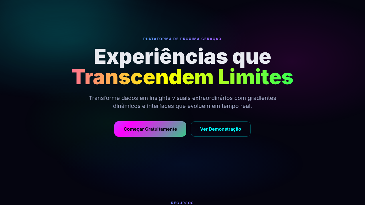
Gradient Mesh / Aurora Evolved
Design with gradient mesh aurora effect. Ideal for landing pages, saas. AI-ready template.
Use case: Landing pages, SaaS
Historical Context
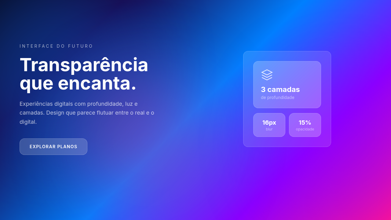
Gradients have had three lives. The first was embarrassing — Photoshop-era linear sweeps slapped on everything from buttons to business cards. We collectively agreed to stop. Then flat design killed them entirely, which was its own kind of violence. The resurrection started around 2018. Stripe's landing pages introduced these impossibly smooth, multi-stop gradients that felt like light refracting through glass. Vercel followed with darker, more celestial takes — aurora-like washes that made developer tools feel like spacecraft dashboards. Suddenly gradients weren't decoration. They were atmosphere. Tools caught up slowly. CSS got conic-gradient and oklab interpolation. Figma shipped mesh gradients in 2024, finally letting designers plot color across a 2D field instead of forcing everything through linear axes. WebGL and canvas-based animations pushed things further — now gradients could breathe, shift, respond. The mesh gradient isn't a trend. It's the medium finally matching what we always wanted gradients to be: dimensional, organic, alive.
When to Use
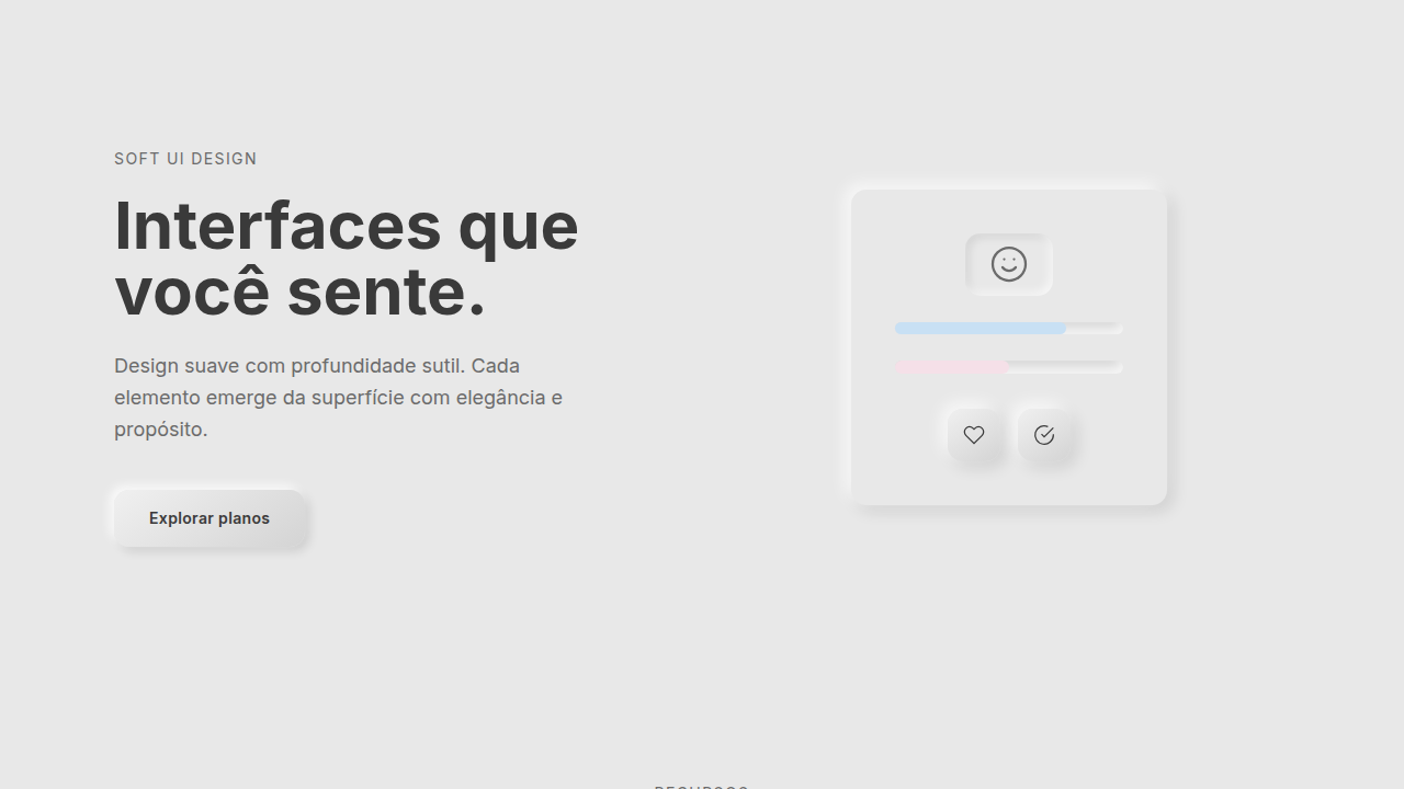
When your product needs to signal sophistication without relying on illustration or photography. AI products love these because they suggest intelligence without being literal. Premium SaaS uses them to differentiate hero sections that would otherwise be generic. Creative tools lean on them for brand identity — they say 'we understand aesthetics' without a single word. Skip them for utilitarian interfaces, dense data products, or anything where the gradient would compete with content rather than elevate it.
Design Principles
- Anchor in one dominant hue, let secondary colors orbit — never give three colors equal weight or you get mud
- Animate at glacial speed. If a user can consciously track the movement, it's too fast. Think 20-60 second loops minimum
- Use oklab or oklch color spaces for interpolation — sRGB creates dead gray zones between complementary colors
- Constrain the mesh to backgrounds and large surfaces. The moment you put a mesh gradient on a card or button, you've lost the plot
- Pair with high-contrast typography and generous whitespace. The gradient is the quiet part — text is the loud part
Technical Specs
Colors
Primary
Effects
CSS mesh-gradient (experimental), SVG gradients, canvas gradients, smooth color morphing, flowing animation
Light/Dark
✓ Full / ✓ Full
Related
Last synced: 4/1/2026