Glass Gradient Creative
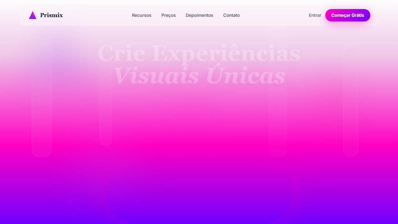
Full-screen hero page with a vertical white-to-magenta gradient background, overlapping blurred triangular shapes in purple and pink, and tall glass columns using glassmorphism. Ideal for landing pages criativas, portfólios de design, digital agencies, produtos visuais premium. AI-ready template.
Use case: Landing pages creative, Portfolios de design, Digital agencies, Products visuais premium
Historical Context
Glassmorphism didn't appear out of nowhere. It's the logical conclusion of a decade-long oscillation between flat and skeuomorphic thinking. Apple's iOS 7 blur panels in 2013 planted the seed — frosted acrylic over content, depth without literal shadow. Microsoft's Fluent Design picked it up with Acrylic Material in 2017, proving that translucency could organize hierarchy without heavy borders. But the term 'glassmorphism' only crystallized around 2020 when designers on Dribbble started pushing frosted panels with visible borders and background blur to absurd, beautiful extremes. The vertical gradient variant takes this further. Instead of uniform frost, you get directional color bleeding through glass columns — a technique that owes as much to print poster design and light photography as it does to UI trends. The gradient isn't decoration; it's wayfinding. Each column catches a different slice of the spectrum, creating implicit grouping without explicit containers. What makes this pattern endure where others fade is restraint in its best implementations. The glass is a lens, not a wall. When designers forget that — when blur becomes so heavy it obscures everything — the pattern collapses into noise. The best glass gradient work remembers that transparency is a contract with the user: you're showing them layers exist.
When to Use
Reach for glass gradient columns when your content needs to feel layered and premium without resorting to heavy card borders or drop shadows. It works when you have a bold background — photography, gradients, or video — and need foreground content to remain legible while preserving visual connection to what's behind it. Creative agencies use it to signal craft. Portfolio sites use it to let work breathe behind navigation. Premium SaaS uses it to elevate pricing tiers or feature comparisons beyond the typical bordered-box grid. Avoid it on data-dense interfaces or anywhere accessibility contrast ratios become a fight.
Design Principles
- Transparency is hierarchy — blur intensity and opacity should map directly to content importance, not applied uniformly across every panel
- Borders define, not decorate — a 1px border at 15-20% white opacity gives glass its edge; without it, panels dissolve into mush against similar backgrounds
- Gradient direction carries meaning — vertical gradients in columns should flow consistently (top-warm to bottom-cool, or light-to-dark) to reinforce reading direction and visual gravity
- Background contrast is non-negotiable — glass only works when there's something worth seeing through it; a flat white background behind frosted panels is just a card with extra steps
- Motion reveals depth — subtle parallax or scroll-linked opacity shifts on glass layers prove the translucency is real, not a static texture pretending to be transparent
DESIGN.md
---
version: "alpha"
name: "Glass Gradient Creative"
description: "Full-screen hero page with a vertical white-to-magenta gradient background, overlapping blurred triangular shapes in purple and pink, and tall glass columns using glassmorphism. Ideal for landing pages criativas, portfólios de design, digital agencies, produtos visuais premium. AI-ready template."
colors:
  primary: "#FDFDFD"
  secondary: "#FF00C3"
  tertiary: "#7000FF"
  neutral: "#E3E3E3"
  surface: "#FF0080"
  accent: "#C38CFF"
typography:
  h1:
    fontFamily: System UI stack
    fontSize: 2.25rem
    fontWeight: 700
  body-md:
    fontFamily: System UI stack
    fontSize: 1rem
    fontWeight: 400
  label-caps:
    fontFamily: System UI stack
    fontSize: 0.75rem
    fontWeight: 500
rounded:
  sm: 18px
  md: 36px
  lg: 54px
components:
  button-primary:
    backgroundColor: "{colors.primary}"
    textColor: "{colors.neutral}"
    rounded: "{rounded.sm}"
    padding: 12px
---

## Overview

Full-screen hero page with a vertical white-to-magenta gradient background, overlapping blurred triangular shapes in purple and pink, and tall glass columns using glassmorphism. Ideal for landing pages criativas, portfólios de design, digital agencies, produtos visuais premium. AI-ready template. Glassmorphism didn't appear out of nowhere. It's the logical conclusion of a decade-long oscillation between flat and skeuomorphic thinking. Apple's iOS 7 blur panels in 2013 planted the seed — frosted acrylic over content, depth without literal shadow. Microsoft's Fluent Design picked it up with Acrylic Material in 2017, proving that translucency could organize hierarchy without heavy borders. But the term 'glassmorphism' only crystallized around 2020 when designers on Dribbble started pushing frosted panels with visible borders and background blur to absurd, beautiful extremes.

The vertical gradient variant takes this further. Instead of uniform frost, you get directional color bleeding through glass columns — a technique that owes as much to print poster design and light photography as it does to UI trends. The gradient isn't decoration; it's wayfinding. Each column catches a different slice of the spectrum, creating implicit grouping without explicit containers.

What makes this pattern endure where others fade is restraint in its best implementations. The glass is a lens, not a wall. When designers forget that — when blur becomes so heavy it obscures everything — the pattern collapses into noise. The best glass gradient work remembers that transparency is a contract with the user: you're showing them layers exist.

- Density: 3/10 — Airy
- Variance: 3/10 — Restrained
- Motion: 4/10 — Subtle

- **Style:** General
- **Keywords:** glassmorphism, gradiente vertical, colunas de vidro, glow magenta, tipografia elegante centrada, layout minimal, hero fullscreen
- **Era:** 2020s Glassmorphism Creative
- **Light/Dark:** ◐ Partial

## Colors

- **Branco suave** (#FDFDFD) — Light surface, card backgrounds
- **Magenta neon** (#FF00C3) — Decorative accent, highlight elements
- **Roxo intenso** (#7000FF) — Accent color, emphasis elements
- **Cinza claro** (#E3E3E3) — Secondary text, borders, muted elements
- **Rosa** (#FF0080) — Decorative accent, highlight elements
- **Roxo claro** (#C38CFF) — Accent color, emphasis elements


## Typography

- **Display / Hero:** System UI stack (-apple-system, sans-serif) — Weight 700, tight tracking, used for headline impact
- **Body:** System UI stack (-apple-system, sans-serif) — Weight 400, 16px/1.6 line-height, max 72ch per line
- **UI Labels / Captions:** System UI stack (-apple-system, sans-serif) — 0.875rem, weight 500, slight letter-spacing
- **Monospace:** JetBrains Mono — Used for code, metadata, and technical values

Scale:
- Hero: clamp(2.5rem, 5vw, 4rem)
- H1: 2.25rem
- H2: 1.5rem
- Body: 1rem / 1.6
- Small: 0.875rem


## Layout

- **Grid:** CSS Grid primary. Max-width containment: 1280px centered with 1.5rem side padding.
- **Spacing rhythm:** Balanced. Base unit: 0.5rem (8px).
- **Section vertical gaps:** clamp(4rem, 8vw, 8rem).
- **Hero layout:** Split-screen (text left, visual right).
- **Feature sections:** Zig-zag alternating text+image rows. No 3-equal-columns.
- **Mobile collapse:** All multi-column layouts collapse below 768px. No horizontal overflow.
- **z-index contract:** base (0) / sticky-nav (100) / overlay (200) / modal (300) / toast (500).


## Elevation & Depth

Gradiente vertical do branco ao magenta, formas triangulares sobrepostas com blur, colunas altas com glass effect (desfoque e borda clara), sombras suaves, glow na base

- **Physics:** Ease-out curves, 200-300ms duration. Smooth and predictable.
- **Entry animations:** Fade + translate-Y (16px → 0) over 420ms ease-out. Staggered cascades for lists: 80ms between items.
- **Hover states:** Subtle color shift + shadow adjustment over 200ms.
- **Page transitions:** Fade only (200ms).
- **Performance:** Only transform and opacity animated. No layout-triggering properties.


## Shapes

Base corner radius: 18px. See rounded tokens in front matter for the full scale.


## Components

- **Primary Button:** Rounded (18px) shape. Accent color fill. Hover: 8% darken + subtle lift shadow. Active: -1px translate tactile press. Font weight 600. No outer glows.
- **Secondary / Ghost Button:** Outline variant. 1.5px border in muted color. Text in primary color. Hover: subtle background fill.
- **Cards:** Rounded (18px) corners. Surface background. Subtle shadow (0 2px 12px rgba(0,0,0,0.06)). 1px border stroke.
- **Inputs:** Label above input. 1px border stroke. Focus ring: 2px accent color offset 2px. Error text below in semantic red. No floating labels.
- **Navigation:** Primary surface background. Active item: accent color indicator. Font weight 500 when active.
- **Skeletons:** Shimmer animation matching component dimensions. No circular spinners.
- **Empty States:** Icon-based composition with descriptive text and action button.


## Do's and Don'ts

- No emojis in UI — use icon system only (Lucide, Heroicons)
- No decorative gradients — flat color only
- No shadows heavier than 0 2px 8px rgba(0,0,0,0.08)
- No pure black (#000000) — use off-black or charcoal variants
- No oversaturated accent colors (saturation cap: 80%)
- No 3-column equal-width feature layouts — use zig-zag or asymmetric grid
- No `h-screen` — use `min-h-[100dvh]`
- No AI copywriting clichés: "Elevate", "Seamless", "Unleash", "Next-Gen"
- No broken external image links — use picsum.photos or inline SVG
- No generic lorem ipsum in demos

- Do Hero fullscreen com gradiente vertical branco → magenta → roxo
- Do Formas triangulares sobrepostas com blur e variação de opacidade
- Do Colunas verticais com efeito glass (backdrop-filter + borda clara + sombra suave)
- Do Headline serif elegante centralizada em branco
- Do CTA principal destacado na região mais intensa do gradiente


## Use Case

Landing pages creative, Portfolios de design, Digital agencies, Products visuais premium
Technical Specs
CSS
border-radius: 18px; box-shadow: 0 28px 80px rgba(0,0,0,0.35); background: linear-gradient(to bottom, #FDFDFD 0%, #FF00C3 75%, #7000FF 100%); backdrop-filter: blur(30px); border: 1px solid rgba(255,255,255,0.45);
Variables
--radius-glass: 18px; --color-bg-top: #FDFDFD; --color-gradient-mid: #FF00C3; --color-gradient-bottom: #7000FF; --glass-border: rgba(255,255,255,0.45); --glass-blur: 30px; --shadow-glass: 0 28px 80px rgba(0,0,0,0.35);
Checklist
☐ Hero fullscreen com gradiente vertical branco → magenta → roxo, ☐ Formas triangulares sobrepostas com blur e variação de opacidade, ☐ Colunas verticais com efeito glass (backdrop-filter + borda clara + sombra suave), ☐ Headline serif elegante centralizada em branco, ☐ CTA principal destacado na região mais intensa do gradiente
Colors
Primary
Secondary
Effects
Gradiente vertical do branco ao magenta, formas triangulares sobrepostas com blur, colunas altas com glass effect (desfoque e borda clara), sombras suaves, glow na base
Light/Dark
◐ Partial
AI Prompt
Act as a Senior Frontend Engineer and Expert UI Designer.
Your task is to code a complete Landing Page on the first attempt.
- Landing Page Theme: <INSERT THEME>
- Sections to add: <INSERT SECTIONS>

Generate the final code immediately following these definitions:

## Style

- **Name:** Glass Gradient Creative
- **Type:** General
- **Keywords:** glassmorphism, gradiente vertical, colunas de vidro, glow magenta, tipografia elegante centrada, layout minimal, hero fullscreen
- **Era:** 2020s Glassmorphism Creative
- **Light/Dark:** ◐ Partial

## Color Palette

- **Primary:** Branco suave #FDFDFD, Magenta neon #FF00C3, Roxo intenso #7000FF
- **Secondary:** Cinza claro #E3E3E3, Rosa #FF0080, Roxo claro #C38CFF

## Visual Effects

Gradiente vertical do branco ao magenta, formas triangulares sobrepostas com blur, colunas altas com glass effect (desfoque e borda clara), sombras suaves, glow na base

## AI Visual Direction

Create a full-screen hero page with a vertical white-to-magenta gradient background, overlapping blurred triangular shapes in purple and pink, and tall glass columns using glassmorphism. Center a refined serif headline and subheadline in white, with a prominent CTA button over the glowing gradient base.

## CSS Technical

```css
border-radius: 18px; box-shadow: 0 28px 80px rgba(0,0,0,0.35); background: linear-gradient(to bottom, #FDFDFD 0%, #FF00C3 75%, #7000FF 100%); backdrop-filter: blur(30px); border: 1px solid rgba(255,255,255,0.45);
```

## Design System Variables

```css
--radius-glass: 18px; --color-bg-top: #FDFDFD; --color-gradient-mid: #FF00C3; --color-gradient-bottom: #7000FF; --glass-border: rgba(255,255,255,0.45); --glass-blur: 30px; --shadow-glass: 0 28px 80px rgba(0,0,0,0.35);
```

## Implementation Checklist

- ☐ Hero fullscreen com gradiente vertical branco → magenta → roxo
- ☐ Formas triangulares sobrepostas com blur e variação de opacidade
- ☐ Colunas verticais com efeito glass (backdrop-filter + borda clara + sombra suave)
- ☐ Headline serif elegante centralizada em branco
- ☐ CTA principal destacado na região mais intensa do gradiente

## Execution Rules

1. Strictly follow the defined visual style.
2. Use high-quality inline SVG icons (Heroicons or Lucide style) — NEVER use emojis as icons.
3. Add `cursor-pointer` and smooth `hover` states (transition-all) on all interactive elements.
4. Required Page Structure:
   - Navbar (Logo + Links + CTA)
   - Hero Section (Impactful Headline + Subtitle + 2 buttons + 3D/Abstract visual element via CSS)
   - Features (3 cards with icons)
   - Testimonials (3 cards)
   - Pricing (3 tiers, highlight the middle one)
   - Final CTA
   - Full Footer with social links, privacy policy, terms of use, contact and SEO links.
5. All text content must be in English.
6. The visual must be CLEARLY distinct — do not create a "default Bootstrap" design. Force the use of the provided design system variables.
7. Use `<style>` tags in the head for custom classes (especially for complex backdrop-filter effects and animations) that Tailwind CDN doesn't cover.
8. Full Responsiveness: Layout must adapt perfectly to Mobile, Tablet and Desktop (vertical stack on mobile).
9. Include basic SEO, Viewport and Open Graph meta tags in `<head>`.
10. Footer must contain: Copyright 2026, Secondary navigation links and Social media icons.
11. Make the creative decisions needed to deliver the complete, functional result now.
Related
Last synced: 4/1/2026