Estilo de Realidade Virtual Social
Design an immersive and futuristic landing page for a new metaverse space. Ideal for landing pages, modern websites. AI-ready template.
Use case: Landing pages, Modern websites
Historical Context
Social VR design didn't emerge from UI departments. It crawled out of game engines, modding communities, and the collective fever dream of people who wanted to be somewhere else together. VRChat proved the thesis early: give people avatar bodies and a shared room, and they'll build culture without your permission. The interfaces were janky, the menus floated awkwardly in mid-air, but none of that mattered because presence was the product. Meta Horizon Worlds tried to corporatize this. Clean lines, friendly colors, legless avatars that became a punchline. The lesson was brutal — you cannot design social VR like a mobile app with depth. Flat-screen thinking produces dead spaces. The successful platforms understood that your UI isn't a screen anymore, it's the entire environment. Menus become objects. Navigation becomes locomotion. Identity becomes a body you inhabit. Designing for social VR means accepting that the avatar IS the interface. Every interaction radiates outward from a virtual body — gestures, proximity, gaze direction. The design system must account for spatial relationships between people, not just between elements on a canvas. Personal space exists here. Eye contact has weight. This changes everything about how you structure interaction patterns.
When to Use
Reach for this style when you're building anything where people exist as embodied presences in shared digital space. Metaverse platforms, obviously. Virtual event venues where attendees need to feel like attendees, not cursors. Avatar creation systems that treat identity as spatial, not just visual. Social VR lobbies, collaborative virtual workspaces, or any experience where the relationship between users matters more than the relationship between user and content. If your product has a concept of 'being there together,' this is your territory.
Design Principles
- Avatar-first hierarchy — every UI decision starts from the body outward, not the screen inward. The avatar is your primary input device and your primary display.
- Spatial proximity as interaction model — distance between users carries meaning. Design for intimate, social, and public zones the way architects do, not the way app designers do.
- Environmental UI over overlay UI — embed interface elements into the world geometry. Floating HUDs break presence. Objects you can reach for maintain it.
- Graceful degradation across embodiment levels — your system must work for full-body tracking, hands-only, and controller-pointer users without making anyone feel like a second-class citizen.
- Social legibility at a glance — identity, status, intent, and availability must read clearly from across a virtual room. You have maybe 200 milliseconds before someone decides whether to approach.
DESIGN.md
---
version: "alpha"
name: "Estilo de Realidade Virtual Social"
description: "Design an immersive and futuristic landing page for a new metaverse space. Ideal for landing pages, modern websites. AI-ready template."
colors:
primary: "#0078F4"
secondary: "#3A0CA3"
tertiary: "#FFFFFF"
neutral: "#E0E0E0"
surface: "#00FFFF"
accent: "#FF00FF"
typography:
h1:
fontFamily: Inter
fontSize: 2.5rem
fontWeight: 700
body-md:
fontFamily: Inter
fontSize: 1rem
fontWeight: 400
components:
button-primary:
backgroundColor: "{colors.primary}"
textColor: "{colors.neutral}"
padding: 12px
---
## Overview
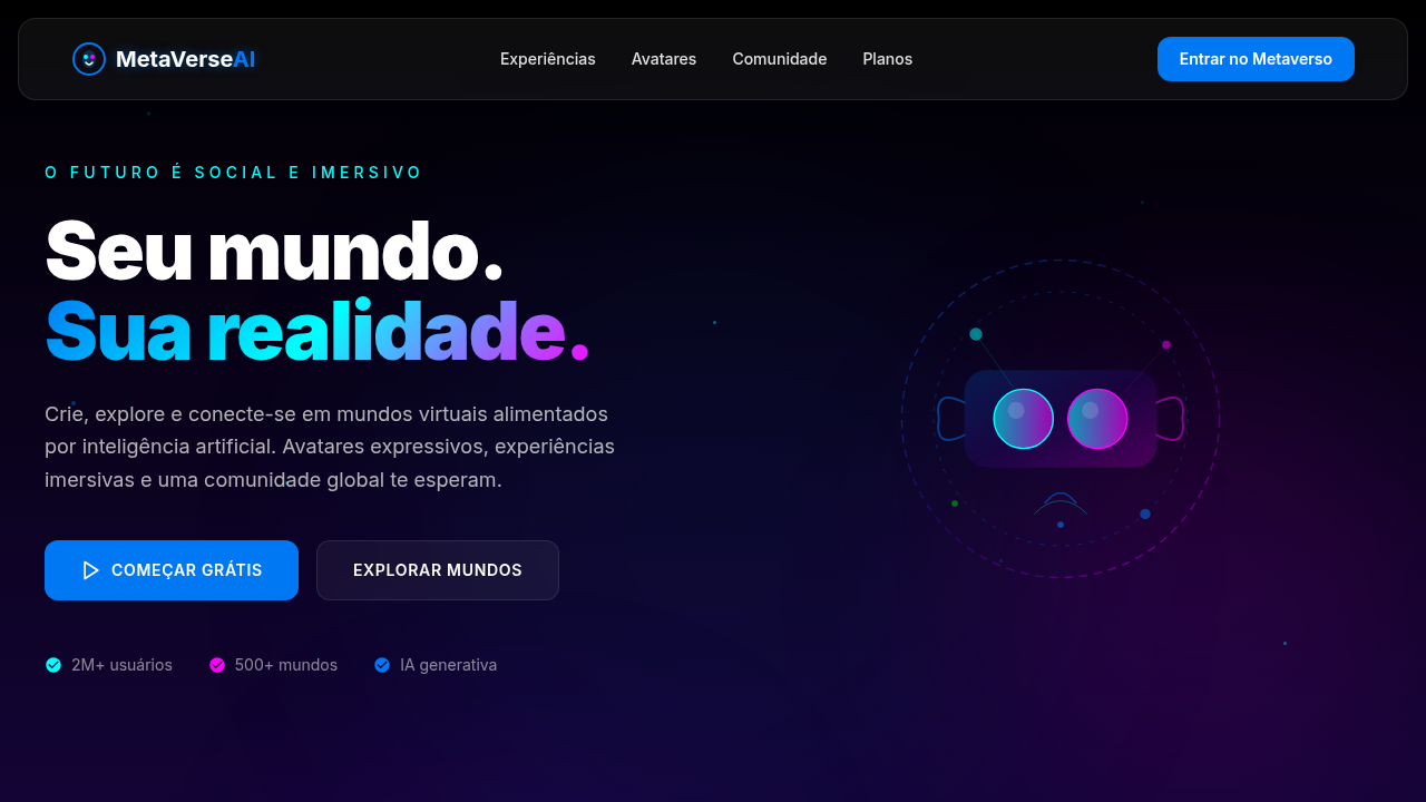
Design an immersive and futuristic landing page for a new metaverse space. Ideal for landing pages, modern websites. AI-ready template. Social VR design didn't emerge from UI departments. It crawled out of game engines, modding communities, and the collective fever dream of people who wanted to be somewhere else together. VRChat proved the thesis early: give people avatar bodies and a shared room, and they'll build culture without your permission. The interfaces were janky, the menus floated awkwardly in mid-air, but none of that mattered because presence was the product.
Meta Horizon Worlds tried to corporatize this. Clean lines, friendly colors, legless avatars that became a punchline. The lesson was brutal — you cannot design social VR like a mobile app with depth. Flat-screen thinking produces dead spaces. The successful platforms understood that your UI isn't a screen anymore, it's the entire environment. Menus become objects. Navigation becomes locomotion. Identity becomes a body you inhabit.
Designing for social VR means accepting that the avatar IS the interface. Every interaction radiates outward from a virtual body — gestures, proximity, gaze direction. The design system must account for spatial relationships between people, not just between elements on a canvas. Personal space exists here. Eye contact has weight. This changes everything about how you structure interaction patterns.
- Density: 5/10 — Balanced
- Variance: 4/10 — Moderate
- Motion: 8/10 — Cinematic
- **Style:** Immersive, Futuristic, Social
- **Keywords:** metaverse, virtual reality, augmented reality, social, immersive, futuristic, interactive, AI, community, expressive
- **Era:** 2026+ Metaverso Interconectado
- **Light/Dark:** ✗ No / ✓ Full (com elementos de luz e sombra)
## Colors
- **Azul Social** (#0078F4) — Accent highlight, links and focus states
- **Roxo Escuro** (#3A0CA3) — Dark surface, primary background
- **Branco** (#FFFFFF) — Light surface, card backgrounds
- **Cinza Claro** (#E0E0E0) — Secondary text, borders, muted elements
- **Ciano** (#00FFFF) — Extended palette, decorative use
- **Magenta** (#FF00FF) — Decorative accent, highlight elements
- **Verde Elétrico** (#00FF00) — Success states, positive indicators
- **Preto** (#000000) — Deep contrast surface
## Typography
- **Display / Hero:** Inter — Weight 700, tight tracking, used for headline impact
- **Body:** Inter — Weight 400, 16px/1.6 line-height, max 72ch per line
- **UI Labels / Captions:** Inter — 0.875rem, weight 500, slight letter-spacing
- **Monospace:** JetBrains Mono — Used for code, metadata, and technical values
Scale:
- Hero: clamp(2.5rem, 5vw, 4rem)
- H1: 2.25rem
- H2: 1.5rem
- Body: 1rem / 1.6
- Small: 0.875rem
## Layout
- **Grid:** CSS Grid primary. Max-width containment: 1280px centered with 1.5rem side padding.
- **Spacing rhythm:** Balanced. Base unit: 0.5rem (8px).
- **Section vertical gaps:** clamp(4rem, 8vw, 8rem).
- **Hero layout:** Split-screen (text left, visual right).
- **Feature sections:** Zig-zag alternating text+image rows. No 3-equal-columns.
- **Mobile collapse:** All multi-column layouts collapse below 768px. No horizontal overflow.
- **z-index contract:** base (0) / sticky-nav (100) / overlay (200) / modal (300) / toast (500).
## Elevation & Depth
Gradientes etéreos, elementos flutuantes, transições de realidade virtual, visualizações de avatares 3D, micro-interações sociais, tipografia futurista, efeitos de partículas, portais dimensionais.
- **Physics:** Spring — stiffness 120, damping 20. Confident, weighted transitions.
- **Entry animations:** Fade + translate-Y (16px → 0) over 540ms ease-out. Staggered cascades for lists: 120ms between items.
- **Hover states:** Scale(1.03) + shadow lift over 200ms.
- **Page transitions:** Fade + slide (300ms).
- **Performance:** Only transform and opacity animated. No layout-triggering properties.
## Shapes
Base corner radius: 8px. See rounded tokens in front matter for the full scale.
## Components
- **Primary Button:** Subtly rounded (0.5rem) shape. Accent color fill. Hover: 8% darken + subtle lift shadow. Active: -1px translate tactile press. Font weight 600. No outer glows.
- **Secondary / Ghost Button:** Outline variant. 1.5px border in muted color. Text in primary color. Hover: subtle background fill.
- **Cards:** Subtly rounded (0.5rem) corners. Surface background. Subtle shadow (0 2px 12px rgba(0,0,0,0.06)). 1px border stroke.
- **Inputs:** Label above input. 1px border stroke. Focus ring: 2px accent color offset 2px. Error text below in semantic red. No floating labels.
- **Navigation:** Primary surface background. Active item: accent color indicator. Font weight 500 when active.
- **Skeletons:** Shimmer animation matching component dimensions. No circular spinners.
- **Empty States:** Icon-based composition with descriptive text and action button.
## Do's and Don'ts
- No emojis in UI — use icon system only (Lucide, Heroicons)
- No pure black (#000000) — use off-black or charcoal variants
- No oversaturated accent colors (saturation cap: 80%)
- No 3-column equal-width feature layouts — use zig-zag or asymmetric grid
- No `h-screen` — use `min-h-[100dvh]`
- No AI copywriting clichés: "Elevate", "Seamless", "Unleash", "Next-Gen"
- No broken external image links — use picsum.photos or inline SVG
- No generic lorem ipsum in demos
- Do Gradientes etéreos
- Do Elementos flutuantes
- Do Transições VR
- Do Avatares 3D
- Do Micro-interações sociais
- Do Tipografia futurista.
## Use Case
Landing pages, Modern websites
Technical Specs
CSS
background: linear-gradient(180deg, #000000, #3A0CA3), color: #FFFFFF, text-shadow: 0 0 10px rgba(0,120,244,0.5), box-shadow: inset 0 0 20px rgba(0,0,0,0.7), backdrop-filter: blur(15px) saturate(1.8), font-family: "Inter, sans-serif", animation: metaverse-pulse 8s infinite alternate, perspective: 1000px, transform-style: preserve-3d.
Variables
--social-blue: #0078F4, --dark-purple: #3A0CA3, --white: #FFFFFF, --light-grey: #E0E0E0, --gradient-start: #000000, --gradient-end: #3A0CA3, --font-futuristic: "Inter, sans-serif", --shadow-immersive: inset 0 0 20px rgba(0,0,0,0.7).
Checklist
☐ Gradientes etéreos, ☐ Elementos flutuantes, ☐ Transições VR, ☐ Avatares 3D, ☐ Micro-interações sociais, ☐ Tipografia futurista.
Colors
Primary
Secondary
Effects
Gradientes etéreos, elementos flutuantes, transições de realidade virtual, visualizações de avatares 3D, micro-interações sociais, tipografia futurista, efeitos de partículas, portais dimensionais.
Light/Dark
✗ No / ✓ Full (com elementos de luz e sombra)
AI Prompt
Act as a Senior Frontend Engineer and Expert UI Designer.
Your task is to code a complete Landing Page on the first attempt.
- Landing Page Theme: <INSERT THEME>
- Sections to add: <INSERT SECTIONS>

Generate the final code immediately following these definitions:

## Style

- **Name:** Estilo de Realidade Virtual Social
- **Type:** Immersive, Futuristic, Social
- **Keywords:** metaverse, virtual reality, augmented reality, social, immersive, futuristic, interactive, AI, community, expressive
- **Era:** 2026+ Metaverso Interconectado
- **Light/Dark:** ✗ No / ✓ Full (com elementos de luz e sombra)

## Color Palette

- **Primary:** Azul Social #0078F4, Roxo Escuro #3A0CA3, Branco #FFFFFF, Cinza Claro #E0E0E0
- **Secondary:** Ciano #00FFFF, Magenta #FF00FF, Verde Elétrico #00FF00, Preto #000000

## Visual Effects

Gradientes etéreos, elementos flutuantes, transições de realidade virtual, visualizações de avatares 3D, micro-interações sociais, tipografia futurista, efeitos de partículas, portais dimensionais.

## AI Visual Direction

Design an immersive and futuristic landing page for a new metaverse space. Use: social blue and dark purple gradients, floating elements, VR transitions, 3D avatar visualizations, social micro-interactions, futuristic typography, particle effects, dimensional portals, AI-powered social features.

## CSS Technical

```css
background: linear-gradient(180deg, #000000, #3A0CA3), color: #FFFFFF, text-shadow: 0 0 10px rgba(0,120,244,0.5), box-shadow: inset 0 0 20px rgba(0,0,0,0.7), backdrop-filter: blur(15px) saturate(1.8), font-family: "Inter, sans-serif", animation: metaverse-pulse 8s infinite alternate, perspective: 1000px, transform-style: preserve-3d.
```

## Design System Variables

```css
--social-blue: #0078F4, --dark-purple: #3A0CA3, --white: #FFFFFF, --light-grey: #E0E0E0, --gradient-start: #000000, --gradient-end: #3A0CA3, --font-futuristic: "Inter, sans-serif", --shadow-immersive: inset 0 0 20px rgba(0,0,0,0.7).
```

## Implementation Checklist

- ☐ Gradientes etéreos
- ☐ Elementos flutuantes
- ☐ Transições VR
- ☐ Avatares 3D
- ☐ Micro-interações sociais
- ☐ Tipografia futurista.

## Execution Rules

1. Strictly follow the defined visual style.
2. Use high-quality inline SVG icons (Heroicons or Lucide style) — NEVER use emojis as icons.
3. Add `cursor-pointer` and smooth `hover` states (transition-all) on all interactive elements.
4. Required Page Structure:
   - Navbar (Logo + Links + CTA)
   - Hero Section (Impactful Headline + Subtitle + 2 buttons + 3D/Abstract visual element via CSS)
   - Features (3 cards with icons)
   - Testimonials (3 cards)
   - Pricing (3 tiers, highlight the middle one)
   - Final CTA
   - Full Footer with social links, privacy policy, terms of use, contact and SEO links.
5. All text content must be in English.
6. The visual must be CLEARLY distinct — do not create a "default Bootstrap" design. Force the use of the provided design system variables.
7. Use `<style>` tags in the head for custom classes (especially for complex backdrop-filter effects and animations) that Tailwind CDN doesn't cover.
8. Full Responsiveness: Layout must adapt perfectly to Mobile, Tablet and Desktop (vertical stack on mobile).
9. Include basic SEO, Viewport and Open Graph meta tags in `<head>`.
10. Footer must contain: Copyright 2026, Secondary navigation links and Social media icons.
11. Make the creative decisions needed to deliver the complete, functional result now.
Related
Last synced: 4/1/2026