Estilo de Entretenimento Imersivo
Cinematic and engaging landing page for a new interactive series. Ideal for landing pages, modern websites. AI-ready template.
Use case: Landing pages, Modern websites
Historical Context
Netflix didn't invent the dark UI. But they made it law. Around 2013, when the platform shifted from DVD-by-mail afterthought to streaming behemoth, their interface crystallized into something unmistakable: black canvas, oversized thumbnails, horizontal carousels that begged you to keep scrolling. The chrome disappeared. Navigation shrank to near-nothing. Content became the interface itself. Disney+ arrived later and doubled down — adding cinematic hero banners that auto-played trailers before you'd even decided what to watch. The message was clear: you're not using software, you're entering a theater. Every pixel serves the content or gets out of the way. This pattern spread everywhere. Spotify adopted it for music. YouTube for creators. Gaming platforms like Xbox and PlayStation rebuilt their dashboards around it. The formula is deceptively simple — dark backgrounds reduce eye strain during long sessions, large imagery creates emotional pull, and minimal UI chrome keeps the brain in consumption mode rather than navigation mode. It works because it respects what people came for: the content, not the container.
When to Use
When your product IS the content. Streaming apps, media libraries, gaming storefronts, cinematic portfolios — anywhere the visual material should dominate and the interface should feel invisible. Works best for lean-back experiences where users browse rather than search, where emotional engagement matters more than information density. Skip this if you're building productivity tools or data-heavy dashboards. The dark-first, image-heavy approach falls apart when users need to read dense text or compare structured information.
Design Principles
- Content is chrome — thumbnails, posters, and hero imagery ARE the navigation, not decoration beside it
- Dark-first canvas — deep blacks and near-blacks reduce visual competition and make imagery pop with cinematic contrast
- Progressive disclosure through motion — auto-play previews, hover expansions, and parallax depth reveal information without cluttering the resting state
- Horizontal momentum — carousels and lateral scrolling mimic the browsing psychology of flipping through a collection, keeping users in discovery mode
- Atmospheric hierarchy — use blur, gradient overlays, and depth-of-field effects to create foreground/background relationships that guide attention without visible UI elements
DESIGN.md
---
version: "alpha"
name: "Estilo de Entretenimento Imersivo"
description: "Cinematic and engaging landing page for a new interactive series. Ideal for landing pages, modern websites. AI-ready template."
colors:
primary: "#E50914"
secondary: "#000000"
tertiary: "#FFFFFF"
neutral: "#222222"
surface: "#FFD700"
accent: "#800080"
typography:
h1:
fontFamily: Helvetica
fontSize: 2.5rem
fontWeight: 700
body-md:
fontFamily: Helvetica
fontSize: 1rem
fontWeight: 400
components:
button-primary:
backgroundColor: "{colors.primary}"
textColor: "{colors.neutral}"
padding: 12px
---
## Overview
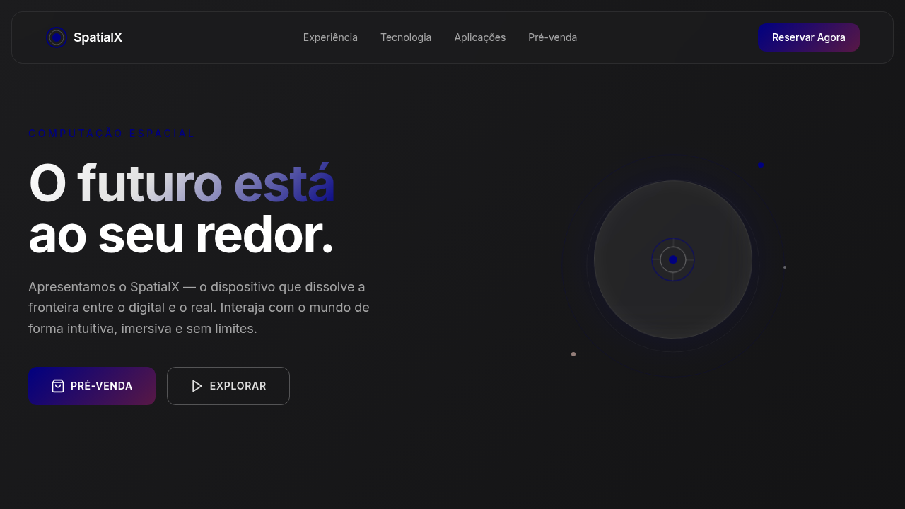
Cinematic and engaging landing page for a new interactive series. Ideal for landing pages, modern websites. AI-ready template. Netflix didn't invent the dark UI. But they made it law. Around 2013, when the platform shifted from DVD-by-mail afterthought to streaming behemoth, their interface crystallized into something unmistakable: black canvas, oversized thumbnails, horizontal carousels that begged you to keep scrolling. The chrome disappeared. Navigation shrank to near-nothing. Content became the interface itself.
Disney+ arrived later and doubled down — adding cinematic hero banners that auto-played trailers before you'd even decided what to watch. The message was clear: you're not using software, you're entering a theater. Every pixel serves the content or gets out of the way.
This pattern spread everywhere. Spotify adopted it for music. YouTube for creators. Gaming platforms like Xbox and PlayStation rebuilt their dashboards around it. The formula is deceptively simple — dark backgrounds reduce eye strain during long sessions, large imagery creates emotional pull, and minimal UI chrome keeps the brain in consumption mode rather than navigation mode. It works because it respects what people came for: the content, not the container.
- Density: 5/10 — Balanced
- Variance: 4/10 — Moderate
- Motion: 8/10 — Cinematic
- **Style:** Cinematic, Engaging, Personalized
- **Keywords:** streaming, entertainment, interactive, AI, cinematic, engaging, personalized, dark mode, dynamic, immersive
- **Era:** 2026+ Interactive Storytelling
- **Light/Dark:** ✗ No / ✓ Full
## Colors
- **Vermelho Streaming** (#E50914) — Error states, destructive actions
- **Preto** (#000000) — Dark surface, primary background
- **Branco** (#FFFFFF) — Light surface, card backgrounds
- **Cinza Escuro** (#222222) — Dark surface, primary background
- **Dourado** (#FFD700) — Premium accent, decorative highlights
- **Roxo** (#800080) — Accent color, emphasis elements
- **Azul** (#0000FF) — Secondary accent
- **Cinza Claro** (#CCCCCC) — Secondary text, borders, muted elements
## Typography
- **Display / Hero:** Helvetica — Weight 700, tight tracking, used for headline impact
- **Body:** Helvetica — Weight 400, 16px/1.6 line-height, max 72ch per line
- **UI Labels / Captions:** Helvetica — 0.875rem, weight 500, slight letter-spacing
- **Monospace:** JetBrains Mono — Used for code, metadata, and technical values
Scale:
- Hero: clamp(2.5rem, 5vw, 4rem)
- H1: 2.25rem
- H2: 1.5rem
- Body: 1rem / 1.6
- Small: 0.875rem
## Layout
- **Grid:** CSS Grid primary. Max-width containment: 1280px centered with 1.5rem side padding.
- **Spacing rhythm:** Balanced. Base unit: 0.5rem (8px).
- **Section vertical gaps:** clamp(4rem, 8vw, 8rem).
- **Hero layout:** Split-screen (text left, visual right).
- **Feature sections:** Zig-zag alternating text+image rows. No 3-equal-columns.
- **Mobile collapse:** All multi-column layouts collapse below 768px. No horizontal overflow.
- **z-index contract:** base (0) / sticky-nav (100) / overlay (200) / modal (300) / toast (500).
## Elevation & Depth
Backgrounds de vídeo em loop, capas de filmes dinâmicas, micro-interações de seleção de conteúdo, tipografia ousada (sans-serif), elementos de recomendação personalizada, transições cinematográficas, efeitos de desfoque e foco.
- **Physics:** Spring — stiffness 120, damping 20. Confident, weighted transitions.
- **Entry animations:** Fade + translate-Y (16px → 0) over 540ms ease-out. Staggered cascades for lists: 120ms between items.
- **Hover states:** Scale(1.03) + shadow lift over 200ms.
- **Page transitions:** Fade + slide (300ms).
- **Performance:** Only transform and opacity animated. No layout-triggering properties.
## Shapes
Base corner radius: 8px. See rounded tokens in front matter for the full scale.
## Components
- **Primary Button:** Subtly rounded (0.5rem) shape. Accent color fill. Hover: 8% darken + subtle lift shadow. Active: -1px translate tactile press. Font weight 600. No outer glows.
- **Secondary / Ghost Button:** Outline variant. 1.5px border in muted color. Text in primary color. Hover: subtle background fill.
- **Cards:** Subtly rounded (0.5rem) corners. Surface background. Subtle shadow (0 2px 12px rgba(0,0,0,0.06)). 1px border stroke.
- **Inputs:** Label above input. 1px border stroke. Focus ring: 2px accent color offset 2px. Error text below in semantic red. No floating labels.
- **Navigation:** Primary surface background. Active item: accent color indicator. Font weight 500 when active.
- **Skeletons:** Shimmer animation matching component dimensions. No circular spinners.
- **Empty States:** Icon-based composition with descriptive text and action button.
## Do's and Don'ts
- No emojis in UI — use icon system only (Lucide, Heroicons)
- No pure white (#FFFFFF) backgrounds — use off-white or dark surfaces
- No oversaturated accent colors (saturation cap: 80%)
- No 3-column equal-width feature layouts — use zig-zag or asymmetric grid
- No `h-screen` — use `min-h-[100dvh]`
- No AI copywriting clichés: "Elevate", "Seamless", "Unleash", "Next-Gen"
- No broken external image links — use picsum.photos or inline SVG
- No generic lorem ipsum in demos
- Do Background de vídeo em loop
- Do Capas de filmes dinâmicas
- Do Micro-interações de seleção
- Do Tipografia ousada
- Do Recomendações personalizadas
- Do Transições cinematográficas.
## Use Case
Landing pages, Modern websites
Technical Specs
CSS
background: #000000, color: #FFFFFF, text-shadow: 0 0 10px rgba(229,9,20,0.5), box-shadow: inset 0 0 20px rgba(0,0,0,0.7), backdrop-filter: blur(10px) saturate(1.5), font-family: "Helvetica, Arial, sans-serif", transition: all 0.4s ease-in-out, background-image: url("series-background.mp4"), background-size: cover, background-position: center, .video-background, .dynamic-cover-hover. Variables
--streaming-red: #E50914, --black: #000000, --white: #FFFFFF, --dark-grey: #222222, --shadow-dark: inset 0 0 20px rgba(0,0,0,0.7), --font-bold: "Helvetica, Arial, sans-serif", --cinematic-transition: all 0.4s ease-in-out.
Checklist
☐ Background de vídeo em loop, ☐ Capas de filmes dinâmicas, ☐ Micro-interações de seleção, ☐ Tipografia ousada, ☐ Recomendações personalizadas, ☐ Transições cinematográficas.
Colors
Primary
Secondary
Effects
Backgrounds de vídeo em loop, capas de filmes dinâmicas, micro-interações de seleção de conteúdo, tipografia ousada (sans-serif), elementos de recomendação personalizada, transições cinematográficas, efeitos de desfoque e foco.
Light/Dark
✗ No / ✓ Full
AI Prompt
Act as a Senior Frontend Engineer and Expert UI Designer.
Your task is to code a complete Landing Page on the first attempt.
- Landing Page Theme: <INSERT THEME>
- Sections to add: <INSERT SECTIONS>

Generate the final code immediately following these definitions:

## Style

- **Name:** Estilo de Entretenimento Imersivo
- **Type:** Cinematic, Engaging, Personalized
- **Keywords:** streaming, entertainment, interactive, AI, cinematic, engaging, personalized, dark mode, dynamic, immersive
- **Era:** 2026+ Interactive Storytelling
- **Light/Dark:** ✗ No / ✓ Full

## Color Palette

- **Primary:** Vermelho Streaming #E50914, Preto #000000, Branco #FFFFFF, Cinza Escuro #222222
- **Secondary:** Dourado #FFD700, Roxo #800080, Azul #0000FF, Cinza Claro #CCCCCC

## Visual Effects

Backgrounds de vídeo em loop, capas de filmes dinâmicas, micro-interações de seleção de conteúdo, tipografia ousada (sans-serif), elementos de recomendação personalizada, transições cinematográficas, efeitos de desfoque e foco.

## AI Visual Direction

Design a cinematic and engaging landing page for a new interactive series. Use: streaming red accents, black background, looping video backgrounds, dynamic movie covers, content selection micro-interactions, bold typography, personalized recommendation elements, cinematic transitions, blur and focus effects, AI-powered interactive storytelling.

## CSS Technical

```css
background: #000000, color: #FFFFFF, text-shadow: 0 0 10px rgba(229,9,20,0.5), box-shadow: inset 0 0 20px rgba(0,0,0,0.7), backdrop-filter: blur(10px) saturate(1.5), font-family: "Helvetica, Arial, sans-serif", transition: all 0.4s ease-in-out, background-image: url("series-background.mp4"), background-size: cover, background-position: center, .video-background, .dynamic-cover-hover.
```

## Design System Variables

```css
--streaming-red: #E50914, --black: #000000, --white: #FFFFFF, --dark-grey: #222222, --shadow-dark: inset 0 0 20px rgba(0,0,0,0.7), --font-bold: "Helvetica, Arial, sans-serif", --cinematic-transition: all 0.4s ease-in-out.
```

## Implementation Checklist

- ☐ Background de vídeo em loop
- ☐ Capas de filmes dinâmicas
- ☐ Micro-interações de seleção
- ☐ Tipografia ousada
- ☐ Recomendações personalizadas
- ☐ Transições cinematográficas.

## Execution Rules

1. Strictly follow the defined visual style.
2. Use high-quality inline SVG icons (Heroicons or Lucide style) — NEVER use emojis as icons.
3. Add `cursor-pointer` and smooth `hover` states (transition-all) on all interactive elements.
4. Required Page Structure:
   - Navbar (Logo + Links + CTA)
   - Hero Section (Impactful Headline + Subtitle + 2 buttons + 3D/Abstract visual element via CSS)
   - Features (3 cards with icons)
   - Testimonials (3 cards)
   - Pricing (3 tiers, highlight the middle one)
   - Final CTA
   - Full Footer with social links, privacy policy, terms of use, contact and SEO links.
5. All text content must be in English.
6. The visual must be CLEARLY distinct — do not create a "default Bootstrap" design. Force the use of the provided design system variables.
7. Use `<style>` tags in the head for custom classes (especially for complex backdrop-filter effects and animations) that Tailwind CDN doesn't cover.
8. Full Responsiveness: Layout must adapt perfectly to Mobile, Tablet and Desktop (vertical stack on mobile).
9. Include basic SEO, Viewport and Open Graph meta tags in `<head>`.
10. Footer must contain: Copyright 2026, Secondary navigation links and Social media icons.
11. Make the creative decisions needed to deliver the complete, functional result now. Related
Last synced: 4/1/2026