Estilo de Futuro Autônomo
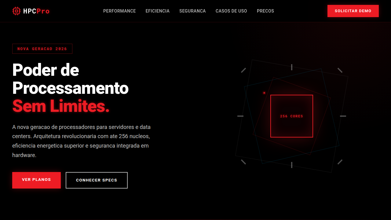
Sleek and futuristic landing page for a new autonomous car. Ideal for landing pages, modern websites. AI-ready template.
Use case: Landing pages, Modern websites
Historical Context
Tesla rewrote the rules. Before the Model S, car interfaces were cluttered messes of physical buttons and skeuomorphic nonsense. Then came that 17-inch portrait screen — brutally minimal, almost arrogant in its simplicity. It said: trust the machine. Waymo took a different path entirely. Their rider-facing UI had to solve a harder problem: how do you make a passenger comfortable when nobody's driving? The answer was radical transparency. Show the car's perception layer. Let people see what the AI sees — pedestrians highlighted, lane boundaries drawn, decisions visualized in real time. Rivian brought warmth to the genre. Where Tesla went clinical, Rivian layered in topographic textures and nature-inspired palettes. Proof that autonomous aesthetics don't require cold minimalism. Meanwhile, the entire industry converged on one truth: distraction is the enemy. Every pixel must earn its place. The philosophy isn't decoration — it's information architecture for humans moving at speed.
When to Use
Reach for this when you're designing anything that moves people — or moves itself. EV dashboards, ride-hailing interfaces, fleet management tools, autonomous vehicle HMIs. It works for mobility startups pitching trust through polish, and for established players modernizing legacy systems. Also strong for smart city platforms, charging network apps, or any product where the user needs to feel safe delegating control to a machine. The aesthetic signals competence without coldness.
Design Principles
- Radical clarity — strip every element that doesn't serve the driver's (or rider's) immediate context. Ambient information stays ambient.
- Trust through transparency — surface system state honestly. Show what the AI perceives, what it's deciding, and why. Opacity breeds anxiety.
- Motion as communication — use animation purposefully to indicate vehicle intent, route changes, and system confidence levels. Never decorative.
- Calm hierarchy — information layers should feel inevitable. Critical alerts dominate; everything else recedes. No element competes for attention.
- Dark-first, light-aware — default to dark interfaces that reduce glare and eye fatigue, but adapt luminance to ambient conditions. The environment dictates the palette.
DESIGN.md
---
version: "alpha"
name: "Estilo de Futuro Autônomo"
description: "Sleek and futuristic landing page for a new autonomous car. Ideal for landing pages, modern websites. AI-ready template."
colors:
  primary: "#CC0000"
  secondary: "#000000"
  tertiary: "#FFFFFF"
  neutral: "#333333"
  surface: "#C0C0C0"
  accent: "#00BFFF"
typography:
  h1:
    fontFamily: Helvetica Neue
    fontSize: 2.5rem
    fontWeight: 700
  body-md:
    fontFamily: Helvetica Neue
    fontSize: 1rem
    fontWeight: 400
components:
  button-primary:
    backgroundColor: "{colors.primary}"
    textColor: "{colors.neutral}"
    padding: 12px
---

## Overview

Sleek and futuristic landing page for a new autonomous car. Ideal for landing pages, modern websites. AI-ready template. Tesla rewrote the rules. Before the Model S, car interfaces were cluttered messes of physical buttons and skeuomorphic nonsense. Then came that 17-inch portrait screen — brutally minimal, almost arrogant in its simplicity. It said: trust the machine. Waymo took a different path entirely. Their rider-facing UI had to solve a harder problem: how do you make a passenger comfortable when nobody's driving? The answer was radical transparency. Show the car's perception layer. Let people see what the AI sees — pedestrians highlighted, lane boundaries drawn, decisions visualized in real time.

Rivian brought warmth to the genre. Where Tesla went clinical, Rivian layered in topographic textures and nature-inspired palettes. Proof that autonomous aesthetics don't require cold minimalism. Meanwhile, the entire industry converged on one truth: distraction is the enemy. Every pixel must earn its place. The philosophy isn't decoration — it's information architecture for humans moving at speed.

- Density: 3/10 — Airy
- Variance: 3/10 — Restrained
- Motion: 8/10 — Cinematic

- **Style:** Sleek, Futuristic, Minimalist
- **Keywords:** electric vehicles, autonomous driving, AI, futuristic, sleek, minimalist, performance, sustainable, innovative, connected
- **Era:** 2026+ Autonomous Mobility
- **Light/Dark:** ✗ No / ✓ Full

## Colors

- **Vermelho Elétrico** (#CC0000) — Error states, destructive actions
- **Preto** (#000000) — Dark surface, primary background
- **Branco** (#FFFFFF) — Light surface, card backgrounds
- **Cinza Escuro** (#333333) — Dark surface, primary background
- **Prata** (#C0C0C0) — Extended palette, decorative use
- **Azul Elétrico** (#00BFFF) — Secondary accent
- **Cinza Claro** (#CCCCCC) — Secondary text, borders, muted elements
- **Preto Fibra de Carbono** (#222222) — Deep contrast surface


## Typography

- **Display / Hero:** Helvetica Neue — Weight 700, tight tracking, used for headline impact
- **Body:** Helvetica Neue — Weight 400, 16px/1.6 line-height, max 72ch per line
- **UI Labels / Captions:** Helvetica Neue — 0.875rem, weight 500, slight letter-spacing
- **Monospace:** JetBrains Mono — Used for code, metadata, and technical values

Scale:
- Hero: clamp(2.5rem, 5vw, 4rem)
- H1: 2.25rem
- H2: 1.5rem
- Body: 1rem / 1.6
- Small: 0.875rem


## Layout

- **Grid:** CSS Grid primary. Max-width containment: 1280px centered with 1.5rem side padding.
- **Spacing rhythm:** Balanced. Base unit: 0.5rem (8px).
- **Section vertical gaps:** clamp(4rem, 8vw, 8rem).
- **Hero layout:** Split-screen (text left, visual right).
- **Feature sections:** Zig-zag alternating text+image rows. No 3-equal-columns.
- **Mobile collapse:** All multi-column layouts collapse below 768px. No horizontal overflow.
- **z-index contract:** base (0) / sticky-nav (100) / overlay (200) / modal (300) / toast (500).


## Elevation & Depth

Animações de condução autônoma, visualizações de dados de sensores, brilhos sutis em elementos de interface, tipografia limpa e moderna (sans-serif), micro-interações responsivas, modelos 3D interativos do veículo, transições fluidas.

- **Physics:** Spring — stiffness 120, damping 20. Confident, weighted transitions.
- **Entry animations:** Fade + translate-Y (16px → 0) over 540ms ease-out. Staggered cascades for lists: 120ms between items.
- **Hover states:** Scale(1.03) + shadow lift over 200ms.
- **Page transitions:** Fade + slide (300ms).
- **Performance:** Only transform and opacity animated. No layout-triggering properties.


## Shapes

Base corner radius: 8px. See rounded tokens in front matter for the full scale.


## Components

- **Primary Button:** Subtly rounded (0.5rem) shape. Accent color fill. Hover: 8% darken + subtle lift shadow. Active: -1px translate tactile press. Font weight 600. No outer glows.
- **Secondary / Ghost Button:** Outline variant. 1.5px border in muted color. Text in primary color. Hover: subtle background fill.
- **Cards:** Subtly rounded (0.5rem) corners. Surface background. Subtle shadow (0 2px 12px rgba(0,0,0,0.06)). 1px border stroke.
- **Inputs:** Label above input. 1px border stroke. Focus ring: 2px accent color offset 2px. Error text below in semantic red. No floating labels.
- **Navigation:** Primary surface background. Active item: accent color indicator. Font weight 500 when active.
- **Skeletons:** Shimmer animation matching component dimensions. No circular spinners.
- **Empty States:** Icon-based composition with descriptive text and action button.


## Do's and Don'ts

- No emojis in UI — use icon system only (Lucide, Heroicons)
- No decorative gradients — flat color only
- No shadows heavier than 0 2px 8px rgba(0,0,0,0.08)
- No pure black (#000000) — use off-black or charcoal variants
- No oversaturated accent colors (saturation cap: 80%)
- No 3-column equal-width feature layouts — use zig-zag or asymmetric grid
- No `h-screen` — use `min-h-[100dvh]`
- No AI copywriting clichés: "Elevate", "Seamless", "Unleash", "Next-Gen"
- No broken external image links — use picsum.photos or inline SVG
- No generic lorem ipsum in demos

- Do Animações de condução autônoma
- Do Visualizações de dados de sensores
- Do Brilhos sutis
- Do Tipografia moderna
- Do Modelos 3D interativos
- Do Transições fluidas.


## Use Case

Landing pages, Modern websites
Technical Specs
CSS
background: #000000, color: #FFFFFF, text-shadow: 0 0 8px rgba(204,0,0,0.5), box-shadow: inset 0 0 15px rgba(0,0,0,0.7), border-bottom: 2px solid #CC0000, font-family: "Helvetica Neue, sans-serif", animation: autonomous-scan 10s linear infinite, perspective: 1000px, transform-style: preserve-3d.
Variables
--electric-red: #CC0000, --black: #000000, --white: #FFFFFF, --dark-grey: #333333, --glow-intensity: 0.5, --border-accent: 2px solid #CC0000, --font-modern: "Helvetica Neue, sans-serif".
Checklist
☐ Animações de condução autônoma, ☐ Visualizações de dados de sensores, ☐ Brilhos sutis, ☐ Tipografia moderna, ☐ Modelos 3D interativos, ☐ Transições fluidas.
Colors
Primary
Secondary
Effects
Animações de condução autônoma, visualizações de dados de sensores, brilhos sutis em elementos de interface, tipografia limpa e moderna (sans-serif), micro-interações responsivas, modelos 3D interativos do veículo, transições fluidas.
Light/Dark
✗ No / ✓ Full
AI Prompt
Act as a Senior Frontend Engineer and Expert UI Designer.
Your task is to code a complete Landing Page on the first attempt.
- Landing Page Theme: <INSERT THEME>
- Sections to add: <INSERT SECTIONS>

Generate the final code immediately following these definitions:

## Style

- **Name:** Estilo de Futuro Autônomo
- **Type:** Sleek, Futuristic, Minimalist
- **Keywords:** electric vehicles, autonomous driving, AI, futuristic, sleek, minimalist, performance, sustainable, innovative, connected
- **Era:** 2026+ Autonomous Mobility
- **Light/Dark:** ✗ No / ✓ Full

## Color Palette

- **Primary:** Vermelho Elétrico #CC0000, Preto #000000, Branco #FFFFFF, Cinza Escuro #333333
- **Secondary:** Prata #C0C0C0, Azul Elétrico #00BFFF, Cinza Claro #CCCCCC, Preto Fibra de Carbono #222222

## Visual Effects

Animações de condução autônoma, visualizações de dados de sensores, brilhos sutis em elementos de interface, tipografia limpa e moderna (sans-serif), micro-interações responsivas, modelos 3D interativos do veículo, transições fluidas.

## AI Visual Direction

Design a sleek and futuristic landing page for a new autonomous car. Use: electric red accents, black background, autonomous driving animations, sensor data visualizations, subtle UI glows, clean modern typography, interactive 3D car models, fluid transitions, minimalist and innovative feel.

## CSS Technical

```css
background: #000000, color: #FFFFFF, text-shadow: 0 0 8px rgba(204,0,0,0.5), box-shadow: inset 0 0 15px rgba(0,0,0,0.7), border-bottom: 2px solid #CC0000, font-family: "Helvetica Neue, sans-serif", animation: autonomous-scan 10s linear infinite, perspective: 1000px, transform-style: preserve-3d.
```

## Design System Variables

```css
--electric-red: #CC0000, --black: #000000, --white: #FFFFFF, --dark-grey: #333333, --glow-intensity: 0.5, --border-accent: 2px solid #CC0000, --font-modern: "Helvetica Neue, sans-serif".
```

## Implementation Checklist

- ☐ Animações de condução autônoma
- ☐ Visualizações de dados de sensores
- ☐ Brilhos sutis
- ☐ Tipografia moderna
- ☐ Modelos 3D interativos
- ☐ Transições fluidas.

## Execution Rules

1. Strictly follow the defined visual style.
2. Use high-quality inline SVG icons (Heroicons or Lucide style) — NEVER use emojis as icons.
3. Add `cursor-pointer` and smooth `hover` states (transition-all) on all interactive elements.
4. Required Page Structure:
   - Navbar (Logo + Links + CTA)
   - Hero Section (Impactful Headline + Subtitle + 2 buttons + 3D/Abstract visual element via CSS)
   - Features (3 cards with icons)
   - Testimonials (3 cards)
   - Pricing (3 tiers, highlight the middle one)
   - Final CTA
   - Full Footer with social links, privacy policy, terms of use, contact and SEO links.
5. All text content must be in English.
6. The visual must be CLEARLY distinct — do not create a "default Bootstrap" design. Force the use of the provided design system variables.
7. Use `<style>` tags in the head for custom classes (especially for complex backdrop-filter effects and animations) that Tailwind CDN doesn't cover.
8. Full Responsiveness: Layout must adapt perfectly to Mobile, Tablet and Desktop (vertical stack on mobile).
9. Include basic SEO, Viewport and Open Graph meta tags in `<head>`.
10. Footer must contain: Copyright 2026, Secondary navigation links and Social media icons.
11. Make the creative decisions needed to deliver the complete, functional result now.
Related
Last synced: 4/1/2026