Estilo de Ecossistema Digital
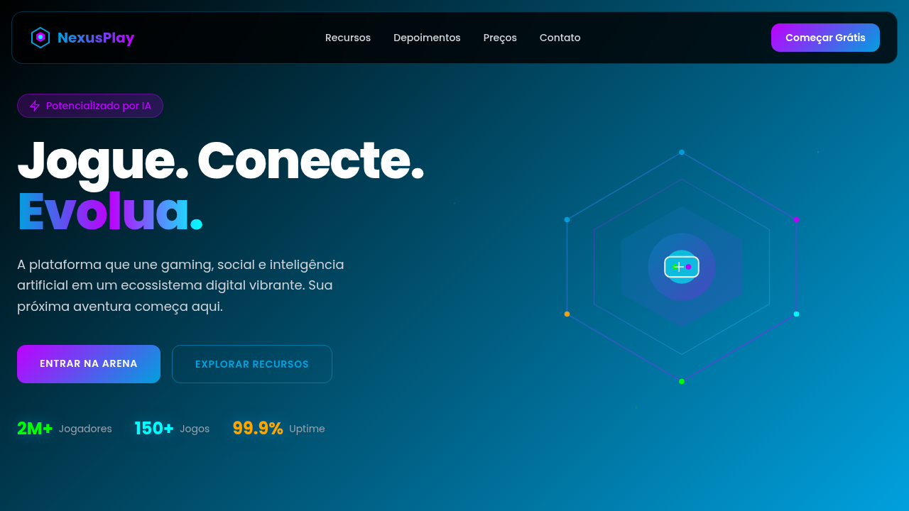
Dynamic and social landing page for a gaming and social platform. Ideal for landing pages, modern websites. AI-ready template.
Use case: Landing pages, Modern websites
Historical Context
WeChat figured it out first. One app, dozens of products — payments, social, gaming, commerce — all feeling like they belong together without feeling identical. That's the trick nobody talks about. Apple did it differently: hardware dictated the language, and software followed. But the principle held. You need a system elastic enough to stretch across wildly different contexts while maintaining something recognizable. A thread. The super-app era forced designers to abandon the single-product mindset entirely. You're not designing screens anymore — you're designing a gravity field. Every sub-product orbits the same core but has its own atmosphere. Grab, Gojek, Alipay — they all learned this the hard way. Too rigid and your fintech module feels wrong inside your social feed. Too loose and users don't trust that it's all one thing. What emerged was a new discipline: ecosystem design. Shared primitives, flexible tokens, contextual density. The visual system becomes infrastructure, not decoration. It has to carry meaning across gaming interfaces, payment flows, and messaging — simultaneously. That demands a fundamentally different relationship with consistency.
When to Use
When you're building something that refuses to stay in one lane. Platform companies juggling multiple products under one roof. Super-apps where a user moves from chat to payments to gaming without friction. Multi-brand portfolios that need coherence without uniformity. Fintech platforms expanding into social features. Any product ambitious enough to become an ecosystem rather than remain a tool. If your roadmap has three or more distinct product surfaces sharing users — this is your starting architecture.
Design Principles
- Shared gravity, independent orbits — establish universal primitives (color, motion, spacing) but let each product surface define its own density and personality within those bounds
- Contextual trust signals — users need to feel safe moving between radically different functions; visual continuity in navigation chrome and interaction patterns builds that bridge
- Token-first infrastructure — design decisions live as tokens, not as pixel specs; this is the only way to scale across products without a 40-person design team losing their minds
- Progressive disclosure of complexity — ecosystem interfaces serve casual users and power users simultaneously; layer information density rather than choosing one audience
- Interconnection as feature — make the connections between products visible and useful; the ecosystem advantage disappears if products feel like separate apps wearing the same shirt
DESIGN.md
---
version: "alpha"
name: "Estilo de Ecossistema Digital"
description: "Dynamic and social landing page for a gaming and social platform. Ideal for landing pages, modern websites. AI-ready template."
colors:
  primary: "#00A1DE"
  secondary: "#000000"
  tertiary: "#FFFFFF"
  neutral: "#BF00FF"
  surface: "#00FF00"
  accent: "#FFA500"
typography:
  h1:
    fontFamily: Poppins
    fontSize: 2.5rem
    fontWeight: 700
  body-md:
    fontFamily: Poppins
    fontSize: 1rem
    fontWeight: 400
components:
  button-primary:
    backgroundColor: "{colors.primary}"
    textColor: "{colors.neutral}"
    padding: 12px
---

## Overview

Dynamic and social landing page for a gaming and social platform. Ideal for landing pages, modern websites. AI-ready template. WeChat figured it out first. One app, dozens of products — payments, social, gaming, commerce — all feeling like they belong together without feeling identical. That's the trick nobody talks about. Apple did it differently: hardware dictated the language, and software followed. But the principle held. You need a system elastic enough to stretch across wildly different contexts while maintaining something recognizable. A thread.

The super-app era forced designers to abandon the single-product mindset entirely. You're not designing screens anymore — you're designing a gravity field. Every sub-product orbits the same core but has its own atmosphere. Grab, Gojek, Alipay — they all learned this the hard way. Too rigid and your fintech module feels wrong inside your social feed. Too loose and users don't trust that it's all one thing.

What emerged was a new discipline: ecosystem design. Shared primitives, flexible tokens, contextual density. The visual system becomes infrastructure, not decoration. It has to carry meaning across gaming interfaces, payment flows, and messaging — simultaneously. That demands a fundamentally different relationship with consistency.

- Density: 5/10 — Balanced
- Variance: 4/10 — Moderate
- Motion: 4/10 — Subtle

- **Style:** Dynamic, Social, Immersive
- **Keywords:** gaming, social media, fintech, AI, entertainment, vibrant, interactive, community, digital, engaging
- **Era:** 2026+ Entretenimento Conectado
- **Light/Dark:** ✗ No / ✓ Full

## Colors

- **Azul Digital** (#00A1DE) — Accent highlight, links and focus states
- **Preto** (#000000) — Dark surface, primary background
- **Branco** (#FFFFFF) — Light surface, card backgrounds
- **Roxo Elétrico** (#BF00FF) — Accent color, emphasis elements
- **Verde Brilhante** (#00FF00) — Success states, positive indicators
- **Laranja** (#FFA500) — Warm accent, call-to-action secondary
- **Ciano** (#00FFFF) — Extended palette, decorative use
- **Cinza Escuro** (#333333) — Deep contrast surface


## Typography

- **Display / Hero:** Poppins — Weight 700, tight tracking, used for headline impact
- **Body:** Poppins — Weight 400, 16px/1.6 line-height, max 72ch per line
- **UI Labels / Captions:** Poppins — 0.875rem, weight 500, slight letter-spacing
- **Monospace:** JetBrains Mono — Used for code, metadata, and technical values

Scale:
- Hero: clamp(2.5rem, 5vw, 4rem)
- H1: 2.25rem
- H2: 1.5rem
- Body: 1rem / 1.6
- Small: 0.875rem


## Layout

- **Grid:** CSS Grid primary. Max-width containment: 1280px centered with 1.5rem side padding.
- **Spacing rhythm:** Balanced. Base unit: 0.5rem (8px).
- **Section vertical gaps:** clamp(4rem, 8vw, 8rem).
- **Hero layout:** Split-screen (text left, visual right).
- **Feature sections:** Zig-zag alternating text+image rows. No 3-equal-columns.
- **Mobile collapse:** All multi-column layouts collapse below 768px. No horizontal overflow.
- **z-index contract:** base (0) / sticky-nav (100) / overlay (200) / modal (300) / toast (500).


## Elevation & Depth

Animações de partículas dinâmicas, gradientes vibrantes, micro-interações de engajamento social, tipografia moderna e ousada, elementos de gamificação, transições fluidas, visualizações de dados de usuários, efeitos de luz neon.

- **Physics:** Ease-out curves, 200-300ms duration. Smooth and predictable.
- **Entry animations:** Fade + translate-Y (16px → 0) over 420ms ease-out. Staggered cascades for lists: 80ms between items.
- **Hover states:** Subtle color shift + shadow adjustment over 200ms.
- **Page transitions:** Fade only (200ms).
- **Performance:** Only transform and opacity animated. No layout-triggering properties.


## Shapes

Base corner radius: 8px. See rounded tokens in front matter for the full scale.


## Components

- **Primary Button:** Subtly rounded (0.5rem) shape. Accent color fill. Hover: 8% darken + subtle lift shadow. Active: -1px translate tactile press. Font weight 600. No outer glows.
- **Secondary / Ghost Button:** Outline variant. 1.5px border in muted color. Text in primary color. Hover: subtle background fill.
- **Cards:** Subtly rounded (0.5rem) corners. Surface background. Subtle shadow (0 2px 12px rgba(0,0,0,0.06)). 1px border stroke.
- **Inputs:** Label above input. 1px border stroke. Focus ring: 2px accent color offset 2px. Error text below in semantic red. No floating labels.
- **Navigation:** Primary surface background. Active item: accent color indicator. Font weight 500 when active.
- **Skeletons:** Shimmer animation matching component dimensions. No circular spinners.
- **Empty States:** Icon-based composition with descriptive text and action button.


## Do's and Don'ts

- No emojis in UI — use icon system only (Lucide, Heroicons)
- No pure black (#000000) — use off-black or charcoal variants
- No oversaturated accent colors (saturation cap: 80%)
- No 3-column equal-width feature layouts — use zig-zag or asymmetric grid
- No `h-screen` — use `min-h-[100dvh]`
- No AI copywriting clichés: "Elevate", "Seamless", "Unleash", "Next-Gen"
- No broken external image links — use picsum.photos or inline SVG
- No generic lorem ipsum in demos

- Do Animações de partículas
- Do Gradientes vibrantes
- Do Micro-interações sociais
- Do Tipografia ousada
- Do Elementos de gamificação
- Do Efeitos de luz neon.


## Use Case

Landing pages, Modern websites
Technical Specs
CSS
background: linear-gradient(135deg, #000000, #00A1DE), color: #FFFFFF, text-shadow: 0 0 8px rgba(0,161,222,0.5), box-shadow: inset 0 0 20px rgba(0,0,0,0.7), backdrop-filter: blur(10px) saturate(1.5), font-family: "Poppins, sans-serif", animation: particle-flow 15s linear infinite, perspective: 1000px, transform-style: preserve-3d.
Variables
--digital-blue: #00A1DE, --black: #000000, --white: #FFFFFF, --electric-purple: #BF00FF, --gradient-start: #000000, --gradient-end: #00A1DE, --font-modern: "Poppins, sans-serif", --shadow-dark: inset 0 0 20px rgba(0,0,0,0.7).
Checklist
☐ Animações de partículas, ☐ Gradientes vibrantes, ☐ Micro-interações sociais, ☐ Tipografia ousada, ☐ Elementos de gamificação, ☐ Efeitos de luz neon.
Colors
Primary
Secondary
Effects
Animações de partículas dinâmicas, gradientes vibrantes, micro-interações de engajamento social, tipografia moderna e ousada, elementos de gamificação, transições fluidas, visualizações de dados de usuários, efeitos de luz neon.
Light/Dark
✗ No / ✓ Full
AI Prompt
Act as a Senior Frontend Engineer and Expert UI Designer.
Your task is to code a complete Landing Page on the first attempt.
- Landing Page Theme: <INSERT THEME>
- Sections to add: <INSERT SECTIONS>

Generate the final code immediately following these definitions:

## Style

- **Name:** Estilo de Ecossistema Digital
- **Type:** Dynamic, Social, Immersive
- **Keywords:** gaming, social media, fintech, AI, entertainment, vibrant, interactive, community, digital, engaging
- **Era:** 2026+ Entretenimento Conectado
- **Light/Dark:** ✗ No / ✓ Full

## Color Palette

- **Primary:** Azul Digital #00A1DE, Preto #000000, Branco #FFFFFF, Roxo Elétrico #BF00FF
- **Secondary:** Verde Brilhante #00FF00, Laranja #FFA500, Ciano #00FFFF, Cinza Escuro #333333

## Visual Effects

Animações de partículas dinâmicas, gradientes vibrantes, micro-interações de engajamento social, tipografia moderna e ousada, elementos de gamificação, transições fluidas, visualizações de dados de usuários, efeitos de luz neon.

## AI Visual Direction

Design a dynamic and social landing page for a gaming and social platform. Use: digital blue and electric purple gradients, dynamic particle animations, social engagement micro-interactions, bold modern typography, gamification elements, fluid transitions, user data visualizations, neon light effects, AI-powered social features.

## CSS Technical

```css
background: linear-gradient(135deg, #000000, #00A1DE), color: #FFFFFF, text-shadow: 0 0 8px rgba(0,161,222,0.5), box-shadow: inset 0 0 20px rgba(0,0,0,0.7), backdrop-filter: blur(10px) saturate(1.5), font-family: "Poppins, sans-serif", animation: particle-flow 15s linear infinite, perspective: 1000px, transform-style: preserve-3d.
```

## Design System Variables

```css
--digital-blue: #00A1DE, --black: #000000, --white: #FFFFFF, --electric-purple: #BF00FF, --gradient-start: #000000, --gradient-end: #00A1DE, --font-modern: "Poppins, sans-serif", --shadow-dark: inset 0 0 20px rgba(0,0,0,0.7).
```

## Implementation Checklist

- ☐ Animações de partículas
- ☐ Gradientes vibrantes
- ☐ Micro-interações sociais
- ☐ Tipografia ousada
- ☐ Elementos de gamificação
- ☐ Efeitos de luz neon.

## Execution Rules

1. Strictly follow the defined visual style.
2. Use high-quality inline SVG icons (Heroicons or Lucide style) — NEVER use emojis as icons.
3. Add `cursor-pointer` and smooth `hover` states (transition-all) on all interactive elements.
4. Required Page Structure:
   - Navbar (Logo + Links + CTA)
   - Hero Section (Impactful Headline + Subtitle + 2 buttons + 3D/Abstract visual element via CSS)
   - Features (3 cards with icons)
   - Testimonials (3 cards)
   - Pricing (3 tiers, highlight the middle one)
   - Final CTA
   - Full Footer with social links, privacy policy, terms of use, contact and SEO links.
5. All text content must be in English.
6. The visual must be CLEARLY distinct — do not create a "default Bootstrap" design. Force the use of the provided design system variables.
7. Use `<style>` tags in the head for custom classes (especially for complex backdrop-filter effects and animations) that Tailwind CDN doesn't cover.
8. Full Responsiveness: Layout must adapt perfectly to Mobile, Tablet and Desktop (vertical stack on mobile).
9. Include basic SEO, Viewport and Open Graph meta tags in `<head>`.
10. Footer must contain: Copyright 2026, Secondary navigation links and Social media icons.
11. Make the creative decisions needed to deliver the complete, functional result now.
Related
Last synced: 4/1/2026