Estilo de Inovação em Dispositivos Móveis
Sleek and modern landing page for a new foldable smartphone. Ideal for landing pages, modern websites. AI-ready template.
Use case: Landing pages, Modern websites
Historical Context
The iPhone didn't just change phones — it killed the button. Overnight, every interaction became a surface. A tap. A swipe. That single slab of glass forced an entire industry to rethink what "using a computer" meant when your thumb was the cursor. Then screens got bigger. Then they folded. Samsung's Galaxy Fold cracked open a question nobody had a clean answer for: what happens to your layout when the canvas literally doubles mid-session? Foldables didn't just add screen real estate — they introduced *continuity* as a design problem. Your app now has to survive a metamorphosis while the user watches. And now, AI lives on the device itself. Not in some distant server rack — on the chip, in the neural engine, running inference while you gesture. The phone anticipates. It pre-renders. It adapts layouts before you consciously decide what you want. We went from "mobile-first" to "mobile-intelligent" in about eighteen months, and the interfaces haven't caught up yet. That's the gap this style exists to close.
When to Use
Reach for this when you're designing for hardware that doesn't sit still. Foldable device UIs that need to gracefully transition between compact and expanded states. Mobile-first products where gesture is the primary language — not a shortcut. AI-powered interfaces that reshape themselves based on context, usage patterns, or device posture. If your product lives on a smartphone and you want it to feel like it belongs to the next generation of interaction rather than the last one, this is your system.
Design Principles
- Posture-aware layouts — design for the fold, the flip, the flat, and every angle between. Your UI should know what shape it's wearing.
- Gesture as grammar — swipes, pinches, and holds aren't enhancements. They're the primary vocabulary. Design the gesture map before the button layout.
- Predictive adaptation — let on-device AI inform layout decisions. Surfaces should anticipate intent, not just respond to input.
- Continuity over consistency — when the screen transforms, the experience must flow. No jarring resets. The user's mental model survives the hardware shift.
- Depth through motion — use physics-based animation to communicate spatial relationships. Layers fold, panels slide, content has weight. The interface should feel like it exists in the same physical world as the device.
DESIGN.md
---
version: "alpha"
name: "Estilo de Inovação em Dispositivos Móveis"
description: "Sleek and modern landing page for a new foldable smartphone. Ideal for landing pages, modern websites. AI-ready template."
colors:
primary: "#1240AB"
secondary: "#000000"
tertiary: "#FFFFFF"
neutral: "#C0C0C0"
surface: "#50C878"
accent: "#E6E6FA"
typography:
h1:
fontFamily: Helvetica
fontSize: 2.5rem
fontWeight: 700
body-md:
fontFamily: Helvetica
fontSize: 1rem
fontWeight: 400
rounded:
sm: 15px
md: 30px
lg: 45px
components:
button-primary:
backgroundColor: "{colors.primary}"
textColor: "{colors.neutral}"
rounded: "{rounded.sm}"
padding: 12px
---
## Overview
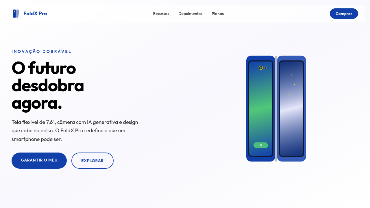
Sleek and modern landing page for a new foldable smartphone. Ideal for landing pages, modern websites. AI-ready template. The iPhone didn't just change phones — it killed the button. Overnight, every interaction became a surface. A tap. A swipe. That single slab of glass forced an entire industry to rethink what "using a computer" meant when your thumb was the cursor.
Then screens got bigger. Then they folded. Samsung's Galaxy Fold cracked open a question nobody had a clean answer for: what happens to your layout when the canvas literally doubles mid-session? Foldables didn't just add screen real estate — they introduced *continuity* as a design problem. Your app now has to survive a metamorphosis while the user watches.
And now, AI lives on the device itself. Not in some distant server rack — on the chip, in the neural engine, running inference while you gesture. The phone anticipates. It pre-renders. It adapts layouts before you consciously decide what you want. We went from "mobile-first" to "mobile-intelligent" in about eighteen months, and the interfaces haven't caught up yet. That's the gap this style exists to close.
- Density: 5/10 — Balanced
- Variance: 4/10 — Moderate
- Motion: 8/10 — Cinematic
- **Style:** Sleek, Modern, User-Centric
- **Keywords:** smartphone, foldable, AI, innovation, sleek, modern, user-centric, vibrant, connected, intuitive
- **Era:** 2026+ Mobile AI
- **Light/Dark:** ✓ Full / ✗ No (com opções de tema)
## Colors
- **Azul Galáctico** (#1240AB) — Accent highlight, links and focus states
- **Preto** (#000000) — Dark surface, primary background
- **Branco** (#FFFFFF) — Light surface, card backgrounds
- **Prata** (#C0C0C0) — Supporting palette color
- **Verde Esmeralda** (#50C878) — Success states, positive indicators
- **Lavanda** (#E6E6FA) — Extended palette, decorative use
- **Dourado** (#FFD700) — Premium accent, decorative highlights
- **Cinza Escuro** (#333333) — Deep contrast surface
## Typography
- **Display / Hero:** Helvetica — Weight 700, tight tracking, used for headline impact
- **Body:** Helvetica — Weight 400, 16px/1.6 line-height, max 72ch per line
- **UI Labels / Captions:** Helvetica — 0.875rem, weight 500, slight letter-spacing
- **Monospace:** JetBrains Mono — Used for code, metadata, and technical values
Scale:
- Hero: clamp(2.5rem, 5vw, 4rem)
- H1: 2.25rem
- H2: 1.5rem
- Body: 1rem / 1.6
- Small: 0.875rem
## Layout
- **Grid:** CSS Grid primary. Max-width containment: 1280px centered with 1.5rem side padding.
- **Spacing rhythm:** Balanced. Base unit: 0.5rem (8px).
- **Section vertical gaps:** clamp(4rem, 8vw, 8rem).
- **Hero layout:** Split-screen (text left, visual right).
- **Feature sections:** Zig-zag alternating text+image rows. No 3-equal-columns.
- **Mobile collapse:** All multi-column layouts collapse below 768px. No horizontal overflow.
- **z-index contract:** base (0) / sticky-nav (100) / overlay (200) / modal (300) / toast (500).
## Elevation & Depth
Animações de dobra de tela, visualizações de câmera com IA, brilhos sutis em elementos de design, tipografia limpa (sans-serif), micro-interações responsivas, elementos 3D do dispositivo, transições fluidas.
- **Physics:** Spring — stiffness 120, damping 20. Confident, weighted transitions.
- **Entry animations:** Fade + translate-Y (16px → 0) over 540ms ease-out. Staggered cascades for lists: 120ms between items.
- **Hover states:** Scale(1.03) + shadow lift over 200ms.
- **Page transitions:** Fade + slide (300ms).
- **Performance:** Only transform and opacity animated. No layout-triggering properties.
## Shapes
Base corner radius: 15px. See rounded tokens in front matter for the full scale.
## Components
- **Primary Button:** Rounded (15px) shape. Accent color fill. Hover: 8% darken + subtle lift shadow. Active: -1px translate tactile press. Font weight 600. No outer glows.
- **Secondary / Ghost Button:** Outline variant. 1.5px border in muted color. Text in primary color. Hover: subtle background fill.
- **Cards:** Rounded (15px) corners. Surface background. Subtle shadow (0 2px 12px rgba(0,0,0,0.06)). 1px border stroke.
- **Inputs:** Label above input. 1px border stroke. Focus ring: 2px accent color offset 2px. Error text below in semantic red. No floating labels.
- **Navigation:** Primary surface background. Active item: accent color indicator. Font weight 500 when active.
- **Skeletons:** Shimmer animation matching component dimensions. No circular spinners.
- **Empty States:** Icon-based composition with descriptive text and action button.
## Do's and Don'ts
- No emojis in UI — use icon system only (Lucide, Heroicons)
- No pure black (#000000) — use off-black or charcoal variants
- No oversaturated accent colors (saturation cap: 80%)
- No 3-column equal-width feature layouts — use zig-zag or asymmetric grid
- No `h-screen` — use `min-h-[100dvh]`
- No AI copywriting clichés: "Elevate", "Seamless", "Unleash", "Next-Gen"
- No broken external image links — use picsum.photos or inline SVG
- No generic lorem ipsum in demos
- Do Animações de dobra de tela
- Do Visualizações de câmera com IA
- Do Brilhos sutis
- Do Tipografia limpa
- Do Elementos 3D do dispositivo
- Do Transições fluidas.
## Use Case
Landing pages, Modern websites
Technical Specs
CSS
background: #FFFFFF, color: #000000, box-shadow: 0 5px 15px rgba(0,0,0,0.1), border-radius: 15px, font-family: "Helvetica, Arial, sans-serif", transition: all 0.3s ease-in-out, background-image: linear-gradient(to bottom, #F8F8F8, #FFFFFF), .fold-animation, .ai-camera-effect.
Variables
--galaxy-blue: #1240AB, --black: #000000, --white: #FFFFFF, --silver: #C0C0C0, --border-radius-lg: 15px, --font-main: "Helvetica, Arial, sans-serif", --shadow-device: 0 5px 15px rgba(0,0,0,0.1).
Checklist
☐ Animações de dobra de tela, ☐ Visualizações de câmera com IA, ☐ Brilhos sutis, ☐ Tipografia limpa, ☐ Elementos 3D do dispositivo, ☐ Transições fluidas.
Colors
Primary
Secondary
Effects
Animações de dobra de tela, visualizações de câmera com IA, brilhos sutis em elementos de design, tipografia limpa (sans-serif), micro-interações responsivas, elementos 3D do dispositivo, transições fluidas.
Light/Dark
✓ Full / ✗ No (com opções de tema)
AI Prompt
Act as a Senior Frontend Engineer and Expert UI Designer.
Your task is to code a complete Landing Page on the first attempt.
- Landing Page Theme: <INSERT THEME>
- Sections to add: <INSERT SECTIONS>

Generate the final code immediately following these definitions:

## Style

- **Name:** Estilo de Inovação em Dispositivos Móveis
- **Type:** Sleek, Modern, User-Centric
- **Keywords:** smartphone, foldable, AI, innovation, sleek, modern, user-centric, vibrant, connected, intuitive
- **Era:** 2026+ Mobile AI
- **Light/Dark:** ✓ Full / ✗ No (com opções de tema)

## Color Palette

- **Primary:** Azul Galáctico #1240AB, Preto #000000, Branco #FFFFFF, Prata #C0C0C0
- **Secondary:** Verde Esmeralda #50C878, Lavanda #E6E6FA, Dourado #FFD700, Cinza Escuro #333333

## Visual Effects

Animações de dobra de tela, visualizações de câmera com IA, brilhos sutis em elementos de design, tipografia limpa (sans-serif), micro-interações responsivas, elementos 3D do dispositivo, transições fluidas.

## AI Visual Direction

Design a sleek and modern landing page for a new foldable smartphone. Use: galactic blue accents, screen folding animations, AI camera visualizations, subtle design glows, clean typography, responsive micro-interactions, 3D device elements, fluid transitions, user-centric and innovative feel.

## CSS Technical

```css
background: #FFFFFF, color: #000000, box-shadow: 0 5px 15px rgba(0,0,0,0.1), border-radius: 15px, font-family: "Helvetica, Arial, sans-serif", transition: all 0.3s ease-in-out, background-image: linear-gradient(to bottom, #F8F8F8, #FFFFFF), .fold-animation, .ai-camera-effect.
```

## Design System Variables

```css
--galaxy-blue: #1240AB, --black: #000000, --white: #FFFFFF, --silver: #C0C0C0, --border-radius-lg: 15px, --font-main: "Helvetica, Arial, sans-serif", --shadow-device: 0 5px 15px rgba(0,0,0,0.1).
```

## Implementation Checklist

- ☐ Animações de dobra de tela
- ☐ Visualizações de câmera com IA
- ☐ Brilhos sutis
- ☐ Tipografia limpa
- ☐ Elementos 3D do dispositivo
- ☐ Transições fluidas.

## Execution Rules

1. Strictly follow the defined visual style.
2. Use high-quality inline SVG icons (Heroicons or Lucide style) — NEVER use emojis as icons.
3. Add `cursor-pointer` and smooth `hover` states (transition-all) on all interactive elements.
4. Required Page Structure:
   - Navbar (Logo + Links + CTA)
   - Hero Section (Impactful Headline + Subtitle + 2 buttons + 3D/Abstract visual element via CSS)
   - Features (3 cards with icons)
   - Testimonials (3 cards)
   - Pricing (3 tiers, highlight the middle one)
   - Final CTA
   - Full Footer with social links, privacy policy, terms of use, contact and SEO links.
5. All text content must be in English.
6. The visual must be CLEARLY distinct — do not create a "default Bootstrap" design. Force the use of the provided design system variables.
7. Use `<style>` tags in the head for custom classes (especially for complex backdrop-filter effects and animations) that Tailwind CDN doesn't cover.
8. Full Responsiveness: Layout must adapt perfectly to Mobile, Tablet and Desktop (vertical stack on mobile).
9. Include basic SEO, Viewport and Open Graph meta tags in `<head>`.
10. Footer must contain: Copyright 2026, Secondary navigation links and Social media icons.
11. Make the creative decisions needed to deliver the complete, functional result now.
Related
Last synced: 4/1/2026