Creative Voltage
Bold, creative, energetic landing page with retro-modern vibes. Ideal for creative agencies, estúdios de música, marcas jovens, eventos culturais. AI-ready template.
Use case: Creative agencies, Music studios, Youth brands, Cultural events
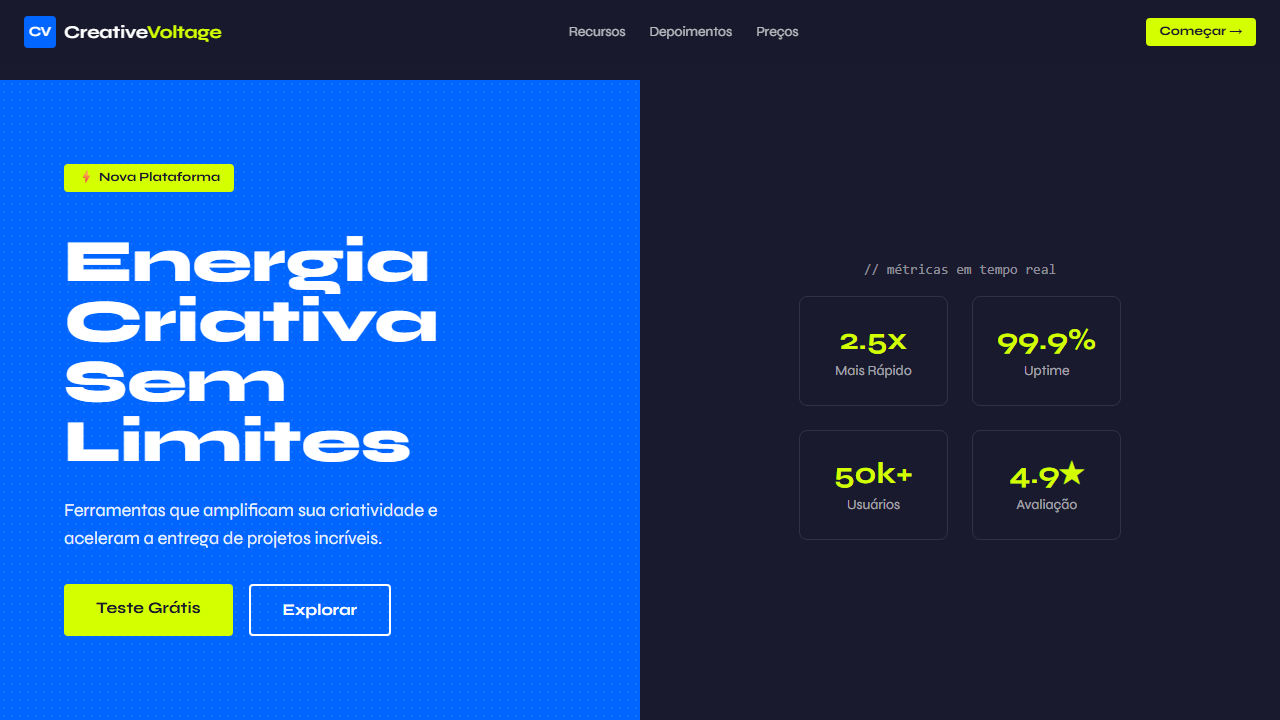
Historical Context
Electric blue paired with neon yellow didn't emerge from careful color theory workshops. It came from rave flyers, from early-2000s sneaker culture, from the moment designers decided legibility was less important than attitude. The combination screams before it speaks. By 2015, every creative agency worth its retainer had some version of this palette on their homepage. Split panels — dark left, bright right — became the visual equivalent of a firm handshake. The formula worked because it communicated exactly one thing: we are not boring. Pentagram wouldn't touch it. That was the point. What's interesting is how the pairing survived the minimalism purge. While other high-energy combinations got flattened into pastels, electric blue and neon yellow kept showing up in pitch decks, hackathon branding, and startup launch pages. The colors carry an implicit promise of velocity — of things being built fast, shipped loud, iterated on publicly. They're the visual language of teams that want you to know they move.
When to Use
When the brand needs to feel kinetic, not contemplative. Creative agencies pitching innovation clients. Tech startups that want to signal builder energy without defaulting to gradient purple. Innovation labs inside larger orgs trying to differentiate from the parent brand's safe navy. Any context where the audience expects boldness and would read restraint as timidity. Not for healthcare. Not for finance. Not for anything that needs to whisper.
Design Principles
- Split panels create tension — let the division be structural, not decorative. One side anchors, the other disrupts.
- Electric blue works as the grounding force. Neon yellow is the accent that earns attention. Reverse this ratio and the page vibrates uncomfortably.
- Energy requires whitespace to land. Pack every panel with content and the voltage flatlines into noise.
- Typography should be blunt — grotesque sans-serifs at large scale. Anything with personality competes with the palette instead of serving it.
- Motion should feel snappy, not smooth. Ease-out curves, quick cuts, abrupt reveals. The animation language matches the color energy — nothing here glides.
DESIGN.md
---
version: "alpha"
name: "Creative Voltage"
description: "Bold, creative, energetic landing page with retro-modern vibes. Ideal for creative agencies, estúdios de música, marcas jovens, eventos culturais. AI-ready template."
colors:
  primary: "#0066ff"
  secondary: "#1a1a2e"
  tertiary: "#d4ff00"
  neutral: "#ffffff"
  surface: "#333333"
  accent: "#3388ff"
typography:
  h1:
    fontFamily: Syne
    fontSize: 2.5rem
    fontWeight: 700
  body-md:
    fontFamily: Syne
    fontSize: 1rem
    fontWeight: 400
rounded:
  sm: 4px
  md: 8px
  lg: 12px
components:
  button-primary:
    backgroundColor: "{colors.primary}"
    textColor: "{colors.neutral}"
    rounded: "{rounded.sm}"
    padding: 12px
---

## Overview

Bold, creative, energetic landing page with retro-modern vibes. Ideal for creative agencies, estúdios de música, marcas jovens, eventos culturais. AI-ready template. Electric blue paired with neon yellow didn't emerge from careful color theory workshops. It came from rave flyers, from early-2000s sneaker culture, from the moment designers decided legibility was less important than attitude. The combination screams before it speaks.

By 2015, every creative agency worth its retainer had some version of this palette on their homepage. Split panels — dark left, bright right — became the visual equivalent of a firm handshake. The formula worked because it communicated exactly one thing: we are not boring. Pentagram wouldn't touch it. That was the point.

What's interesting is how the pairing survived the minimalism purge. While other high-energy combinations got flattened into pastels, electric blue and neon yellow kept showing up in pitch decks, hackathon branding, and startup launch pages. The colors carry an implicit promise of velocity — of things being built fast, shipped loud, iterated on publicly. They're the visual language of teams that want you to know they move.

- Density: 5/10 — Balanced
- Variance: 7/10 — Dynamic
- Motion: 4/10 — Subtle

- **Style:** Bold, Creative, Energetic, Retro-Modern
- **Keywords:** electric blue, neon yellow, split panels, halftone texture, neon badges, Syne, Space Mono, creative, energetic, retro-modern
- **Era:** 2024-2026 Creative Energy
- **Light/Dark:** ✗ No / ✓ Full

## Colors

- **Electric Blue** (#0066ff) — Accent highlight, links and focus states
- **Dark Navy** (#1a1a2e) — Dark surface, primary background
- **Neon Yellow** (#d4ff00) — Warning states, attention indicators
- **White** (#ffffff) — Secondary surface
- **Dark Grey** (#333333) — Deep contrast surface
- **Light Blue** (#3388ff) — Secondary accent


## Typography

- **Display / Hero:** Syne — Weight 700, tight tracking, used for headline impact
- **Accent:** Space Mono — Used for decorative or emphasis text
- **Body:** Syne — Weight 400, 16px/1.6 line-height, max 72ch per line
- **UI Labels / Captions:** Syne — 0.875rem, weight 500, slight letter-spacing
- **Monospace:** Space Mono — Used for code, metadata, and technical values

Scale:
- Hero: clamp(2.5rem, 5vw, 4rem)
- H1: 2.25rem
- H2: 1.5rem
- Body: 1rem / 1.6
- Small: 0.875rem


## Layout

- **Grid:** CSS Grid primary. Max-width containment: 1280px centered with 1.5rem side padding.
- **Spacing rhythm:** Balanced. Base unit: 0.5rem (8px).
- **Section vertical gaps:** clamp(4rem, 8vw, 8rem).
- **Hero layout:** Asymmetric composition.
- **Feature sections:** Asymmetric grid with varied card sizes. No 3-equal-columns.
- **Mobile collapse:** All multi-column layouts collapse below 768px. No horizontal overflow.
- **z-index contract:** base (0) / sticky-nav (100) / overlay (200) / modal (300) / toast (500).


## Elevation & Depth

Electric blue + neon yellow contrast, halftone texture patterns via CSS, neon badges/callouts, split panels blue left dark right, script typography accents, bold transitions 200ms

- **Physics:** Ease-out curves, 200-300ms duration. Smooth and predictable.
- **Entry animations:** Fade + translate-Y (16px → 0) over 420ms ease-out. Staggered cascades for lists: 80ms between items.
- **Hover states:** Subtle color shift + shadow adjustment over 200ms.
- **Page transitions:** Fade only (200ms).
- **Performance:** Only transform and opacity animated. No layout-triggering properties.


## Shapes

Base corner radius: 4px. See rounded tokens in front matter for the full scale.


## Components

- **Primary Button:** Rounded (4px) shape. Accent color fill. Hover: 8% darken + subtle lift shadow. Active: -1px translate tactile press. Font weight 600. No outer glows.
- **Secondary / Ghost Button:** Outline variant. 1.5px border in muted color. Text in primary color. Hover: subtle background fill.
- **Cards:** Rounded (4px) corners. Surface background. Subtle shadow (0 2px 12px rgba(0,0,0,0.06)). 1px border stroke.
- **Inputs:** Label above input. 1px border stroke. Focus ring: 2px accent color offset 2px. Error text below in semantic red. No floating labels.
- **Navigation:** Primary surface background. Active item: accent color indicator. Font weight 500 when active.
- **Skeletons:** Shimmer animation matching component dimensions. No circular spinners.
- **Empty States:** Icon-based composition with descriptive text and action button.


## Do's and Don'ts

- No emojis in UI — use icon system only (Lucide, Heroicons)
- No pure white (#FFFFFF) backgrounds — use off-white or dark surfaces
- No oversaturated accent colors (saturation cap: 80%)
- No 3-column equal-width feature layouts — use zig-zag or asymmetric grid
- No `h-screen` — use `min-h-[100dvh]`
- No AI copywriting clichés: "Elevate", "Seamless", "Unleash", "Next-Gen"
- No broken external image links — use picsum.photos or inline SVG
- No generic lorem ipsum in demos

- Do Syne + Space Mono carregados
- Do Split panels azul/escuro
- Do Halftone texture patterns
- Do Neon badges amarelo (#d4ff00)
- Do Contraste elétrico forte
- Do Script typography accents
- Do Responsivo mobile/tablet/desktop


## Use Case

Creative agencies, Music studios, Youth brands, Cultural events
Technical Specs
CSS
font-family: 'Syne' for headings, 'Space Mono' for mono, background: #0066ff, .panel-dark { background: #1a1a2e }, .neon-badge { background: #d4ff00; color: #1a1a2e; padding: 4px 12px; border-radius: 4px; font-weight: 700 }, .halftone { background-image: radial-gradient(circle, #000 1px, transparent 1px); background-size: 8px 8px; opacity: 0.1 }Variables
--bg-primary: #0066ff, --bg-dark: #1a1a2e, --accent-neon: #d4ff00, --text-light: #ffffff, --font-display: 'Syne', --font-mono: 'Space Mono', --halftone-size: 8px, --badge-radius: 4px
Checklist
☐ Syne + Space Mono carregados, ☐ Split panels azul/escuro, ☐ Halftone texture patterns, ☐ Neon badges amarelo (#d4ff00), ☐ Contraste elétrico forte, ☐ Script typography accents, ☐ Responsivo mobile/tablet/desktop
Colors
Primary
Secondary
Effects
Electric blue + neon yellow contrast, halftone texture patterns via CSS, neon badges/callouts, split panels blue left dark right, script typography accents, bold transitions 200ms
Light/Dark
✗ No / ✓ Full
AI Prompt
Act as a Senior Frontend Engineer and Expert UI Designer.
Your task is to code a complete Landing Page on the first attempt.
- Landing Page Theme: <INSERT THEME>
- Sections to add: <INSERT SECTIONS>

Generate the final code immediately following these definitions:

## Style

- **Name:** Creative Voltage
- **Type:** Bold, Creative, Energetic, Retro-Modern
- **Keywords:** electric blue, neon yellow, split panels, halftone texture, neon badges, Syne, Space Mono, creative, energetic, retro-modern
- **Era:** 2024-2026 Creative Energy
- **Light/Dark:** ✗ No / ✓ Full

## Color Palette

- **Primary:** Electric Blue #0066ff, Dark Navy #1a1a2e, Neon Yellow #d4ff00
- **Secondary:** White #ffffff, Dark Grey #333333, Light Blue #3388ff

## Visual Effects

Electric blue + neon yellow contrast, halftone texture patterns via CSS, neon badges/callouts, split panels blue left dark right, script typography accents, bold transitions 200ms

## AI Visual Direction

Design a bold, creative, energetic landing page with retro-modern vibes. Use split panels with electric blue (#0066ff) on left and dark (#1a1a2e) on right. Add halftone texture patterns using CSS. Include neon badges and callouts in yellow (#d4ff00). Use Syne font (700/800) for display and Space Mono for code/accents. Script typography for creative flair.

## CSS Technical

```css
font-family: 'Syne' for headings, 'Space Mono' for mono, background: #0066ff, .panel-dark { background: #1a1a2e }, .neon-badge { background: #d4ff00; color: #1a1a2e; padding: 4px 12px; border-radius: 4px; font-weight: 700 }, .halftone { background-image: radial-gradient(circle, #000 1px, transparent 1px); background-size: 8px 8px; opacity: 0.1 }
```

## Design System Variables

```css
--bg-primary: #0066ff, --bg-dark: #1a1a2e, --accent-neon: #d4ff00, --text-light: #ffffff, --font-display: 'Syne', --font-mono: 'Space Mono', --halftone-size: 8px, --badge-radius: 4px
```

## Implementation Checklist

- ☐ Syne + Space Mono carregados
- ☐ Split panels azul/escuro
- ☐ Halftone texture patterns
- ☐ Neon badges amarelo (#d4ff00)
- ☐ Contraste elétrico forte
- ☐ Script typography accents
- ☐ Responsivo mobile/tablet/desktop

## Execution Rules

1. Strictly follow the defined visual style.
2. Use high-quality inline SVG icons (Heroicons or Lucide style) — NEVER use emojis as icons.
3. Add `cursor-pointer` and smooth `hover` states (transition-all) on all interactive elements.
4. Required Page Structure:
   - Navbar (Logo + Links + CTA)
   - Hero Section (Impactful Headline + Subtitle + 2 buttons + 3D/Abstract visual element via CSS)
   - Features (3 cards with icons)
   - Testimonials (3 cards)
   - Pricing (3 tiers, highlight the middle one)
   - Final CTA
   - Full Footer with social links, privacy policy, terms of use, contact and SEO links.
5. All text content must be in English.
6. The visual must be CLEARLY distinct — do not create a "default Bootstrap" design. Force the use of the provided design system variables.
7. Use `<style>` tags in the head for custom classes (especially for complex backdrop-filter effects and animations) that Tailwind CDN doesn't cover.
8. Full Responsiveness: Layout must adapt perfectly to Mobile, Tablet and Desktop (vertical stack on mobile).
9. Include basic SEO, Viewport and Open Graph meta tags in `<head>`.
10. Footer must contain: Copyright 2026, Secondary navigation links and Social media icons.
11. Make the creative decisions needed to deliver the complete, functional result now.Related
Last synced: 4/1/2026