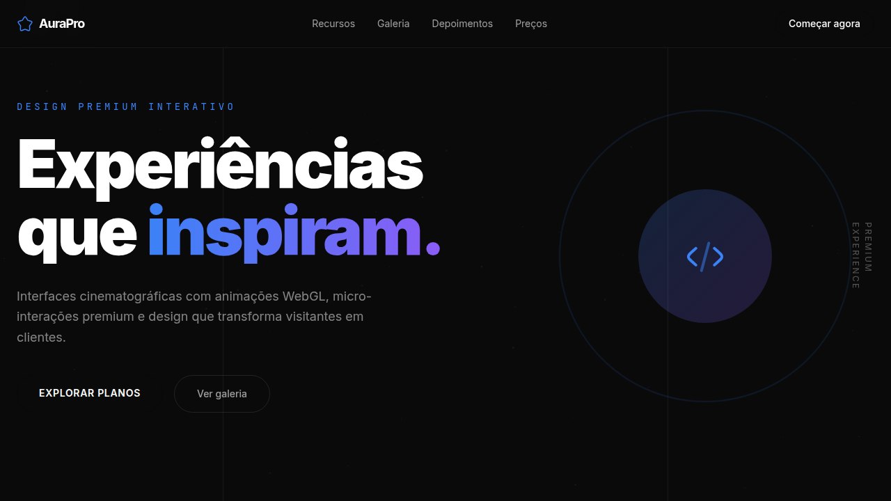
Bold Signal
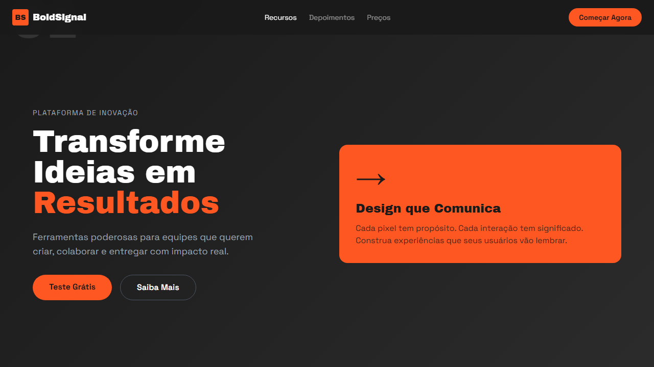
Design bold e confiante com card colorido em fundo escuro, tipografia impactante Archivo Black e numeração de seções. Prompt pronto para IA.
Uso: Agências criativas, Startups tech, Portfolios de design, Apresentações corporativas
Contexto Histórico
Inspirado em design editorial moderno e apresentações de alto impacto. Combina tipografia bold com cards coloridos como ponto focal, criando hierarquia visual forte e navegação intuitiva.
Especificações Técnicas
Cores
Primárias
Secundárias
Efeitos
Bold colored card as focal point, large section numbers (01, 02), navigation breadcrumbs with opacity states, grid-based layout, smooth hover transitions 250ms
Light/Dark
✗ No / ✓ Full
CSS
background: linear-gradient(135deg, #1a1a1a 0%, #2d2d2d 50%, #1a1a1a 100%), font-family: 'Archivo Black' for headings, 'Space Grotesk' for body, color: #FFFFFF, .card-accent { background: #FF5722; color: #1a1a1a }, .section-number { font-size: 6rem; font-weight: 900; opacity: 0.15 }
Variáveis
--bg-primary: #1a1a1a, --bg-gradient: linear-gradient(135deg, #1a1a1a 0%, #2d2d2d 50%, #1a1a1a 100%), --card-bg: #FF5722, --text-primary: #ffffff, --text-on-card: #1a1a1a, --font-display: 'Archivo Black', --font-body: 'Space Grotesk', --section-number-size: 6rem
Checklist
☐ Archivo Black + Space Grotesk carregados, ☐ Dark gradient background, ☐ Colored card focal point (#FF5722), ☐ Large section numbers (01, 02, 03), ☐ Navigation breadcrumbs com opacity, ☐ Grid-based layout preciso, ☐ Responsivo mobile/tablet/desktop
DESIGN.md
Design System: Bold Signal
1. Visual Theme & Atmosphere
Design bold e confiante com card colorido em fundo escuro, tipografia impactante Archivo Black e numeração de seções. Prompt pronto para IA. Inspirado em design editorial moderno e apresentações de alto impacto. Combina tipografia bold com cards coloridos como ponto focal, criando hierarquia visual forte e navegação intuitiva.
- Density: 5/10 — Balanced
- Variance: 2/10 — Structured
- Motion: 4/10 — Subtle
2. Color Palette & Roles
- Dark Background (#1a1a1a) — Primary background surface
- Card Orange (#FF5722) — Warm accent, call-to-action secondary
- White (#FFFFFF) — Light surface, card backgrounds
- Dark Gradient (#2d2d2d) — Deep contrast surface
- Text on Card (#1a1a1a) — Primary text color
- Muted Grey (#888888) — Secondary text, borders, muted elements
3. Typography Rules
- Display / Hero: Archivo Black — Weight 700, tight tracking, used for headline impact
- Accent: Space Grotesk — Used for decorative or emphasis text
- Body: Archivo Black — Weight 400, 16px/1.6 line-height, max 72ch per line
- UI Labels / Captions: Archivo Black — 0.875rem, weight 500, slight letter-spacing
- Monospace: JetBrains Mono — Used for code, metadata, and technical values
Scale:
- Hero: clamp(2.5rem, 5vw, 4rem)
- H1: 2.25rem
- H2: 1.5rem
- Body: 1rem / 1.6
- Small: 0.875rem
4. Component Stylings
- Primary Button: Subtly rounded (0.5rem) shape. Accent color fill. Hover: 8% darken + subtle lift shadow. Active: -1px translate tactile press. Font weight 600. No outer glows.
- Secondary / Ghost Button: Outline variant. 1.5px border in muted color. Text in primary color. Hover: subtle background fill.
- Cards: Subtly rounded (0.5rem) corners. Surface background. Subtle shadow (0 2px 12px rgba(0,0,0,0.06)). 1px border stroke.
- Inputs: Label above input. 1px border stroke. Focus ring: 2px accent color offset 2px. Error text below in semantic red. No floating labels.
- Navigation: Primary surface background. Active item: accent color indicator. Font weight 500 when active.
- Skeletons: Shimmer animation matching component dimensions. No circular spinners.
- Empty States: Icon-based composition with descriptive text and action button.
5. Layout Principles
- Grid: CSS Grid primary. Max-width containment: 1280px centered with 1.5rem side padding.
- Spacing rhythm: Balanced. Base unit: 0.5rem (8px).
- Section vertical gaps: clamp(4rem, 8vw, 8rem).
- Hero layout: Split-screen (text left, visual right).
- Feature sections: Zig-zag alternating text+image rows. No 3-equal-columns.
- Mobile collapse: All multi-column layouts collapse below 768px. No horizontal overflow.
- z-index contract: base (0) / sticky-nav (100) / overlay (200) / modal (300) / toast (500).
6. Motion & Interaction
- Physics: Ease-out curves, 200-300ms duration. Smooth and predictable.
- Entry animations: Fade + translate-Y (16px → 0) over 420ms ease-out. Staggered cascades for lists: 80ms between items.
- Hover states: Subtle color shift + shadow adjustment over 200ms.
- Page transitions: Fade only (200ms).
- Performance: Only transform and opacity animated. No layout-triggering properties.
7. Anti-Patterns (Banned)
- No emojis in UI — use icon system only (Lucide, Heroicons)
- No pure white (#FFFFFF) backgrounds — use off-white or dark surfaces
- No oversaturated accent colors (saturation cap: 80%)
- No 3-column equal-width feature layouts — use zig-zag or asymmetric grid
- No
h-screen— usemin-h-[100dvh] - No AI copywriting clichés: "Elevate", "Seamless", "Unleash", "Next-Gen"
- No broken external image links — use picsum.photos or inline SVG
- No generic lorem ipsum in demos
Prompt para AI
Design a bold, confident dark landing page. Use a colored card (orange/coral) as the focal point on a dark gradient background. Add large section numbers (01, 02, 03) top-left. Include navigation breadcrumbs with active/inactive opacity states. Use Archivo Black for display and Space Grotesk for body. Grid-based layout with precise alignment.
Relacionados
Última sincronização: 01/04/2026