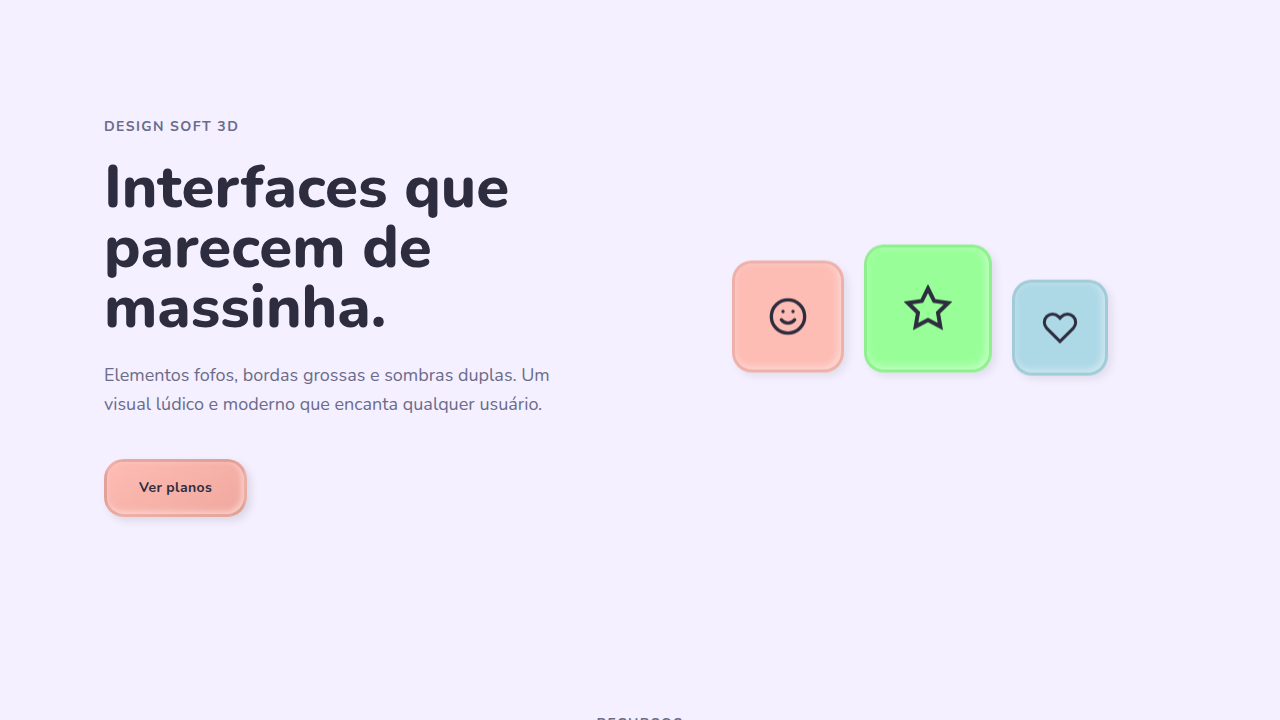
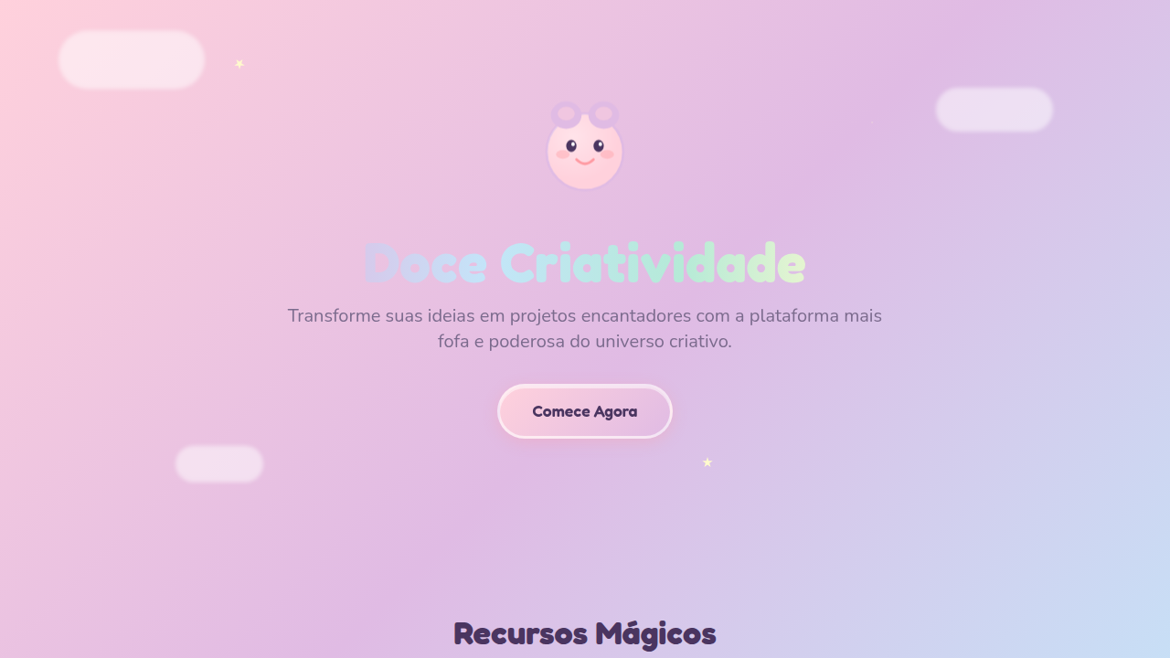
Claymorphism
Playful, toy-like interface with soft 3D, chunky elements, bubbly aesthetic, rounded edges (16-24px), thick borders (3-4px), double shadows (inner + outer), pastel colors, smooth animations. Ideal for apps infantis, creative tools, education, jogos interativos. AI-ready template.
Use case: Apps infantis, Creative tools, Education, Jogos interativos
Historical Context
Claymorphism emerged around 2021 as designers got bored with flat UI and started pulling visual language from 3D illustration tools. The Clay.io aesthetic, combined with the explosion of Blender and Cinema4D artists creating chunky, inflated characters for tech brands, gave UI designers permission to make interfaces feel tactile again. People were rendering soft, squishy objects and thinking: why can't buttons feel like this? It's worth distinguishing this from neumorphism, which tried (and mostly failed) to simulate realistic depth through subtle light and shadow on monochrome surfaces. Claymorphism doesn't pretend to be realistic. It's deliberately toy-like, exaggerated, cartoonish. The shadows are colored. The shapes are puffy. Nothing here is trying to fool your eye into thinking it's a real object on your desk. By 2026, claymorphism has settled into a comfortable niche. You see it in educational platforms, creative tools, and anywhere the brand voice skews young or playful. It never took over enterprise UI (thankfully), but it proved that depth and whimsy have a place in digital product design when the context is right.
When to Use
Claymorphism works when your audience expects delight over efficiency. Children's apps, gamified learning platforms, creative tools where the interface itself should feel like a toy. It signals approachability and low stakes. But be careful: applied to the wrong context, it reads as condescending. A banking app with puffy 3D buttons tells users you don't take their money seriously. Same goes for productivity tools where speed matters more than charm. The line between playful and infantilizing is thinner than most designers think.
Design Principles
- Exaggerate border-radius beyond what feels 'correct.' Claymorphism lives in the 20-40px range where shapes start feeling inflated rather than merely rounded.
- Use colored, diffused shadows instead of neutral grays. A pink card gets a deeper pink shadow. This sells the 3D-object illusion without photorealism.
- Keep surface colors in the pastel-to-saturated range. Claymorphism dies on dark backgrounds because the soft dimensionality needs light to breathe.
- Add micro-animations with overshoot easing (spring physics). Static clay elements feel like dead plastic. A slight bounce on interaction sells the squishiness.
- Maintain generous padding and spacing. Cramped layouts kill the inflated aesthetic instantly. Every element needs room to feel puffy.
Technical Specs
Colors
Primary
Effects
Inner+outer shadows (subtle, no hard lines), soft press (200ms ease-out), fluffy elements, smooth transitions
Light/Dark
✓ Full / ◐ Partial
Related
Last synced: 4/1/2026